Leaderboard
Popular Content
Showing content with the highest reputation on 06/12/2024 in all areas
-
5 points
-
When I started out, I was very confused about my layers. Then I learned that you could NAME them! For me, it was a game changer. It's easier now to find what I want without the time consuming process of naming, but in the beginning it kept me from being totally lost.5 points
-
5 points
-
Two days ago when the Campus was up after that terrible gremlin attack, Sue very kindly gave instructions how to make a candle out of wordart! She has been perfecting her initial idea on this. Here is my try to make something too. To me it was clear it must be done with the warpmesh tool to get the rounding, but that you could use wordart to do so is a genius idea. I didn't want to copy her "card", so I tried a birthday card. I'm not totally happy with the colors I used and I have to try to make a better ellips on the bottom. I didn't have a realistic flame and I haven't a subsciption by CF. When I tried to just buy a flame they want me to take that really nice subscription for a year, which I at this point won't do. I just updated my filter forge and that was my budget for now. I'll see if I can find some flames there, but in the mean time I wanted to post this 1st try. I can see nice, unique cards made this way, Sue thank you so much for sharing this with us.5 points
-
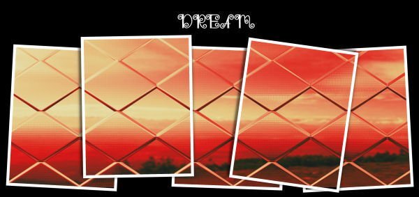
I can now post again. I hope that is the end of the issues, as Carole, I'm sure somteimes technology can be a nightmare. I created this for a friend, whose birthday was yesterday, using one of my bird photos, as she is also an avid bird and insect watcher, like myslef. (Barn Swallow) The colours used in the candle can all be found in the photo. I used one of my embosed cutout templates. It's a 5x7 ecard. Which my friend was able to print off. I'm currently unable to comment on posts in the campus. Corrie Kinkel I love everything about your candle! If anyone was going to try their hand in creating one, I knew it would be you. They certainly do have the potential to be used in a variety of ways. I only wish I had thought of it long ago. Thanks Michele Fineron, for the suggestive challenge, as without your vision I may not have had thought to take the candle to this level. By the way, everyone has been posting wonderful, inspiring pages!4 points
-
That is an interesting point. I don't usually teach it, for a couple of reasons: you can have a preview that is visible, which is usually enough for me to know whether this is a frame, or a photo, or a paper I often use the OpenasLayer script, which will rename based on the file you opened, so some layers will automatically be renamed However, it could be useful, especially for those using older versions that don't have thumbnails in the Layers palette.4 points
-
Increasing the thumbnail size just means not as many layers will show in the layers palette. And, I want to have as many visible there as possible. I just changed mine to 100 (way too big for my many layer layouts) and 75 (better than 100 but still not many layers showing). Even at 100, some of the smaller elements are too small to actually see what it is. Also, with my PSP settings/layout and screen size, I can see 7 layers when it is set at 50. A setting of 75 has 5 layers and a setting of 100 has 4 layers. However, changing the tooltip size is a better choice for me. A size of 200 seems to be good. Again, personal preference. I will sometimes rename layers but since I drag and drop my papers and elements directly on to the layer palette they get renamed to the file name that way. I've been doing this so long, (long before I even knew about a script to open as a layer) it is just an automatic for me. I'm an old dog that has a hard time learning new tricks 😉3 points
-
3 points
-
2 points
-
2 points
-
One little tip I'll give is to use a guide when you are manipulating the duplicate vector, to get the extra thickness on the curves. So the pen nodes are aligned to create both sides symmetrical. Also lower the width of the duplicate vector. I'm still making adjustments when I create a candle. I've done several templates The more I do the better they get, as will yours. Not that I could find fault with yours, but you are like me. I have to be happy with what I create.2 points
-
A bigger monitor typically will have a higher resolution, and a higher resolution will result in smaller display. That is why I purposefully use a lower resolution on my monitor when I record tutorials or hold classes. Then, in order to increase the size of the thumbnails, you can go to File > Preferences > General Program Preferences > Palettes and you can change the Palette Thumbnail size from the 50 pixels default to something else. You can also change the Tooltips Thumbnail to something large and that will give a bigger image when you hover over a layer.2 points
-
2 points
-
It was my pleasure to share with you all, once I had played with it. You did an awesome job! I love it.2 points
-
2 points
-
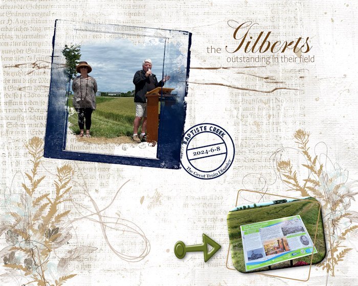
Since I used the date stamp (that I have finally figured out how to do with reverse text), I want to post the "souvenir" I made for the couple pictured here. They are local historians/writers who have spearheaded a project to install heritage (historical) plaques (large) in various rural areas and small communities (one is underway now for my home town). I am on the committee and involved with the unveilings that are taking place this summer, and in the future. This plaque, literally in a field (lower right photo), showcases a terrible train disaster that occurred close by in 1854 with a massive loss of life. It was the early days of railroads and there were many accidents, but none as disastrous as this one. The blue frame is from (I think) Natali Designs on Pickleberry Pop; most of the other elements are from ET (Erika) Designs or Katie Pertiet. I'm not good at keeping track while I'm doing the layout.2 points
-
1 point
-
1 point
-
I do the same for small ones especially, or if I have a lot of layers that are similar then i"ll for sure name them, or group them and now I highlight the orig. vector (in yellow) in case I need to get to it, it's really easy to find.1 point
-
I would actually like to sit outside more but because of allergies, I don't very often. I do have a nice patio with a 2 seat cushioned bench, 2 cushioned chairs and a table that came as a set. I just got the cushions out this week for the first time since 2022. I physically wasn't able to do it last year. There is very little shade on the patio so it can get quite hot on an very sunny day. However, Peyton loves to go on the patio (it is fenced in) and she'll lay on the furniture in the sun. I have a set up that when I go away in nice weather, I leave her outside. She can be on the patio or go in the garage if she wants. I have a very small front porch but do have 2 chairs with a very small table between them. I used to have those plastic chairs on it but last summer I got 2 cushioned chairs at a garage sale when my cousins were selling my aunt's stuff (they moved her to an assisted living community). They are comfortable and look nice. There is a nice big bush in front of the porch so people can't really see me but I can see everything going on. The porch is in the shade so I do like to sit out there in the early evenings and read for awhile. Peyton goes on a tie-out so she can lay in the grass if she wants but can't run away.1 point
-
Sue thank you and I'm going to play a bit more with the candle, I need a couple of cards for family and friends who have a special birthday coming up in the next months. I'm not 100% happy with my first attempt but I know now which adjustments I have to make and I have to think of appropriate Dutch words because we tend to have longer words, so the fonts and their spacing will be important too. Luckily I have been using the meshwarp before that makes it way easier. Thanks again to you for the initial idea and thanks to Michele for her suggestion. I wish I had thought of using wordart for a candle. I think many of my X-mas cards for this year are going to have a candle!1 point
-
1 point
-
Julie I think we all have our own "system" for renaming the thumbnails and like you I most of the time rename the ones that are very hard to see. Alas over time I have to rename more and more because I find them harder to see. But to me that's a small price to pay for better and quicker reference; it offers an easier workflow in the end.1 point
-
1 point
-
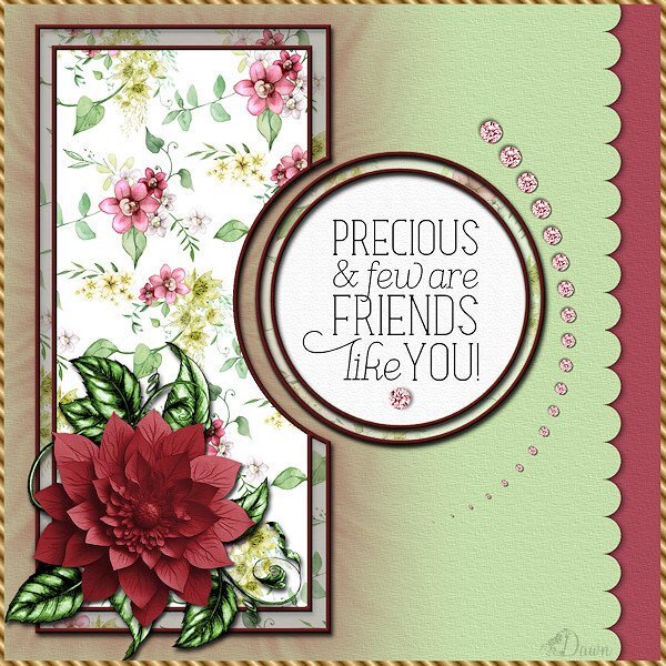
Dawn a lovely card, if I would get such a card from a friend I would be over the moon!1 point
-
Really like it. I made a candle flame today - in png format, I am showing in on a "quickie" candle and then separately beside it. If you would like the flame, I can put it on the facebook page. Just let me know.1 point
-
1 point
-
I see that the posts I had posted, which disappeared, have been restored . I will now post the updated transparent wordart candle which I posted on facebook as promised. Anyway, after some playing I can create celebration, festive candles which I will be happy with. Which are ever so easy to create, yet the results are quite impressive. I will start with the base. Using the vector elipse shape create the shape, duplicate. Using the pen tool move the side nodes in on the top layer, merge down, after duplicating, any gaps can be filled with the brush tool. Using the feather tool in selections feather severeal times until you get a nice tapered gap. Of course you would create the base after you have created the candle itself. Once you have created the wordart, stretch it out horizontally, and and a little squidging down. In order to achieve a shorter more compact candle. If that is what you'd prefer. Always duplicate, then convert to a raster. I won't go through the instructions of using the warp brush to create the rounded effect and shadows. Check out the tube tutorial in the creative scrap. Instead of using the usual written verse inside some cards I intend using a candle. The candle flame came from CF. I won't challenge you , but give it a try, and post it. It really is that easy.1 point
-
1 point
-
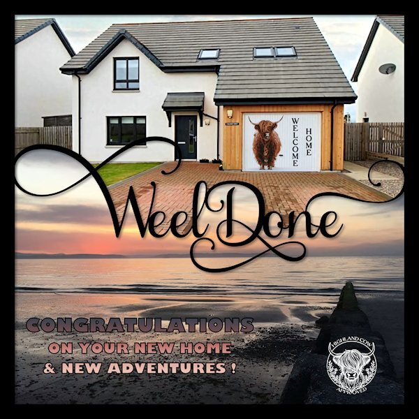
Great to be back to posting. This was the post I tried to post on June 6th. so glad is stayed on the Editor...and good thing it didnt post because I forgot to add a shadow the Weel Done and the frame. I had looked on "professor" Google to see what do Scottish people say for "congratulations" and it came up with a slang term, "Weel Done". I have no idea if this is legit or not. Just a quickie I did tonight...because I left it to the last moment. My friends moved to Scotland on the Moray Firth (Moray Coast?) in Nairn (close to Inverness). Tomorrow (from my point of view - Today from theirs) they get the keys to the new house and their new adventure. I had originally thought I'd be doing something with the text and the outer frame, but it seems to look better in black. I found the highland cow on Unsplash (Sasha Matic is the photographer) and since it was on a snowy white background I used the Darken blend mode to made the background disappear into the garage door. I found the highland cow in the circle frame on Creative Fabrica and used text on a path as shown in the last master class. I see that I didnt get the bottom word as far away. I'll fix that later, I need to send it now as they should be just about getting up for the day...as I'm about to be going to sleep. I am showing it in black (as it came), on the layout I turned it to white so it would show up.1 point
-
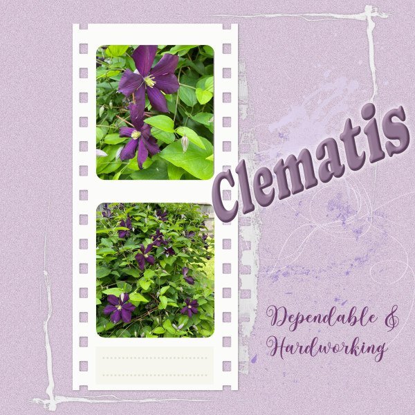
It's wonderful! I am able to react to others' posts and comment on layouts. The gremlins seem to have been beaten back! I prepared this a while ago and couldn't put it here, but it might work now. (I actually tried to post it just when the Forum went wonky.) Just a general layout featuring one of my favourite plants in the garden. Purple is not a colour choice I use very often, but it works here, I think. Some elements from Katie Pertiet Designs.1 point
-
1 point


