Leaderboard
Popular Content
Showing content with the highest reputation on 05/05/2024 in all areas
-
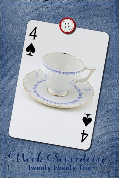
Week 14 Version 2.0 Well, I posted this once already only to notice I used a T-cup that I used before. I had to compress this quite a bit so it's super blurry looking here. I'll try and post on FB if I get more caught up this weekend. I changed up the magnet holding the card in place for the 2nd quarter of this challenge. The Lifted Photo script was put to good use and most thankful for the shadow that accompanies it. The background is one layer of a gradient, duplicate it and I think I might have added lots of repeats, then Effect>Reflection>Kaleidoscope and stopped at this one which looks like a textures cement wall at night with a spotlight (gelled blue) on it. I used a blend mode on that second dup layer (Hue). I kept the outline frame and text the same red that comes with the script and applied a blend mode (Hue-Legacy) to make it look like it was painted onto the "cement" wall. Font is Asher Punk (CF likely). It actually looks more dramatic with the original wrong cup I put on it.4 points
-
4 points
-
Week 16 All my ducks line up in a row (centered actually). Except the T-cup which I tipped over a bit. Papers from Creative Fabrica: the Dutch Lady -Daphne Populiers - Watercolor Inc Splash Backgrounds, Sandy Shores. Two papers with a blend mode surprise for me that it matched the magnet and the t-cup. Fonts Country Wedding (Week 16) and Couple Heart from either CF or Google.3 points
-
3 points
-
2 points
-
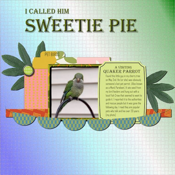
Here's what I've been distracted by recently. I was a bit astounded to find a parrot at my bird feeders! All the supplies came from Marisa Lerin, mostly from her Template 530 and Bolivia Mini-Kit. The title font is Algerian, and the text font is Agency. I'd like to introduce you to the Quaker Parrot "Sweetie Pie".2 points
-
I started creating this as just one page, and it ended up being a double page. Most of the time, the final layout is completely different from the one I began—different papers, colors... That's why it takes so long for me, but I am happy that at least I'm doing something. Credits: Template by Scrapping with Liz (SwL_LotsofBlocksTemplate5). -- To suit my needs, I usually rotate the template, change the size of the photos, etc. Background paper: #ps_janet-scott_43698_paper-texture-template-068_cu plus a Photo Effects>Sepia Toning ---- I also added a lined paper I created for the Build-A-Kit Workshop, plus a photo of the internet with a Black Pencil filter. From Cassel: Tutorials>Fasteners>Back Brad -- Photo Prongs -- Cross Stitch cass-DateStamp#4 script, which I purchased on the 22nd just for this layout. The arrows are created with a font suggested in the Lab7-Module 08 (KGArrows).2 points
-
2 points
-
Whenever you create a project, you will likely want to use some text. In this case, you might be looking for some interesting fonts to showcase titles or dates. This month, I am suggesting a font that indicates some thickness. Although it might look like a layered font, it is not, but you can easily "paint" the sides/center in different colors for a special effect. You can get this free font HERE.1 point
-
1 point
-
I haven't been scrapping much lately but took time last night to do a layout for a challenge at The Lily Pad. Main requirement was to use a template by Scrapping with Liz (she gives a free template upon completion). To post the layout in their gallery you need to use a kit sold by a designer in their store (retired kits are OK to use). So all my supplies for the layout are from The Lily Pad: SWL Recyclables 79 template (deleted a photo spot) and Forever Joy's Dog Tails. Instructions for the layout: 1. An odd number of photos (1, 3, 5, etc.) 2. At least one background paper with pink on it 3. At least one other paper/paper piece with yellow on it 4. At least one blue round element (can be button, flower, word art, etc.) 5. At least one orange word (can be title, date, journaling, word art, etc.) If you posted in the thread before the challenge started, you could delete one of the instructions if desired. I deleted #5. The dog was actually a flat paper element as was the word strip. I used an inner bevel on both of them and like the result, especially on the dog. I think it looks like a magnet!1 point
-
1 point
-
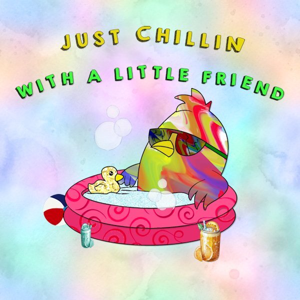
I started playing with this with the font from the font challenge ( kg-happy.font?fpp=100 ) and a freebee from C F that was I think a coloring book page. (https://www.creativefabrica.com/product/funny-bird-chilling-in-the-pool-coloring/) I had fun with it but it did take a while because I was just playing and kept changing things.1 point
-
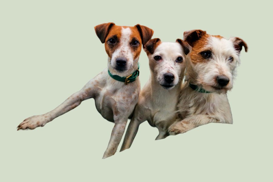
My daughter sent me a photo of her three girls. Tot in the middle is the mother of the other two. Smudge and Bramble is the wire haired one. They are Parsons terriers. I started the extraction last night, after watching the advanced extraction masterclass in the campus. It is an older video, but most helpful. It was a tedious, eye staining task. Yet, althouogh it's not perfect, I'm happy with the end result. I've sent it to my daughter, which she will get tomorrow morning. I given her a choice of background colours. Here is one one them.1 point
-
1 point
-
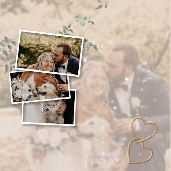
I think you have a done a lovely job. I like the split frame effect. If I may, I'm going to make an alternative suggestion using a frame or the split frame technique and I have also posted an example even though it's not the split frame effect, it is still a frame, and I feel it will work equally as well. Duplicate the photo, hide one. Create the frame/frames. Using the magic wand select outside the frame, contract by a few pixels, then invert. Now you can edit the photo not in the frame or frames, reduce the opacity, blur, add a texture, its up to you. I would then place the hearts up in the left corner, with a few words. I added an out of bounds effect, for that I used the hiden photo. You could have the bouquet just out of the frame.1 point
-
1 point
-
Ann, Christina, I love both your pages. At the moment I am still in California and I just checked in to see what the new month brings. I am pretty much occupied here with all kind of things. Made a lot of flower photos, visited interesting places, enjoyed family time and helped with book interviews in the class of my youngest granddaughter! Coming weekend we will be going to Yosemite National Park and on Tuesday I will be flying home. So end of next week after my jet lag I am back in the Campus, albeit a bit sad after saying farewell to my dearests. See you all soon!1 point
-
1 point
-
1 point
-
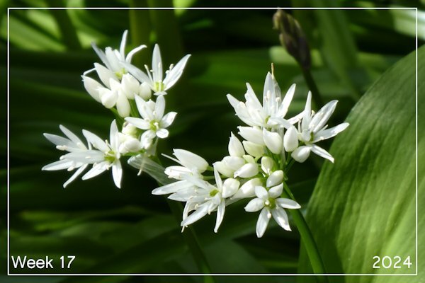
Beautiful pic. Do you ever use it to cook? I had to look it up and found out it is edible.1 point
-
1 point
-
1 point


