Leaderboard
Popular Content
Showing content with the highest reputation on 05/01/2024 in all areas
-
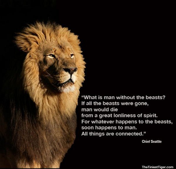
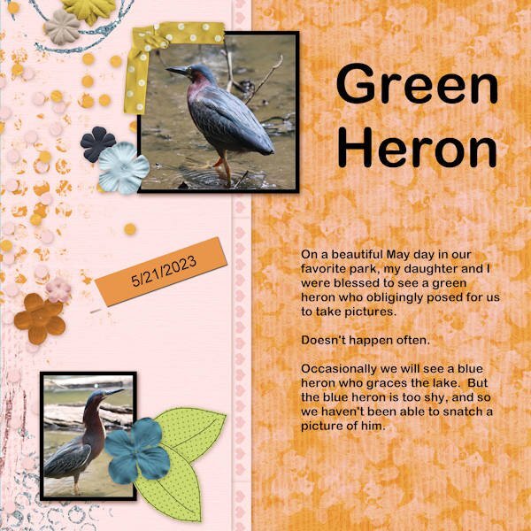
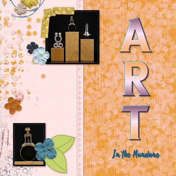
My last page for April 2024. I read the latest post in the blog. Using a table in digital scrapbooking. Something I have never considered doing, so I thought I would give it a try. Folded ribbon and ribbon are Carole's scripts, the lace is a brush. Created a grungy overlay for the papers, the leaves is a paper template used as an overlay. Everything else is my own. Oh yes, I mustn't forget Carole's heart corner punch.6 points
-
I started creating this as just one page, and it ended up being a double page. Most of the time, the final layout is completely different from the one I began—different papers, colors... That's why it takes so long for me, but I am happy that at least I'm doing something. Credits: Template by Scrapping with Liz (SwL_LotsofBlocksTemplate5). -- To suit my needs, I usually rotate the template, change the size of the photos, etc. Background paper: #ps_janet-scott_43698_paper-texture-template-068_cu plus a Photo Effects>Sepia Toning ---- I also added a lined paper I created for the Build-A-Kit Workshop, plus a photo of the internet with a Black Pencil filter. From Cassel: Tutorials>Fasteners>Back Brad -- Photo Prongs -- Cross Stitch cass-DateStamp#4 script, which I purchased on the 22nd just for this layout. The arrows are created with a font suggested in the Lab7-Module 08 (KGArrows).5 points
-
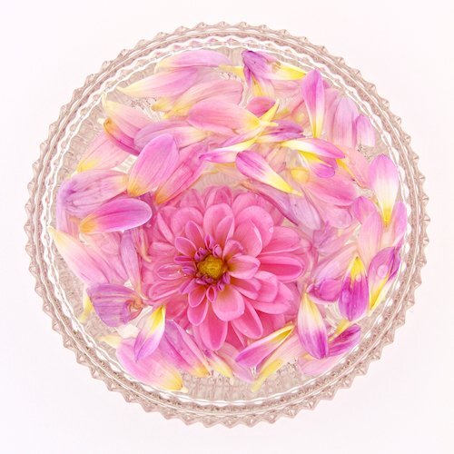
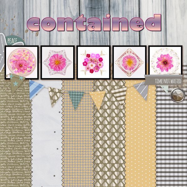
#5 You can see I didnt quite nail the backgrounds. To much light contamination and different colors in the flowers and glass reflecting. even with a custom white balance in-camera. I've just started to experiment with using Kelvin settings instead to see if that helps. (I'm using constant light so light contamination from my yellows walls and a window in the room can be an issue since I'm shooting at a slower shutter speed - one day i'll have strobes (studio flashes) and that wont be an issue as much)4 points
-
4 points
-
4 points
-
4 points
-
4 points
-
4 points
-
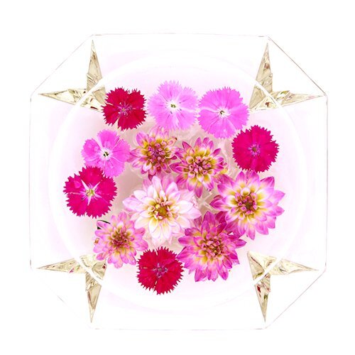
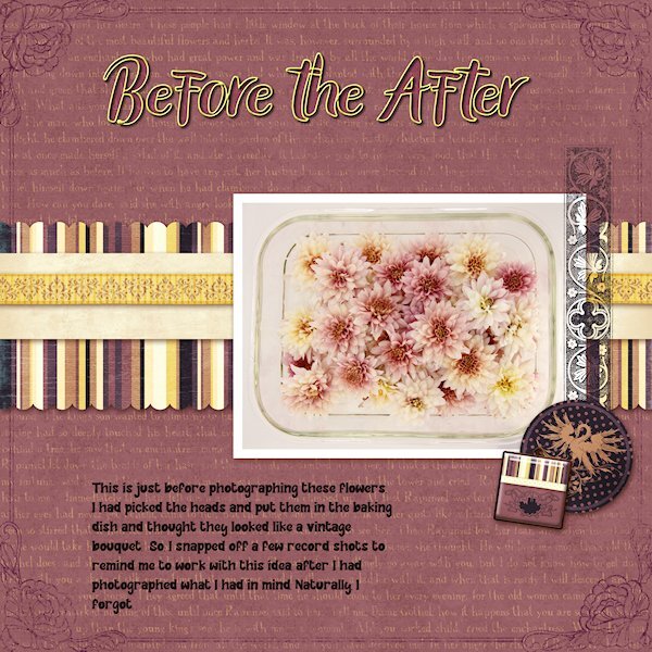
Day 8, looking for a QP at Digital Scrapbook This one is from Marisa Lerin Vietnam QP 13 I forgot to post this before the extra extra Day 8 post. that one (with the single flower) is from Marisa Lerin QP Set 014. This is me using the kitchen devices (baking dish) to carry the flowers I brought in the studio to photograph. I didnt grow these, they were from a garden centre. I had them all in a pile in the dish and thought they looked cool so took a shot of them, wish I'd taken them out of the dish as the dish part is distracting. But , I showed it here so you dont think I actually arranged them them. I could never do it that good if I meant to, I literally just plopped them in after cutting them with no thought at all. I only lightened the whites a bit, otherwise this is pretty much how it came out of the camera. Thank you for the workshop Carole and everyone who participated, I have oogled at and loved your layouts.3 points
-
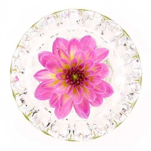
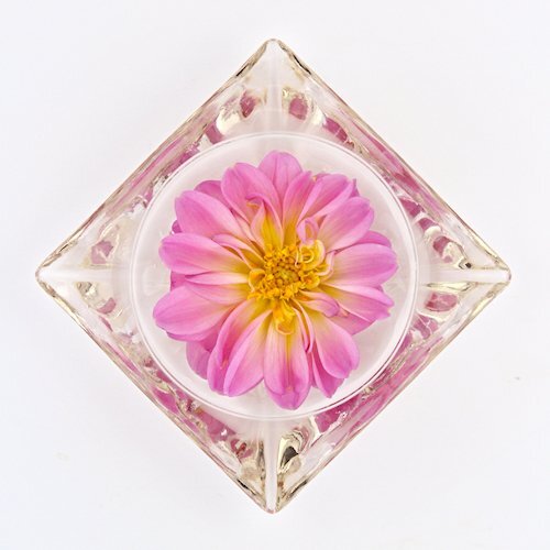
Here's a Day 8 Extra Extra for you. I did not edit this photo, just stuck it in as it was. It was a failed attempt at floating in a vessel too big for it and it would float to the edges and not stay in the middle. I photographed the vessel/flower on black so i could eventually extract it. but since the rest that I photographed I abandoned the idea of extracting. At least I got to use it here!3 points
-
3 points
-
3 points
-
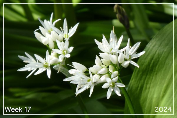
Sharla, this is a simple and lovely layout. The flowers are so delicate and beautiful. I remember the first time I saw wild garlic (Bärlauch) here. We were riding our bicycles in the forest, and after a turn, we came to huge patches of it... Back then, we had no idea what plant it was ... Over the years, it became more known, and now people make pesto, spreads, mix with butter, etc.3 points
-
Day 7 Diamond Extra Photos from 2022 when the world was being contained (or were we coming out of containment by then?) I started doing flower flat-lays and well, I contained them too. I had to buy the flowers as I have never grown them before. 2023 was my breakout year for learning to grow flowers. Font is Gill Sans Ultra bold (formerly from Microsoft) that I had to scoop off my laptop since Windows 10 didn't have it anymore. I used the technique we learned in the Text Workshop (and there is a blog post on it too) where the outline can be used separately, which I added a bevel too. Side note: I think my brain has turned to mush. My shadows, even at 80% have been looking soft and lighter and I thought, oh oh, something is wrong with my eyes. Today I just noticed the shadow color wasn't black but a dark grey. Geez, when did I change that and why?3 points
-
Ann, Christina, I love both your pages. At the moment I am still in California and I just checked in to see what the new month brings. I am pretty much occupied here with all kind of things. Made a lot of flower photos, visited interesting places, enjoyed family time and helped with book interviews in the class of my youngest granddaughter! Coming weekend we will be going to Yosemite National Park and on Tuesday I will be flying home. So end of next week after my jet lag I am back in the Campus, albeit a bit sad after saying farewell to my dearests. See you all soon!2 points
-
2 points
-
2 points
-
2 points
-
Your flower flat lays are absolutely gorgeous. I would love to see them closer up. Can you post a few of them by themselves so we can see the details?2 points
-
Those are so pretty, Suz! I wasn't a fan of this layout but you've "contained" it well! 😉2 points
-
That is interesting. The hares are so big it seems like if they could gather enough courage they could some damage with their back feet. For the first time this year me and a co-worker have found some of the discarded coats. I couldnt believe how soft it was and you are so right about the wind, just a little bit and it was off flying away from my hand.1 point
-
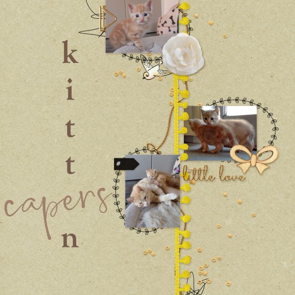
I read the blog post too and had never thought about a "table" as a starting point. Great idea and you executed it to perfection. That shadow on the folded edge of the photo is outstanding. There is a little bend(arc?) near the corner of the shadow and really "makes it" seem so real. I must admit to wanting to hug and cuddle and get my face all up in their fur. I know they'd "love it" too. hahaha. Poor guy, it would probably give it a heart attack. I saw on a wildlife rescue show that any wild rabbits, hares etc is hard to rehab because they stress easy (being a prey animal and all). BTW, love the quote.1 point
-
1 point
-
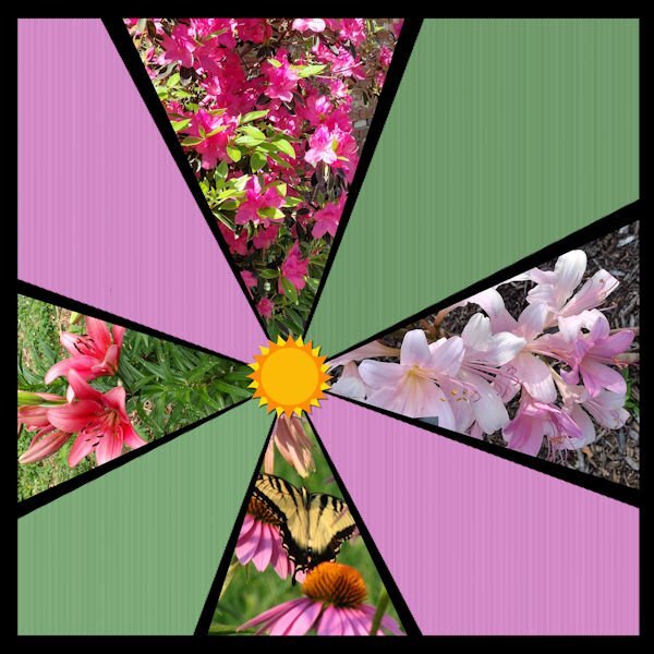
Thank you so much Ann. I initially liked it, but then realized how much the details get lost in such small boxes. Love your pun BTW. Gave me a laugh.1 point
-
1 point
-
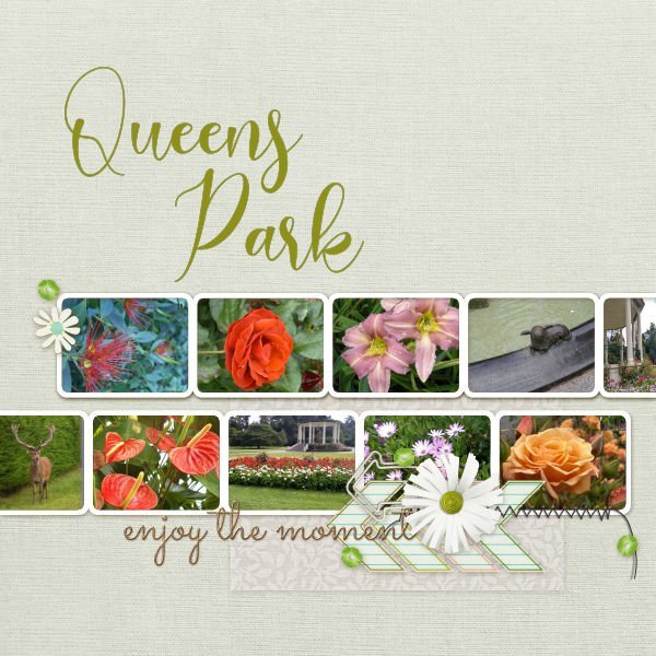
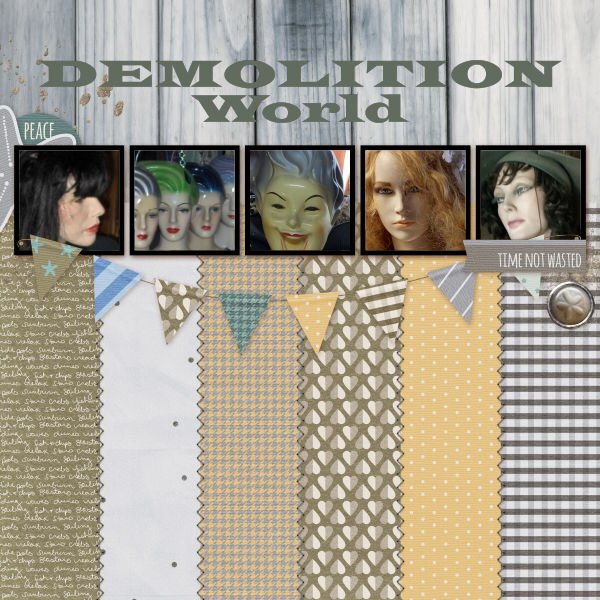
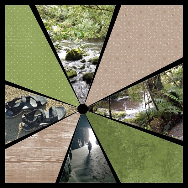
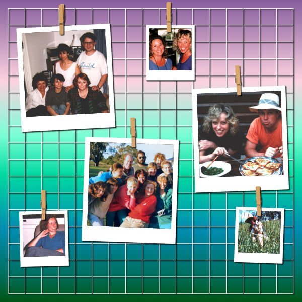
In Invercargill, Southland, New Zealand, we have a beautiful large space for all to enjoy, children, sportspeople, gardeners. The park is a mecca for those who enjoy the natural and the planned. Its numerous gardens and botanical attractions provide vibrant displays whatever the season. I love Demolition World in Invercargill. Although the business sells pieces from demolished buildings, windows, doors, lighting, corrugated iron, etc, Lee and Dave have created a wonderful retro village. For years I have used an image I grunged up as my avatar online, and the mannequins are a delight, as are the gorgeous plastic clothes hangers found in the village, 2nd and 3rd from the left in my image below. I had a few photographs that might have gone in this no-scrap image, however, I thought they would all compete against each other, so I used alternate spaces with scrap paper instead. The area is on the Southern Scenic Highway, through Tautuku [pronounced similar to toe-too-koo] and on towards Owaka and onward to Dunedin, Otago. Through the bush are some beautiful sights, the magnificent Tautuky Beach and McLeans Falls, and Cathedral Caves where there is a slim chance of wandering along the beach to walk to the caves. They are only open for a short time each day. I used hue saturation and lightness to match the colours of the photographs used. These quick pages have been fun to create. Thanks, Carole, and everyone, I've loved the creations of everyone. Jeni1 point
-
1 point
-
1 point
-
1 point
-
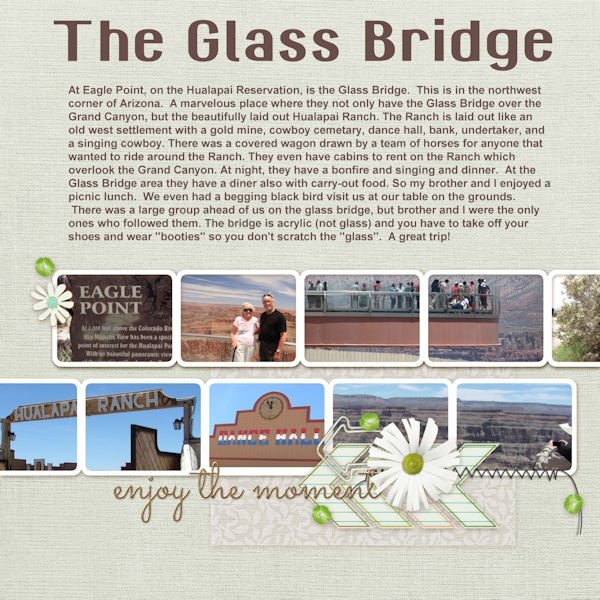
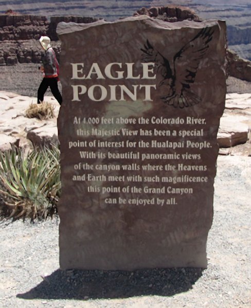
On to lesson 7. These are a few of the pictures of the trip my brother and I took to the Glass Bridge in Arizona. It was a great trip and this was the final destination of that trip. We were gone from home about 3 weeks and enjoyed many stops on the way (followed Route 66 from St. Louis, MO to Miami, Oklahoma) and left the old road and continued on I-40. I will post the picture of Eagle Point separate because you can't see what is on the sign in the QP. And, that is 4,000 feet above the Colorado River at the bottom of the Grand Canyon. The title font is GranaPadano, the journal font is Arial.1 point
-
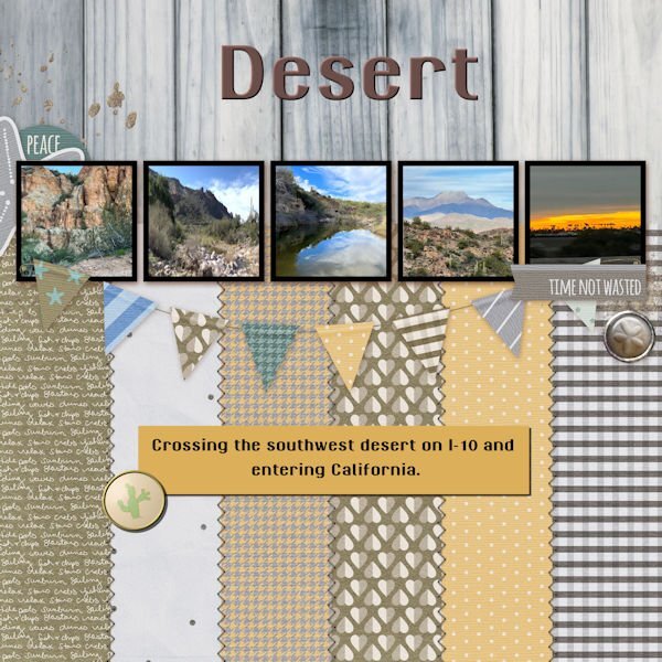
Day 7 I spent a lot of my time deciding which pictures I should use and revising the template to match my colors. I think that is why I don't like quickpages unless they are layered. The photo are my own taken while visiting Las Vegas and the Valley of Fire. Las Vegas has the Ethel M candy factory which has a beautiful cactus garden, not to mentions the best chocolates. Ethel M is the upscale brand of chocolates from the Mars family, Ethel being the mother. The font is a colored font from Creative Fabrica and does not work in Paintshop. They had a bonus file of pngs which I used for the title. The font does work in Photoshop, even my old one.1 point
-
1 point
-
1 point
-
1 point
-
1 point
-
1 point
-
1 point
-
1 point
-
Happy Birthday dear Carole and thank you for the beautiful work and the beautiful creations you offer us so kindly.💖❤️❤️❤️1 point



.jpg.f09f49a6e8cea282ca457b3474ec5f79.jpg)













.jpg.dd085516c77d877e2bb4b6192fbfe99c.jpg)
