Leaderboard


Popular Content
Showing content with the highest reputation on 04/09/2024 in all areas
-
I was fairly "scrapbooky" on this one, yay! I thought a collage of spring scenes would qualify for the theme. I used paper and elements from Marisa Leren's Hello Spring kit in PS/DS. A label instead of another pic gave me a good place to put my text. The fonts are Spring and Sprightly Two.7 points
-
To quote Carole " a great starting point to display photos............," Once again she is right! I edited the one template and created what Carole demonstrated in, I think was the 4th project in the masterclass using grids. The paper with Carole's corner punch is a paper template. The others are my own. I did rotate the stipes, but it didn't look right to me, so rotated back to how I created it. The tag is one I made a while back. Wood tokens, and a wood burning tag. The heart paperclip is my own, which I colourized, using the sculpture tool. (silver) It doesn't really look like it, but the wood burning tag is actually not only under the folded paper, but also it's shadow.
 7 points
 -
Ann this shows that plain can be lovely in its own right!4 points
-
The 1st story page; the preceding ones are just more title pages. I'm by now wondering if I should draw this out to more pages. It is one rather short story. As a kid I always thought there wasn't enough text on these pages in story books. Then again how attractive exactly is a visual of lambs being breakfasted by the wolf? I might change the body font which is France and giving me a bit of a headache. I love its looks tho. The title font is Calysa.4 points
-
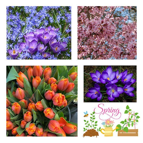
Though I posted this in the Flowers Challenge I'd like to show it here as it's inspired by the webinar and Sue Thomas' layouts. I also made templates. Here are Spring flowers in Warwick. The clipart lower right is from Jessica Dunn.
4 points
-
He's calling for Allan! Allan! Allan! hahahahaha google this: Funny talking animals: Alan!.. Alan!.. Steve! | Walk on the Wild Side - BBC and you'll get it.https://www.youtube.com/watch?v=xaPepCVepCg Hopefully this link works. You can also google Allan Allan Allan and you'll get just the Allan part.3 points
-
The shadowing on those folds is outstanding! I like that they are folded to different thickness and the shadow reflects that. I love the photos, they are such a joy to watch arent they.3 points
-
There will be a sale on Carole's birthday coming around the 22nd of April. You'll be able to get the script...and many more....on sale.3 points
-
I have those corner punches too and I love them, they are so versatile and you used them well. I like the idea to use the same punches on the 2 papers!3 points
-
Following Sue Thomas' lead, I did the grid challenge from the webinar and created two templates. This is the first, showcasing some spring flowers from Warwick. The lower right is just clipart from Jessica Dunn. Very plain, no shadows or overlapping embellishments.
3 points
-
Another excellent masterclass today. When I read what it was going to be about, I knew what I was going to showcase. I used the first layout which Carole demonstrated.
3 points
-
I have a book going for a young family member. Here is my cover. Graphics Marisa Lerin. Font Qiara.3 points
-
Revisited and revised an old one. I have no idea where I got the cherry blossom clip art or the lovely pic I used for the slats, but the font is Asia Pacific, free from DaFont.3 points
-
How about the chicken screaming for Maria?2 points
-
Thank you Julie, no, it's not ticked off. This one was calling to others, as it's the breeding season. Males can be ferocious towards each other over territory and females. I have shots of them fighting, and of them licking their bloody wounds. They have the teeth and claws to cause harm. They will also make warning calls, of potential predators.2 points
-
Can't tell....is the one at the bottom right happy or ticked off? Love these pix.2 points
-
I'm hoping to find time to create something new, but here's something I created several years ago. See how Cass's corner punches can make plain paper look so pretty? The font is Ernesthuge from CF. The centerpiece took many steps, but if you want them, just ask.2 points
-
I couldn't agree more. I saved the templates after converting the photo slots to masks.2 points
-
kit ciel bleu by Regina Falango2 points
-
Edited. folded corner on the photo.
2 points
-
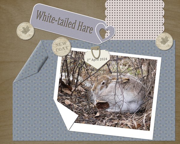
I used paper templates. The heart tag I saw on the telly, which caught my eye, so I created my own. Paper clip, ( I had previously made, all I had to do was colourize it.) Wood tokens and folded corners. I used one of Carole's punches on the arrow note. Every day, the hares are getting darker, casting their white winter coats for summer ones.
2 points
-
That was a very interesting read. It must have been quite a bit of work to make these layouts, but they are effective.2 points
-
April Showers Papers and puddles from Jessica Dunn on PS/DS. The people are characters from the game. The font is AlphaShapes raindrops, free from DaFont. The creator is Fonts & Things and they have some very interesting fonts https://www.dafont.com/fonts-n-things.d1209.2 points
-
And here is a second project, about a place in Germany (say shtorkoh, meaning storks in English) Storkow about a 40 minutes drive east of Berlin and 20 minutes west from the Polish border. It is part of the outer, historic military ring around Berlin. Interesting place. Graphics JBS and Marisa Lerin, fonts are Qiara on title and Poppins on body.2 points
-
Another one from the 1960. Some graphics JBS Designs, rest myself. Again 10x8 inches, fonts are Lato on body, Pacifico on title Rock Beach on location and Georgia on date.2 points
-
Great calendar page @Ann Seeber, love the open book look. Is that a script as well? I was hoping to get into scripts on Easter Monday but life had different plans... It sure is on my list. Thank you for the lovely kit @Louyse Toupin!!! I have a little project going with photos from the sixties and seventies. Some are slides, all are scanned, except the one on this page 😉 Graphics JBD Design discontinued. 10x8 inches. Font is Lato on body and Nickson Four on title.2 points
-
That was a good one! I loved the otter singing Copa Cabana.1 point
-
Doro 💗, how sweet of you to say. Thank you! I had to translate this 'lost journo' part back and forth literally to get that it is a compliment. LOL These phrases and sayings don't really translate literally with the same meaning they might have in German. ....😄 I'm in a bit of esteemed company tho, writing about Storkow, did you know?1 point
-
They provide endless entertainment. I appreciate the compliment. The one fold had to have more lift, to take into account the tag being under it.1 point
-
Hi Bina, A journalist was lost because of you. Or do you work for a magazine? In any case, I'm pleased that you've invested such a long text in the German language and especially the dialect around Berlin😘. But what do you like about the boring houses and the prefabricated buildings for a private album? But everything is the typical Bina journal style 😁. But I like that you decorate sparingly and the photos get the main attention.👍1 point
-
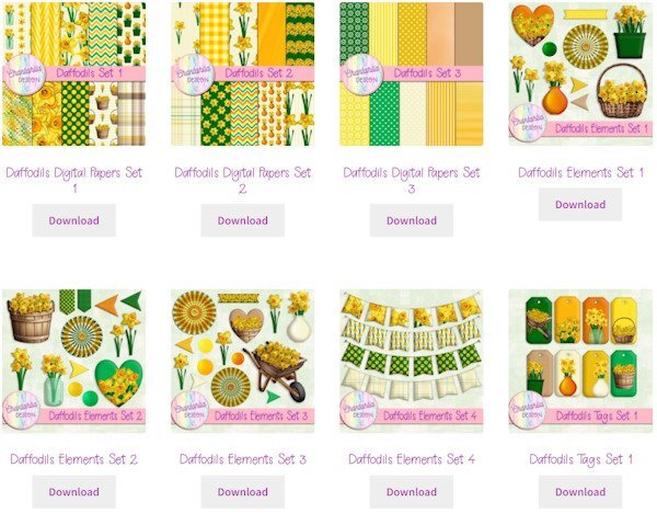
Speaking of Daffodils (as Carole did in her intro), Chantahlia Designs has a beautiful set of daffodil papers and elements this week. CD products are always free. Sometimes when I click on the Download button, I get an error that the download key has expired, but I just have to click on it again. https://chantahliadesign.com/?s=daffodils&post_type=product Here's a sample of what's included.
1 point
-
A perfect starting point to display photos. And then, the sky is the limit if someone wants to add details, embellishments, etc.1 point
-
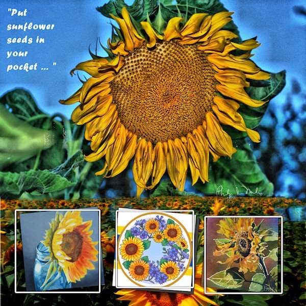
From February 2022 Masks Workshop - Ukranian Sunflowers
1 point
-
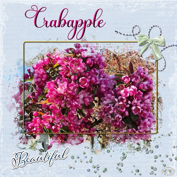
Because I like this theme challenge and I like this mask I made another layout using a photo from a crabapple (Malus) tree in my neighborhood. With a more colorful photo and another background it looks completely different. The background is made with 2 papers and a blendmode; all the elements are by Jessica Dunn and I made a very thin frame and the font is Beladine Gadelia.
1 point
-
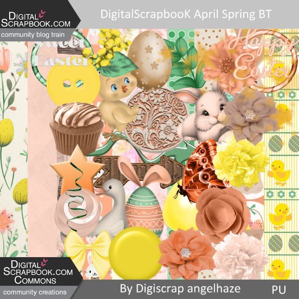
Hello, I have built a mini kit for : https://www.digitalscrapbook.com/forums/digital-scrapbooking/digitalscrapbookcom-blog-trains/apr-2024-blog-train-final-list here is my part, to download it just go on my blog: Digiscrap Angelhaze
1 point
-
Happy April. Here is my monthly Wild Cat Calendar for April 2024. I used the cass-open-book script for the top and a calendar from Gina Jones. The Snow Leopard photo was taken by my granddaughter, Jackie Thorpe, at her Claws 'N' Paws Wild Animal Park in Mt. Ariel, PA. The title font is Fredericka the Great, and the text font is Agency. The background gradient is labeled "Bondi." The "Say No" brad is mine. I will also post this on our Facebook page full size for anyone who would like to print it out at 8.5" x 11" which is what I do.
1 point
.jpg.5e00fa1ef3e89be94a195fd748295ca7.jpg)