Leaderboard
Popular Content
Showing content with the highest reputation on 04/08/2024 in all areas
-
7 points
-
6 points
-
5 points
-
I'm hoping to find time to create something new, but here's something I created several years ago. See how Cass's corner punches can make plain paper look so pretty? The font is Ernesthuge from CF. The centerpiece took many steps, but if you want them, just ask.5 points
-
I have a book going for a young family member. Here is my cover. Graphics Marisa Lerin. Font Qiara.5 points
-
4 points
-
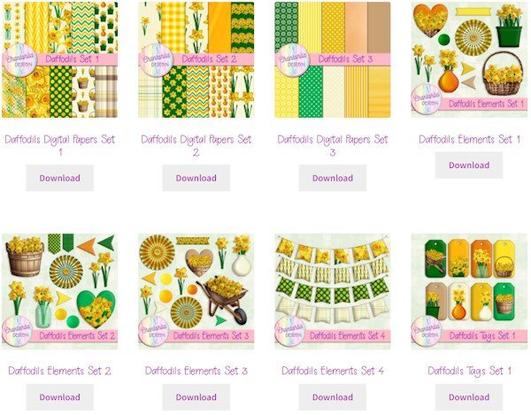
Speaking of Daffodils (as Carole did in her intro), Chantahlia Designs has a beautiful set of daffodil papers and elements this week. CD products are always free. Sometimes when I click on the Download button, I get an error that the download key has expired, but I just have to click on it again. https://chantahliadesign.com/?s=daffodils&post_type=product Here's a sample of what's included.4 points
-
A perfect starting point to display photos. And then, the sky is the limit if someone wants to add details, embellishments, etc.4 points
-
4 points
-
The 1st story page; the preceding ones are just more title pages. I'm by now wondering if I should draw this out to more pages. It is one rather short story. As a kid I always thought there wasn't enough text on these pages in story books. Then again how attractive exactly is a visual of lambs being breakfasted by the wolf? I might change the body font which is France and giving me a bit of a headache. I love its looks tho. The title font is Calysa.3 points
-
The last UK Solar Eclipse on 11th August 1999 occured whilst I was a Cub Scout Leader. I had set the Cub Scouts a challenge to write a " newspaper report" of the Eclipse and their experience of it. The main memory they had of it was of the sudden drop in temperature ( 8 - 10 degrees if I remember correctly) , and we where located over 200 miles away from the totality zone and only saw a partial eclipse. I remember the changes of the wind as it went darker and then lightened up again. I also wrote a report but cannot find it or the pictures from a weather satalite showing the shadow on the earth.3 points
-
Thank you Julie, no, it's not ticked off. This one was calling to others, as it's the breeding season. Males can be ferocious towards each other over territory and females. I have shots of them fighting, and of them licking their bloody wounds. They have the teeth and claws to cause harm. They will also make warning calls, of potential predators.2 points
-
2 points
-
So few true blue flowers. This is one of my favourites. Lovely layout.2 points
-
2 points
-
I couldn't agree more. I saved the templates after converting the photo slots to masks.2 points
-
2 points
-
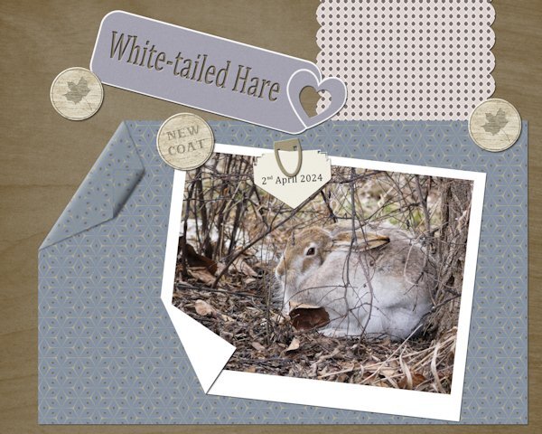
To quote Carole " a great starting point to display photos............," Once again she is right! I edited the one template and created what Carole demonstrated in, I think was the 4th project in the masterclass using grids. The paper with Carole's corner punch is a paper template. The others are my own. I did rotate the stipes, but it didn't look right to me, so rotated back to how I created it. The tag is one I made a while back. Wood tokens, and a wood burning tag. The heart paperclip is my own, which I colourized, using the sculpture tool. (silver) It doesn't really look like it, but the wood burning tag is actually not only under the folded paper, but also it's shadow.1 point
-
1 point
-
Can't tell....is the one at the bottom right happy or ticked off? Love these pix.1 point
-
@Julie Magerka Thank you! I usually make the collages with a collage app and save as png to put on the layout. It is a pretty fast process altogether. The text is also mostly ready to copy/paste before I start the layout. I would spend hours looking at fonts if I did not decide beforehand which ones to take. Seriously, that is what I can spend the most time on, lol.... gazing at fonts and the spaces they leave on the page ;91 point
-
1 point
-
1 point
-
I used paper templates. The heart tag I saw on the telly, which caught my eye, so I created my own. Paper clip, ( I had previously made, all I had to do was colourize it.) Wood tokens and folded corners. I used one of Carole's punches on the arrow note. Every day, the hares are getting darker, casting their white winter coats for summer ones.1 point
-
1 point
-
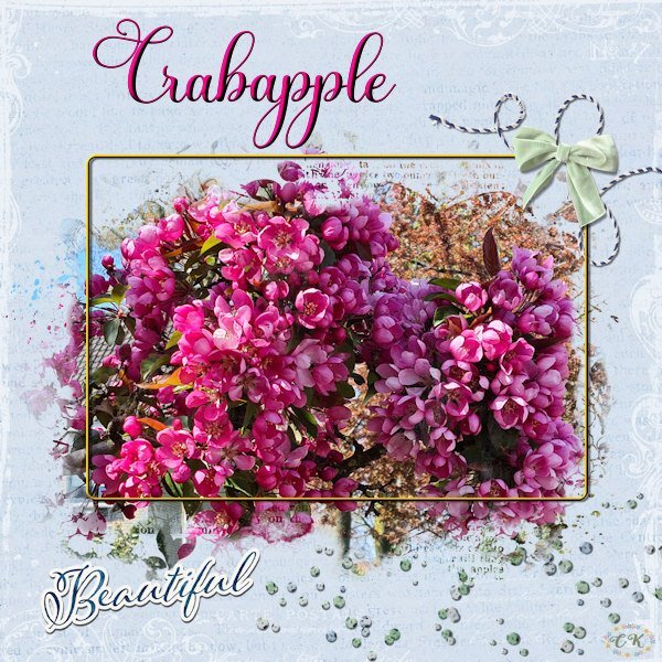
Because I like this theme challenge and I like this mask I made another layout using a photo from a crabapple (Malus) tree in my neighborhood. With a more colorful photo and another background it looks completely different. The background is made with 2 papers and a blendmode; all the elements are by Jessica Dunn and I made a very thin frame and the font is Beladine Gadelia.1 point
-
My total solar eclipse experience in 1999☀️😎 SOFI= Sonnenfinsternis = solar eclipse1 point
-
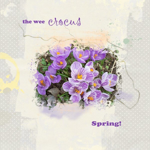
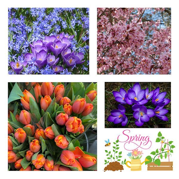
After a mild and warm March, we are having a much wetter and colder April so far. There are a few early bulbs out here but they're biding their time. I had to dig into old pix to find one from my own garden a number of years ago. The mask I used is the free one from Jessica at Curio Pantry. I blended a couple of background papers, used some splashes and splatters and some squiggles.1 point






.jpg.5e00fa1ef3e89be94a195fd748295ca7.jpg)

Resized.thumb.jpg.d25811db03a63358cedab1e79f527635.jpg)
