Leaderboard


Popular Content
Showing content with the highest reputation on 03/22/2024 in all areas
-
Day 11 Project 5 Travelling along the lakeside highway from Queenstown, we chanced upon this scene. Sheep were being moved from one area of the farm to another. This happens often in country areas. Jeni
 9 points
 -
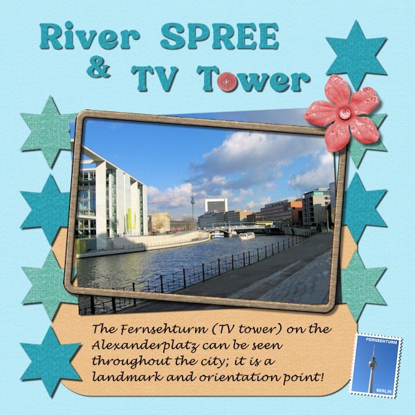
Project #5 The end of this Bootcamp and the end of the trip to Berlin. I used the minikit crafty-eve-cpjess from the 2022 blogtrain and a frame from Sharon Dewi Stolp that I have in my stash because this kit had no frame. The font is Bremlin, the font Berlin that I used for the other layouts was to thin for this one and Lucinda calligraphy. And of course again a postage stamp with my own script. Instead of the little rectangles I used stars, like a rating for the trip to Berlin, just for the fun of it. It was good to have a little refresher of the basics after having learned more over the last 4 years. I completely forgot that you can use a paper as a pattern for text, so it will match perfectly with the rest of the papers. Carole thank you for offering the Bootcamp again, I have enjoyed it as well as seeing all the projects from the others, that is always inspiring.
9 points
-
Picked a random picture of my Aunt and went from there. Pretty much just followed the tutorial.7 points
-
Project 4...more daffs...the top one volunteered in my yard; the other 2 volunteered in the woods. I hope to dig them and transplant them.7 points
-
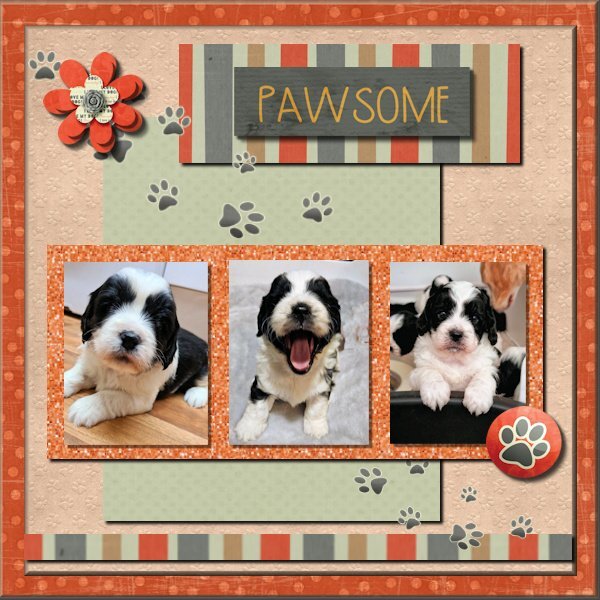
DAY 7 PROJECT 3 I could not stand the fuzzy edges and the mistakes on the shadowing so I have redone it! Thank you Carole, my opacity was like you suggested way to low and the fuzzy edges were due to the feathering being on ! As I had called it Pawsome I thought I should have some pawprints !
6 points
-
I didn't have anything specific in mind this evening to create. I randomly chose a photo from my trip home, created a layout/template, wordart, background paper, and used one of Carole's punches. Using vector shapes particularly for the circles not only gives nice clean lines, I'm able to do text on a path. Retaining the vectors, once I have duplicated and converted to rasters to colourize, texture etc.
6 points
-
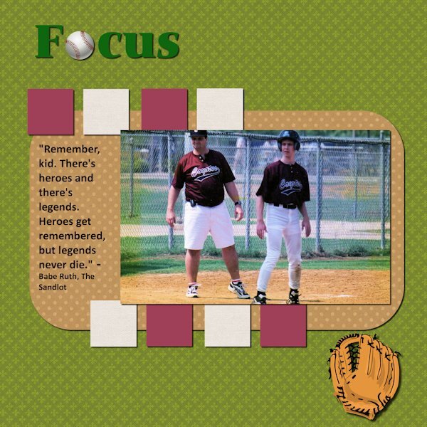
From the days long ago (note the pager on my belt,) when I helped coach my son's baseball team. Not a particularly original layout as I simply followed Cassel's instructions step-by-step with the exception of a picture frame. If I used one and tried to put it inside the photo, I cut off my head. Used a quote from one of the great baseball flicks of all time.
6 points
-
Papers are all from Marisa Lerin. The steering wheel is from Canva, and the paperclip is from my kit and recolored. I pretty much followed the tutorial using the same fonts and overcame my addiction to layered fonts. This project was a good refresher for placing shadows, something with which I often struggle.
6 points
-
Here is my last project, no 5. graphics from my Vinted kit, font is Selectric Advocate, WA brushes by Katie Pertiet. Many thanks for everything , @Cassel. Such a great workshop!5 points
-
I honestly do appreciate your words. This community oozes encouragement, help, support and inspiration. Not forgetting constructive criticism, which I find is important, when received in the manner in which it is given.4 points
-
Project 4 - used the Spring Skies kit and used photos from work trips down time from a few years ago.4 points
-
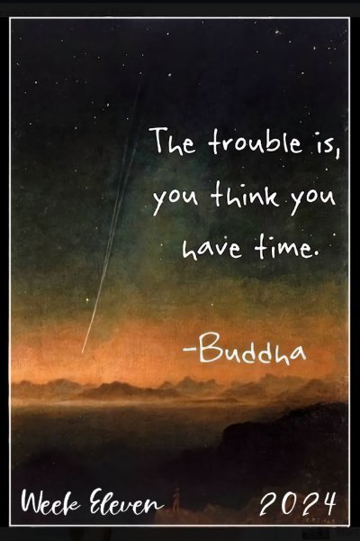
Here is my Week Eleven - I count Sundays so I'm a little behind here. The font is Cardigan Script. This is just a quote about Time. Sue Ewart is the expert on that topic; she will have a Mega Kit for it by the end! 😁
4 points
-
Scrap Bootcamp Day 9 - Project #4
3 points
-
Catching up, Project 3 used photos from a Halloween parties I knew would have several friends in roughly the same size photos. The theme was drinks / cocktails.3 points
-
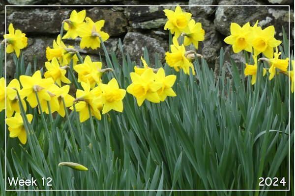
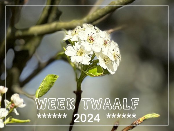
Week 12 At last, the taller daffodils are opening. These are in our local churchyard – I just loved how vibrant they looked.
2 points
-
Concentration made me think of terrible things from years gone. Today's world conflicts do not help. Items are from Bing except paper from jessica-dunn. Font is Arial Narrow.2 points
-
This is so nice. I love the "O" sheep and leaving the windshield wipers in the photo is a great touch!2 points
-
hahaha...the "MEGA" - mini kit. A mini kit with about 40 add-ons. This is so pretty Ann, you have the nicest background for this. I think I might be so behind (in P52 and Build A Kit) that I've caught up to myself. This would have been the perfect journal card for my kit wouldn't it?2 points
-
Corrie, the woods are mine...on my property.2 points
-
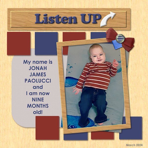
Final Bootcamp project - featuring one of my new great-grandsons. He'll explain... Fonts used are Cooper Black and Century Gothic - old standbys... All elements are mine from my own kit...
2 points
-
Sue thank you, your words mean a lot to me! Your encouragement and critics have helped me to get further in developing my skills. Your layouts are always an inspiration!2 points
-
Hi, I'm currently working privately on a lot of digital birthday cards and congratulations on the birth in mobile phone format. Many family members and friends have birthdays in the first half of the year😄🌷2 points
-
Never forget!1 point
-
I started while on was on leave and found my photos were the wrong size, and then I had to go back to work. So I have not actually started as yet, I will try and find some time over the weekend, So much to do, so little time.1 point
-
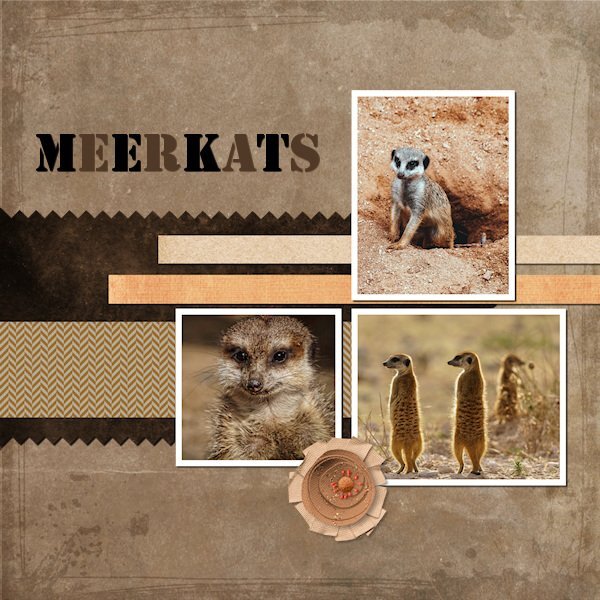
@James Thomas Keep it up! The gold glitters work very well with the theme and it gives a great texture. Your pinked edge seems a little odd. It almost looks like the Opacity was less than 100%. Is that possible? Also, the polkadots seem to be on a separate layer from the green strip. Do you see the same thing or is it only in the resized version? @Jen Brown Great choice of colors to go with those photos. Meerkats always remind me of Lion King and make me smile. @Ann Seeber Your use of inner bevel gives a lot of dimensions to your page! @Donna Sillia For your title, make sure you increase the kerning more when you want to replace one letter with something else. In some fonts, a simple space is not the same width as a regular character. @Bonnie Ballentine It is interesting that, instead of alternating the colors by letter, you alternated with phrase segments! That is a great way to highlight words. @Corrie Kinkel It is also great to have you as a student! You make me look good! I smiled when I saw another stamp on your layout 🙂 Keep it up. If you post 4 out of 5 projects by Monday night, your name will be in the random draw for great prizes!1 point
-
I like this very much, so colorful and at the same time not too much!1 point
-
@Cassel Thank you for the observation re the shadows, I could have both problems ! I will check. Re the fuzzy edges. I couldn't understand why then suddenly I realized it was the feathered edge that was on but it was too late as I had all ready posted it ! But again thank you for the observation I really appreciate all the help.1 point
-
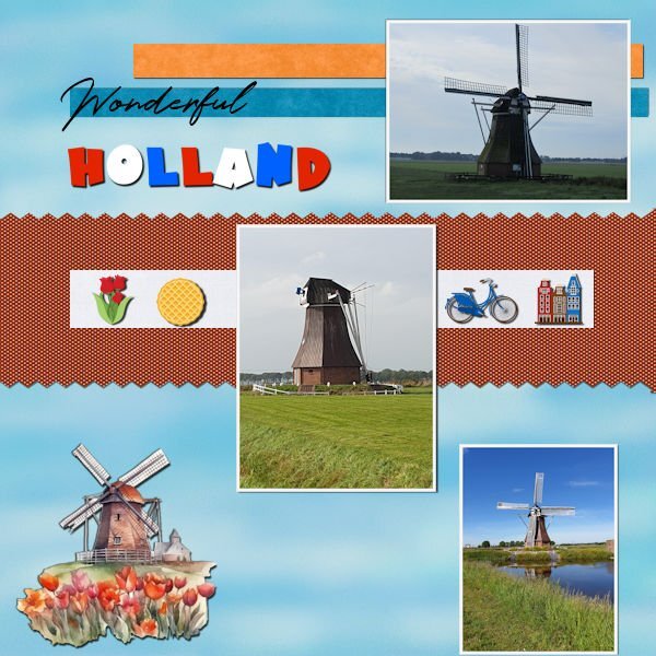
Day 9 This was fun again 🙂 One day we came across the same mill and the "wings" were gone. It took some while to repair (high costs) but now it is again in it's full glory 🙂 I used some elements found on Creative Fabrica, all Dutch things this country is famous for. The waffle is a "stroopwafel" as we call it. Papers where all in my stash. Font is Holland 😉 and Hot mustard (The thick one) I totally forgot how we learned in previous bootcamps to add an edge around a photo with the magic wand, I tend to use mats 🙂 Was a good reminder 🙂 🙂
1 point
-
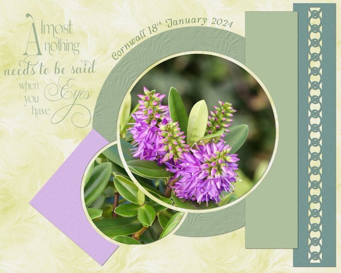
I'm a bit early with my week12 but I don't think it will be getting much better then this. We have lovely Spring days at the moment and there is so much coming into flower. Yesterday we went to the "Heemtuin" in a nearby village where a large natural garden is created which only has wild flowers, trees and shrubs that are native for this area. I was able to take a lot of photos, so in other projects I will use many more. This photo is of a Prunus variety.
1 point
-
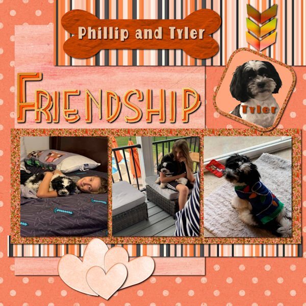
A day late, but yesterday I was feeding my addiction for layered fonts. For the bottom papers, I used a cpjess kit call cherish mini, and the hearts from cpjess cranberry mini. I couldn't find stripes to match so I created some using the cass stripes2 script. The bone is from Creative Fabrica with an added texture that I created on AI and recolored. The photos are my own. The glitter was created using cass glitters B script to match my colors. The font from Creative Fabrica is Rainbow which I used in my Kit and recolored to match. The arrows are my own.
1 point
-
@Cassel: Just to make sure, here is a second Project 0ne. Would not want to miss the entry... 💕Supplies myself and Jen Maddock, fonts are Qiara on title and Myriad Pro on my NEW haiku.1 point
-
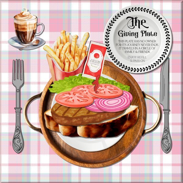
I have had such fun doing this for the second time. It is the sandwich that saved me from giving up on PSP last year . I just could not get the grasp of layers until I found Carole and all the wonderful members on here. The site has so much to offer and I often found I had no idea where to go but a quick "HELP" soon had someone directing me! I was forever loosing the forum I needed to post on ! Thank you all for your help .To anyone new on here and who feels like giving up.. DO NOT ..I am getting there and I am sure you will ! Being able to download the PDF files to refer back to is also a great bonus I think as my memory is becoming a little less reliable! I am lucky enough to have a printer but I now need a filing system! The graphics were mostly from Creative Fabrica The cutlery was re coloured, drop shadows were applied as needed. I put a bevel I think it was on the tablecloth. I lost count of all the layers I used !
1 point

Resized.thumb.jpg.d25811db03a63358cedab1e79f527635.jpg)