Leaderboard


Popular Content
Showing content with the highest reputation on 02/01/2024 in all areas
-
I have had a go with this one and although I have the script which would make it a piece of cake to do, I love to be able to make things as well so was up for the challenge. I was quite surprised and pleased with my result but found it a bit fiddly in places.
 4 points
 -
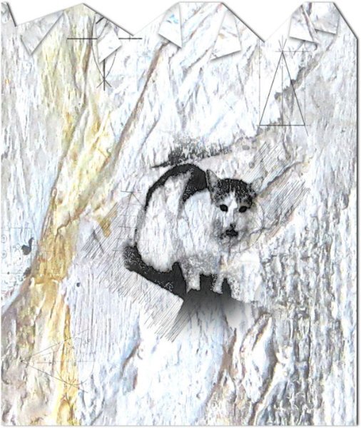
I guess I should post the one I made which is part of a larger layout. This used the Pencil Sketch 2 script to start...
3 points
-
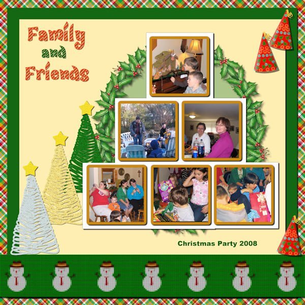
Last module for Lab 11. Lab 11 Mod 12. Requirements: Knit pattern and strip (the snowman knit strip at the bottom); glitter tree (I made a silver one, a gold one and a green one – also made a glitter star which I put on the top of each tree but they are separate); party hat – I put a gold tassel on the hat also. The plaid paper background I had made probably 2 years ago and the holly wreath on the light green circle paper I had made probably 1 year ago. I always have fun! The font for the title is CandyLandSwirls 1 from CF. I think it is fussier than I usually do, but it is what it is.
3 points
-
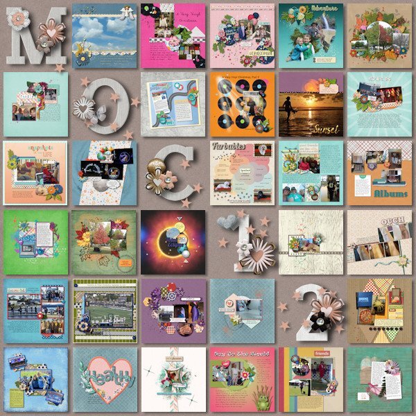
I spent the month of January participating in the Month of Challenges at The Lily Pad. 31 challenges in 31 days. Even with 4 days away from the computer I was able to get them all done. One of the designers graciously provides a free template to showcase all of the layouts. I finished that today using a kit by Bella Gypsy. Also, all layouts must have only product currently on sale at the store or retired products by the current designers. Some challenges were a real challenge! Some challenges were easy because of things I've learned here at Scrapbook Campus (hello Mask Workshop). And some were full of ideas to use in future layouts.
2 points
-
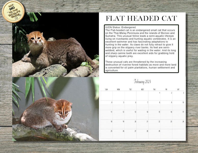
Here's my Wild Cat Calendar for February, 2024, featuring the Flat-Headed Cat. Similar to the Fisher Cat in habits as he swims and eats fish and other aquatic animals. I will post this full size on Facebook so you can print it out @ 11" x 8.5" if you wish.
2 points
-
I looked up Gill Sans and it's creator has a questionable past and that's why Microsoft dropped it from it's line up. It's is horrendous what the creator did (and he even documented in his diary). Having said that....we can't change the past but we can use the good they did cant we? Can you imagine if we find out the inventor of electricity did something heinous in the past would we all be required to give up electricity. What about the inventor of the phone? Are we going to give up any form of phone we have? that is moving backwards and not forwards with trying to wipe out these heinous acts. Sorry, no more politics or soap box rants from me.2 points
-
On the last day of January 24: I recently found this behind the curtain in my dentist's waiting room. I was frightened and thought to myself, is this supposed to allay children's fear of treatment when adults are already frightened by it? Credits: Most from Creative Fabrica Photo by me.
2 points
-
Mary if there is a time when you can go a little bit more "fussier" , it is Christmas! This is very nice.1 point
-
I have a book somewhere Just My Type described as "not just a font book, but a book of stories. About how Helvetica and Comic Sans took over the world" It's surprisingly interesting. I must find it to see about Gill Sans. When I left work I bought each of the designers in the studio the book and selected a typeface that matched their character.1 point
-
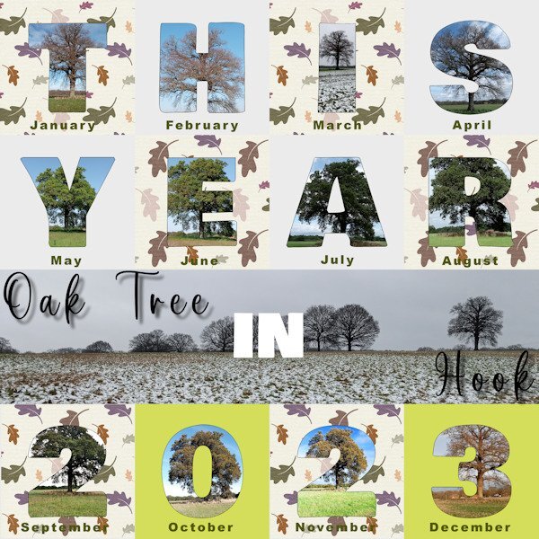
I am just getting done in time for the end of January for my first attempt at my Hook trees project. I saw people using the 2023 review template so thought I would give it a go for the trees although I will still work on some other designs in due course. This one shows my photos with their respective dates and the central photo shows the tree in situ in the field. Adjustments to the template included: - resetting the dates as the white text on the raster text layer supplied did not show up on my chosen background. - changing the grey squares to an oak leaf design paper from Digital Scrapbook.com. In order to select a different part of the pattern for each mat for the sake of interest, my process was to save the oak leaf paper as a layer. Then for each grey Mat in turn made a selection and then on the oak leaf paper layer promoted the selection to a layer and positioned it above the Mat layer. - adding a fine outline to the main letter characters as some of the photos did not contrast well with the background. As each character was a raster layer my process was to duplicate the character layer and move it above its group. Then use the Magic Wand on the new outline layer. Selection/Modify/Contract by 3 pixels and then delete and de-select.
1 point
-
Quite a funky idea Susan and I like the way the font changes to suit the china design1 point
-
I like your minimal vintage scrap, Julie. I think it's good that you didn't change anything in the photo. Can I “save” it and publish it in my Vintage Scrap folder on Pinterest?1 point
-
I would now also like to take part in the Campus challenges. My dentist appointment was canceled this morning due to... Illness of the dentist. Now I can try it. So I take knit. My next word is dance (whether ice dance, ballet or pair dance on the parquet) Credits: on Scrap, Font: Pasile Scraplift from AMarie Charp ( Digitalscrapbook.com)
1 point
-
We have a Canon printer and we have it about 7 years now. We have always used the Canon inks, but not the paper. We live in a village and couldn't get that paper, only on-line and then you have to pay for the delivery as well unless you buy things over a certain amount of money. But I find other papers satisfactory as well.1 point
-
Unlike the previous forum platform, this one does not have a "spam" folder. The only thing I get, sometimes, is a notification that some posts need to be approved (usually when they have links). Strangely, it lets in some real spam, but flags the legit posters!1 point
-
I agree about ink as well. My last few printers have been Canon printers so I always buy their ink. The off brand alternatives always come up when I go on Amazon to order and are much cheaper but I stick with the Canon ink. Even going back to the laser printer I had in the late1990's (an HP LaserJet 6P), I only ever bought the HP laser cartridges. I saw so many problems with the HP laser printers at work when off brand cartridges were used that I never ever thought about going off brand.1 point
-
It just happened to me right now. I quoted Mary's comment, commented on how I liked the layout and pressed ENTER, and it disappeared. 😞1 point
-
Congrats on the new printer! I have an Epson WorkForce Pro and use it a lot. I agree about using materials from the printer manufacturer, especially ink. Cheap ink products will probably damage your printer as they don't have the special ingredients included to keep it from jamming. I know it is more expensive but I only buy ink directly from Epson and never have jam-ups.1 point
-
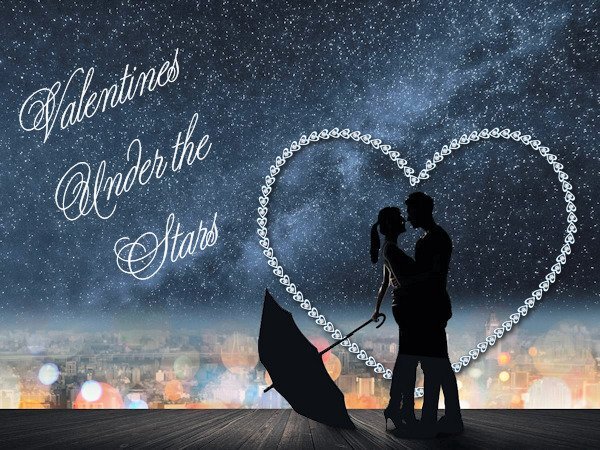
I take it Valentine. I used Cassel's HeartChainB picture tube to make the heart behind the lovers. The font is Young Love ES from AZ Fonts. The new word is KNIT.
1 point
-
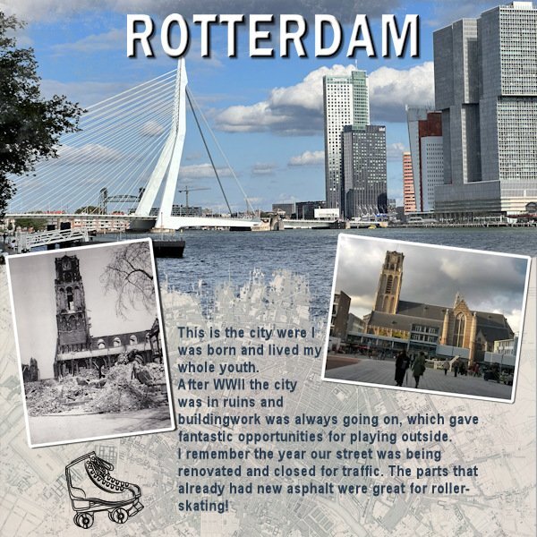
As this challenge will generate a new prompt every month or so and we had the Template Workshop to do, I only now had the time to make something for this new challenge. I liked what Bonnie did and made a page for the city where I was born and lived my whole youth. A little detail that is not mentioned in the layout is the black and white photo which is taken by my dad some time after the bombing of the city center of Rotterdam in WWII. The photo to the right is of the same church and I took that one on more or less the same spot a couple of year ago. My dad passed the love for photography on to me!
1 point
-
I created this layout for the template workshop...but it works here also. I was born and raised in Columbia, South Carolina, USA. Columbia is the state capitol.1 point
-SGH-31-01-2024.jpg.02dcbd67007640252c2283d26e915e91.jpg)


Resized.thumb.jpg.d25811db03a63358cedab1e79f527635.jpg)