Leaderboard
Popular Content
Showing content with the highest reputation on 12/28/2023 in all areas
-
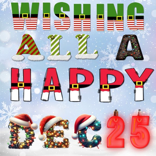
I had a heck of a time putting their little Christmas hats on (except for the one in the Santa dress). Lots of different pick modes. 🙃4 points
-
You can never have too much of the two things: GLITTER and SEQUINS! Love the characters you chose.2 points
-
2 points
-
2 points
-
2 points
-
I think this is the last Christmas theme of the year! Template is from CD, font is Nomah, presents from a Corel picture tube, and my sequin picture tube. Do you think the sequins were too much? I was going to delete them, but I ran out of time and had to post it to my group with only seconds to spare.1 point
-
Our pickleball Christmas luncheon. Double page layout. Templates by Chantahlia Designs.1 point
-
1 point
-
1 point
-
1 point
-
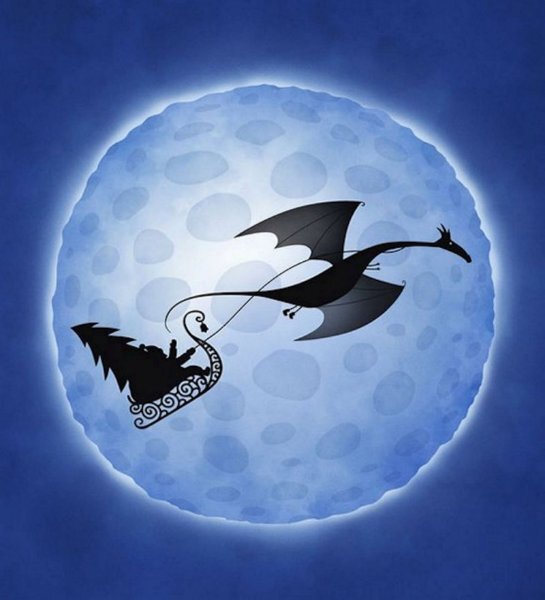
Merry Christmas All! This is my husbands company's version of Christmas. We went out in the evening to photograph the tire tree and snowman. They had lights but the battery was dead. I had wanted to try some light painting but the ambient lights from the parking lot was very bright, but I did use my flashlights to fill in the shadows a bit. Then I darkened it a bit again because I liked it a bit darker instead and lighter. It's nice to see even a big tire company has the Christmas Spirit. The font is Klasted from Creative Fabrica. The moon is from the parking lot that night as well. I got the light flare from CF as well. I wonder if there is a way to make the Santa/Dinosaur arched without distorting it. Like we do with vectors on a path. I would have liked a little bit of an arch on them. I used a Layer Style, outer glow...which I've never used before but I've seen other do it and liked it. I had to use the lowest setting and a lowered opacity too otherwise it's crazy big.1 point
-
1 point
-
Beautiful, Monique! I was wondering where your Outlander was. Thought maybe I missed it somehow. It looks terrific! Congrats!1 point
-
Was a bit MIA, but wow Carole, what a wonderful book! It is subtle, the pictures are wonderful as they are and the text is lovely. This is not only a great gift, but also for Xavier, when he gets older, a wonderful reminder of his dad 🙂1 point
-
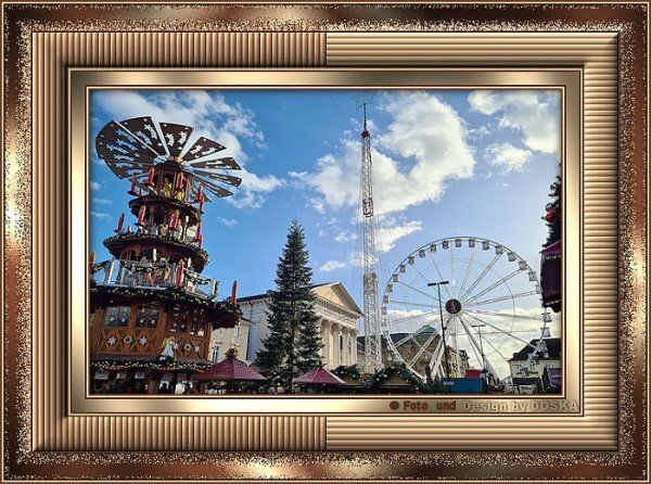
Hi all, I've been doing a lot of graphic work this month, personal cards and scraps for family, forums and PSP school. Most of it still with PI X3 but also frames with PSP. However, I have to switch to PI for plugins because the new PSP no longer allows external filters, as I read. I would have bought an older version if I had known this earlier. But with PI I can still switch if external filters need to be applied. Here is one of my newer PSP frames with a recent photo from our municipal Christmas market. The Tutorial is from here1 point
-
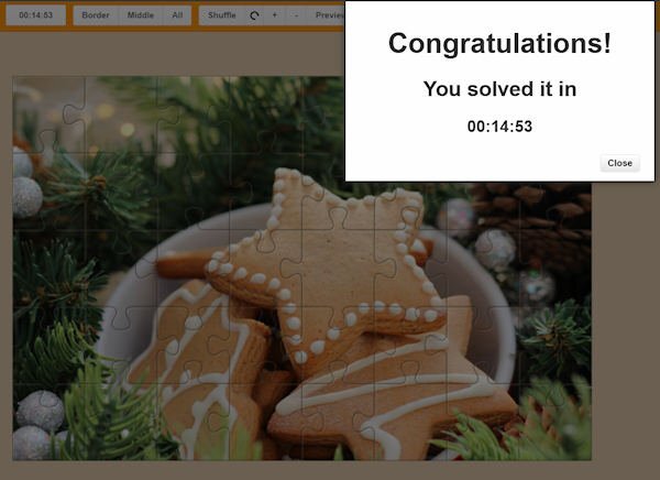
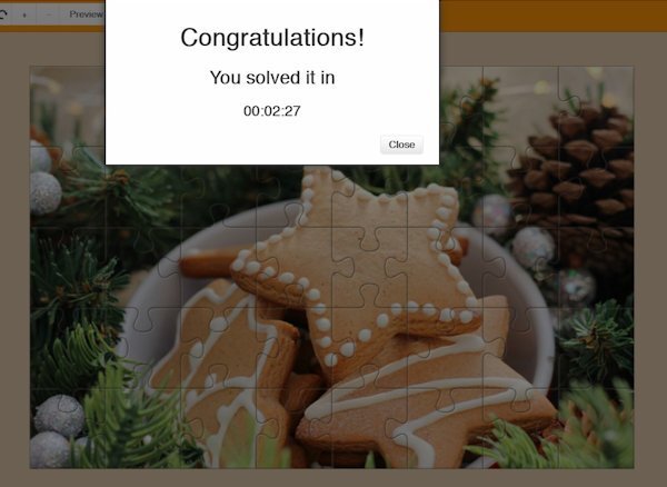
The important this is, Did you have fun solving the puzzle? If you did, time is not a factor. Relax and have fun!1 point
-
1 point
-
1 point
-
1 point
-
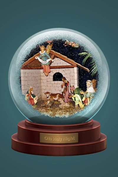
Wasn't sure if I would do something for this, but I got to playing this morning with that BAS Globe that was offered somewhere here last Christmas or the Christmas before. I made it a mask and then came up with this. Working with the magic wand wasn't cooperating at first, not sure why, but I extracted the shape of the placque and then filled it with a color similar to the placque background; used Arial Bold for the text and then effects>cutout with a fill color of yellow, and this is what I came up with (also changed the background color from red since it wouldn't go with this picture. The picture is of the manger scene at our church.1 point
-
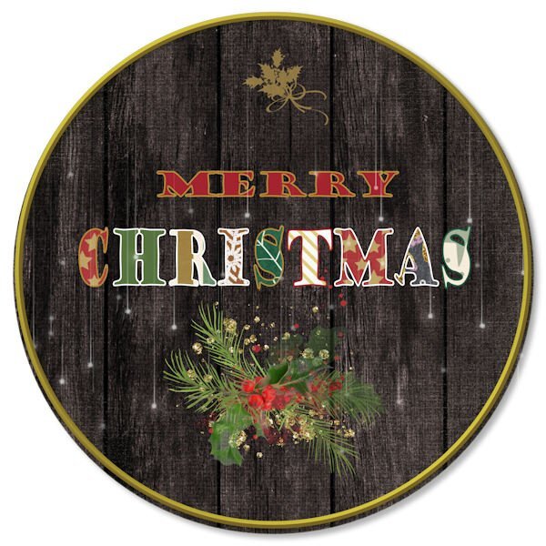
Another layout. I saw something like this in the background on a TV show. I like that I can try to replicate something, even if it doesn't turn out the way I imagined. The cutout circle background gave me so much trouble, don't know why. I wanted to give it more depth but just couldn't add a bevel or any other 3D effect to it. The file seemed to be so slow to load and save, just glitchy I guess. It's created as a .png but had to also save as .jpg to use here. Have no idea what I'd use it for, but enjoyed doing it.1 point
-
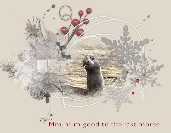
Moving on from bumbershoots and old folks....🙃 Not only do I feed peanuts and seeds to the critters in the backyard, but sometimes I watch their behaviours and silly antics. This particular girl (my photo) savours every peanut she gets, leans way back to eat it, and sometimes falls right over! It looks like she's in raptures with her treats.1 point
-
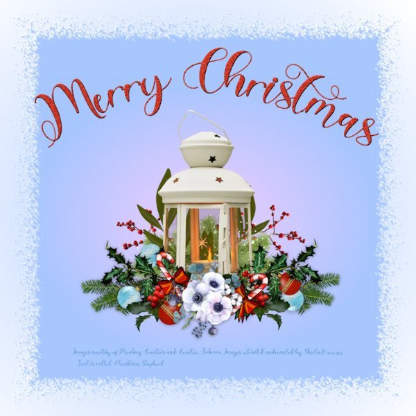
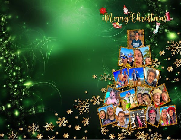
I was really lazy this year and most of my graphics and the font are from Creative Fabrica. The photo collage is from a free download, but I removed the background and moved it to my card. The card was made for my grandkids and their girlfriends who live in Las Vegas. I know it's pretty busy, but I have trouble restraining myself. The font is a glyph font called Helo Angel from Creative Fabrica. The gold snowflakes are also from a free template. This card is the front and needs to folded in half. Original is letter size to fit my card paper.1 point
-
A suggestion and request for a masterclass on being creative using vector swashes, swirls, flourishes, dividers. For this decorative festive wordart I used several of the above vectors. To create the banner I used a flourish, duplicated it, mirrored, flipped, then added another decorative swirl in the same manner for extra curls on the banner. Using a vector I was able to easily created text following the path of the banner. I used a divider for the main stem of the mistletoe. added foliage which I took from a font monogram. The holly and berries, stars, snowflakes, ribboned bauble and date also came from font extras. Pen tool to hang the 2 decorations from the banner. I find it rewarding to be able to create my own. It is also much quicker than endless searching for something suitable online which would be in PNG format. Although I will scroll through some for inspiration. The beauty of using vectors is that you can use a 100 pixel size and resize it to 1000pixels plus whilst retaining it's clarity and sharpness. Using the pen tool you can also make adjustments to your liking. For those that didn't know or was curious to know, this is how I created the above festive wordart.1 point
-
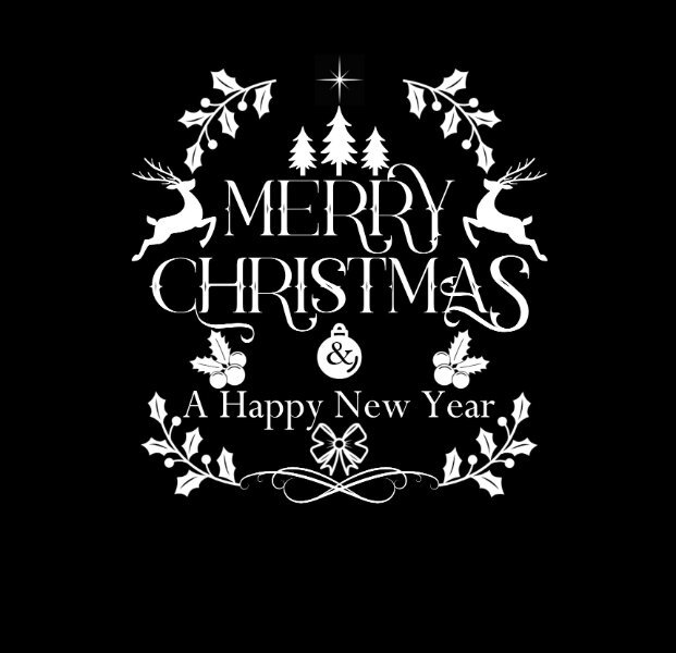
Now then, don't anyone dare laugh, but seeing as I had completed all my festive cards, calendars and everything else related to the festive season a while back. I decided to start thinking of Christmas 2024. I'm currently working on greetings for the inside of cards, something other than the usual plain journaling. I posted the wordart tree earlier. Since then I have done 3 similar to the one below. Although it's white vectors on a black background, they will be colourized. This is how I start any of my word/subway art. I used from vector shape to cut out the & from the bauble.1 point
-
1 point
-
Welcome to December. Here is the December calendar featuring the Amur Leopard this time. Enjoy. I even used a little Out of Bounds on this one. I have posted a full size version on Facebook that will print 11"x8.5" I feature mine on my desktop. The leopard information is from the Beardsley Zoo in Connecticut, where they have successfully bred some new members of this endangered species. Edit: forgot to name the Amur Jaguar font - Sedalia and the journaling is Arial Narrow.1 point


.jpg.a695ad03f9f2583f8bd9ecc8cc498088.jpg)
.jpg.55123badfd7ae9247c40b88285613e7a.jpg)
.jpg.a1dcc764c5eb987535b8158dcd8e6b1b.jpg)
.jpg.2dfa58f0bf439a38f1d55958c353bf3c.jpg)
.jpg.c738f353c8ac8709340d3c0b9a66c776.jpg)
.jpg.47e061eb77354b6cd89f819739aee7f8.jpg)
.jpg.b6d05d4cc677bf20ca4e3c04090ae25d.jpg)
.jpg.f5025f5e262aa4eecfd3931bc8109ee4.jpg)
.jpg.dc18ff475ec5c84ad3b0a045e92384b0.jpg)
.jpg.e1fa018c01baaf2ed3285166a60f2392.jpg)
.jpg.cdface04466161ceb115b0e72dbdbaed.jpg)
.jpg.cf24cb3f2a32334a5003e5409fcbdb47.jpg)
.jpg.e98e6fb67b19bcfe65733f8d48022c4a.jpg)
Resized.thumb.jpg.d25811db03a63358cedab1e79f527635.jpg)
