Leaderboard
Popular Content
Showing content with the highest reputation on 12/27/2023 in all areas
-
I think this is the last Christmas theme of the year! The template is from CD, the font is Nomah, presents from a Corel picture tube, and my sequin picture tube. Do you think the sequins were too much? I was going to delete them, but I ran out of time and had to post it to my group with only seconds to spare.6 points
-
I think this is the last Christmas theme of the year! Template is from CD, font is Nomah, presents from a Corel picture tube, and my sequin picture tube. Do you think the sequins were too much? I was going to delete them, but I ran out of time and had to post it to my group with only seconds to spare.6 points
-
Our pickleball Christmas luncheon. Double page layout. Templates by Chantahlia Designs.6 points
-
4 points
-
4 points
-
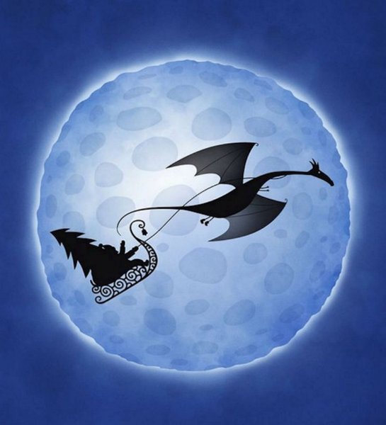
Merry Christmas All! This is my husbands company's version of Christmas. We went out in the evening to photograph the tire tree and snowman. They had lights but the battery was dead. I had wanted to try some light painting but the ambient lights from the parking lot was very bright, but I did use my flashlights to fill in the shadows a bit. Then I darkened it a bit again because I liked it a bit darker instead and lighter. It's nice to see even a big tire company has the Christmas Spirit. The font is Klasted from Creative Fabrica. The moon is from the parking lot that night as well. I got the light flare from CF as well. I wonder if there is a way to make the Santa/Dinosaur arched without distorting it. Like we do with vectors on a path. I would have liked a little bit of an arch on them. I used a Layer Style, outer glow...which I've never used before but I've seen other do it and liked it. I had to use the lowest setting and a lowered opacity too otherwise it's crazy big.4 points
-
Our pickleball Christmas luncheon. Template by The Cherry On Top .4 points
-
No, perfect as is. I saw this template somewhere and wondered how to use it. You've done it justice.3 points
-
3 points
-
3 points
-
3 points
-
You can never have too much of the two things: GLITTER and SEQUINS! Love the characters you chose.2 points
-
Once a week a group of women to meet to play pickleball. After pickleball, we share a picnic lunch and play games. This day we played Jenga. One of our towers reached 28 layers and one reached 34! Template= Lab 13-04.2 points
-
2 points
-
Yes, that's Chef Gideon with the girls and his assistant chef. LOL1 point
-
No, not at all, Michele. This is a wonderful sendoff for Christmas! Love the idea of Santa's belt buckle! I think this is the first time I've see someone other than glamorous women in your Fab Divas layout. Is that a chef?1 point
-
1 point
-
1 point
-
1 point
-
I have been rather busy and haven't been inside this tread for a while, so I'm not going to comment on every entree, but it was a joy to browse! For all of you have a very good Christmas time, in which ever way you celebrate this time of the year. Thanks for all the inspiration, comments, friendship and support and may this continue in 2024!!!1 point
-
1 point
-
Another layout. I saw something like this in the background on a TV show. I like that I can try to replicate something, even if it doesn't turn out the way I imagined. The cutout circle background gave me so much trouble, don't know why. I wanted to give it more depth but just couldn't add a bevel or any other 3D effect to it. The file seemed to be so slow to load and save, just glitchy I guess. It's created as a .png but had to also save as .jpg to use here. Have no idea what I'd use it for, but enjoyed doing it.1 point
-
1 point
-
1 point
-
1 point
-
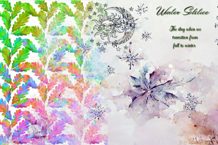
I found this gorgeous solstice background on Creative Fabrica in a bundle of twelve. It was hard to pick just one. The girls are from pngtree, I think. To create the "window" I combined a rectangular vector with an ellipse vector, magic wand selected on the outside, switched to a layer with a duplicate of the background, and deleted. Then I modified the selection with Select Selection Borders for the outline around the window. Added a little inner bevel on the text (Avenida LET font) and a drop shadow with 100% opacity and no blur. The singers got a smaller inner bevel just to give them a little depth. I kind of liked having the same background design in two different sizes. Any suggestions?1 point
-
1 point
-
Wow! this is cool. It is pretty convenient isnt it. I needed the Santa, sleigh and reindeer and popped on there and got dinos instead of deer. I have till Next Nov, then I think I need to stop the membership stuff (except the CAMPUS!) for a while, it's getting painful on my bank account. I'll be trying to fill up over the next year and that will be what I have. Unless I win the lottery that is.....without buying a ticket. 😆0 points


Resized.thumb.jpg.d25811db03a63358cedab1e79f527635.jpg)


