Leaderboard
Popular Content
Showing content with the highest reputation on 11/11/2023 in all areas
-
I had birthday cards to make for two people. I ran out of gas after the first one so I simply changed the name. Don't tell anybody. All the butterfly stuff comes from CF. I used a bunch of layers and a mask from Mask by Ginny. The font is Octagon Calligraphy.6 points
-
6 points
-
5 points
-
5 points
-
I love how you altered the decorations on the corners into the ones on the title! Again you have such an eye for detail.3 points
-
2 points
-
2 points
-
That is how we all learn, through trial and error. Tenacity, persistence, patience along with encouragement will pay off, with rewarding results. It isn't always an easy technique to master, to obtain that realistic effect, that we all know isn't real. As Carole said it is fantasy.2 points
-
2 points
-
2 points
-
2 points
-
1 point
-
You photograph beautifully, Sue. What I'm particularly interested in is the font name of the title1 point
-
1 point
-
1 point
-
1 point
-
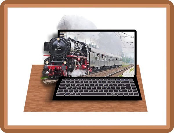
I tried many ways but above the keyboard the screen had to be huger. Onrealistisch high. The top of the train disappeared. OOB's are surrealistisch but a big part must be realistic. Making your own Mock-up is faster than to find something on the internet. I found that keyboard as pgn. But again I'm a step further in learning OOB's. another time I make one with the top as oob and not the side. Before I have a perfect one????????? Every try I run into someone else. But every attempt is a good exercise.1 point
-
1 point
-
Cristina thank you so much. It is a good feeling to actually be able to use the things we have learned so far. You are going through the same lessons for the second time and I already know that if this course comes up again in another year I will take it again to rehearse. I find it much more inspiring to do this with a (now small) group than on my own.1 point
-
Hello all, this time there are no flowers and bows, just oil cans and coal☺️. I wanted to do a technical scrap. As a child I lived on a railway line in the Black Forest, so I have a soft spot for the railway. The challenge was the text. For me, T couldn't be selected when I had selected 2 layers to change the font color. It could also be due to my graphics card, which was quite busy when I had to use the video and graphics program. The double shadow was also a bit difficult. Suddenly there were 2-3 shadows behind the object. I quickly deleted it and reloaded it and then checked the box for drop shadow with extra layer, then moving the shadow or blurring it worked. The papers are all from Creative fabrica. The photo was taken by a former work colleague Frank St., who photograph Trains worldwide. I have his permission. The deco is from Kisspng and pngtree. Font: Model Railway (CF) Doska1 point
-
Good morning all, here is my module 5, which was really a challenge until I finally placed the rings satisfactorily 😉 but the new techniques were fun. We have a Dutch fabric market in the city twice a year which is very popular. Even if you're not a seamstress, you'll be happy to go there for photos, as it's a very colorful market. Credits: PSBT-Jan16-Minikit © DS Jessica Dunn Alphas: DS Marisa Lerin Photo & Tag: Doska Font: Arial1 point
-
1 point
-
Hello Carole, I have now registered for the PSP course here. I already have the trial version. Could I maybe do a little preparatory work before the course starts? Make default settings, get to know tools or design papers, e.g. B. PI also works with layers. Do you have free tutorials to read? (So that I can copy and translate them. Videos in English are a bit difficult as a beginner) Have a nice sunday. Doska1 point


