Leaderboard
Popular Content
Showing content with the highest reputation on 11/07/2023 in all areas
-
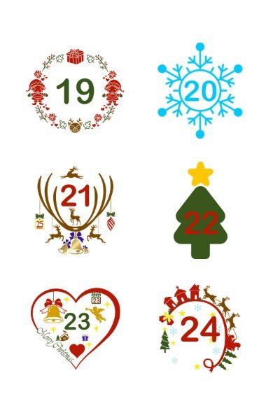
We are quickly approaching the Winter Solstice, which entails the festive season. This year's advent calendars for my little girls are already en route. Seeing as Michele has posted a lovely Xmas page, and mentions having fun colouring. I thought I'd post some of the dates that are printed onto multi purpose removable labels. (11/2 x 11/2 inches) which are easy for the girls to peel off. I have a nice large collection of Xmas monogram fonts which I use, and grows with each year. I use the same font for the numbers( Ariel). Colouring is time consuming, but I really do enjoy the tediousness of it.8 points
-
Daily Look for today. I decided to go with a poster feel. The bell and the ornament on the top are from CF. I've had Santa with his sleigh for so long that I don't remember where it came from. The snowflakes are a picture tube I made several years ago and the font is Kirvy (I know; you'd expect it to be curvy!). I had fun changing the color of the overlapping portions of the elements.8 points
-
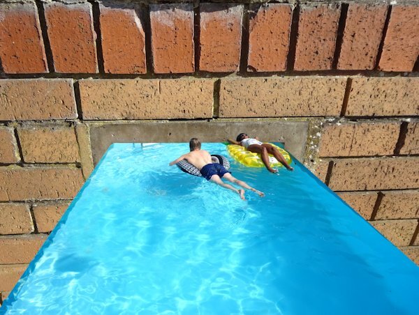
I have found a mockup that I liked and have used the photo of a California Condor (from the internet). I have seen those birds on my visit to the Grand Canyon, but it was impossible to get somewhere near them to take a photo. There were photographers with a mighty telelens that couldn't take a good photo of them either. I have given the bird a shadow because in the image is a shadow too with light coming from the left. When I have time I might search for another mockup for another photo, but I wanted to give this a try.7 points
-
6 points
-
6 points
-
6 points
-
5 points
-
5 points
-
Actually, for me choosing a photo is easy, choosing a background to place the photo in is far more difficult. I rarely, if ever use outside resources, other than some elements.5 points
-
5 points
-
I have not figured it out yet. I will wait until I have all the photos on hand to decide. I have many options: keeping it completely white so the focus is only on the photos having a random watercolor pattern to frame the frame (which might not be white either) using a faded/black and white version of the photos themselves (which might not always work if they don't cover the whole page create a small pattern from the colors in the photo So, right now, it is still a work in progress and nothing is finalized, however, the OOB approach is getting more and more interesting now. I'll keep you all posted!4 points
-
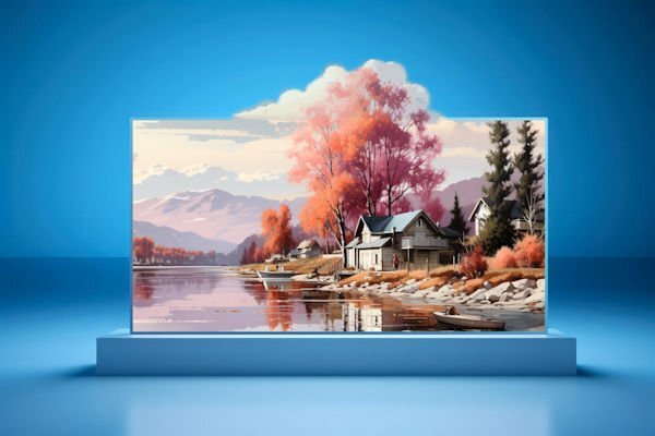
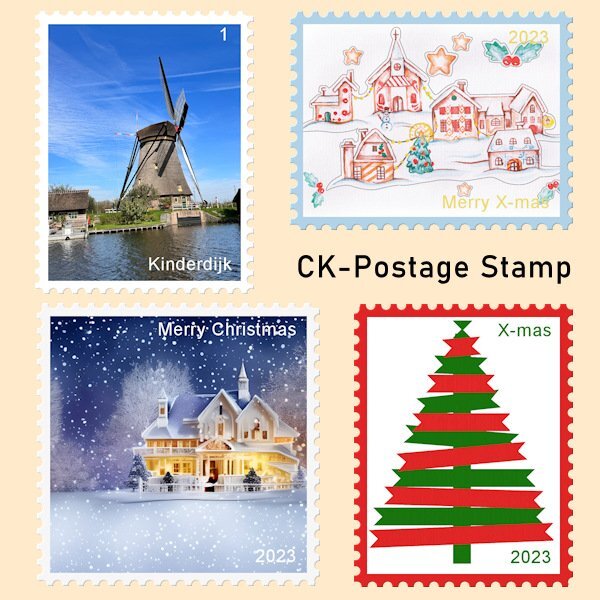
Seeing all the above OOB's I will have to go and search for some mockups that I like and that will go with my photos. In the mean time I like to show what I have been up to with the scripting course. I have posted there my result but that is only visible for the members of the course, so I will post it here too. I have been making my first "real" script, not something for practice only. I made a postage stamp script that can use landscape, portrait or square format with a border for which you can choose the color. You can choose to have no text or with a simple text for which you can again select the color. When testing I used some X-mas related images, so I can use them this year. I have used the "ribbon tree", that Sue T has generously shared with us last year, for one of the postage stamps. Thanks again Sue! The Kinderdijk postage stamp was the one I used to code the script so I could adapt it for the other formats, colors and text.4 points
-
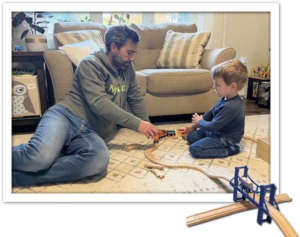
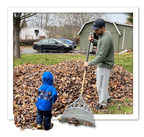
As I have mentioned before, I plan on making a storybook with photos of my son-in-law and grandson as a "home-made" gift exchange this Christmas. I am still collecting photos to have enough for a story, and I have not yet, decided on how to display the photos (as is? with instant effect? extracted?) so I thought of trying another method, which is the OOB, as we saw in the class yesterday.4 points
-
You always do such a cracking job, on whatever you put your mouse or stylus to.3 points
-
Shadowing is tricky with that type of effect. First of all, we have to remember that it is a "fantasy" setup so it is not going to be 100% realistic. Second, the shadows will depend on the lighting you have at the time. Finally, the shadowing will depend on what we want to get, but like in Sue's example, she based her shadows on the existing shadows on the scene. Notice that the light source is not from the top left, but from the top right to match the others.3 points
-
I do like the out of bounds technique. It's a unique approach to showcasing photos. When you come to displaying the photo on a page, what would you use for a background paper. Personally I would keep the backgrounds relevantly plain. No loud patterns in other words.3 points
-
One of my favourites from the British lexicon. Read it or hear it often in books/TV series.2 points
-
I think I gotta move to Wales for a while and learn some new lingo.2 points
-
Although I use the words thrilled, pleased, delighted, and the list goes on, to use the word chuffed lifts the meaning of those to a higher level.2 points
-
Very cool words, love Dead chuffed cause I like the definition word used: "chuftness".2 points
-
You did a grand job, your choice of subject is also fantastic. We have the Turkey Vultures. I just love them.2 points
-
Hubby spend a few hours trying all different kinds of instructions and finally found a place when he could put his phone number in and get a call-back. The call was immediate and after a 10 minute hold the nice lady in India just gave him a code and made it work. yeesh, two days for a 30 second phone conversation to fix it. So back in business and now I will get my PSP workspaces up and running as we had done (a couple months ago) all new installs on all the programs to have a nice clean start. Although I lost all the saved emails it's really a blessing in disguise. I get to start all over with email and keep the inbox to a manageable number.2 points
-
Well, here's another unfamiliar phrase, though I've seen you use it before. My own take on "chuff" is the sound an adult tiger makes in greeting! LOL But here's the explanation for your use of "chuffed" - "It means ‘pleased’ but there are various different levels of chuftness: Chuffed - standard level, mildly pleased Highly chuffed - more than just chuffed Well chuffed - satisfied as well as pleased Chuffed to bits - thrilled Seriously chuffed - said by usually men who don’t want to admit how chuffed they really are. Dead chuffed - The ultimate in chuftness ie You couldn’t be more chuffed."2 points
-
You really have been a very busy girl! Here is that word again. Ineffable!!!!!! From some of the comments you have made, it appears to me that you have revelled in the scripting class, with possibly some frustrations. You should be proud with what you have achieved. To top it off, I'm chuffed to bits that you have included my ribbon tree, in your presentation page.2 points
-
There are so many options at your disposal. For what's it's worth I like the thought of keeping it completely white.2 points
-
That is true. I had another project to show (but that will be for Part 2) which is even more important when you consider the perspective for the photo and the "base".2 points
-
Yes, the most difficult part of this technique is to find/take 2 suitable photos2 points
-
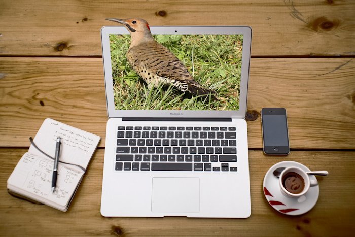
I had some time earlier to have a quick play with the Just Out Of It. It took me longer to find a suitable background, eventually I found one on Unsplash. Than to create the page. I liked the natural rustic wooden table, to go with the photo I used. Northern Flicker Woodpecker. I quite liked the slight tilt of her head, and element of surprise on her face, which I thought appropriate considering the situation she found herself in. 🙂2 points
-
2 points
-
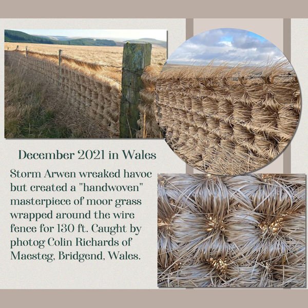
Something turned up on my FB feed that caught my eye. Normally I don't pay much attention to them, but this one was from David Attenborough's fan club (or so they say). I googled the images to check for the veracity of this phenomenon, and it appears to be true. The natural wonder of it is quite astounding. And since we have a Welsh person in this group, I threw together a layout using a template to save time.2 points
-
1 point
-
Beautiful. Hope your design can be used for some of the remembrance activities on Armistice day.1 point
-
Thank you and at least I now know what "ineffable" means! You are right about the frustrations but the wish to understand and use this scripting has by far outweighed it. But the course is not over yet, after this week comes the last module of 5 lessons. But I'll take a break for the Calendar Workshop, one of my favorites! Besides all this, your ribbon tree was perfect for a postage stamp.1 point
-
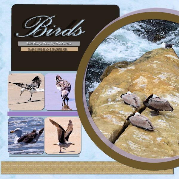
This is the cleaned-up version of my design. I fixed the kerning on my font by setting my kern value to -25. Then I swapped two of the square pictures and adjusted my circle layers so they did not over-power any of my squares. Finally, I fixed all of my shadows. My background paper used the pattern effect on my picture of the three birds. I used the same effect to create the brown band across the bottom of the design. The thinner bands and the large rectangle were created using the colors in the circle picture. Thank you to everyone who offered me advice and suggestions.1 point
-
Yup! That is the right definition for all of the variations. Chuffed to bits is the one most commonly used, although on occasion I will use dead chuffed.1 point
-
This is not the first time I have done it. A couple of years ago I did a great job in it. it was still in the X2 . I go absolutely further on this technique But not tonight. it's over ten here so I want to go to my bed. Wednesday I give it another try. There are already plans circulating in my brain. Probably not tomorrow as I have other things to do.1 point
-
I appreciate your thoughtful suggestion Jannette. I wasn't struggling with creating this wonderful new approach to creating something quite unique, implementing modern technology with photographs. Ann's comment made me doubt myself. Until, that is Carole replied. Don't give up, I look forward to seeing what else you create using this technique. What you have done so far is lovely. I will suggest that you zoom right in, until you see every pixel, it makes the job in hand ever so much easier.1 point
-
I think this method is far and away more striking. I'd do it.1 point
-
1 point
-
I have a tough time making cards for men (in this case, my brother) as most scrapbooking supplies I have seem to be fairly feminine. I used some papers and elements from a 2018 blog train for this. I used one of Cassel's corner punches and the font is No. 7 Regular.1 point
-
I took a screenshot of a map, of the Maesteg area. I have circled where my parents farm is. The narrow lane takes you up to Mynydd Yr Gaer mountain, and on to Rhiwcellog, which is common land, where the sheep would spend their summers. There are cattle grids on either side of all mountains. The farm fields would rest, to produce hay to feed the sheep during the winter months.1 point
-
1 point
-
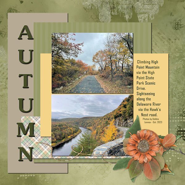
My latest entry in the Basic Scrap Course: Module 3. Photos by my daughter, Debbie, from last month when she was visiting for her High Point Regional High School Reunion. The fall colors seemed muted this year. Not as many reds, so perhaps no maple trees. The materials are: Background paper-ID_All That's Fall; Title font: Souvenir; Text font: Agency; Cluster Group: ID_All That's Fall and ps_Jessica Dunn_harvest pie string. Making the cluster a group worked well as I could add shadows within the group while also being able to move the whole cluster around intact.1 point
-
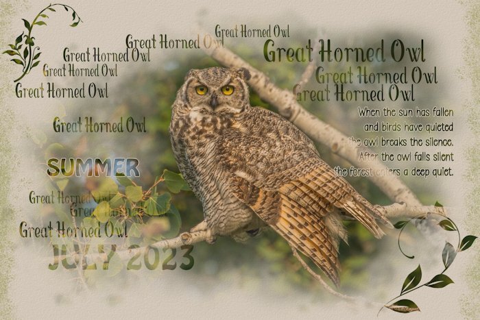
After looking at Carole's latest script, I had to see if I could replicate it. This is my test interpretation. I used a new mask layer, hide all. Brushes, Fonts, from vector shape, select selection borders. I must admit I do like this effect, another way to showcase my photos. The photo fills the whole page. Perhaps this wasn't the best photo to use as an experimental page, as the background of the photo gets rather dark. But I get the gist on how to create this effect. One of my resident Great Horned Owls. I'm going to put the script on my wish list, as I'm sure it will take a fraction of the time it took me to create the page below. Still, I enjoyed myself.1 point
-
November to me is always about Remembrance, especially during the first half of the month. I have done a lot of research into WWI and WWII service people from my hometown area in order to write biographies of them for the Legion. The more I learn, the more humbled I am. This is my FB cover page for this month. I make one every month...since I can...thanks to this group and Carole!1 point
-
My mojo has escaped again and so I've been playing around, This summer I took a snapshot of a wall covering that I thought would make a good background. This morning I took a square of it and make it a pattern. Then I worked on the pattern and made it an overlay and reduced the opacity to 50% and then made a copy of it and put it in my Textures file. Then I made a paper of blue color and used effects>texture effects and this is what I came up with.1 point
-
1 point
-
1 point
-
1 point
-
Here's my Day 1. I had absolutely no inspiration so it's pretty boring. LOL1 point

