Leaderboard


Popular Content
Showing content with the highest reputation on 09/18/2023 in all areas
-
Hello People ... I decided to go with the 8.5 X 11 inch format ...(Is that the same as A4....?) I also decided to make my image take up the full page... I'm hoping this will be ok down the road.
 7 points
 -
Page 7 of Shenae's book, siblings
7 points
-
We are busy with coffee. So I made a coffee cluster.
6 points
-
I found the do-it-yourself snowman kit that Cass made available to us tonight. I got to playing with it but must admit that I made some changes to the accessories.
6 points
-
I was lucky to have the old templates in my stash so I could start inspite of the wrong link in the mail ? I'm working on 3 magazines and will see which one will be the one I will finish ? One Outlander, one about my granddaughter which I can't show and one of our holiday which ended 3 days ago.
5 points
-
Carole's Framed Mask 3 freebie Font: KG When Oceans Rise
5 points
-
here is mine for the challenge, Using picture tubes by cassel and corel4 points
-
Day 1 cover page. I have a bazillion flower pictures so I thought flowers would be a good theme for my magazine. The font is Hesthia Austine but in all caps. I resized the mask to show more of the flower.
3 points
-
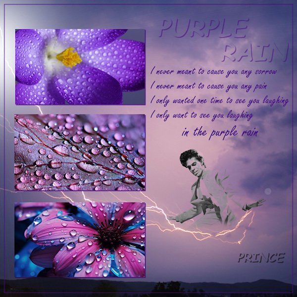
Pictures from Pexels.com, and png from pngwing.com Song, Purple Rain from Prince
3 points
-
I'm using this workshop to do some layouts of the Hot Air Balloons that were an event during the 50th Moon Landing Anniversary weekend in my town in 2019. I'm still doing 12x12 since I will be adding elements and other items after the workshop. The layouts will be included in an album I have about the town. But for now, here is the "cover". I changed the color of the background to match a kit I will be using for the elements.
3 points
-
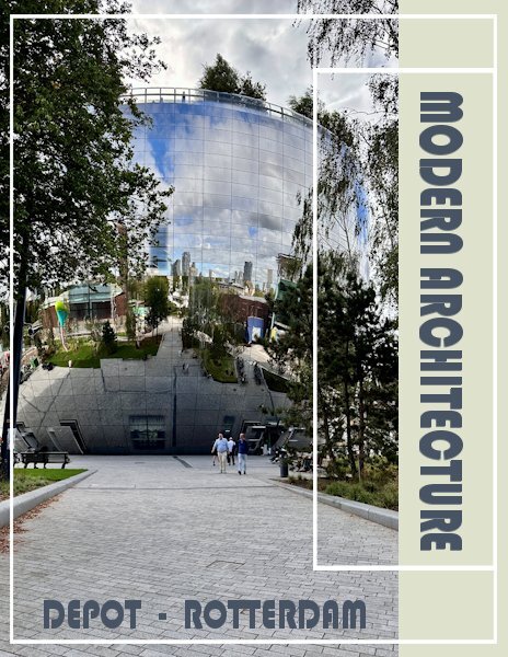
Here is the start of my cover page, but there will be more on it. I have done this workshop (called a challenge 2 years ago) , so I have the templates already resized to rectangular. A magazine to me is rectangular, I looked in the shops where they sell magazines and they are all rectangular; a brochure can be any size though. Last week I visited the "Depot" of a very well known museum called Boijmans van Beuningen in Rotterdam. Because their storage department became way to small for everything a museum has in storage (or depot), a new depot was being build. A took a lot of photos which I can use, therefore my magazine is called Modern Architecture. In the following pages you will see this Depot is very futuristic. On my first page I have gone a little bit further then the tutorial, but I'll try not to go to far ahead. The font I chose is Bauhaus.
3 points
-
Figuring out how to get that shadow just right must have taken a lot of thought and work. It turned out great.3 points
-
It was a pleasure! You resized the pattern perfectly, it isn't any longer a distraction, instead it enhances the overall layout, without taking the eye away from the photos.2 points
-
Hi @Sue Thomas, I did take your advice as I agree it was a bit distracting. It led me on a whole new adventure about seamless tiling LOL! Decided to make a tag as I had been inspired by those made in the Travel class and here is the revised result. Thank you sharing your thoughts from experiened eyes!?.
2 points
-
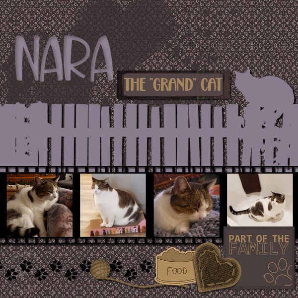
Hello everyone, I'm enjoying seeing your creative juices at work, for some reason my reaction button is not working, but I do like what I see! ? Here is my take on the Freebie Challenge Wood Fence, a happy accident to start! I had placed Carole's fence on the plain raster layer and then when I went to fill in the background on the under layer with the fence layer open it did not fill behind the fence...so I took it as a sign to create a silhouette and went from there. The paper I created myself from round about trials and really no idea where it was going. I did set out to create the film strip (vector shape and square eraser brush tip) and convoluted it into a mask of sorts ( need to continue the mask class!) and saved it as a paint tube. I think that's what I love most about this program the playing around with colour and shape until you get something you like. Fonts: Back to Love (label) With you forever (Nara) Elements: from PS designers, Elif Sahrin (heart paint spatter), Gina Jones (yarn ball) Jessica Dunn (plaid label) Marisa Lerin (all the rest)
2 points
-
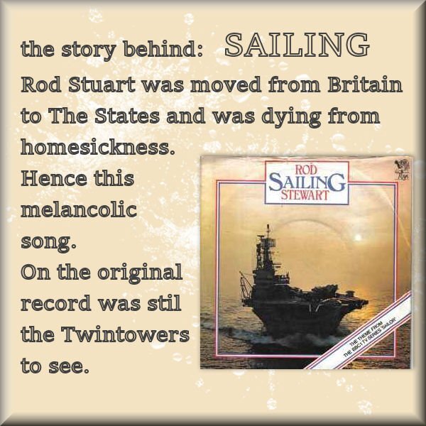
Ros Stuart: SAILING
2 points
-
Yes, the wrong email was sent. I will send the correct links in a minute. Stay tuned.2 points
-
here is my work with the fence for the fence I made a big shadow on its own layer, mirrored vertical and use the shear tool for perspective, added gaussian blur and reduced opacity2 points
-
Poor Kitty Cat. It only wants to get home for it's dinner.
2 points
-
I didn't like them even when I was young. In those days I liked the French chansons more. Now I appreciate them more than then.
2 points
-
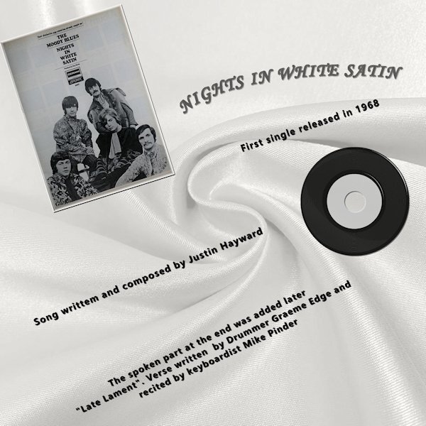
Nights in white satin has always been my Husband & My "Song" The single was released in 1968 and we were married in 1969 so the [Chorus] was true then and is still true today. "Cause I love you Yes, I love you Oh, how I love you" The info was Wikipeda.
2 points
-
Poppy does not like snow...ever! Template # 198 by Bourico Casper, AKA, Lady 22. Fonts: Meows, Palace Script MT, Christmas Snow Bold Swash 007 by A Janner, Snowdays at Digital Scrapbook Hearts on a string by Marisa Lerin, brush #03, Winter Plaid Kit at Digital Scrapbook Snowflake by Gina Jones, Winter Elements, Snowflake 02 at Digital Scrapbook
2 points
-
I'm in, but what will my magazine be about???
2 points
-
Besides scrapbooking and scripting I get once in a while an English lesson or explanation too. WOW ?2 points
-
I use 3 different Canon cameras and all are set to take the same size photos. I use the 4:3 image size then have a choice of 5 different combinations of size (number of pixels) and compression (image quality). All 3 are set for the largest pixel size (which is about 5184x3888) and the highest image quality. These settings do take up more space on the memory cards but with the larger cards I still get a lot of photos. So I'm able to use any photo on a 12x12 layout with no problem. Sizing down for a layout is not an issue either! I run into the problem you are having when I receive photos from other people that use a lower number of pixels in their settings so that they get more photos on the memory card.1 point
-
I certainly hope that this workshop will make it easy for people to use all those pictures to create a page!1 point
-
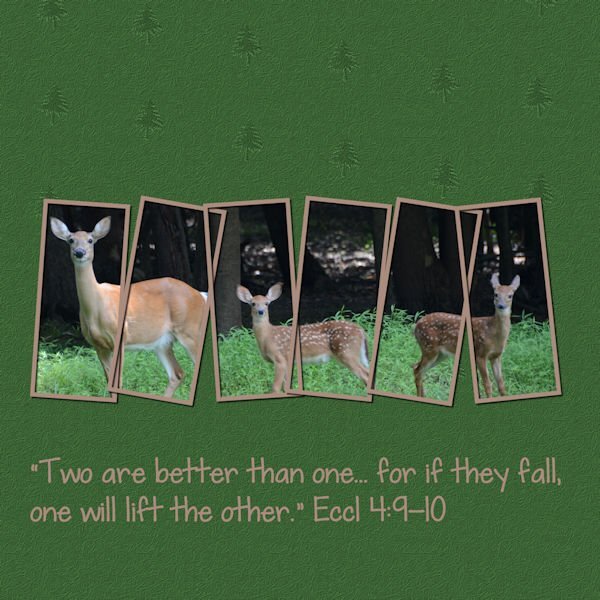
I like such bible scriptures, but I don't know how deers can help each other when one falls. Or are the frames?1 point
-
I know that problem, It's a terrible fact. ??1 point
-
ij = ijskoffie = recipe: keep all coffee leftovers in a closed container in the fridge, Max. 1 week. add a few big spoons of vanilla ice cream and mix. To your liking, you can add some caramel sauce.1 point
-
What a great musician...1 point
-
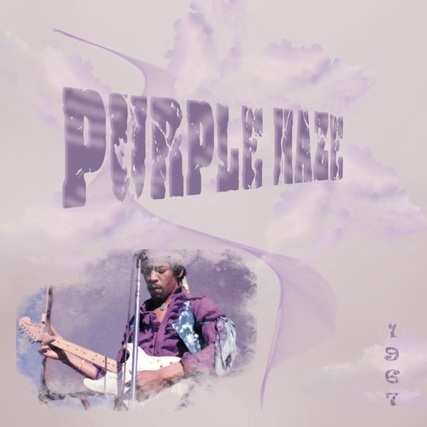
The first song that came to mind. The one, the only Jimi Hendrix. Nothing special done, just bits and bobs to try and capture the psychedelic vibe.
1 point
-
You nailed it. I'd call that pretty artistic. Good job Donna.1 point
-
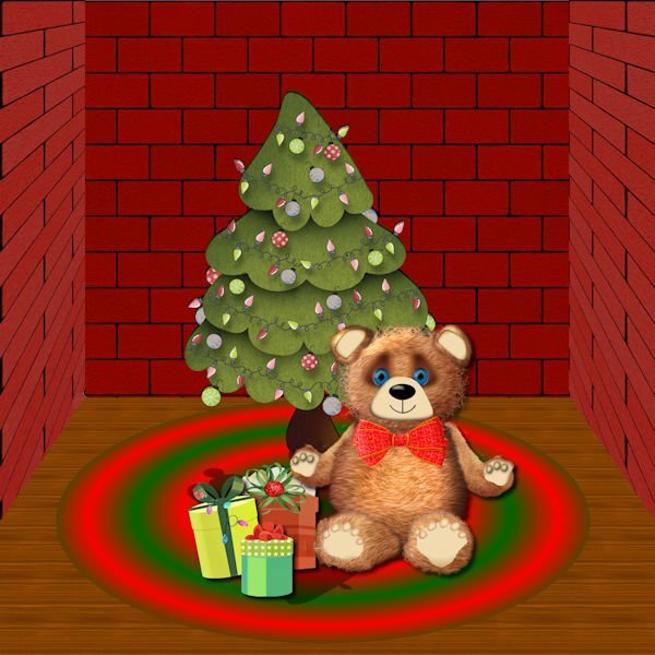
I am definitely not an artist, but I wanted to try to make a Teddy Bear. Starting with vector shapes to which I applied plush using the cass plush script, I used a lot of what I have learned about shading. The paws are tubes which I modified. I used a vector to trace the ear of a teddy that I downloaded using AI and the script to merge and cut out the inner shape. The background is from the Masterclass on Pop ups that I never completely finished. The tree is from Digital Scrapbook, and I'm not sure where I got the presents. All the other shapes--head, body, legs and arms were made from vectors.
1 point
-
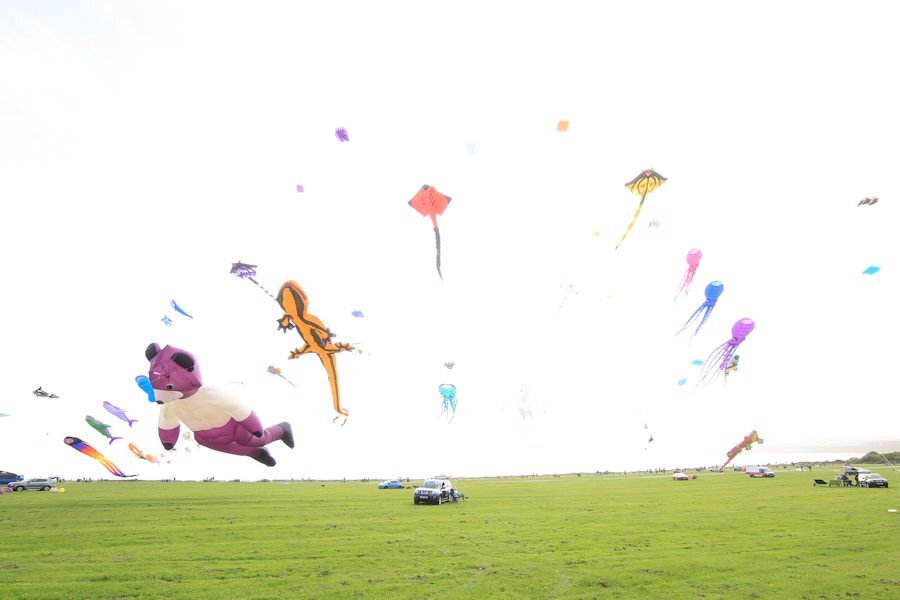
I have visited the Kite Festival today and have photographed some of the large kites. The stunt kites were not flying as the wind speed was to high for them to put on a controlled display. I am hoping for a calmer day tomorrow. This is a view of the kites flying when I arrived, requires some editing.
1 point
-
Susan and Rene, I have to agree with you both. It appears I started quite the conversation. Changing gears slightly, but on the same subject, which is a relevant point, which I think has just been proven, when it comes to creating a good magazine cover or page, the text should be easy to read and understand. I believe it's a good idea to use simple short sentences. The same goes for the layout, it has to have balance, variety and emphasis to be an appealing and a functional design, that will make sense to anyone. Of course it doesn't only apply to magazines, but to any creative page. Should there be any typos, just read over them. Simple and minimalistic ( I wonder how many meanings these two words have!! lol) should be my middles names This is my opinion!1 point
-
A kit from Erika at ET Designs. I like a lot of her designs. All the elements come from that. I was thinking of losses and felt like making something. I'm not sad, just thinking of those who are gone.
1 point
-
I've made something in Particle-shop today. A castle in a bottle. The background is made of 2X the castle, one upside down and merged. Then activated Particle-Shop and the image was in. I blended the whole layer of the background to what you see by using several disciplines. In the end, I gave it some sparkles. And added the castle to it. Than accepted. back in PSP, I placed the background behind the bottle and the castle. Selected the bottle, reversed, and Dell. The bottle was finished. In the end, I gave it some sharpness. And so was my empty bottle filled.
1 point
-
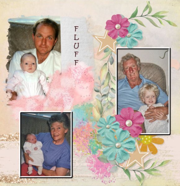
Page 5, and here she is with her Dad and the grandies. Her Dad's pet name for her was "my wee fluff".
1 point


Resized.thumb.jpg.d25811db03a63358cedab1e79f527635.jpg)


.jpg.858aad9480fa037359d9669991e64e11.jpg)