Jump to content

Leaderboard

Popular Content

Showing content with the highest reputation on 09/09/2023 in all areas

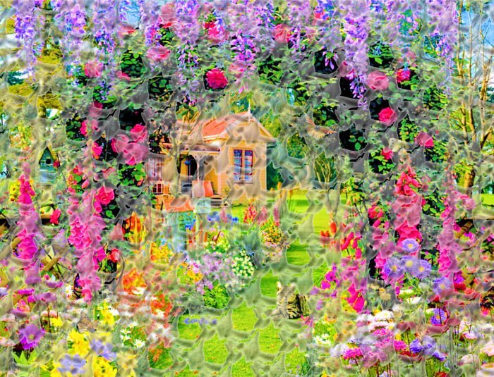
  1. I downloaded Dozi's brushes, as suggested in Grunge Magic and I was mesmerized by the odd shapes. Using Dozi's Background 5, I just clicked it once, then clicked again next to that image, etc., until I had a pattern. Then, I copied and pasted that pattern repeatedly, until I had filled a page. It reminded me of some sort of energy field. So, I used the page I'd created as an overlay to a garden scene. I made the garden very bright and saturated, since I wanted it to be other-worldly. Then I adjusted the opacity of the energy field overlay to show that there's a barrier, but so it wasn't obscuring the garden. I call it Garden Seen Through Dimension Rift! Of course, I had to shrink it to fit on this venue, but I hope you can get the drift.
    14 points
  2. There was a challenge in February 2018 called Love Story and this is Day 1. I can't find it anywhere, not even in the archives. Earlier in this topic @Cristina said it was redone as the Masks Workshop.
    13 points
  3. Here is my out-of-bound technique. One from the tutorial and the other for my gaming group. https://scrapbookcampus.com/2019/01/out-of-bound-technique/
    13 points
  4. Still learning to use shadowing to create dimension. This layout was from the basic scrap course. I also learnt how to cut shapes in a non destructive way to add as an element. Lovely effect.
    13 points
  5. Learning how to use shadows especially with the layering of papers. Using reversed shadowing can help things look more realistic and for me help them pop a bit.
    13 points
  6. This is one where I learnt how to isolate a coloured element.
    13 points
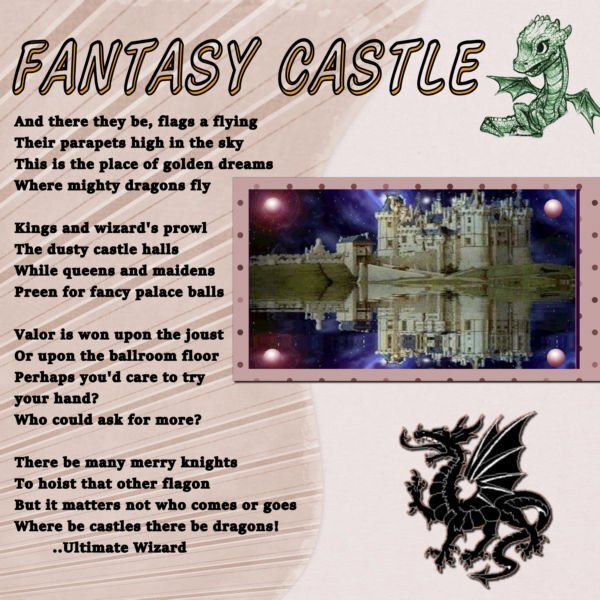
  7. Wise Words Challenge April 2020. I looked for a link in the archives but it did not go back that far back. This was my third day "Fantasy Castle , There Be Dragons" entry.
    13 points
  8. Besides the campus, we mustn't forget the books Carole has done on Kindle. ( don't have those) The one I do have is Tips and Tricks for PaintShop Pro.
    12 points
  9. My last post to this thread. Carole did a fab webinar on making patchwork as a layout so I used it for this photo. If i did it again, I would make the letters look like they were embroidered to fit in better.
    12 points
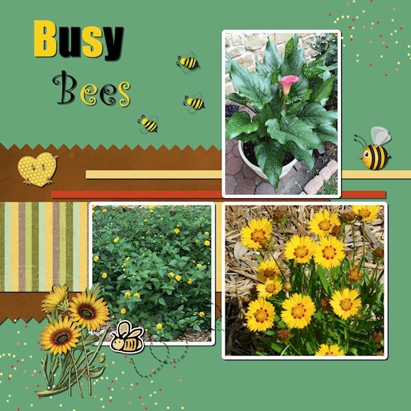
  10. Here is another one from Sept. Scrapbook Bootcamp. It is Day 9 I learned how to use the pinking shear effect which was a lot of fun.Flower pictures are from my backyard and papers and embellishments are from Digital Scrapbooking. Font for Bees is Franklin Gothic Demy Cond.
    12 points
  11. QUICKPAGE/BUSYBEE WORKSHOP - Day 4 (not meant as counting toward my 10) Here, for comparison, I added text. 3 of the same page, three different looks. This page is pretty as it is, but the other pages in the workshop I did drastic color changes. It's a fun workshop, I highly recommend it. this is from June 2023
    11 points
  12. I remember joining here In December of 2019 and my attempts at the "sandwhich". We all had a good laugh at my mess on that one. Tutorial Tech Challenge, Fairy Frolic, October 29, 2020. My first attempt at making my own user defined filter too, I looked for a link in the archives but it did not go back that far back.
    11 points
  13. This was from an early workshop, reverting a coloured photo to take on the appearance of an old sepia photograph.
    11 points
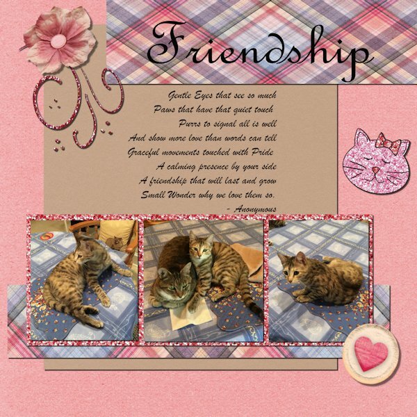
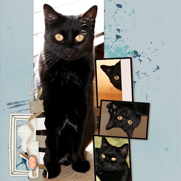
  14. Here is my project Bootcamp Sept. 2021 Lesson-7 resized to new format. I learned about rulers and snap to Guides. Photo shows our cats Bella and YaPurr. Papers and other embellishments are from Digital Scrapbooking.
    11 points
  15. I attended the next Scrapbook Bootcamp that started in September 2021. Here is Lesson 3 again. Photo is of our Bella who likes to climb the book shelves to look for some interesting Cat Tales. Background and other embellishments are from Digital Scrapbooking. I am resizing my graphics to fit the 501 maximum kb limit. They used to work in the earlier workshops.
    11 points
  16. I started with Scrapbook Campus in March 2021, I learned about layers and also received a sheet with helpful Basic Scrap Tips. Lesson 3 titled New Kid on the Block. Here is my result. I used a photo of our Leo. Some embellishments and font are from my files and some from Digital Scrapbooking
    11 points
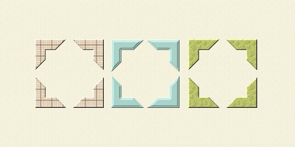
  17. Also from the Build-A-Kit workshop, I made these photo corners from papers I made for the kit. Photo Corners | Scrapbook Campus
    11 points
  18. This was a Dymo Label I did in the Build-A-Kit workshop. Dymo Tape | Scrapbook Campus
    11 points
  19. This was a layout for the Mask Workshop in 2023. This was the 2023 Day 3 Extra Mask.
    11 points
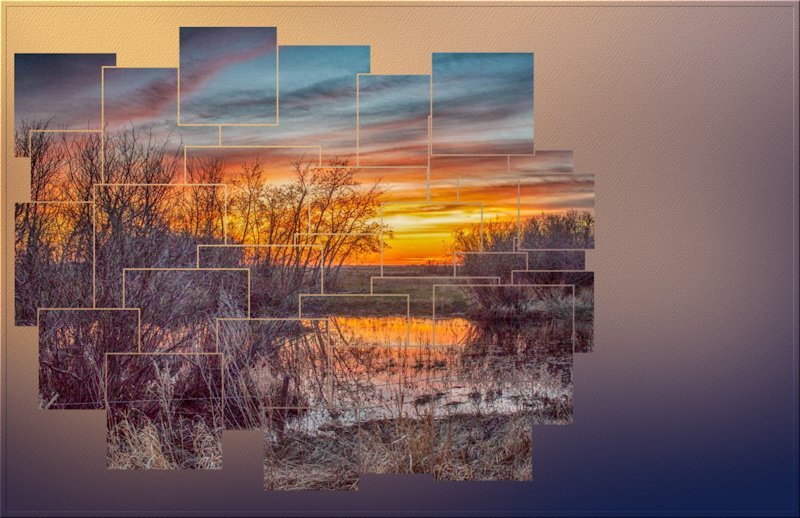
  20. Creative scrap block photo. Before the Lab existed. Many of you will have noticed that I use this effect quite often to showcase photos.
    11 points
  21. Lab 10-8 Split photo. Creative scrap, Stitched element (before the lab existed)
    11 points
  22. https://scrapbookcampus.com/promo/scrap-bootcamp/day-11/
    10 points
  23. https://scrapbookcampus.com/master-classes/selections-everywhere/ I love this technique too.
    10 points
  24. https://scrapbookcampus.com/master-classes/no-kit-scrap-2/ I love this effect. I should revisit it!
    10 points
  25. QUICK PAGE/BUSY BEE WORKSHOP - Day 4 (not meant as counting toward my 10, just a comparison to my prev. one) This was from May 2022 and I got brave and turned it on it's side. Special thanks to Sue T. for pointing out the shadows were not quite right. She got me through how to mirror and flip and all sorts of contortions to make it right. I was grateful that learning opportunity.
    10 points
  26. https://scrapbookcampus.com/promo/qp-workshop/lesson-4/ QUICKPAGE/BUSY BEE WORKSHOP -Day 4 I miss it the first time around and regreted it. This workshop teaches you not only how to use a Quick Page, but how to manipulate it and add to it to make unique. I've done it 3 times now. This one is the first one I did in February 2022. I dont think I changed anything on it. Or added anything. I was still quite a newbie.
    10 points
  27. found today Lab5-09 tutorial in one of my folders and made this layout -paper with dots, paper with text, eyelet and the ribbon with the eyelet
    10 points
  28. This one was to practice the Lab10-Module09 tutorials: Diamond2 pattern Banner Alpha Interlocking Pattern I also added some Layered Flowers using Cassel's script. The Lifted Shadow technique is from the Realistic Shadows Masterclass. The String is a picture tube from Cassel's Store.
    10 points
  29. Overflowing Masterclass
    10 points
  30. Creative Scrap, eyelet fabric
    10 points
  31. I created the scalloped edge with what I learned from the Double Scallops lesson in the Diamond members scrapbook section but now when I click the link for that lesson it takes me HERE which is obviously the wrong destination. In any case, the paper used is from Joyful Heart. I made the Hello September greeting and the mask. I generated the woman image with Bing Ai. Other things are from Just Because Studio.
    10 points
  32. Lab 10-3 Bracket frame
    10 points
  33. 10 points
  34. Lab 10-7 Clapper board
    10 points
  35. 9 points
  36. Lab 10-7 negative effect
    9 points
  37. The main pic is from another great clip art collection from Creative Fabrica. I tried to make it look like I was using a mask. First I Gaussian blurred the background paper. Then I magic wand selected outside the clip art, inverted, contracted, inverted again, and applied a Gaussian blur. I'm sure there's an easier way to achieve it, but I was in a huge time crunch; I even missed my deadline by about 15 mins. I have no idea where I got the little grapevines in the corners and I added a few versions of my game avatar (my members like to see them). The title font is Morning Dew and the swash is Avelana Deco Medi.
    8 points
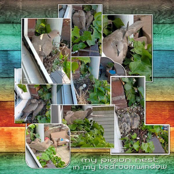
  38. Yes, I'm running behind, It's September already The background is from Jessica Dunn. Font Futurex Vayager. Last year I got a present from Mother Nature as a dove was breading in my bedroom window. An experiment to place different shapes made out of photos and add an edge around them. Father and Mother Dove are both breading by turns on the nest. So I figured it out. Father is having the night shift. .
    7 points
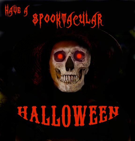
  39. Spooky Halloween Masterclass Lab 8-2 Shaped text
    7 points
  40. CALENDAR WORKSHOP 2022 -Lesson 5 (Sept-Oct) This doesnt count to my 10, because I dont know where the link is for this. it turned out to be my favorite one of that calendar workshop and it happens to be September.
    7 points
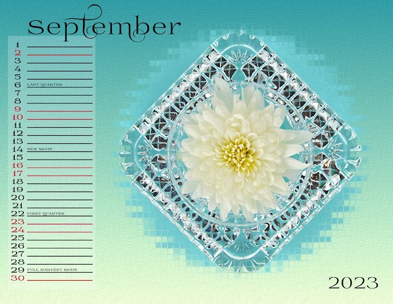
  41. https://scrapbookcampus.com/promo/double-page-workshop/lesson-5/ CALENDAR WORKSHOP 2023 - Lesson 5 (September - October) These masks are really cool looking, here is September.
    7 points
  42. https://scrapbookcampus.com/promo/double-page-workshop/lesson-4/ DOUBLE PAGE WORKSHOP - Lesson 4 Loved this one. My cousins farm is so preaceful (I was there when all the seeding was done, so no machines running), it's a special place.
    7 points
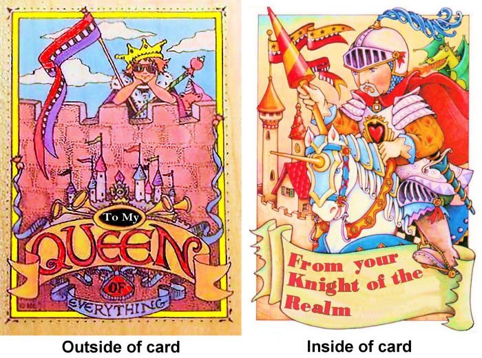
  43. Before I viewed 4 Tips to use with Text on Path, I tried to make text flow on a flag. I ended up just tilting each word separately, and it doesn't look very good. But the card itself, based on the art of Mary Engelbreit, turned out well enough to give my wife a smile.
    6 points
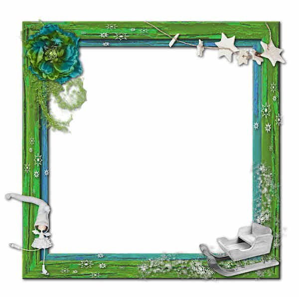
  44. We had a challenge in December of 2021 to create our own frames from slats of wood. Here are the 3 I made.
    6 points
  45. with mixed technics of "Text Workshop 2023 " all credits on my gallery
    6 points
  46. https://scrapbookcampus.com/workshops/vector/lesson-5/ Text on a path.
    5 points
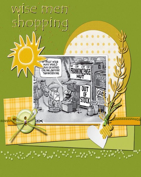
  47. In Dec 2021 we were tasked to do layouts with a shopping theme. I thought this was amusing... ?
    5 points
  48. December 2021: we worked with using a bounding selection box to arrange text on a layout. The thing to remember is to be sure to duplicate the text as a raster or it might disappear when posted.
    5 points
  49. Lab 11 Module 3: colorful banner, sun shape and a stylized flower (which I've really had fun with including expanding that flower)
    5 points
  50. Still in Travel Challenge 2023 - because of the length of the trip, I will be working on it well into October. As usual, all papers and elements are mine - except the 2 RV's on the road - they are from PS Marissa Lerrin; The title font is Britannic Bold; the font on the journal strips are Black Horse (pretty sure it is from Creative Fabrica).
    5 points
×
×
  • Create New...