Leaderboard
Popular Content
Showing content with the highest reputation on 08/03/2023 in all areas
-
7 points
-
4 points
-
3 points
-
3 points
-
For everyone who struggled with the CRAC-Paste technique, I am happy to see that you worked hard at it. Some of you have "cracked" the code to make those cutouts. As I was thinking "Wouldn't it be nice to have a script to do it for them?". Well, guess what? There already is one. And even better... YOU already have it. In fact, it is a default script that everyone has! The name of that script is "VectorMergeAndCutoutSelected". See? CUTOUT!!! Just have both objects active and run the script!2 points
-
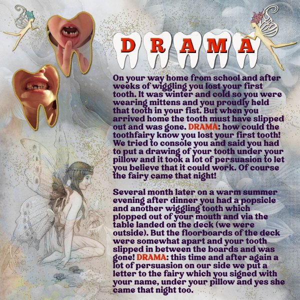
Corrie, that’s so cute! And such a gorgeous layout! Fairy dust, fairies, and you made your own teeth, too!2 points
-
She is almost 14 now and I think she remembers it, although it hasn't been mentioned lately. I have been grinning to myself all the time writing this story down.2 points
-
As soon as I saw the theme I thought of my oldest granddaughter and the dramas we had with her when she lost her teeth. At the time of the stories I happened to be visiting my family and I have photos of her when she lost 2 of her teeth. The background paper is Inked Florals DD 10048 which I have in my stash and I blended in the Fairy from Grunge-Forest-Fairy-Junk-Journal. I used the freebie from this theme for the title and thanks to the Vector Workshop I made a shape out of it and filled it with a part of my photo. In this manner I can use my photos without her being recognizable! Two more fairies by Sheila Reid - enchanted purple (and teal) hair fairy on Digital Scrapbook and a gold dust tube.2 points
-
2 points
-
I've been working on the creative scrap tutorials and I love how this one came out. The first one was adding noise with monochrome checked which was cool. But then I did it with monochrome unchecked and what a nice surprise!1 point
-
1 point
-
I have worked most of the day on this shape. I just couldn't get it to save as a preset shape. I was practicing the CRAC Paste for the open eye, and the cut and remove part for the closed eye. All were on separate layers. Then trying to export as a shape. At first all it did was export the individual layer shapes but call it the name of the shape in the shape folder. Then I went back and looked at the instructions in project 2 for saving a 2 layer label and found that you had to group the layers and name the group the name you want. Did that. No luck. It wasn't until I had deleted the brush name from the shape file, and then went back to my pspimage on the group layer and then export it that it finally worked.1 point
-
Sorry to read about the recent losses of Ann and Julie.........virtual hug from here fo you both!1 point
-
1 point
-
Michele, they are both beautiful! Sometimes, I also uncheck the monochrome and will choose the one that fits the layout better. I remember Carole saying a long time ago that it was by chance she discovered this technique. Lucky us!1 point
-
1 point
-
Rene all the best! I hope it will be the shorter option. Maybe we can do the scripting course together next year. In the mean time take good care of yourself, PSP is patient and can wait.1 point
-
Julie I'm sorry for your loss, but be assured that PSP will be waiting for you until you are ready to use it once more!1 point
-
I used Cassel's WordSlats script for this one. I started with a black background and ran it three different times for each row of text. Copied one on top of the other and moved it to where I wanted the second line of text to be. Using the magic wand selection brush inside the new words, I switched to the original layer and hit delete. Once I hid the second layer, both lines were on one layer. Lather, rinse, repeat for the third row of text. Finally, all three were on one black layer with the words cut out. I used the magic wand again to choose the black and copied/pasted into selection the picture of the woman on the rock. The font is Hobo Std which is what Carole used on her free samples.1 point
-
Thought I would go for an old photo album look for this theme. The photo corners are by Sheila Reid from PixelScrappers. The main font is Tomatoes (free from Fontspace), but I used Lazy Ride (free from FPTFY) for the numbers. I've had the background for so many years that I can't recall where it came from. Given more time, I could have created my own paper with everything I've learned in the Campus. Also don't know where the party pic came from. I've been doing a much better job recording the origin information in the last several years, but the old ones are from who knows where.1 point
-
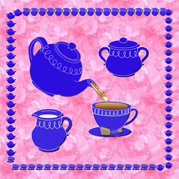
Mary, I just noticed your saucer is different brightness. How did you do that? Are your cut and saucer two separate objects. Same with the lip of the saucer, it's lighter. It's very cool.1 point
-
1 point
-
1 point
-
1 point
-
Julie, I'm so sorry to hear of your loss; doubly because I had a similar situation that kept me frozen on Lesson 1 also. Perhaps, together , we can explore those pesky nodes and enjoy the rest of the lessons in our own time. Take care. ?0 points
-
I did NOT fall off the face of the earth; it only felt that way. There was an unexpected loss of someone very close, and it knocked me sideways. Life has a funny way of skewering your plans. I was all set for the Vector Workshop, then BAM! I tried to watch a couple of videos and tried a few shapes, but my concentration was obliterated. But I did check in to see some of the posts that have appeared. So impressive. I have learned a bit more about working with those nodes, but I have to start now from Square 2. I think I have Square (Lesson) 1 under control. I need to get back in the game!0 points


