Leaderboard
Popular Content
Showing content with the highest reputation on 07/14/2023 in all areas
-
9 points
-
8 points
-
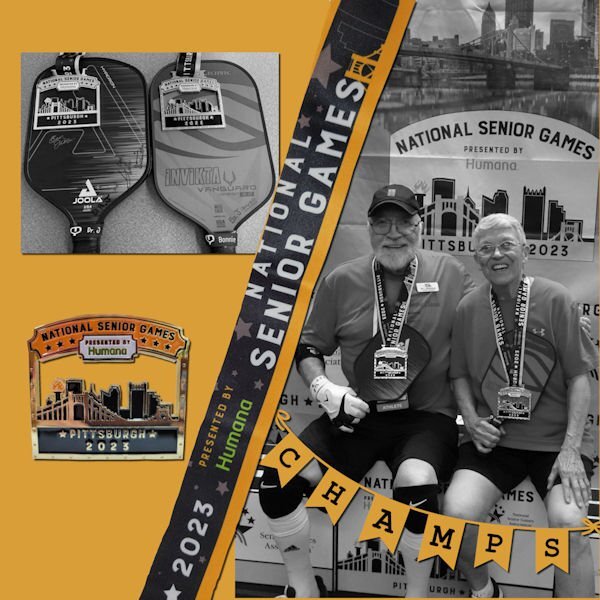
Playing with layers, cutouts, shadows, and Gaussian blurs. Sometimes creating something in the right dimensions for FB takes some work. The original painting is by Anna Ewa Miarczynska. The font is Black Chancery; I've had it so long that I don't know where it came from, but you can find it for free as it's in the public domain.5 points
-
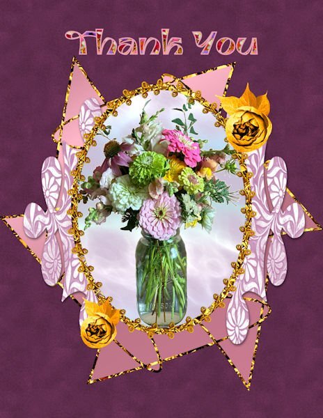
Yesterday, a dear friend brought me this beautiful bouquet. I decided to make a "thank you" card with an extracted picture of the bouquet. I used Adobe Express to extract the image since I have found that Adobe Express does the best job of extracting that I have found. I used vector tube to make the oval using the cass tube, gimptrim2 and under that added a circle filled with one of my gem glitters. The patterned shape is a preset shape filled with one of my patterns. I made the shape in back using the preset star with a little node moving, filled with a gradient and stroked with my glitter gel. The roses are from a package that I purchased and changed to gold using the gold tutorial. The mask was made using rastertomask, and the background for the vase is from Filter Forge. The font is Ambidexter filled with a seamless flower pattern that I made with the cass seamless pattern script. I tried to make a velvet pattern from the tutorials, but wasn't very successful. I am loving all my scripts which save so much time. I am learning so much!3 points
-
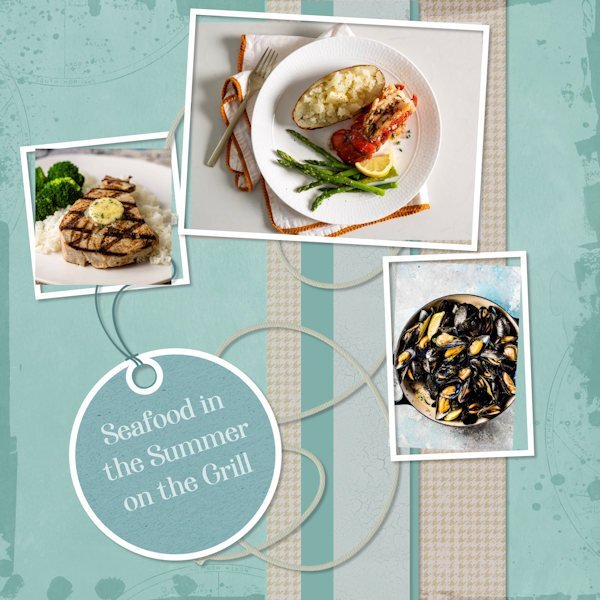
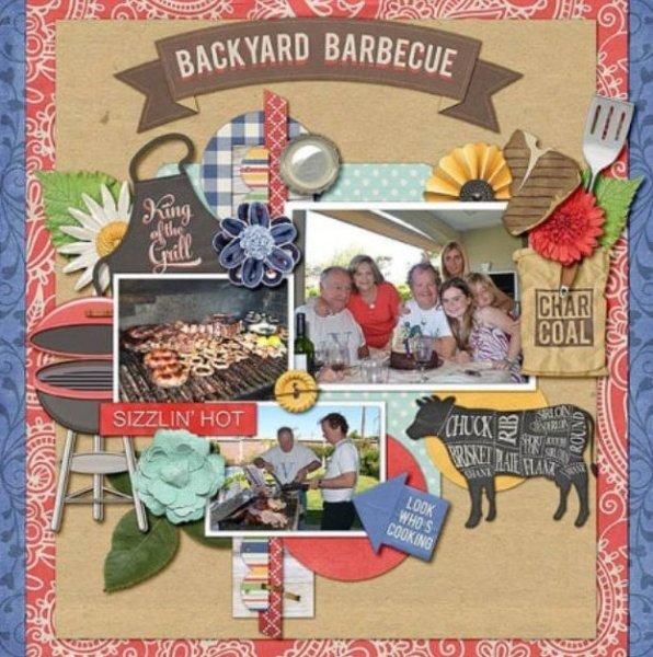
I was glad to see something I could work on with this scraplift. My layout is loosely based on one of the grilling examples in the July theme (as pictured). I was more interested in colours than in theme. The edge overlay is from Billie Irene at DS; the photos all come from online; the tag and string are from my stash from DS. And, I do adore seafood, cooked on the grill or any old way.3 points
-
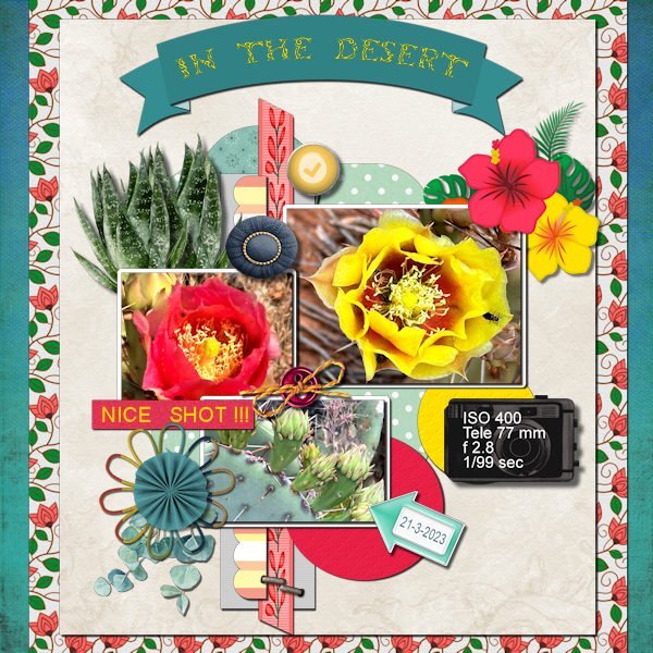
This is the layout I choose for this scraplift and the result. I had a hard time choosing one of the 8 layouts given and in the end I choose for one a bit out of my comfort zone. Mostly my pages are not so busy. To get all the colors working together I used the Hue Map a lot. Thanks to the Q&A of last weekend I finally know how to use that map, it was an eye opener and now it so easy to use!!! I didn't made all the papers and elements myself but used the things I have in my stash or had made on another occasion. The photos are my own and a lot of the papers/elements I used are from Marissa Lerin and from a blogtrain (May 2021). The fonts are Arial and Tribal Case for the title in the banner. Had I realized when I started that it was a lot more work then I anticipated I probably would have gone for one of the less busy layouts.3 points
-
Susan, that’s really interesting on the background remover removing it to a solid white color. Not useful for the bulk of our projects, except that picture of Magic’s tea party. With a white background, Ann Seeber could use the same garden background and set Magic’s pic to screen, I think, but maybe it’s multiply. One lets the background show thru white. I’m at the App Store, looking at Adobe Express, but being that shiny things capture my attention, I saw Adobe Scan + OCR in the same listing. “Oooh”, I think, “that sounds perfect!” Well guess what? I was looking for a trap because you had found one (IMHO) on that background eraser. You can do the OCR just fine, but you can’t *do* anything with it because it puts it in .jpg format - a picture of text. Might as well take a picture of it. Or .pdf format. Where you need to PAY MONTHLY for being able to manipulate the text. I’m thinking of scans I could take of text for my newsletter, but either thing, .jpg or .pdf would not be helpful since you know 99% of the time, it would be the wrong size for legibility, or too wide or narrow as a block for the amount of space. Plus I usually edit heavily because my contributors talk and talk… ooh, look how long this post it, ROTFL, !2 points
-
I went and downloaded it. Want to try out the background removing part but for now played with the AI generator which came up with a usable photo of an animal I saw outside my window yesterday but had no handy camera at the time. Score! ?2 points
-
I have had issues with staying logged in long before yesterday. One time I was on the site and came back less than 3 hours later and had been logged out even though I always tell it to keep me logged in.1 point
-
Yesterday, when there were some issues on the site, I could log in but there were certain features (like the Forum) that were not accessible. I just waited it out. Today seems OK.1 point
-
Some time ago I bought (on sale, good price) Affinity Photo for iPad. I really like it and use it with a stylus. But I just don't have the time to devote to watching tutorials on how to use it well. As you so succinctly said, I'd rather be good at one than mediocre at several similar programs. I especially don't want to pay a monthly fee for another I likely won't use much either. (Affinity Photo 2 is out, no fees involved, FYI.)1 point
-
I checked it out earlier, and I'm just not sure I want to invest the time to learn it. I'm still struggling with many aspects of PSP and not sure my brain can handle yet another new learning curve. They do have a free "upload" feature which takes the image and removes the background for one, but not sure how good that is.1 point
-
that's my problem, I see something or someone talks about something new and shiny and I just have to have it. then I never use it. It's my downfall. I'm trying to narrow my learning for a little while and learn what I need to learn even when I dont know I need to learn it. hahaha, both of us with similar names (and similar last names) are quite wordy. that's hilarious. I'll be quiet now...because I have to go to work. But you can sure, I'll be talking a lot there.1 point
-
I'm more with you. PSP will get better and more than that, I will get better at using PSP's tools. I feel the same, it's another program to learn, taking me away from PSP. I dont want to be mediocre at several programs when i can strive to be good at one program. It's one of the hardest lessons I've had to learn. I'd have saved a lot of money if I'd realize that sooner in life. If someone is familiar with the Adobe products already then it's a no-brainer for them.1 point
-
Grace, welcome to my world! Hahaha. I was just getting ready to post about Adobe Express….not sure how I got here!1 point
-
Suzy thank you, and about childbirth hurts that is something that happened to me a long time ago and I have forgotten all about it. But the effort was well worth it, childbirth and layout birth ?1 point
-
Corrie, your busy layout is exceptional! I really love it, and I think, when time passes, you will be glad you spent that time. Sort of like forgetting about how much childbirth hurts a few months after the fact. ☺️1 point
-
Susan I have the same problem. I already have an Adobe account from way back when I needed one for reading ebooks but I never looked at Adobe Express. So now I did but like you I find that I have to learn a lot and I don't think I have the time nor the gusto to study a new program while I have so much more to learn about scrapbook. For the time being I stick to PSP. Maybe if you and others are getting exceptional lovely results I''ll change my mind1 point
-
I tried the Adobe Express. Some learning required. I managed to make an extraction, it did pretty good. Only I cant figure out how to get a transparent PNG, it puts it on a white background. I did my own extraction to compare. Mine does result in a larger size, but it's sure fast to do it with Adobe. I just need to learn yet another program. ugh. Now that I have a shiny new Adobe account I should take the plunge and download Bridge too. When will I have time for PSP.1 point
-
Thank you, Suzy. I love glitter, and I love to fill in my text with patterns. I used the cass script seamless patterns for this fill with my own flower pics. There is an Adobe Express for your desktop. I think it includes some Adobe Stock in the free version. As long as it is free, I will use it. Adobe programs are really expensive and not worth it to me, but I do have PSD 5 which comes in handy at times.1 point
-
No. If you want to apply the technique to something else, you can but this is not a "scrapbooking" workshop, at all. Only one lesson will use a photo but you might actually prefer to use a stock photo for the particular technique anyways.1 point
-
The free Adobe Express is limited, but sufficient for me. I see no need to pay the $10 per month at this time.1 point
-
Adobe Express is free? Didn't realize that. Nice gold glitter, Donna.1 point
-
I would love to join in but I have too much going on next week and would not be able to devote any time to it. I'll look at the workshop when it is posted in the Diamond area after things settle down for me.1 point
-
I'm always blown away when I see your layouts. this is really beautiful. I did a layout recently where I had turnd off the frame layer to see something and saw that the shadow layer on it own looked better than having the frame layer. Your frame also has a beveled look, is that because you used cutout. I dont quite understand how to use the cutout even though i think I used it in some of the tutorials. So much to remember with PSP.1 point
-
1 point
-
Thank you, Susan. I love glitter, too. I made a set of them for my Build a Kit. Definitely look into Adobe Express which is free for now and has so many options. My gem glitters were actually made in Photoshop and converted to PSP. You can change their colors using the blend mode or hue and saturation.1 point
-
Julie nicely done and your colors go very well together. I too found it difficult to choose a layout for this scraplift.1 point
-
That is great. It looks like an advertisement for a restaurant. Really good design Julie.1 point
-
I will try. I'm shooting flowers this week, they are colorful so it will be fun trying to change colors and see how they turn out. I'm shooting on Black, white (for easy extraction if I want) and on grey (for blend modes). That is if they turn out okay. Tripod, cable release and manual focus...YIKES!1 point
-
Well I never had such a thing for my birthdays or those of my kids. My daughter did themed birthday parties for her kids when they were living in Switzerland but I haven't heard about it now they are living in the States. Of course during the last couple of Corona years there weren't any parties.1 point
-
I = Impatience when you have to wait till the charcoal is hot enough to start grilling (if you don't have a electric gas bbq)1 point
-
1 point
-
Donna like most of us I have a couple of premade cards to use when I need one quickly, because I had forgotten some ones birthday. They are mostly in landscape format and I always have them as a PSP file so I can change backgrounds, colors, photos, names etc as needed for the occasion.1 point
-
Michele I hope you will have many more happy accidents when playing with a layout! This one is stunning thanks to the colors.1 point
-
that is a good idea. then I'd make a duplicate and make the quick page from the duplicate. But I would not put any text on the quick page, that would be added after, according to the occasion. Since I am notorious for forgetting birthdays I don't have to worry about making a quick page for such occasions. ?1 point
-
Actually, since Facebook will fill in the left and right sides with a complementary color, I find my square layouts don't always look the best. I'm going to transition to Michele's suggestion of 3000 wide x 2000 deep since Facebook doesn't fiddle with them in that format. It seems it insists on landscape format for the ratio. Not sure about iPad or moble because i rarely use them for design. When our company started putting out an emailed newsletter I discovered that over 80% of the subscribers were using their mobile to view our art so the platform we used would design for that format.1 point
-
1 point
-
1 point

Resized.thumb.jpg.d25811db03a63358cedab1e79f527635.jpg)


