Leaderboard
Popular Content
Showing content with the highest reputation on 06/23/2023 in all areas
-
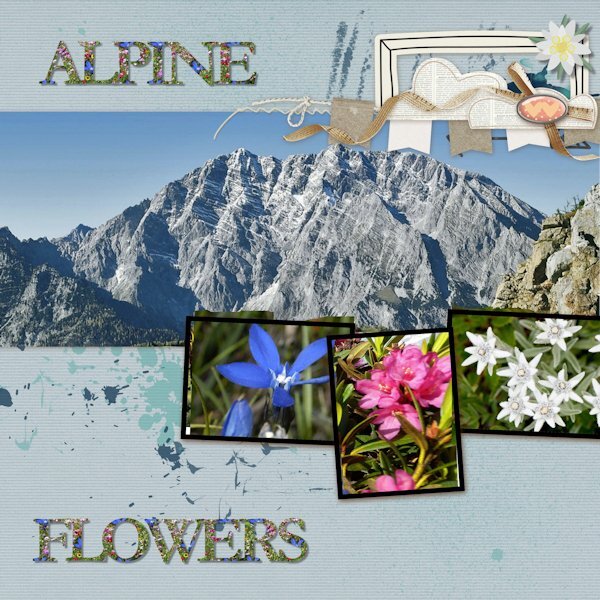
Here is my QP - Day 4 I selected an Alpine Mountain photo and Alpine Wildflowers for Day 4. Photos are from Pixabay and Creative Fabrica. The font is Garamond and I it took me a while to find a photo of a meadow filled with Alpine wildflowers.The one I found did not have the blue Gentian (Enzian) so I copied the one I had and added it to the meadow. The other 2 flowers are Alpine Rose (also called Rhododendron) and the Edelweiss. Instead of color for the font, I used the pattern and chose the meadow, then added drop shadows.13 points
-
you have all done a great work with the quickpages here is my day 4, I used snowflake brushes in two colors and blends them in the background, and a snowman picture tube12 points
-
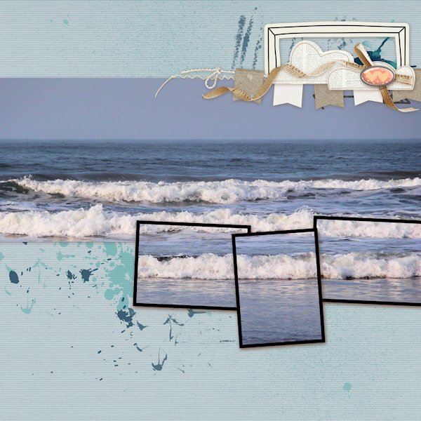
I had to be away from my computer yesterday so am catching up today - it was a joy to look through the posts I'd missed to see all the amazing layouts. My day 4 project has no tweaks! It also only uses 1 photo. I discovered that my photo showed into all the frames and fit just fine so I ran with. The photo is one of many I took of the sea when I lived at Saltburn on the NE coat of England.11 points
-
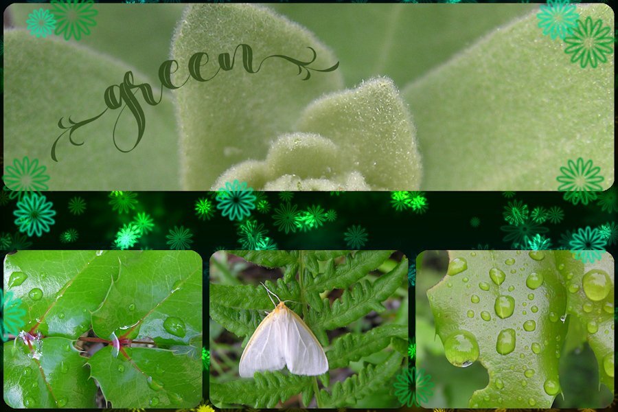
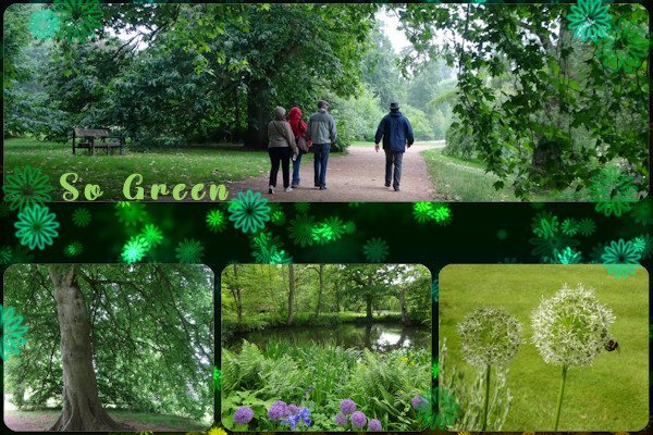
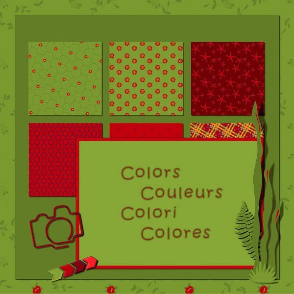
QP-Non Scrap-4 I copied others and went with a green theme with old photos I havent seen for more than 10 yrs! I used Beauty Nature font again. (Creative Fabrica). I like this format. it's a challenge to get the the photo right for the top rectangle. In playing around I used a very small portion of the plant and learned I dont always need to have most of it showing. I'm happy with the results and the photo's didnt look too bad for being low res.11 points
-
10 points
-
I couldn't find suitable photos for this commission. so I had a look at my stock scrap kits. I have first resized the original as I'm used to working on smaller boards. I played with some scripts (got the most from here) number 1 is the original, and number 2 is photo edges, number 3 is the dot method.10 points
-
I've made some progress and reached it in 40 minutes. The delay was in the sizing, it was in % instead of px. So it takes such a long time before I found what it was other wise I had been finished in 5 minutes. But the pics were png images so they needed a background. Underneath the wedding rings is a homemade TEXTURE. I'm very proud I have made 5 textures now. So altogether it takes a bit less than 1 hour.8 points
-
8 points
-
8 points
-
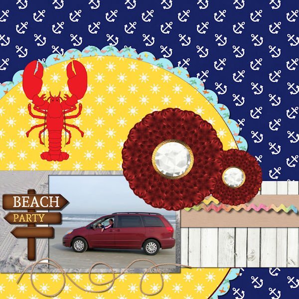
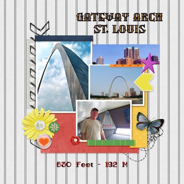
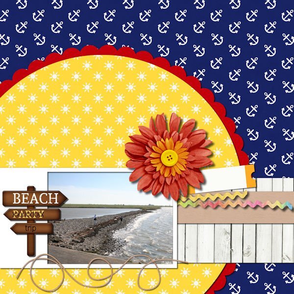
I am just getting to page three, partly due to beautiful weather and partly due to taking so long to decide on pictures. Beach Party is a picture of our van on the beach in St. Augustine. I changed the flower to two of my own from my build a kit. I changed the background under the van to sand from one of my own photos. The lobster is a Summitsoft clip art. The St. Louis Arch pictures are my own photos. I changed the little houses to a picture of buildings in St. Louis. The top font is an olf called Silverblade and the lower font is sailor bold 1 grunge, a Windows font.7 points
-
7 points
-
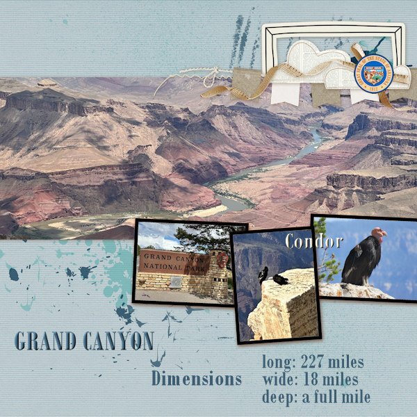
The only thing I changed was the button in the righthand corner, I used the great seal of Arizona instead. The close-up photo of the condor is from the internet but the photo of the 2 condors is mine, they were perched on a cliff and you can imaging that it was impossible to go near them. We were lucky to have seen them at all and the other visitors including us were pointing at them and going WOW!!! There are not that many condors, the park is in the proces of relocating them to their original homelands. Added the text, font is Bodoni MT7 points
-
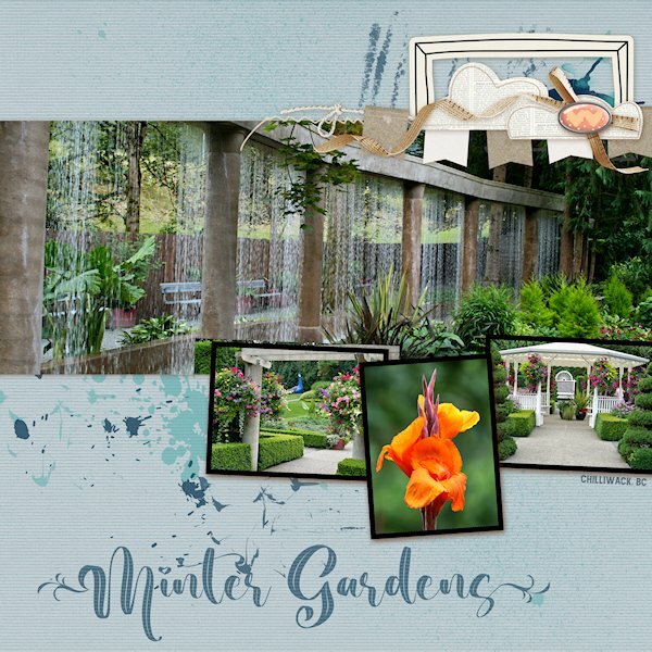
QP Lesson 4 I'm still doing a deep dive into old photo files. This was (and is no more ?) a garden close to where I lived in BC. It was a beautiful place to walk around even without a camera. It was very peaceful there. I did not change anything on this layout and only added text. Fonts: Beauty Nature and Amnestia Normal (creative fabrica) PS Beauty Nature has some nice glyphs, it's described as a "leaf" font. I used a glyph on the first and very last letters. It's from Creative Fabrica I believe.7 points
-
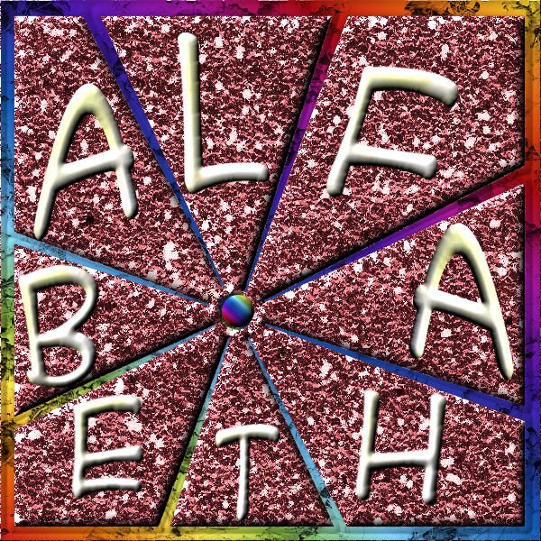
I was not intending to make this one but I was practicing making TEXTURES. So I was looking into my stuff for a suitable application, and I bumped into this one. Someone had placed it here and I downloaded it. It was very terrible working. When I selected one section all were selected. Advanced this came out of all my creative possibilities. YOU DON'T HAVE TO LIKE IT ? As I don't have a FB account I can't download from that source.6 points
-
5 points
-
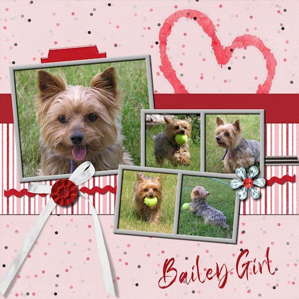
QP Extra 4 This time after choosing too many photos because I couldnt decide on something that reflectected a love theme. I found My brothers dog Bailey. This dog is little, but she's big on the inside. She will play fetch for as long the humans can stand it. We looked after her one weekend and had lots of play time. I didnt do anything to the photo's just plunked them in and erased the necessary parts and added a title...it truly can be quick. Font: Klasted (Creative Fabrica).5 points
-
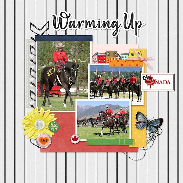
QP Lesson 3 More from the RCMP Musical Ride. These are some warming up shots and one just before they get lined up to parade in to the arena. I used extra elements from KMRD-The great White North (brad 1 and CANADA with Maple Leaf) Fonts: Afifla (words 'Oh' & 'Eh?') and Aesthetic Violet for the the title, both from Creative Fabrica.5 points
-
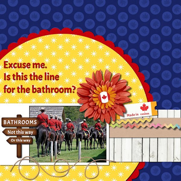
QP Extra Lesson 3 I managed to get one made today. Came across some old photos circa 2005 (pre-DSLR days) from Ft. Steele Heritage Town in the Kootenays (British Columbia). I used the brush tool to put circles over the anchors as it didnt fit. I added a maple leaf to the circle for some texture. Changed the sign (I used the clone tool) and added a few Canadiana items. I had fogotten about these photos and laughed when I saw this one. Looks like they are all lined up for the bathroom. Font is Acme, I think it's a google one that came with my font viewer. Onto the other lesson 3 QP.5 points
-
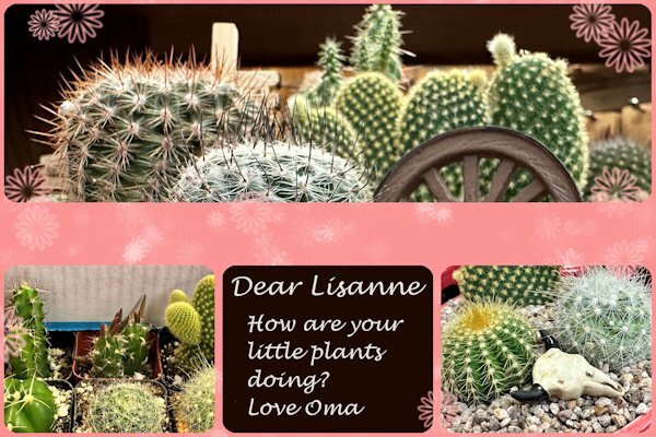
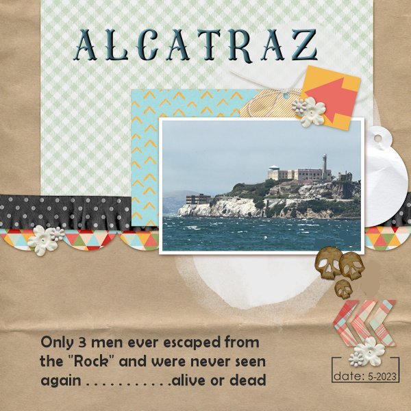
For Non-Scrap 4 from yesterday I used some photos I took because my youngest granddaughter asked me to do. She loves and takes care of all sorts of plants and animals! I changed the colors of the template because the colors of the photos didn't get well with the vibrant greens of the template. I turned this into a card which I'll send to her. QP 5 Extra has again a photo from my trip and when I was in San Francisco I saw Alcatraz in the Bay. Even from a distance it looks so formidable and threatening! I made a small alteration of the template, b there were little hearts which I replaced with some skulls; this is no place for hearts!4 points
-
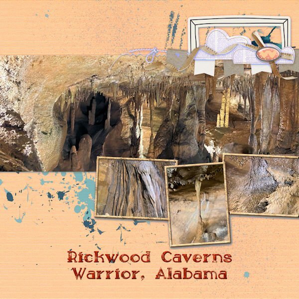
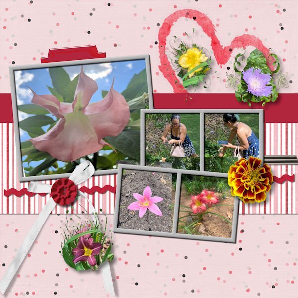
Day 4 is an homage to my daughter who has seriously started taking pictures for me, including photos for just texture. The first one has pictures of the cave at Rickwood cave in Alabama. She remembered how I love caves. I made a texture from one of the photos and used it to fill in the picture frames. I also changed the color to be more compatible with the pictures. The second one is of Beth taking the photos at the Botanical Gardens near Birmingham, Alabama and some of the flower pictures that she took. I added the marigold flower from one of my own photos. I used masks that I made for some of her other flower photos and added them.4 points
-
4 points
-
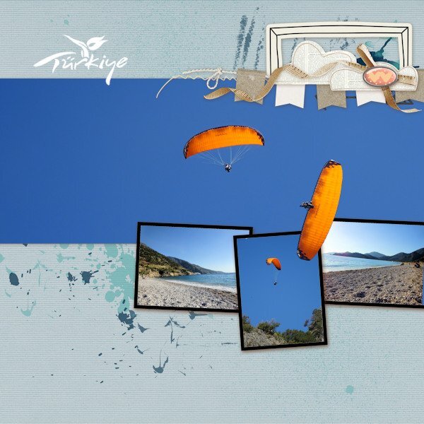
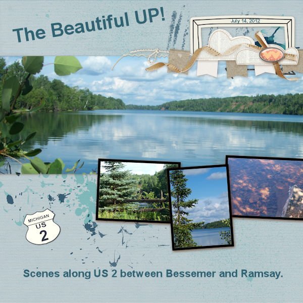
I've just managed to create one page so far for Lesson 4. This year we had a short but lovely holiday in Turkey. On the beach all day, the power gliders would be landing having taken off from the huge mountain behind us. The angle of the power glider image that I have placed on top of the frames is the actual angle he/she was flying...crazy guys. The Turkey tourism logo was a white on black background and using the 'Screen' blend mode in the layers palette it turned to a white logo with no background. Perfect!4 points
-
4 points
-
4 points
-
3 points
-
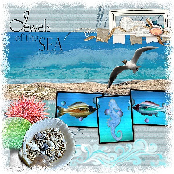
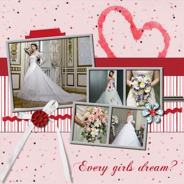
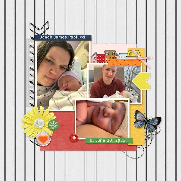
@Susan Ewart I had noticed such a mismatch when testing 2023. Maybe the same thing happened in 2022 but it was just on different fonts. That bathroom layout is so funny! Well done! Maybe you should post those RCMP layouts on FB and tag them! You might share some smiles for them too. @Jannette NieuwboerYou are adding a lot of work on that QUICK page! Lovely! The way you treated the Jewel from the sea layout is very creative and inspiring! @Ann Seeber I knew we would have a lovely layout about the baby!!! Good choice to show three photos! @MoniqueN. Small additions make the project totally unique! Beautiful bride photos for that layout! With the Chopin font, check to make sure you don't have a stroke, because it is so fine. You managed very well with the page you didn't like! @Julie Magerka Yes, it is QUICK but that excludes selecting the photos! ? @Mary Solaas Beautiful flowers! Did you align the letters one by one to fit between the lines? @fiona cookIt is so cool to see that glider out of bound! @Corrie KinkelGreat way to showcase that Grand Canyon! And it is a good thing you didn't go closer to the edge! @libera The font for the Congratulations is a simple Brush Script. Do you plan to add photos to the quick-pages? @Anja Pelzer It is interesting how the whole layout turned wintery with the photos and added snowflakes! @Suzy Being creative sometimes means being inspired by others! Creativity does not always come from nowhere! Keep them coming. Keep inspiring each other. There are still several days and projects to come!3 points
-
3 points
-
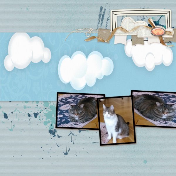
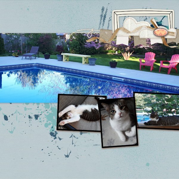
QP - 4 Choosing pix is the longest part for me, but this time I had some on hand, taken by friends whose house, yard & cat this is. Kitty, unfortunately, doesn't get to go out there but she lazes away in the screened porch & watches birds. I added nothing extra b/c I'm enjoying having this be "quick" stuff.3 points
-
3 points
-
3 points
-
3 points
-
Day 2 and 3, again both again from my recent trip. I have so many photos that didn't make it in my album, so lots to use in the coming months. I must admit that after being away and not doing much scrapping I'm a bit rusty and have to think about how to do things..... I must be getting older! The fonts are Wiskey Cool and Better Brush.3 points
-
3 points
-
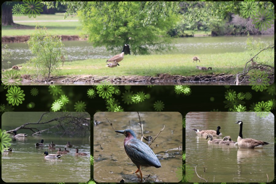
And now for that green extra on day 4. I changed the color of the original elements with Hue Saturation Lightness with the Colorize option. That was fun. These are pictures I took one day when my daughter and I visited our favorite park. The geese and the ducks are with us always, but occasionally we find one of the heron family there. This day we were lucky and saw a green heron (yes, I know he doesn't look green, but we looked him up when we got home.)2 points
-
2 points
-
Love it. I was there in St. Louis when they began the arch and the surrounding park.2 points
-
I love particularly the raindrops on the leaves. I took many photos with raindrops on flowers. trees and so on. It is an absolutely fascinating effect.2 points
-
Eine gelungene Abkühlung in dieser Hitze, Anja ? A nice cool down in this heat we have in Germany.2 points
-
2 points
-
2 points
-
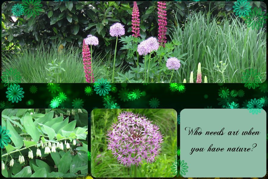
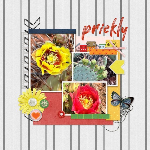
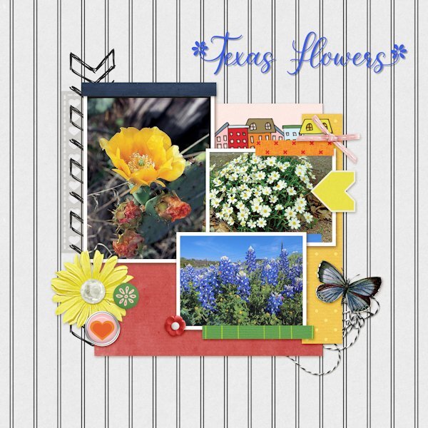
Here is my QP- Day- 3 project. It took me only 15 minutes finding, selecting, and pasting the flower images in the QP template. The flowers shown are: Prickly Pear Cactus, Blackfoot Daisies and Blue Bonnets. I used the eraser brush on overlapping parts. The font is Spring Flowers from Creative Fabrica and that took me a bit longer. I used the font’s glyphs for the letters T and F.2 points
-
2 points
-
2 points
-
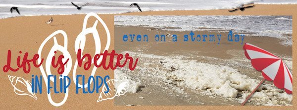
had fun filling this page, I used some picturetubes on the sand and picture I colorized the text in the colors from the photos2 points
-
2 points
-
2 points
-
The photo is of my husband, but we both went up the arch. It was so exciting! You don't have to walk; they have little cars that take you to the top.1 point
-
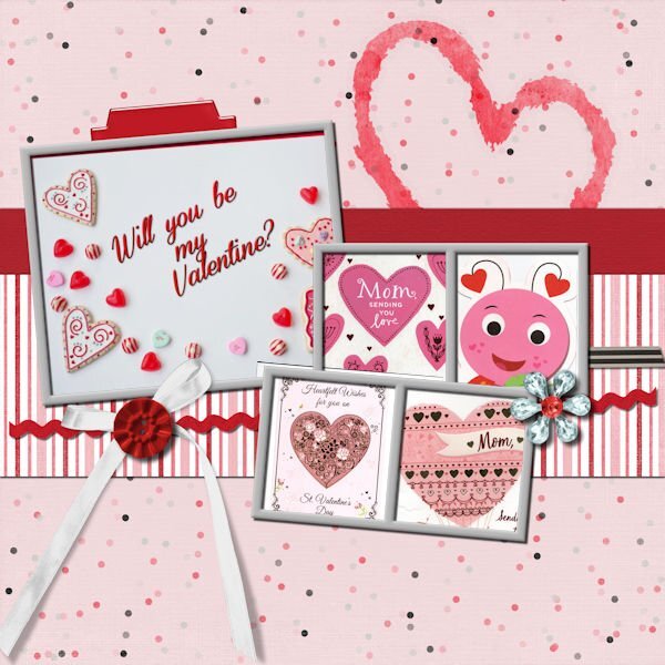
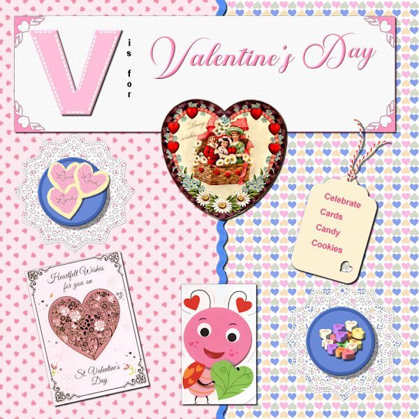
Bonnie - love your ice cream pics and layouts! Makes me drool for ICE CREAM! I decided to go with V is for Valentine's Day. (There are too many places I like to go to for vacation - mountains, sometimes the beach, family members in the north, the south, the east, the west; route 66, route I-90 (from the east coast to the west coast) - would take a whole album to do those vacations! So here we are with Valentine's Day. Cassel's heart punches on the corners of the title paper; I made the cookies and bought Cassel's script for tube icing since I wanted icing that was not just flat - used the sprinkles I made in one of the labs for the word Love on the cookies; used the picture tube for the heart candies; used the plate in the basic course, made the doily in one of the labs; made the papers; Cass-zig zag ribbon in white which I (of course) colorized; the valentines: the old victorian one was from PS - Janet Kemp; the others are scanned images of cards I have received; made the tag in one of the labs, as is the string attached to the tag. And of course, Valentine's Day is celebrated with cards, candies, cookies, cake and whatever sweet you can give your "sweet".1 point
-
1 point
-
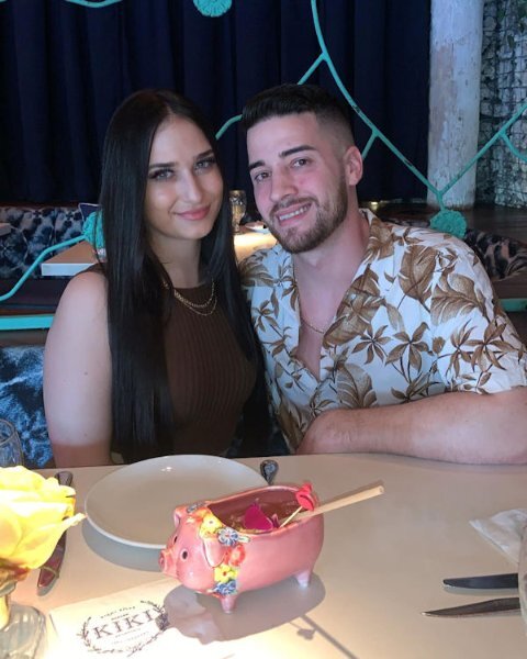
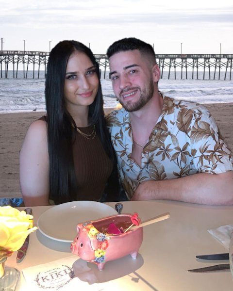
I was reviewing the Back Off Master Class when I realized with the newer versions of PSP we have Artificial Intelligence built in that promises to change backgrounds easily. I tried it with a photo of my grandson, Brad, and his girlfriend, Livia. The original background was quite dark and I replaced it with a beach scene offered by my PSP 2023 Ultimate. Here is the original and the digitally changed version.1 point


