Leaderboard
Popular Content
Showing content with the highest reputation on 06/21/2023 in all areas
-
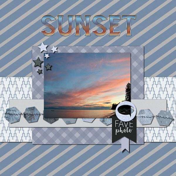
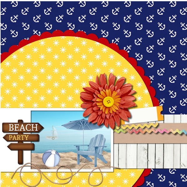
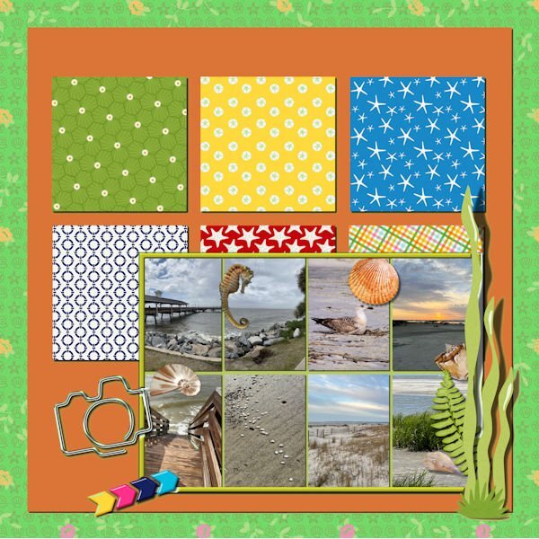
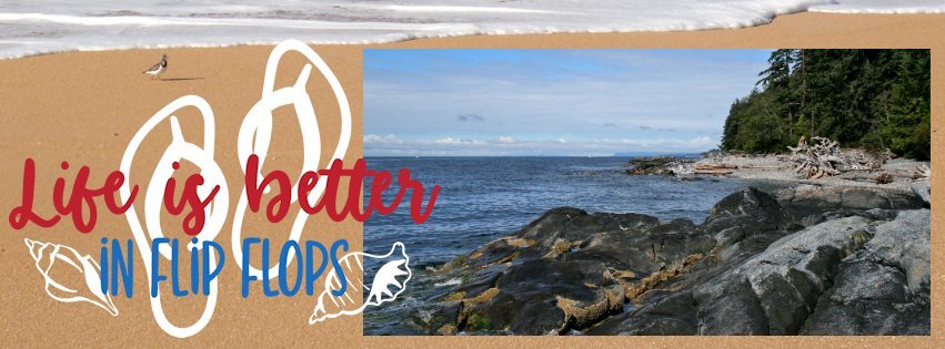
Quick Page Xtra - Lesson two I did so much stuff to get to this color (for the Quick Page) that I wouldnt be able to replicate it. I just tried different tools to make changes and went back and forth to see where it would go and ended up here where I liked it. I did duplicate the QP and added a blend mode and ended up with a nicer blue than I had and a whiter white on the one paper. I tried to use the see-through-letter technique which I used recently with no problem. today the outline misaligned everytime. I ended up getting it to work a different way so I could add a bevel to the outline. I've done it several times with no issues, but tonight I must be missing something. Photo is from the same beach as the other quick pages. Font is Amnestia Normal (Creative Fabrica)15 points
-
12 points
-
11 points
-
11 points
-
11 points
-
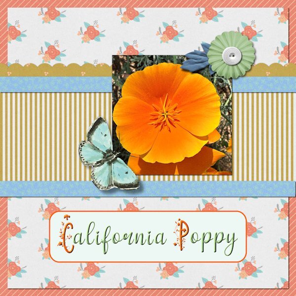
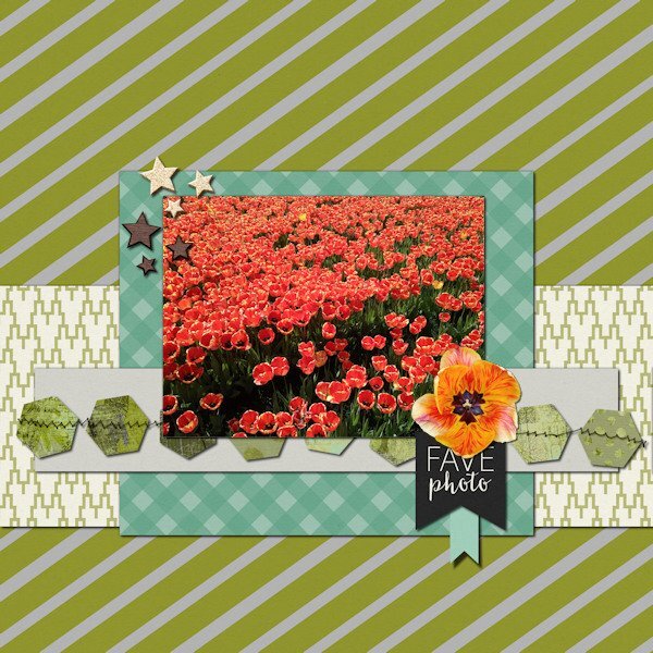
I'll be there too, although like Ann (and Mary?) it is not for the first time. My photobook about my recent trip to California is almost ready, so time to start on something else and easy now. Well I just have sent my book to the printer's and I expect it back in maybe a week or so. There are made already a lot of nice layouts, to much to comment on and Ann congrats on another great-grand!!! Here I used a vibrant orange California Poppy to complement the oranges in the QP. It is already after midnight, so I'm of to bed!11 points
-
10 points
-
10 points
-
10 points
-
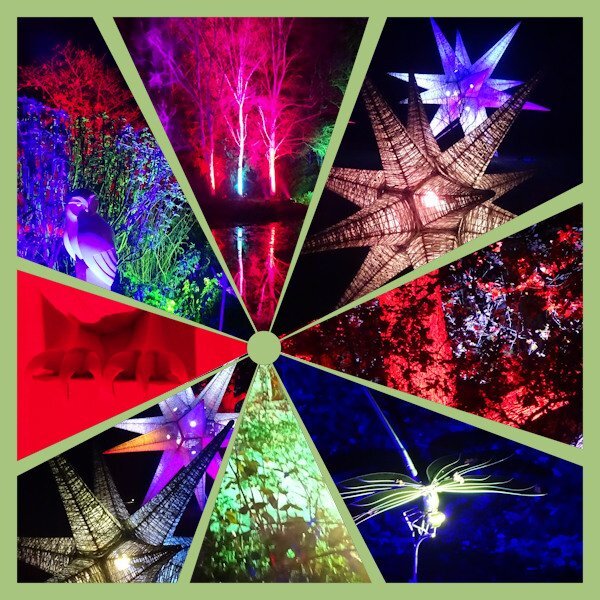
I have had the same trouble as Mary with downloading the Facebook header template but I have been inspired by kasany and the collage. We visited RHS Rosemoor garden in Devon, England, last winter when there was a 'Glow' event. All the trees and ponds were lit up. I took lots of photos and was wondering how to create something from them. Here's the result today. It took much more than 5 minutes but I used the point to point Selection tool and inverted the selection to delete the excess as an alternative to the eraser tool in this case.9 points
-
9 points
-
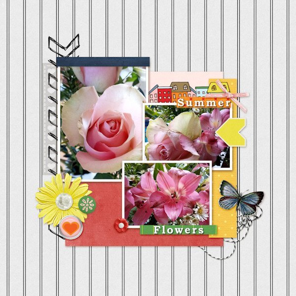
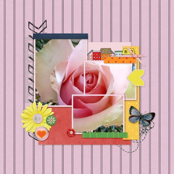
For my Lesson 3 I made two versions as I discovered by accident that I liked the one rose image covered by the three frames. Following Susan's idea previously to change colours, I used the Colour Changer fill tool on the background to match one of the pink colours in the rose. (I notice it has coloured the frames as well!)9 points
-
9 points
-
9 points
-
8 points
-
8 points
-
7 points
-
7 points
-
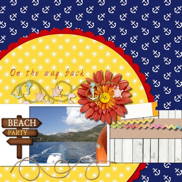
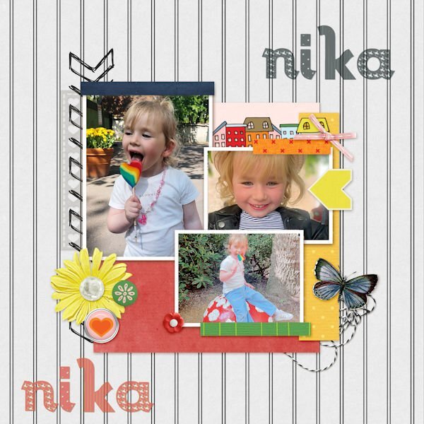
This lesson was absolutely not done in just 5 minutes. Looking for three photos and making them fit was a lot of scaling and cutting necessary. ? The first photo is from my granddaughter Nika, the happiest child in the world as long as her mom is around. Iv made a shadow of her name and used the shade on the top, as there is a lot of space extra. The second photo was just a photo of a sand beach and sea. So dull in my opinion. So I placed a little boat in the sea and some beach attributes in the sand. The chair is empty as the person is gone to the party.7 points
-
6 points
-
6 points
-
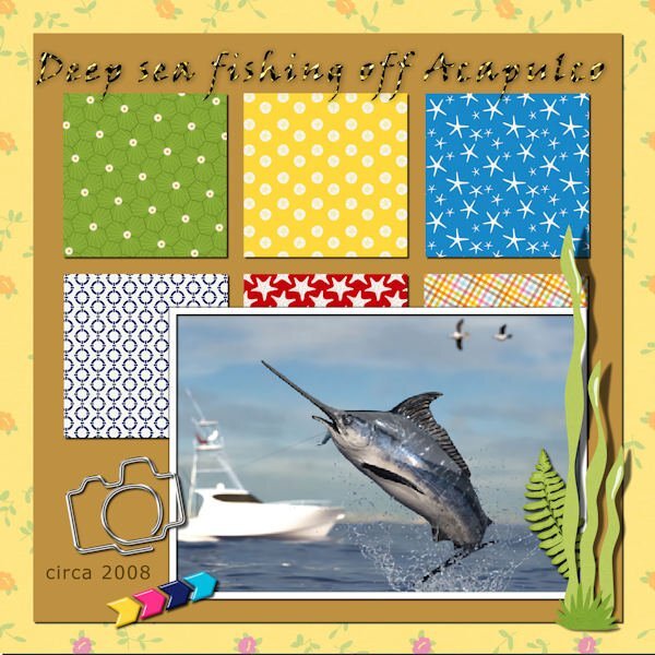
QP-2 - Part 1 - Deep sea fishing off Acapulco. Since that was the only place we went for vacations (we loved being pampered by the "beach boys" ?) we had to try all the activities there. We went deep sea fishing and hubby, Fran, and I, each had a rod and a chair. I reeled in my fish but he had trouble. So I had to reel in his, also! This was sort of ridiculous as I weighed about 110 and he was topping 300. Whew!6 points
-
5 points
-
I think it was Ann Seeber who used the AI background remover in PSP. I tried it with the same pic I used for QP-2 layout. It wasn't perfect, but it's much BETTER than anything I can do using the Edit Selection which always gives me grief and leaves me frustrated. This time, I can live with the results. Background image of "colonade" from Unsplash.5 points
-
5 points
-
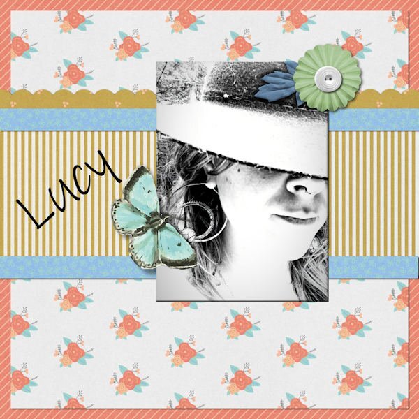
This time I did all 3 layouts for QP-1. First is a new bird at my feeder, well, actually, a regular but in a new color morph. Never saw an orange-headed house finch before but Merlin confirmed my sighting. This is the Merlin photo. The alpha is Fiesta from Annie Tobin-R.I.P. The text font is Ink Free. Second is the flip flop banner, featuring my daughter's flip flop birthday cake from last September when she turned 60. I used a gimp picture tube for the top border. Last is my granddaughter-in-law, Lucy, mother of Magic. I thought the black and white photo went well in the busy layout. I enlarged the photo area with my eraser tool.5 points
-
had fun filling this page, I used some picturetubes on the sand and picture I colorized the text in the colors from the photos4 points
-
4 points
-
4 points
-
4 points
-
4 points
-
4 points
-
4 points
-
4 points
-
4 points
-
4 points
-
4 points
-
4 points
-
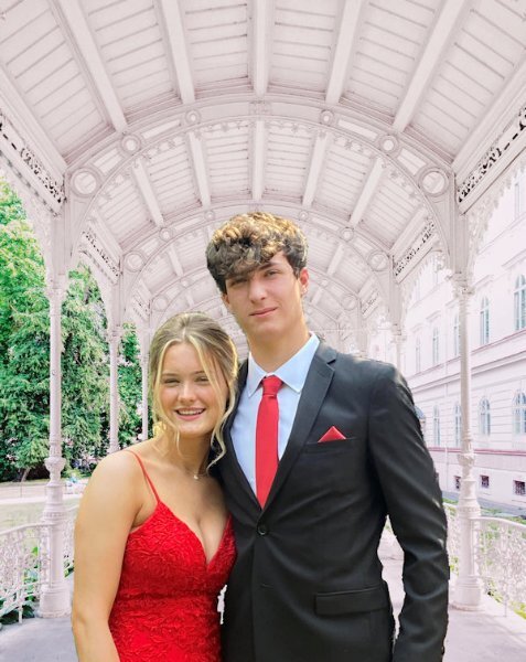
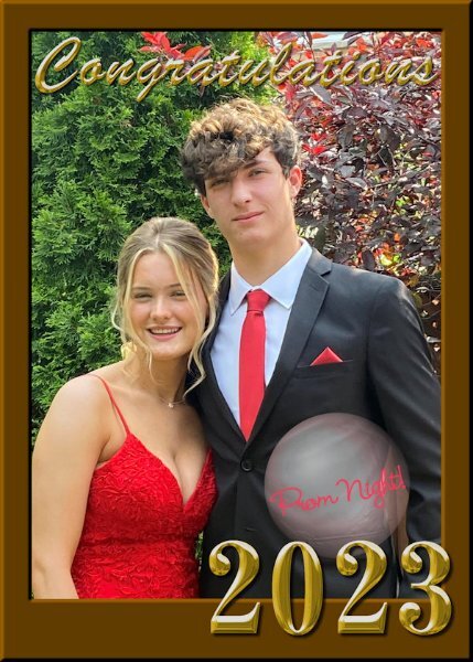
The framed celebration layout for QP-2 worked fine for a pic of my grand-nephew before the prom recently. I added a bubble to put some text in (Prom Night) to distinguish it from another type of celebration. I had tried previously to do something with this photo over and over and was never satisfied with the results. This was quick and easy, for a change.4 points
-
4 points
-
4 points
-
4 points
-
3 points
-
3 points
-
3 points
-
3 points
-
3 points
-
3 points
-
QP Lesson 1 Front used: Brush King Photo: mine from 2007, Visiting at a friends cabin in Gibbsons, BC. Also known as the Sunshine Coast along the Straight of Georgia. It is 31 kms from Vancouver, BC and 40 minute ferry ride...even though it's actually on the mainland BC and not an island. My friends cabin is right on the beach (Pacific Ocean) and this was one of the old cabins we came across while walking on the beach. All you could see was these three windows and bit of the roof, the res was covered in greenery.3 points
-
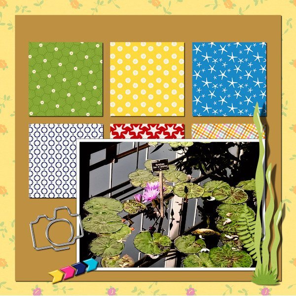
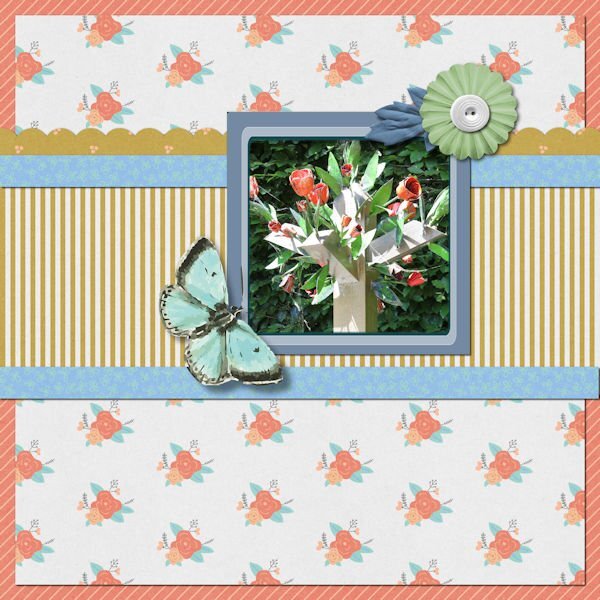
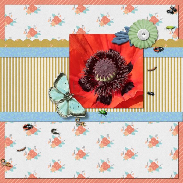
wow what an interesting insect, great use of the sketch here is mine, I used the warp tool to make the two papers uneven font is Underwater World3 points


