Leaderboard
Popular Content
Showing content with the highest reputation on 06/18/2023 in all areas
-
7 points
-
6 points
-
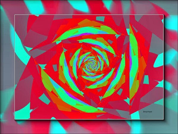
So, I made a layout using one of the fractal triangle papers, and the Koch Star mask. The picture was taken by my daughter-in-law Pam Solaas - she works in this show every year and took me to it too this year. Love it. It is known nationally and has been held for over 70 years in Germantown, TN (just outside Memphis, TN). The horseshoe I got from Creative Fabrica and made it into a paint brush and a picture tube. Also created the wood-burned element from the tutorial by Carole. The font for the title is Ballpark from Creative Fabrica some time ago.5 points
-
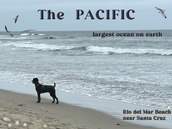
The last of my intro pages for my photobook. We went to the Pacific and it was a very hazy day with almost no one on the beach except some people walking their dogs, as we were. It struck me how empty and endless the ocean was. In The Netherlands we also have nice and sandy beaches bordering the North Sea which is part of the Atlantic, but you are always seeing ships - big and small! Therefore I choose a photo that represented this feeling and left it quite empty. Now I can assemble my book and get it printed.4 points
-
2 points
-
2 points
-
2 points
-
Love what you do, Ann. Seems like I'm going to have to play with that background replacement tool - My next OCD venture???2 points
-
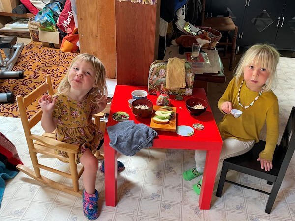
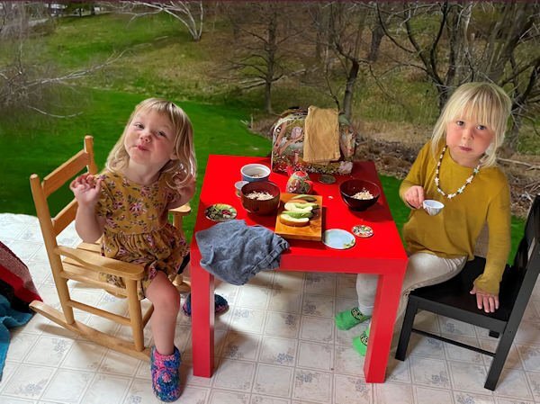
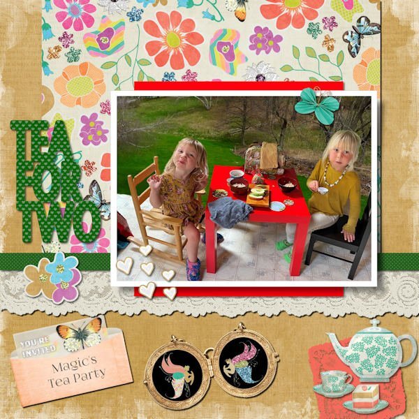
Unlike Michele, this took me two whole days! Deb sent this photo of Magic and her friend having a tea party and I couldn't resist using Janet Kemp's Garden/Tea Party Kit. Even the title is word art from that kit. I spent too much time changing the background on the photo. (Learning as I go here, this subject proved to be too detailed for an easy background change. I used part of a photo from my previous home that had a big lawn for the background.) This is probably more "scrapbooky" than my usual layouts but it seemed to call for flourishes! ?2 points
-
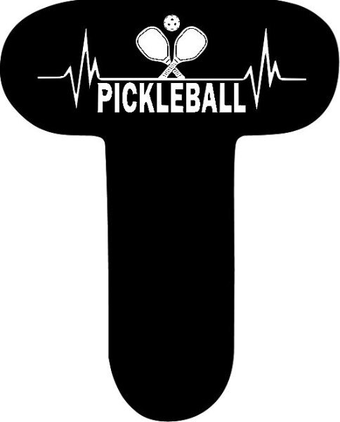
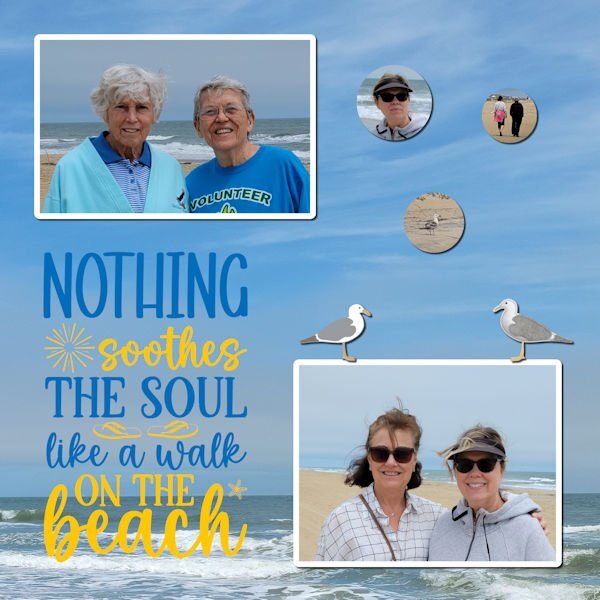
June 1 - 4 four of us went to the beach for a "girl's weekend". We had a wonderful time playing games, pickleball, walking the beach and eating ice cream. It was drizzley, cold and windy but they weather couldn't stop all the fun. 20 minutes away it was sunny and warm and we had a blast in a pickleball tournament. This layout shows us on the beach.1 point
-
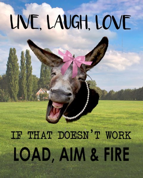
I downloaded a $1 special from creativefabrica (https://www.creativefabrica.com/product/animal-jokes-sublimation-bundle/)and this developed from one of the paged from that. The original one had a cute cow and no background. My 81 year old Sister has always loved the Live, Laugh, Love saying and she also aced her Concealed Carry shooting test. I sent her a picture of the original and this evolved from there. She wanted it made with a Jackass, but I think this is a mule picture that I have no idea where I got it from some time ago. I did add the bows and pearls so that it was obvious that it was a female. She loves it and is going to print it and put it in a 8x10 frame.1 point
-
1 point
-
What kind of "group" is it? Would they be interested in PSP? If so, invite them over here!1 point
-
I will feel a sense of relief, Ann. I've been doing this for almost ten years and the company that runs the game has pretty much given up on it. The only reason I keep doing it is for the loyal members of my group.1 point
-
1 point
-
Oh, dear, sorry to hear the game may be ending, though, I imagine, for you, it may be like me when the drive-in closes for the winter. I always feel a welcome relief from the ongoing pressure to create during the season.1 point
-
I played with it tonight. First photo when I clicked "done", I had the 3 layers (original, mask and ai background) on my workspace. I then closed the image since it was just a test. I opened another image, this time of my dog. Since there was no person I had to use the brush to make the mask. Got that done then selected a background. When I clicked "done", all I had on my workspace was my original photo. Since this was another test, I just closed the program. I don't know if this is the same as what Ann had, but I thought I'd let you know.1 point
-
I just posted the original in the files section on the FB page. Cant wait to see the script in action. I love concrete and have my eye on a chiped out piece on my steps that would make a cool mask. I'm happy to say I am a fully fledged texture-holic.1 point
-
Michele, so if we create on 3600 wide x 2400 long or 5400 wide x 3600 long, it should fit Facebook's parameters? (The only math I could do reliably is algebra! ?)1 point
-
I don't know what it is with me and "cute" pics this week, but that looks like the best ice cream date ever! The frame (it started out as a paper) is from a Scrap Designers Blog Train; the tricky part was changing the dimensions from 3600 x 3600 to 3000 x 2000. Facebook changed how it displays pics a while ago so if you don't change it, FB adds its own borders. I wish I had enough time to create more of my own stuff, but I only have an hour or two every day from inspiration to fruition. Anyway, I thought the frame really complimented the little girl and her puppy. The little waffle cone heart in the top right corner is from CF. I used two fonts, Summer's Ice Cream and Ferrero Rocker; the first one was all cones which I thought was too much.1 point
-
1 point




Resized.thumb.jpg.d25811db03a63358cedab1e79f527635.jpg)
