Leaderboard
Popular Content
Showing content with the highest reputation on 03/18/2023 in all areas
-
7 points
-
Cassel's St Patrick Template came in handy when I had to do a quick Daily Look for my gaming group. I really hate when I don't have time, but Cass saved the day!5 points
-
5 points
-
5 points
-
5 points
-
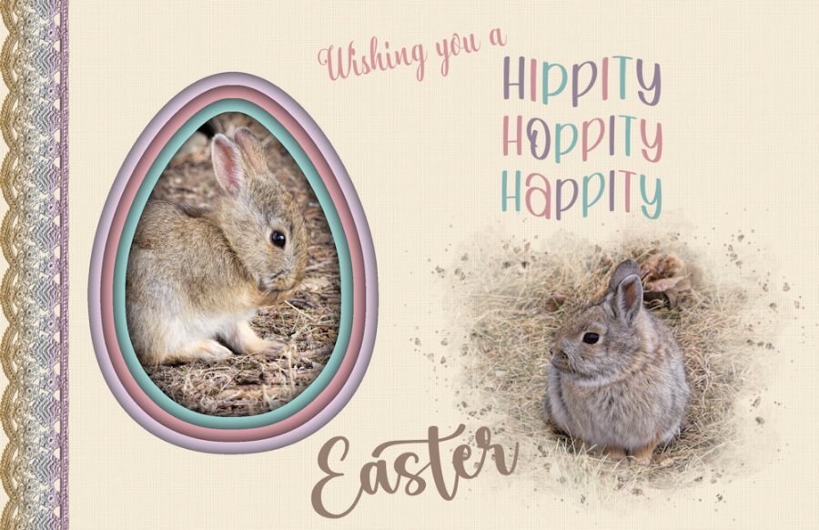
Fabulous! That shadow box has awesome depth. Is there anything cuter than bunnies? They are so sweet. I like how you colorized the lace.3 points
-
2 points
-
Thanks Cassel- I did not realize I could go to the topics to perhaps learn how to make some of the things included in the "Build a Kit" . Thanks Susan Ewart also, Your response made me thing that maybe I will still try most some of those tuts etc. There are so many great tutorials and classes it is easy to get lost when trying to find one . What I need to figure out sometimes is in a totally unrelated tut or class.1 point
-
1 point
-
Those are wonderful. I agree, the textures add that finishing touch that elevates it above the others. What a great card this will make.1 point
-
Is it too early to put my birthday order in...hahahah, just kidding. This is fabulous.1 point
-
Crafts can be hobbies and hobbies can be crafts. But I have had hobbies over the years that don't fall into the craft category. One being genealogy research. Reading being another. And, then there are the jigsaw puzzles I do every December. Those are hobbies but definitely not crafty!1 point
-
I - Inebriated! How you'll be after happily drinking all that Guinness. ?1 point
-
1 point
-
Although only a handful has posted, there are already over 150 registrants for this workshop. Woohoo!!!!1 point
-
1 point
-
That one is kind of ongoing. The only thing you would sign up for is the email reminders. But check in the DIAMOND only section and all the links are there! You can still join in!1 point
-
I was surprised to not see your name for Build a Kit. It really got me out of my fear box and got me to try new things. Especially supplies I dont use, like alphas, ribbons/bows, fasteners etc. Under the guise of making these supplies I'm learning to be more comfortable with the tools in PSP, and what can go wrong and how to troubleshoot the setting - which is usually something I've done wrong or in the wrong order, or a box is or isnt checked in the settings etc. Also I've learned about using tools I've never used and what setting to use. I hope my memory can keep it all in past the workshop. It really helps direct you to the right tutorials (all availalbe in the Diamond membership-tutorials, master classes, notebook labs etc) and having it around building a kit really helps you focus on creating a cohesive body of work one step at a time. Hoepfully it will be a yearly workshop.1 point
-
1 point
-
1 point
-
1 point
-
March...I didn't spend much time on the Build-a-Kit project. It would have required a lot of time in watching videos to figure out how to make some of the components, and I just couldn't spend the time lately. But March 17 is a day I can't ignore....no, no Irish in my genes...it's my birthday. And I like to make a Facebook greeting for the day just for the few friends I have on there. Nothing in this layout is mine. It's all from somewhere....Digital Scrapbook (frame), elements (from ?), and photo of the Emerald Isle from Unsplash. But I had fun playing with it and it didn't eat up a lot of time.1 point
-
I spent the day yesterday actually scrapping. I was catching up on the backlog of photos for my cousin's family from April 2022. I decided to think outside the box on one of the layouts. I don't use frames very often and the kit I was using had a lot of frames. The template I used was very basic since it was more to do a magazine type layout so had no clusters on it. So I kept the photo spot and one paper strip then did what I wanted. Starting with using a frame as a basis for a cluster - some items behind it, others on top of it. The template is Scrapping With Liz Zine Double (set 2) available at The Lily Pad. The kit used is "Center Stage" by Kristin Cronin-Barrow available at Sweet Shoppe Designs.1 point
-
I can't give credit for the illustration because I couldn't find the original on Google. Layered a couple of papers by Gina Jones from PS and played with the opacity to get the hue I wanted. I used a rounded rectangular selection to change the shape of the pic and added a couple of select selection borders on separate layers. Some clipart from DSS to add some interest. The font is Sexy Beachy from DaFont.1 point
-
CF had some amazing watercolor carriages; it was hard to choose just one. I added my avatar from the game just for fun. This is a little late for the seamless topic from February, but I clipped some floral elements from the original carriage pic and used Cassel's seamless pattern script. I flood filled a new layer with it and lowered the opacity above a solid layer. The font is from DaFont and it's called Atziluth.1 point
-
Found this lovely illustration by Yigit Ozcakmak which I thought fit the theme very well. I got the paper and elements from DSS several years ago. And the font is, of course, Little Mermaid from fontmemes.1 point


