Cassel
-
Posts
5,996 -
Joined
-
Last visited
-
Days Won
17
Content Type
Profiles
Gallery
Forums
Everything posted by Cassel
-
@Steve KovacsDid you add a shadow on the project 5 text? It is hard to say in the resized version, but remember that text typically has no thickness so it does not need a shadow. But it might also just be an illusion due to the resizing. For your idea of merging layers to move them, sometimes, it is enough to LINK them, since merged layers cannot be unmerged later! @Linda J WalkerRounded corners are automatically created when expanding a selection or using the Select Selection Border with the Outside or Both option checked. @Gerry LandrethInteresting tidbit of information. I heard that somewhere, a big object (maybe not a rocket) was to be moved through a town and to accommodate the space needed, they cut down hundred-year old trees on both sides of the road. At least, for power lines, they can "easily" be replaced! @TonimarieGreat work. I am glad you enjoyed the bootcamp. @Anja PelzerI think that using a part of the image as a fill for your title is a great idea. I would suggest to make the title even larger to accommodate such a busy pattern, otherwise, it is a little harder to read. You have plenty of room to make it larger. @Leslie JostesI feel your frustration about not finding exactly what you want. In fact, that is the whole reason behind the membership where there are hundreds of tutorials to show you how to make your own supplies OR to convert existing supplies to suit what you want. A lot of members started just like you and now, they can create perfectly matching elements and papers. As for your question about "tubes", they are unique features of PaintShop Pro. Here are a couple of articles about them: Picture tubes in PSP and What can you do with Picture Tubes. That might answer at least some questions. Don't hesitate to ask if it is not clear enough. @GabrielaSuch a fun layout for a cute photo. Well done. @Thomas WillisThanks for the cuddos. The issue you are experiencing with the text "disappearing" is due to the fact that the wrapped text stays inside the "selection", yet once the selection is deselected, it has to stay in the program/image memory. The text does not really disappear, but is now outside of the smaller image. To test that, resize back to 3600 pixels (yes it will possibly be pixellated but just to illustrate). The text should still be where it was. I wrote an article about the Text Wrapping feature and at the end, I mention this issue. It should explain it. And as mentioned by others, it might be simpler to resize a jpg version of the full-size project OR to rasterize one copy of the text as the rasters won't be affected by that oddity. @Mary SolaasI don't know if you added a texture to the title but it almost looks like embroidery. Is that just a trick on my eyes? @kasanyNice photo to showcase. I think that the background paper would let the details show up more if it was solid OR even very blurred as it is hard to distinguish what is the background and what is a little square with a cloud since they are so similar in colors. I think you forgot some shadows on the elements (other than the title and the squares). Is that possible? @Susan EwartThe compression will only be set when saving in jpg. In recent versions of PSP, you can adjust that right in the Save as... dialog window. I think it is the same as using the Optimizer. Back a few versions, the Optimizer was the only way to adjust the compression to control the file size. Not anymore. For those who have not yet finished, don't worry, you still have a couple of days to post 4 out of 5 projects to be entered into the random draw, on Monday night.
-
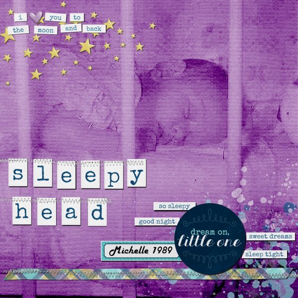 A simple picture of my daughter, at 3 months. The original photo was very dark and grainy, so making it monochrome with a texture hid those defects.
 -

Is there an easy way to resize shapes for nesting?
Cassel replied to Virginia Lovejoy's topic in PSP Stuff
On the other hand, if you look at the example on the left, it would use a different approach. There is a way to achieve that "even" gap but, so far, as of PSP2023, there is no way to retain the corners, and this is what you may end up with. If that is good enough, then here are the steps: Start drawing the smallest shape you want (make sure you have room around). If you can make it in vector format, you will get a better result. Make a selection from that smaller shape Expand by a certain amount, which would be the gap (I used 50 pixels) Add a new layer Fill with the color you want for the other shapes If you want only an outline and no fill, Contract by a stroke width (I used 10 pixels) Expand again Add a new layer Fill with the color and so on At this point, PSP won't retain the corners like in your example. I suspect that has been asked before (and that is what the first patch in 2023 was SUPPOSED to do, but we know how that went!)
-
Is there an easy way to resize shapes for nesting?
Cassel replied to Virginia Lovejoy's topic in PSP Stuff
Although it is not the quickest way (maybe I should make a script?), there is a way. Draw the largest size you will use (it would work the other way around but here, you have the maximum space used) Center it in your canvas (even if temporarily) using Objects > Align > Center in canvas Duplicate the vector layer Resize by 90%. Uncheck the "Resize all layers" Duplicate the INITIAL vector layer Resize by 80% and so on. Always go back to the initial vector layer to duplicate At the end, the outline will have also been resized. If you want them all the same thickness, you can manually double-click on each shape, and adjust the stroke width. Although it is not quick, it is easy. Would that work with what you want to achieve?
-
Here is a challenge to do something that might not be repeated in other months. Just an idea that popped like that (and you can also send me suggestions for occasional random challenges too). This time, use a single photo but use it to cover the whole page. You can add effects to the photo or showcase it in all its original splendor. Add a title and journaling however you want, but it will have to be on top of the photo itself. Here is one example of a large photo using the whole space. For other ideas to use large photos, check out this article. Post your project in the gallery.
-
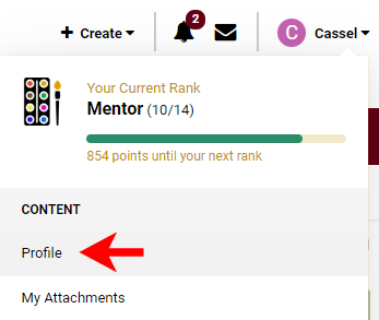
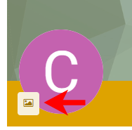
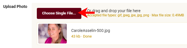
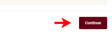
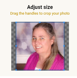
We all love to know who are fellow members are and some of you hav already uploaded a profile picture for the Campus. However, the new forum/gallery is not using those pictures so you have to upload it another time, in a different place. But don't worry, it is just as easy. Step 1. Click on dropdown arrow beside your name, on the top right of the page, while you are logged into the forum or the gallery. Step 2. Click on Profile. You can also just click on the image or the letter that shows up if you don't have an image yet. Step 3. Click on the image icon that appears near the colored letter. Step 4. Choose "Upload a photo" Step 5. Click "Choose single file" and navigate, on your computer, where you have the image you want to use. Step 6. Click "Continue" Step 7. Adjust the area you want to use, with the handles around the blue square. Step 8. Click "Save" and you are done.
-
- 2
-

-

-
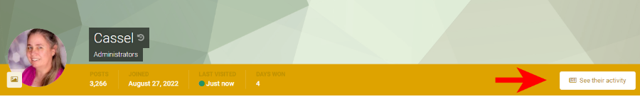
If you want to look at all the images posted by a specific member in the gallery, there is a way. Step 1. Click on any members profile image (or the letter that shows if they have not added an image yet). Step 2. Click on the View their activity button on the yellow band. Step 3. Click on the Albums tab Step 4. Click on Images on the left, to see all their images.
-
- 2
-
-
-
I just want to remind participants to try to avoid slippery topics because we want to be a neutral place for everyone to feel welcome. In the past, discussions about political views and religion have caused members to leave. These posts are not at that point yet, but for anyone who is reading, it COULD get slippery. Thank you for supporting each other, even when world events might trigger some strong feelings.
-
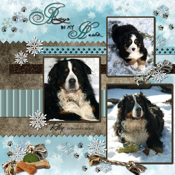 A photogenic puppy!
 -
BC Project 4-Pareidolia-600.jpg
Cassel commented on Susan Ewart's gallery image in Bootcamp - Project 4
 I see the Star Trek Entreprise in red!
 -
@Ann SeeberNice choice of colors to match the squares and the clip. I wonder if a black shadow on the title would make it stand out more instead of a white shadow that seems to make it a little "blurred". Or maybe it is due to the resizing, in which case you couldn't do anything. @Mary SolaasNice work. You know, when you have scatters, it is ok if they overlap a small portion of the photos. In your case, it would almost be "expected" to be on top of the corners as they would not cover much of the image. @Linda J WalkerWOW, you certainly managed to get great photos of that bird. I too would have expected it to just fly away. I guess it was just too good a lunch! As for time, don't worry, you still have until Monday to work on 4 projects, so you should be good. @Anja PelzerThat two color title was very subtle, but very effective. As I mentioned to Mary, you are "allowed" to overlap the corner of a photo when you have some small elements like the footsteps in your page. You got the last lesson of the series, but you still have time to complete them. And if you didn't start, it is not too late either!!
-
This is a known "bug" that was introduced with Patch 1. Your version number is 25.1.0.28. A corrected version of the patch has been released in November 2022. However, since it is a CORRECTED patch and not a new patch, you cannot install it like other patches. The ONLY way is to uninstall your current PSP2023 and reinstall it. The installation process will pull the correct version from the server and it will solve that problem. That Patch one also had MAJOR impact on running scripts. Now, it is fixed. I wish there was another way around than uninstalling/reinstalling, but there isn't.
-
@kasany Great work so far. I have to say that those stripes are a real "eye-catcher"! @Steve Kovacs This is just the beginning. And there are more workshops and lessons to come for those who want some! The "error" with the owl pictures frame is actually interesting as it shows the birds sticking out of the frame, somehow. It is a bit similar to the out-of-bound technique, but just more subtlely. If you have a hard time filling the selection, check this article. @Lesley MapleI see you nicely used the pinked edge technique. Great. @Gerry LandrethAfter this "button" issue, I am sure you will notice those details in future elements. Cast shadows are a bit challenging, but you got a good start. Have a peek at the Advanced shadowing with PSP class for more details. @GabrielaThat is a beautiful layout to showcase great photos! That dog is definitely photogenic! Tomorrow, you will get the last lesson with a project tutorial. Then, you will have several days to catch up if you are still behind (or if you have not posted yet). Looking forward to seeing them.
-
It is hard to view and remember all the products in the store! There are over 850!
-
I think this can be done with this script: https://creationcassel.com/store/index.php?main_page=product_info&cPath=7_8&products_id=716
-
@kasanyDid you add shadows to the photos? If so, what were the settings? They are either very faint or they are missing. They are nicely placed on the title, however! @Ann SeeberNice use of the two color title and the pinked edge. @Steve Kovacs One suggestion: instead of stretching an element, make a duplicate copy and overlap the two. It might work in some situations. For your Magic Wand issue, a few questions: (1) are you on the correct layer? (2) Do you have All layers checkbox checked? For your project, it is great that you found an alternative instead of being stuck! For the paint splash, that is one type of elements that typically would not need a shadow. @Mary SolaasI don't think the texture of the paper would be the cause. Does the text have some stroke? It might be just due to the resizing, although it is interesting that it is less obvious with Arial than the first font. @Thomas WillisI love those colors and you did a great job of reusing the colors in the title. It loks great. @Tonimarie Cute photos! Glad you liked this lesson. I try to incorporate simple yet versatile techniques in each lesson. Hopefully, you will find other opportunities to use them later. Keep them coming!!!
-
What is going on this week? What changes have you made to your living quarter since you are there? Is there something you would DREAM of doing or things you PLAN on doing? Let's chat!
-
I am so sorry for your loss. Remember that the lessons will still be there, and this thread will still be open for you, so take care of yourself and your loved ones first. PSP can wait!
-
Could it be because there are not shadows? The absence of shadows leave the project look "flat". Can you try that and see if it makes enough difference?
-
@Steve KovacsLovely quote and lovely photos. For your elements used to decorate, did you stretch them horizontally? They look a little... odd. @Lesley MapleBeautiful cause and you showcase those photos very well. Good job in resizing the images without distorting them. @GabrielaDid you create the text yourself? It is lovely and the combination of fonts gives a great result! Good work. You might want to adjust the paper width so the text does not end up over the edge. @Ann SeeberI hope you share this page with the photographer! Who knows? You might convince him to showcase his photos in a "scrapbooking" way! @Leslie JostesYou are doing a great job and photo books might feel "plain" while you can definitely add "scrapbooking" ideas and techniques to make them spectacular. Keep it up! @TonimarieThose are such cute photos. They definitely deserve to be showcased! Great result! @Gerry Landreth Great composition. I would be a little careful with overlapping two buttons! They would be hard to stick there. Also (and this is a tiny detail), notice that the light spot on the buttons indicates that the light is on the top RIGHT. You would need to rotate them 90 degrees to the left to be consistent with your shadows. This might have been a discrepancy from the start as the designer might not have noticed that. @Mary SolaasI think I see a shadow on the text for your journaling. With small text, adding a shadow would make black text harder to read. Are you ready for the 4th project? It is coming tomorrow!
-
Check the Mask workshop lesson 1. Or you can use the Raster to Mask script if you happen to have it. It will do the same thing but faster.
-
Your image is not showing. And to answer your question, it is normal to lose quality and you cannot really change that because when resized, there are just fewer pixels to give the detailed information.
-
@cindy harrisYou did such a good job on the sandwich!!! That mayo addition was very well done. Can you remember the very first exercise you did a couple of years ago??? Such a progress and I see how your creativity is showing, now that you are getting more comfortable with using PSP! @kasanyInteresting take on my suggestion. I would not have thought of using an abstract style, but hey, everyone has a different style ? @Leslie JostesI see that you avoided a common mistake: you added the shadows on the little bows AFTER you rotated one of them. That is good because if you had added the shadow first, it would have looked odd. This way, it makes sense! @Linda J WalkerTo answer your question, yes, making the stroke material null or setting the stroke size to 0 will achieve the same result. You said you didn't like the glitter paper. Did you try it with a small scale? That would make it not look like glitters but still having texture. But it is ok if you still don't like it. @Anja PelzerGreat work on resizing the photos without distortion. @Thomas WillisThat light is so cool!! I see you are creative outside of the digital world! Calling all the registrants who have not participated yet. Are you doing ok? Are you having issues with the tutorials or how to post your projects? Drop me a message if that is the case. I want you to make the best of this bootcamp!
-
Although a solid color for the background is totally fine, it can also be a place to add a "generic" winter scene and lower the opacity so the data still stand out. That is just another way to approach it. Maybe i'll have to do a challenge of making a data layout! That could be fun!
-
I have only used Persnickety Print, and I think they are from the US.