Cassel
-
Posts
5,891 -
Joined
-
Last visited
-
Days Won
17
Content Type
Profiles
Gallery
Forums
Everything posted by Cassel
-
@Anne LampThose feathers are nice and multicolored. However, since feathers have typically a soft edge, maybe you can consider blurring the shadow a bit more to give them that soft look. If you have the shadows on separate layers, you can add that effect on your layered project. On the Mother's Day page, one element seems to have an oddly large shadow. Maybe you moved the element with the Pick tool and it didn't move the shadow? It is definitely a nice photo to showcase. @Ann Seeber Nice way to use that large image in the background since the focus of the photo is on the bottom and not majorly covered. @Thomas WillisSimple photo, simple layout and it's all that is needed. Your shadowing is correct and realistic. Good work. @Mary SolaasNice and colorful page. Well done! @Lesley MapleYou know, you could easily add that story directly onto the page for anyone who would see it without you around to tell it! ? Are you looking forward to the third project? It is coming tomorrow so keep an eye on your inbox!
-
@TonimarieWe often change our minds when doing digital scrapbooking. That is the beauty of the digital medium: we CAN. In your projects, I would be careful about two details: the shadows are a little inconsistent, like the button is missing some, and the distortion in resizing (the photo in the frame of the bottom right is obviously distorted, maybe when you tried to fit it in the frame?). For resizing, check this article for tips. Looking forward to many more pages! For your project 2, that is such a fun photo to use! I would say to be careful with the bevelling/buttonize; applied to the whole page, it makes the edges look a little unrealistic. A simple shadow would be enough. @kasanyVery simple yet effective page. You might want to add those details like the location and date on your page, as subtlely as you want so that someone looking at it without you, would know what it is about. For the project 2, you would get more realism if you were to add shadows to the individual elements in the cluster. When using a whole background to show a photo, you can either make sure we see it all (so not putting something big on top of it) or apply an effect so we are not trying to look behind that element. For example, you can lower the opacity so the focus is on the small version, or create a watercolor effect, or something like that. Instinctively, we are looking at that large photo, while we can't see it all, and it is showcased in the small one very nicely. @Anja PelzerHave you ever considered using a QR code on a page to add a link to more information? I plan on having an article on the subject in the near future. @Steve Kovacsthat is a wonderful choice for the background. That rich color and texture really makes the photo stand out. Personally, I might have used a lighter color for the title but that is just a preference. @Gerry LandrethThose faces defiinitely look like fish. That is a great connection! @Linda J WalkerThat is definitely a photo to showcase! And with the date on the page, it shows how it was a nice Christmas visit! @GabrielaWonderful photo. I think you might have forgotten the shadows on the papers OR might have those layers hidden (that happens when we work). Do we still have some lurkers? Don't be shy! And if you are just visiting and not part of the Bootcamp, remember to "like" all those wonderful projects.
-
Here is the next Word challenge for you. In January the word will be START. January is often a time of year when we will start new things, whether it is a resolution we hope to keep for longer than six weeks, or just consider this as a time to make some changes and start a new habit. Of course, this word can also be associated with something that is started at another time than January, like your grandbaby starting to walk, or when you started to drive, or even when it started to snow outside. What kind of START will you showcase? Are you up to the challenge? Post your project in the gallery.
-
@Gerry LandrethSuch cuties. You did a great job with the lifted shadow on the butterfly. @Ann Seeber Calling the snail "Rumba" is so cute!!! @Mary Solaas You did a great job on the cluster!!! @GabrielaAre those your dogs? Can you share what kit/supplies you used for your project? @Linda J WalkerScript text often should look like writing on a paper and that commonly has no shadow, so you made a wide decision. Get ready as you will have your second project tutorial tomorrow! And if you have not posted your first one, it is not too late!
-
Yeah, although some of them were customized by me, a lot of those are part of the platform. Some are cute though!
-
@Leslie Jostes Better late than never. Welcome to the Bootcamp and you will see, you should have time to catch up. I see you added not only personality, but your personal bite mark! I hope it was good! @Anja Pelzer Nice tablecloth that you did from scratch. Thanks for sharing your process. For your project 1, be very careful about rotating the buttons. A small rotation might work, but if you look closely, the 3D effect is rotated too much. I tend to never rotate more than 30 degrees on any element that has obvious texture/bevel/shading. @Suanne Bundy Did you get the first few links yet? Let me know if there is any issue. @Lesley Maple It is quite interesting to have such an angle for a photo. Even though that is exactly what you see when you walk your dogs, that is not typically how people take photos! That is creative! And your page looks good too. I see that your shadows are all accurate and consistent. @Thomas WillisGreat page. Did you take the photo yourself? Don't hesitate to share that! It is part of the story! @Steve KovacsThat is a stunning butterfly (the metal one I mean). Can you share what resource you used? I would be a little careful with the width of the shadows. Can you try to make them about half the size you used? It will make your paper element stick more to the background. I see dozens of registrants who have not posted. Don't be shy!!! We are all here to help you and appreciate all your projects. We want to see them!
-
@Ann Lovely quilts to showcase! Looking forward to seeing them in your projects. @Thomas Willis Glad to hear you managed to get those settings. You will know how to get them next time! @Steve KovacsYou managed to get those images side by side? Did you already drink your coffee/tea or you didn't pour it in yet? @kasanyYou better not spill any coffee since you don't have a saucer ? Nice plaid placemat! @Gerry Landreththat placemat is full of sunshine! @Ann SeeberWhere did you get all those ingredients again? @Linda J Walkerit looks like you are having lunch on a picnic table. Why not? @Mary SolaasMaybe the challenge with the napkin is that it is "too white"? That does not give as much room to show the folds and the texture. @cindy harrisDid you post a picture? I don't seem to see it. Keep those sandwiches coming. I love the variety and mostly the stories!!
-
What is going on this week? Have you been affected by unusual weather events? Do you have any specific plans? Let's chat!
-
Hi Thomas. What do you get instead of what I have? Maybe you are using the AI-Powered mode, in which case, it will show something different. Maybe check this article and see if that is what you see?
-
@cindy harris I know you will be doing well, Cindy. You are getting more and more confident with your PSP and it shows. @Linda J Walker I hope it will be more than just "passing time". We will have fun, I promise. @Anja Pelzer Hopefully, this will be at a reasonable pace for you. @Mary Solaas The organizer can be great, but it also takes room so it might depend on the size of your monitor/workspace. @Gerry Landreth Those will be fun to use in projects. Glad you joined, even if it was just a last-minute decision. @Steve KovacsYou will see that, although the bootcamp will revolve around showcasing photos, there is also room for stories, and that is just as important! As for your workspace, keep in mind that when you work with multiple images, you might want to use untabbed documents. But you will see when you start working, especially with the sandwich. @Ann SeeberAs mentioned for Mary, if you have the space for it, the Organizer can be good. My monitor is quite small so it is not convenient for me. Don't be shy to post in this thread. We look at every single post!
-
One way to "play" with those is to see which shapes you can "line up" or which ones you can "overlap". Typically, those shapes come from an existing template that I just tweak around for you ?
-
Yeah, it seems to be missing in the forum and gallery. It might be due to the different platform. I'll check if there is a way to get it back OR to get something comparable. Thanks for pointing it out.
-
I can assume so. You will find that resizing images is something you will do very often with PSP so it is a good practice to get started.
-
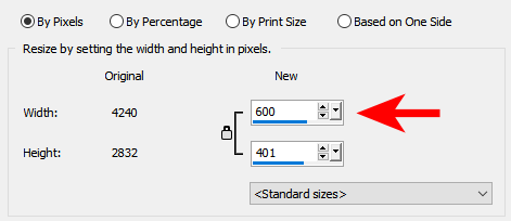
In your PSP, go to Image > Resize and under the first tab (by pixels), you should see the option to enter 600 in the width value. Then, make sure you save a copy of it with -600 in the filename so you don't overwrite your full-size image.

-
Go to the top right, beside the "photo", click on the little triangle and select Profile. There, you should see a little icon on the bottom left of your "photo" where you can click and follow the prompts. I should make a tutorial for it with screenshot. I'll try to do that later today!
-
Remember that you can get in touch if you come north too! ?
-
Hi Helen. I'll have to find another time to go for a coffee with you in the future. Maybe in 2023??
-
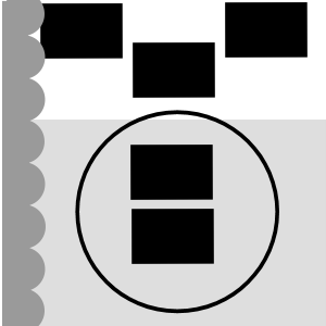
This challenge has had great success in the past so we can continue to have it on a regular basis, don’t you think? Just like those “some assembly required” kits that you can buy for a shelf, a chair, or a picnic table, I am including a 3600×3600 pixels canvas with some shapes. You HAVE to use the shapes in the size and proportions they are. You can move them, rotate them, flip them, and rearrange the layering if you want but you cannot resize them. You need to use ALL the pieces but you can add more if you want. So it is like all the pieces to build a DIY shelf: you cannot change the size of the pieces but you can use them creatively. Obviously, you will want to recolor them or replace them with papers, photos, etc. We just need to be able to recognize the initial shapes. Here is a preview of the shapes involved. Click here to download the layered template. Post your projects in the gallery.
-
Thanks. I guess it might also depend on the scanner you are using. Also, PNG is lossless so it could be good. Either way, at this point, my husband has scanned so many pictures in the last months, I won't ask him to change!! He would look at me with flame throwers in his eyes! Files saved in .tif format are also said to keep layers, but that does not work with PSP which will flatten them, so I am not sure how well PSP handles those files. Something else to consider, I guess.
-
What are you doing this week? Do you set resolutions on January 1st? Do you have specific plans for the year? Let's chat.
-
Yeah. That is why I made some tutorials to guide you all. Review them here. Maybe it will help make it a little simpler?
- 1 reply
-
- 2
-

-

-
I think you did a great job. Often, if you make fewer waves, or narrower, it makes it look "simpler".
-
OK, here are a couple of pointers: - I think that you could add (or add more) shadows on the photos and the blue paper. - I love the goalie in the middle. With a cast shadow, it would make it stand out (pun intended) Will you get it printed for him? If so, make a version with his name instead of a reference to "my grandson". It might be a nice frame to hang in his room!
-
I saw that challenge and thought of the Mask workshop too!
-
Great way to use the template differently!