Leaderboard
Popular Content
Showing content with the highest reputation on 10/31/2024 in all areas
-
6 points
-
One funny story, when my kids were young they were invited to a birthday party with one of their friends. So a week later I got the kids ready for the party, drove them to the event, and no one was there yet, even the door was locked....I thought I must be early.....so we went back to the car and I checked the invitation to see what time the party was......turned out it was for the following week and not that day!! DOH!!5 points
-
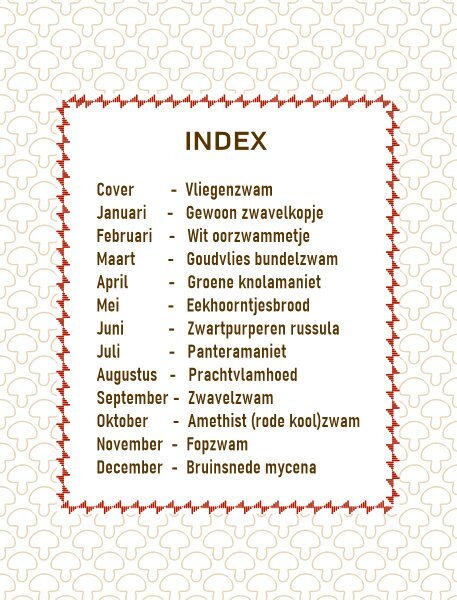
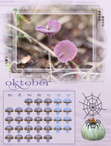
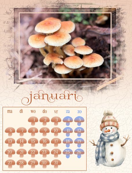
To complete my calendar: this is the index for my Dutch calendar and I'll change the language to German or English but the rest will be exactly the same. I have enjoyed looking at all the different calendars that are made, or are in the making. It was great to see the verity in styles and creativity and I it has given me new ideas for next year.5 points
-
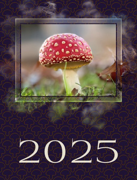
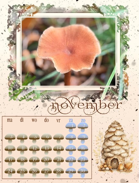
And this is the cover for my calendar. When I was trying some colors for the background I got this nice result with a blendmode. Originally I had a very light color with a darker layer with my mushroom as a pattern. For the pattern I kept the outline of the mushroom without a fill and with this dark color it looks fine, at least in my opinion. Now I only have to make an index with all the names of the mushrooms , but that is more or less a text file with some sort of frame around it. I will print that on the backside of the cover and I need the Latin names as well otherwise my recipients in another country do not know the Dutch names and I don't know the common German or English names. Besides that I have to change the names of the months to German and English. So I'm not done yet.................5 points
-
Speaking of fires, I always sauteed the filet of venison 🦌 when a hunter delivered for us. I added a dash of brandy at the end to create venison flambe. Well, this one wouldn't light, sooo... I added more brandy. When lighting it, the flames shot up and consumed my kitchen curtains! 🔥4 points
-
Your pizza story reminds me of my pizza conflagration! 🔥🔥 Our pizza was delivered but no one was ready for it yet, so I turned on the oven to keep it warm. Put it in the oven, box and all. Next thing I knew, the box caught on fire, so I whipped the door open and flung it on the kitchen floor. Unfortunately, there was a throw rug on that floor so it, also, caught on fire!! Luckily, my sink had a spray attachment!😁4 points
-
Another funny story, I was rushing around that day and decided to put a pizza in the oven, when it was done I took it out of the oven, used the pizza cutter to divide the pizza, then went to serve it to the family, but it smelt a bit odd, and then we realised......they had put a polystyrene base underneath the pizza and it had stuck to the bottom of the pizza......I had cooked it with the pizza and it had melted into the pizza 🤣😂🤣 So I had to find something else for dinner!!4 points
-
4 points
-
4 points
-
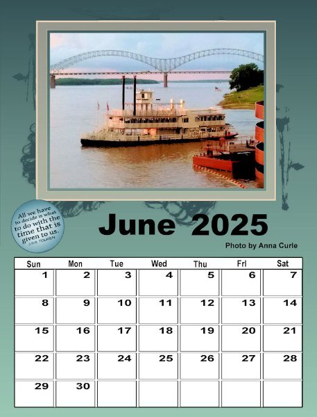
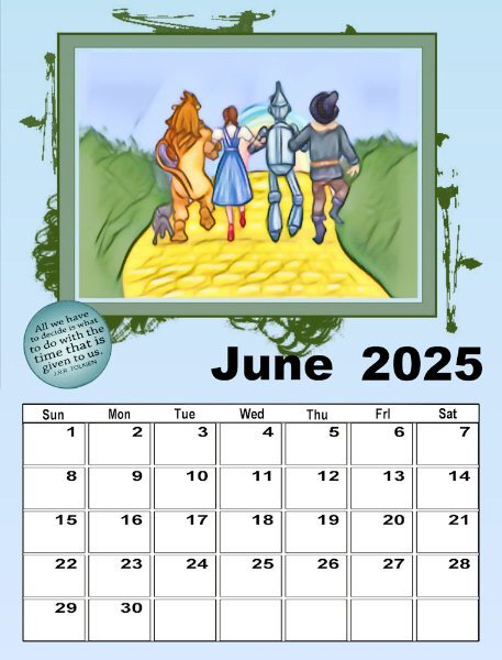
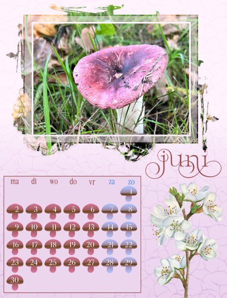
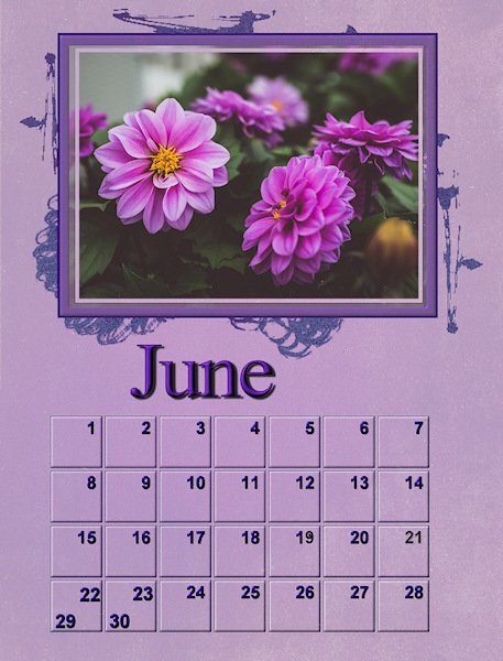
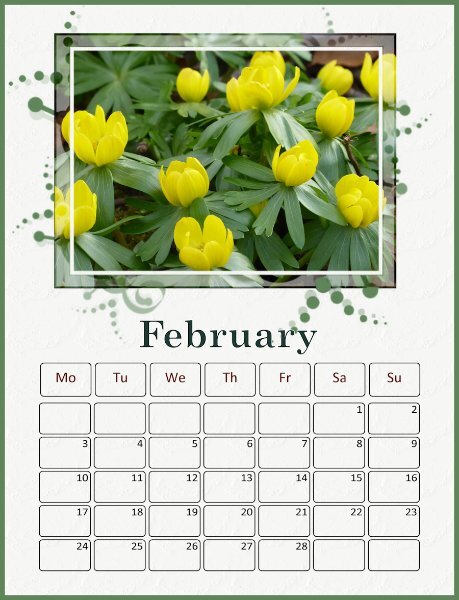
This is June for the 2nd set. It was interesting cropping the photo to fit inside the first frame, adding a layer behind it to make the next layer cream (which I saw let in the background layer as well) so I extended it just a fraction so that it made another frame (cream). Carole, those masks are very interesting. I would love to know how you made them - they are intricate!3 points
-
I'm sorry I hit the laugh button, but I did laugh at the picture in my minds eye. My mom forgot her eggs boiling on the stove once. they blew up and she had to scrape them off the ceiling.3 points
-
I did the same thing. Only the party was in a park and there happened to be a party going on so I thought it was the right party. I couldn't understand why I didn't recognize at least some of the people. I slowly made an exit, thankfully no one really noticed if I belonged or not.3 points
-
3 points
-
Most of the gradients I use are preset and I will tweak them depending on the project. Susan has a good outline of that process in a later post.3 points
-
Suz, I am sure I'm not as discerning as you about blacks and whites. Prices on everything have jumped here mostly caused by corporate greed so who knows what I'll pay this year!?!3 points
-
I actually didn't make them. I happened to have them in my stash from many years ago. I thought they were different than the ones we had in previous calendars. I didn't think it would be that challenging though as I just expected that people would just use a large image and the "extra" would simply fill in the outside. I didn't think participants would go through all the lengths you all did to "separate" the main photos from the "extras". But it could definitely become a class or something like that.2 points
-
Oh, that reminds me of an awkward situation when I was working as a speech-language pathologist. In the 80's group therapies were kind of new and a way to see more patients in the same time period. I was just starting a group and went to the waiting room, called out the four names I had on my paper. So, kids and parents got up and came to the door. One other lady, with a child got up and said, "Can we come too?". I assumed it was a relative of one of the named patients so I said "Sure". As I started the therapy session, I was obviously concentrating on the four named patients, assuming the fifth child was a sibling (or cousin). After about 15 minutes, the extra child's mom raised her voice and asked "How come X is not part of the game?" That is when we figured out she was waiting for her first session with a different therapist. Oops!!!2 points
-
That texture works fine as far as I'm concerned and it gets so nice with different blendmodes and opacity depending on the background color I used. Thanks again and now I have discovered how well it works I'll probably use it more often.2 points
-
thank you so much Monique. I'm glad to see your getting time to get to your calendar. Mine will have to wait a week or so. I love the rich colors you use.2 points
-
It's funny I didnt recognize the texture at all. I was planning on reshooting the garage doors (that's where the texture is) this year with my better camera. Well, you can see how I got around to that. Now it's cold and frosty so i dont want to be out in that.2 points
-
Fabulous Corrie. The cover is striking and really sets off the beautiful mushroom. I cant believe how red it is.2 points
-
@Donna Sillia I took my calendar pages to a local Staples Stationary outlet. They printed it, punched holes and added a comb to the top so it could be hung on a wall. It cost me under $20 and the results were awesome. I just used the full-size pages as jpgs. Here's the cover and back page I made last time...2 points
-
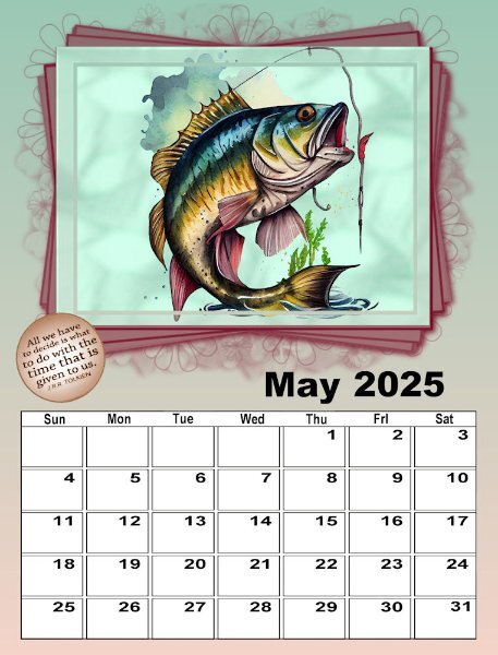
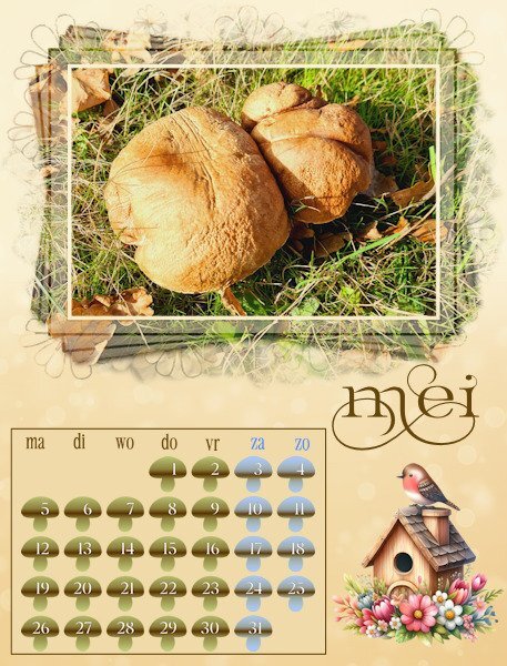
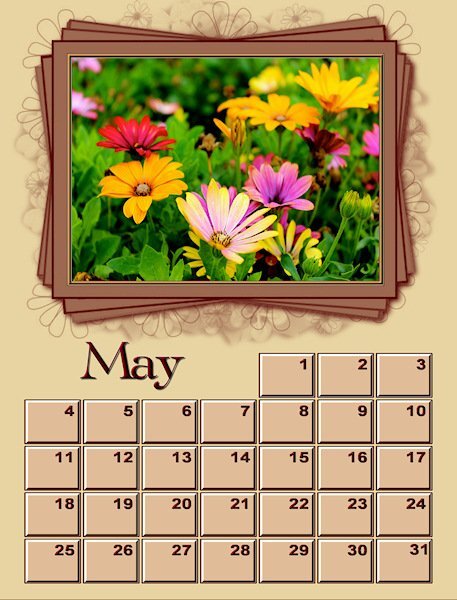
This is my May for the 1st set. I created the photo with a CF watercolor of the jumping fish, and added a background using one of my papers I made with AbstractCurves and adjusted it with HSL, and then added PSP Instant Effects - Watercolor. Then I worked with it to get the softened effect (think I used those extra tools with brushes - push, smudge, etc.2 points
-
I didn't go to the lengths I did on the last one. However, this one - I developed the picture from a clip art I had from Kissclipart that I had used in my Alphabet Workshop, put it on a background that I had created to reflect grass and sky, merged it into one image and then used Instant Effects - Watercolor and used strength 50%, Color Match 30% and smooth 22%. I cropped the image to fit inside the first (light) frame.1 point
-
When we just had an air fryer, we had my sister in law staying with us for the weekend. On sunday morning I wanted to warm the croissants I bought for breakfast and I had read that you could do so in an air fryer instead of the oven. Yes you can but you have to reduce the heat which I didn't. It should take just a couple of minutes, but in no time at all the kitchen was full of smoke and the croissants turned totally black. It is already many years ago but my dear husband reminds me of it every time we have croissants by asking if I have set the right temperature. I don't know why, I just did it once..........🤣1 point
-
1 point
-
I decided to print my pages just to see how they looked and am really glad that I did so. Then, I compared the cmyk that I had also saved; the rgb colors printed much more vibrantly, although I had to increase the vibrancy on a few, especially the reds. They look garish on the computer, but printed they are much better. No more going to the trouble of converting them to cmyk.1 point
-
that reminds me of my Aunt Bess who tried to make pea soup in a pressure cooker. That ceiling always had a greenish cast to it... 😉1 point
-
I did this with popcorn and my husband grabbed it ran through the living room and out the patio door. It smelled so bad. I've also melted a plastic colander in a pot. I thought I turned the stove off, but I had already turned it off. so I ended up turning it on high. I had a kitchen that had a glass sliding door you could close to separate it from the living room. I closed it and then hubby and I are eating our spaghetti and I look and see the sunset light streaming through the door and I tell my husband to look how nice the light look coming through the kitchen windows. He says, that's SMOKE! I jumped up and ran to the kitchen and see a melted colander in a pot on a red hot burner. I do have a picture of that. the joke in our family is my husband wants to have an automatic sensor, if I leave the kitchen the appliances turn off. I am bad for putting stuff on to cook and then taking a "few" minutes to check emails.....well, you can imagine how that turns out. Don't get me started on how many grilled cheese sandwiches have gone into the organics bin!1 point
-
Yes, corporate greed is everywhere these days. Mostly with the wedding invites it's the blacks in the text that is important to me. Especially with fonts that have really thin lines. And putting cardstock through my printer, even on the thick cardstock setting, leaves unsightly black streaks. My printer is 17 yrs old and still going, but not up to that kind of work anymore.1 point
-
1 point
-
1 point
-
1 point
-
1 point
-
1 point
-
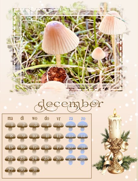
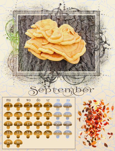
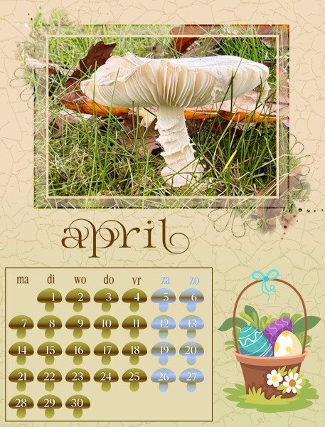
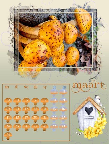
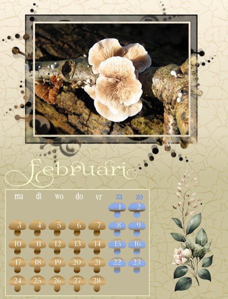
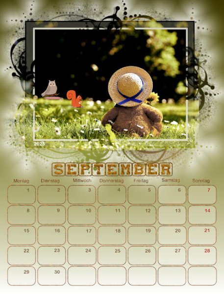
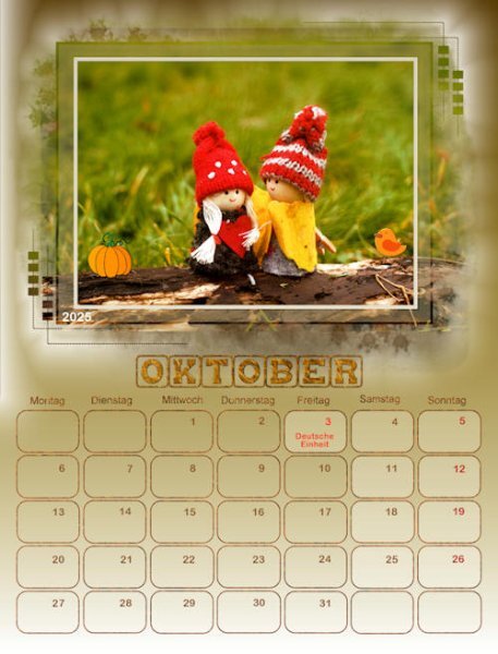
Hurrah, I'm back in business! Today I was able to go to the shop and buy a new mouse. I have all my months done and am resizing for posting. As it is almost midnight over here I will post some now and the remainder tomorrow. I didn't want the month names to overlap the masks because I know that some of the recipients of my calendar will cut the photo from the page as the month is over and use those later for making cards. This is my 5th year of making a calendar and over the years I have used different ways of doing the date boxes, like bigger with a photo underneath, smaller with all the special days with colors or small elements, completely colored etc. I also know that the recipients do not want to write on the calendar and besides that not all the special dates are in different countries on the same date and not all have a second X-mas or Easter day. Therefore I made little mushrooms with the dates, just to have something different for this year; I only colored the weekend days differently.1 point
-
1 point
-
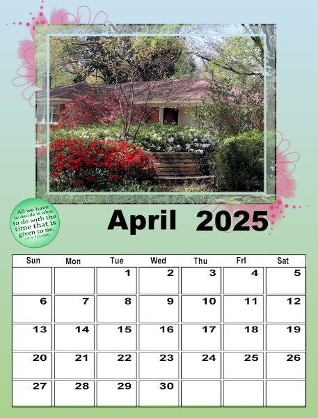
I'm obviously not going to finish this workshop anytime soon, but Carole, this is my first time and it is wonderful. You suggested that we look ay the QP Workshop tuts for ways to deal with the template. I guess that's what I've actually been doing as I had done that workshop several times. This is my April #2. The picture is one I took on a walk in our neighborhood the end of March 2020 - just before 'lockdown". Spring is always the most colorful time of year in Memphis. Fall has more muted colors, except for the sweet gum tree, the dogwood, and the bradford pear which have brighter colors. That particular year, the colors were really spectacular!1 point
-
1 point
-
1 point
-
1 point
-
1 point
-
1 point
-
1 point
-
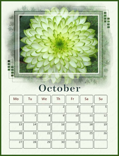
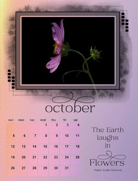
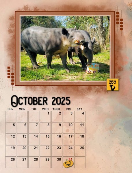
here is an almost finished October. I made the calendar smaller to fit the days of the week across the top and so I could enlarge the Month. Still playing with placements, month in the centre, month to the far left or centered on the date boxes. So, I'll live with this for a bit. The extra space I had planned on using quotes so i will stick with that. I used a gradient on the background (made of one of Cassel's gradients - sunset), two of them, one with an angle and probably a blend mode to blend them together and the fading white as well. kept a copy of all of them then merged the other layers into one layer. Added a texture to the background and to the boxes to make them look like they are part of the background. Havent changed the numbers yet and decided if I'll keep black text or try something else. I did try to blend the rasterized quote and it looked cool, but not sure the calendar would remain cohesive if I did that with all the months. So, this one isnt all the way done but thought I'd show some progress. Now to go back (and forward to Nov/Dec) to complete them all. I'll post as I get each one done. I might have forgotten to take the blend mode of the first part of the quote (it's a separate layer than the word Flowers), it's looks lighter and not black.1 point
-
1 point
-
1 point
-
1 point
-
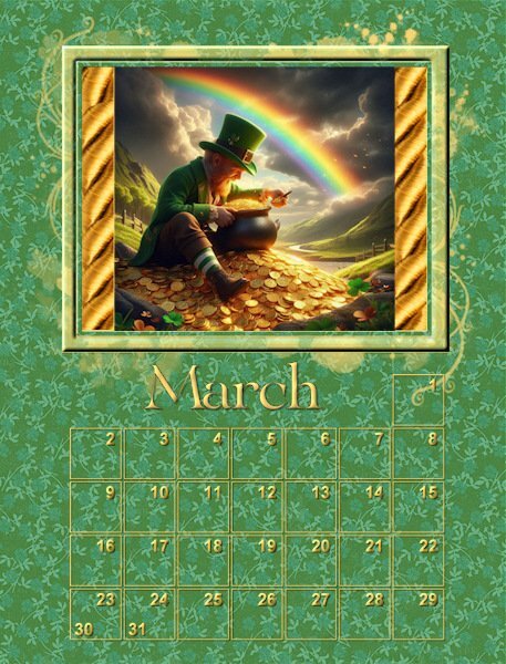
I asked Microsoft copilot AI to generate me an image of a leprechaun counting his gold at the end of the rainbow and this is what copilot gave me. @Cassel The image I had to work with was square but the window and the mask was a rectangle. Is there a way to edit the mask to make the opening in the middle be square without sacrificing any of the cool little squiggles that extend outside of the frame?1 point
-
1 point


