Leaderboard
Popular Content
Showing content with the highest reputation on 10/29/2024 in all areas
-
9 points
-
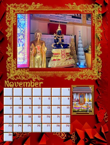
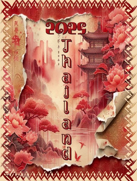
Slowly getting there. Thailand pictures suit my proclivity towards gold and glitter. Red seems to be a prominent color in many of the pictures. The background is Adobe Express AI, but I did make a few adjustments. The ornate frame just called out to me for glitter. The bottom picture is of the King and Queen of Thailand with my future daughter in law in the forefront. I used the same mask that I created on a previous page.7 points
-
6 points
-
6 points
-
6 points
-
Here's my cover page. My calendar has friend and family birthdays. This is my wife and sister. But I had a challenge: The picture cut off right above their heads. So, I cut a thin strip above them, pasted above them flipped vertically, pasted the original above that, etc. You can see the repeating images above them in the mask. I don't think the result is too strange... The font for this page is Gigi.6 points
-
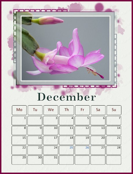
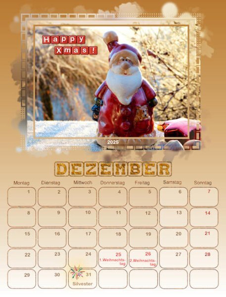
Finally, the December calendar I once again used Adobe Express for the background with a few adjustments. The photo is from David, and I thought it looked festive even though Christmas is not celebrated in Thailand. The bottom picture is also from David and is actually a Gay Pride festival. I merged the mask and added color to the opaque areas and then applied a bevel. The nutcracker was made by me from an Adobe Illustrator tutorial for my Build a kit 2. I wish I could make backgrounds as beautiful as AE.5 points
-
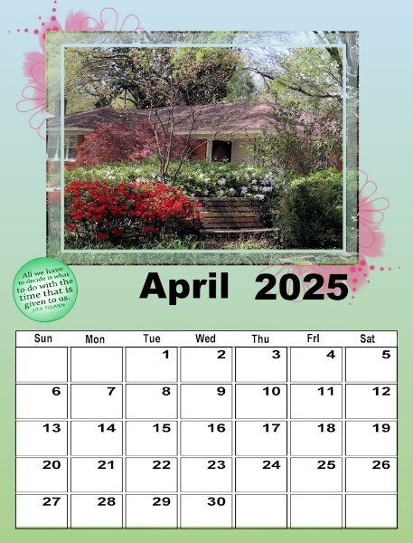
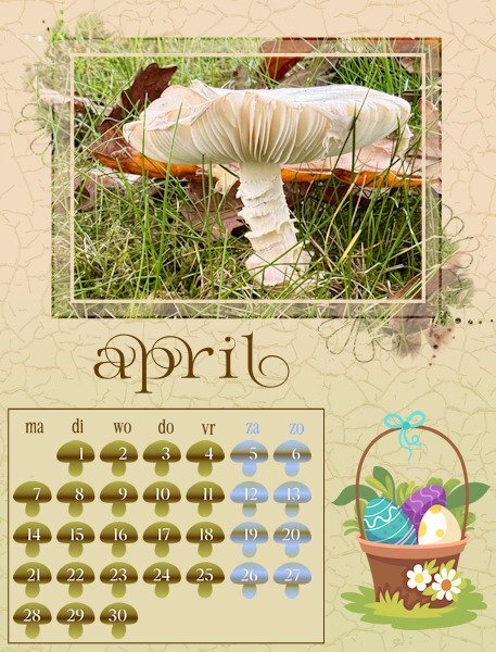
I'm obviously not going to finish this workshop anytime soon, but Carole, this is my first time and it is wonderful. You suggested that we look ay the QP Workshop tuts for ways to deal with the template. I guess that's what I've actually been doing as I had done that workshop several times. This is my April #2. The picture is one I took on a walk in our neighborhood the end of March 2020 - just before 'lockdown". Spring is always the most colorful time of year in Memphis. Fall has more muted colors, except for the sweet gum tree, the dogwood, and the bradford pear which have brighter colors. That particular year, the colors were really spectacular!5 points
-
4 points
-
4 points
-
Carole I'll do that, but it will take more time to finish my calendar, yesterday my mouse went broke and we didn't have a spare one anymore. I can use the touchpad of my laptop to navigate on the screen so I can read all the entrees over here in the forum and use my email etc but scrapping with only the touchpad is a no go for me. This week I'll go to the store to buy a new one and hopefully I can find one that is suitable for my hands. In the mean time I enjoy all the fantastic calendars that are shown here.4 points
-
Thank you for the compliment! Pun intended - I play with complimentary colors a lot. In April, I picked an image with gold in it thinking my main color would be blue since yellow and blue are complimentary. Then I like to go slightly off from the complimentaries. Gold instead of yellow, rust instead of gold, slightly unsaturated and lighter blue than solid blue, etc. If I used bright yellow and bright blue it would be horrible but by sticking with that basic combination and making variations it gets interesting. I developed these ideas when I was making computer generated fractal art. Choosing colors was half of the process.4 points
-
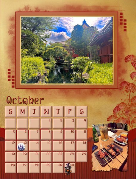
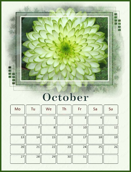
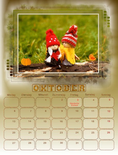
I finally finished October. The background is from Adobe Express just lightened a little. Photos are from David. Columbus Day clip is from Canva. I had to mark Columbus Day because I am Italian and my father would never forgive me if I called it something different. The little witch is from CF. I hope to fiinish today, but now I have to go and exercise.4 points
-
3 points
-
3 points
-
3 points
-
3 points
-
Yes, I discovered that also. I've had fun experimenting with a series of background mats, etc., to control the colors.3 points
-
3 points
-
3 points
-
2 points
-
@Mary Solaas Check your emails as Carole sent a correction that included the correct link. Didn't intend QPs. It is actually Lesson 8 talking about shadows on these pages. Hopefully this LINK will work.2 points
-
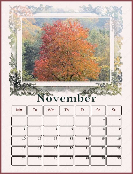
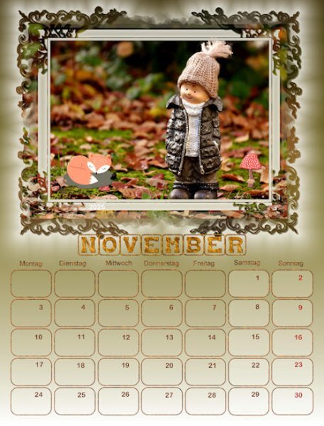
The script I used is called "Custom Calendar" and can be bought from the Creation Cassel website. I didn't consciously change the frame colour on my November page. I simply used a large photo and placed it inside the mask group. I've just checked my PSP file and the frame seems to be taking the colour and texture of the background layer - I have no idea if that was supposed to happen or not...2 points
-
2 points
-
2 points
-
2 points
-
1 point
-
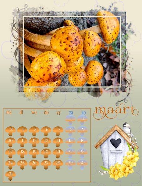
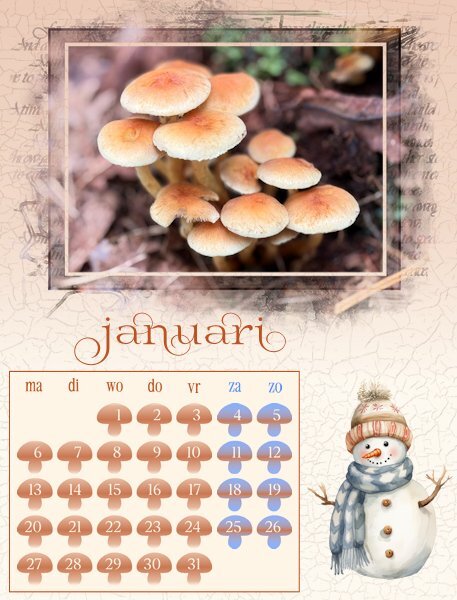
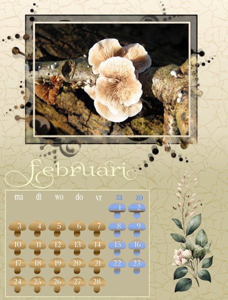
Hurrah, I'm back in business! Today I was able to go to the shop and buy a new mouse. I have all my months done and am resizing for posting. As it is almost midnight over here I will post some now and the remainder tomorrow. I didn't want the month names to overlap the masks because I know that some of the recipients of my calendar will cut the photo from the page as the month is over and use those later for making cards. This is my 5th year of making a calendar and over the years I have used different ways of doing the date boxes, like bigger with a photo underneath, smaller with all the special days with colors or small elements, completely colored etc. I also know that the recipients do not want to write on the calendar and besides that not all the special dates are in different countries on the same date and not all have a second X-mas or Easter day. Therefore I made little mushrooms with the dates, just to have something different for this year; I only colored the weekend days differently.1 point
-
1 point
-
Your colors and layout are so tastefully done. I love the boxes with rounded corners. What is the name of the script you use for that? Also I have been wanting to color the frame differently from the frame like you did for November. How do you do that?1 point
-
1 point
-
1 point
-
1 point
-
Thank you so much Cristina. I've learned so much in the campus from Carole and the members; from layout design to photography that I cant help but be inspired and improve. I love it.1 point
-
1 point
-
1 point
-
Julian, I use promoted layers a lot as I can select an area, promote it to a new layer and whatever I do to it doesn't impact the original. Usually with these calendars, I'm able to isolate the frame for the photo and work on that, independent of the mask, though in certain cases, I had to slide the promoted layer up out of the group totally.1 point
-
1 point


