Leaderboard
Popular Content
Showing content with the highest reputation on 10/06/2024 in all areas
-
Well, you did a fine job of this challenge and kept true to your style. I am struggling with the whole thing. Glitter is not in my repertoire either. I have started and discarded a few layouts already. (Love the pix and the paperclip.)5 points
-
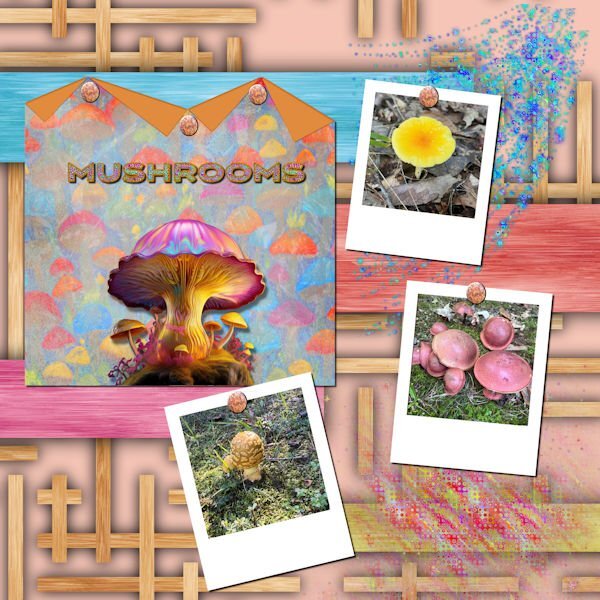
My daughter just sent me photos of some of the mushrooms that see saw on a walk in a Fredericksburg park. The background is called Wood Art from FF. the folded paper is one of mine with a mushroom background created in AI and blended. The big mushroom in the center is from Adobe Express AI. The title was also created in Adobe Express, imported into PSP where I converted it to a vector using the selection to path script so that I could add a glittered stroke with a layer style. I used a star sparkly brush to create the glitters. I used Carole's polaroid lab video to create the polaroid frames. The rusty nails are from Canva. I love glitter, and the stars brushes are great for creating scatters.4 points
-
4 points
-
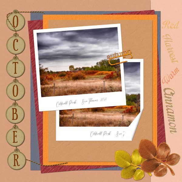
I must say I'm most definately not a glittery person. I rarely use glitter in my layouts. Saying that I turned my paperclip I created some time ago into a gold glittery one. The leafy elements I turned into a soft glitter, along with the wording. It is glittery, as I used the glitter 2 tutorial from the creative scrap, but toned it down somewhat. All my own work. 1 folded corner on a polaroid photo. For the papers I applied textures and blend modes, after selecting colours from the photo.4 points
-
4 points
-
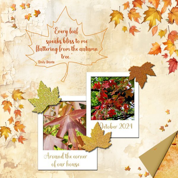
And here is mine and I am not so fond of glitters either! But I have managed to make 3. I used a background from the recent ACD freebie template because it goes nicely with what I had in mind. I already had polaroid frames and because of the background and my photos I made leaves confetti from a photo with cass-Custom Confetti script; the new script from this week would have come in handy, but that is on my wish list for now. I have used the same extracted leaf to make a frame around my text and used it again to make 3 glitter leaves. The folded corner is done with cass-Folded Corner script, after I had to ask Carole why my script wasn't working as expected. It happened to be one of the older scripts that doesn't work in the more recent versions of PSP. So if anyone has a problem with that, there is a new script, thank you Carole. Of course I know how to make a folded corner manually but I still have some problems with my eyesight and those very precise actions are still difficult for me at the moment. Besides that I have the script to use it!3 points
-
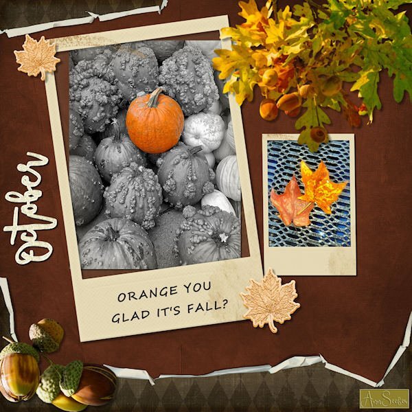
ORANGE YOU GLAD IT'S FALL? Folded paper, Polaroid frames and glitter leaves and word art from Merisa Lerin. Corel fall overlays are freebies this week. Font used is Segoe Script. I got most everything on Digitalscrapbooking.com as daily freebies today. The photos are by Chuck Calio on the Hudson Valley in Pictures Gallery.3 points
-
2 points
-
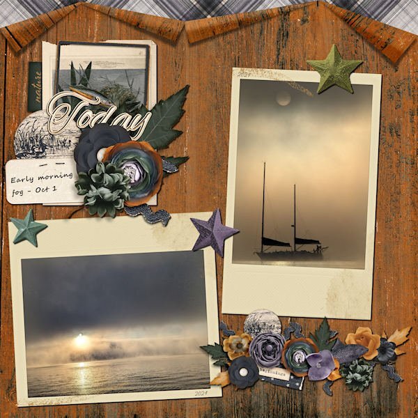
I appreciate that Julie. If it's of any help to you, I always start by putting the photos onto a bank page. In this case the polaroid images. From there I create the papers. The size, shape, placement and number of the papers will be taken into account, of where the text, journal, title and so on will go. Elements are more often than not created and placed last. Quite often rule of thirds play a part in the initial layout. Direction of a bird, mammal insect in which it is facing, is also important. I suppose, it's my eye that determines the layout I go with. Maintaining a balanced minimalistic layout is what I aim for.2 points
-
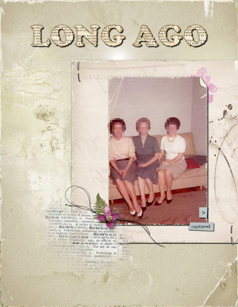
Instead of 12x12, this time, I created a layout with 8,5x11 dimensions. It does feel unusual, but I am trying to get used to it. I tried to use some of Anna Aspnes's freebies (MegaPack Plus Class) and elements from other designers, some of whom I recently got to know. EDITED: I got this mega freebie thanks to a tip from Julie, who shared where to find it on a post. -------------------------------------------------------------------------------------------------------------------------------------------------------- Credits: Cassel: Old Book Alphabet 2019 freebie Anna Aspnes MegaPack Freebie: Papers: AASPN_ArtPlayPaletteHeath_SolidPaper3 and 5 Paper Texture: AASPN_PaperTextures4_2 and 4_9 Others: AASPN_ArtPlayPaletteHeath_ArtStroke2 -- AASPN_ArtPlayPaletteHeath_Transfer7 -- AASPN_FotoGlowMix1_2 -- AASPN_MilieuWordARTMix1_WTHistory -- AASPN_UrbanThreadz3_9 Lynn Grieveson Frames & Borders: lgrieveson-worn-photo-edges1-4 & lgrieveson_retro_pop_1 Rachel Jefferies Bloghop freebie and from Art In Simplicity kit rjefferies_portraits_BLOGHOP-stamp (freebie) rjefferies-AIS-artistry03-flower10 rjefferies-AIS-artistry03-messystamp04 rjefferies-AIS-artistry03-sentiment01 rjefferies-AIS-artistry03-trinket-staple2 points
-
Well, Susan, Julie, and Corrie, I also have "big plans" to do something later. 😄 I see so many great ideas here that I want to replicate, and I am also inspired by different layouts I see on the internet, designer newsletters, etc. Well, I guess the saying "to bite off more than one can chew" resonates with me. But I know that, if not all, I will get some done one day or the other.2 points
-
2 points
-
2 points
-
Thank you, but I'm happy with this color. I tried others but those didn't do it for me. Of course when it comes to colors it always is a personal preference. However the reverse shadow is missing.1 point
-
Keeping you on your toes! 😉At least you may get to learn a new technique. Have fun, as that is what we are all about, whilst showcasing our photos in a creative way.1 point
-
Autumnal themes are always most delightful, their colours alone adorn any layout. Looking at your folded corner, I should have used a different colour, in order for it to stand out more. I did use a reverse shadow, but with the compression of the page, it isn't evident.1 point
-
I didn't realize. Taking it down again. Will repost after I get it figured out.1 point
-
1 point
-
I like the layout and the photos very much, kasany. Great work.1 point
-
That was an easy fix. I just "turned" off the mask layer and resaved everything. Thanks.1 point
-
Susan me too! In the mean time I have taken a quick look at all the goodies and I like a lot what I have seen thus far. Although I have to figure out how to use some.1 point
-
You have that problem too? I have such a long to-do list for winter (or any other season for that matter) and most never gets done! But I always say I do what I like as much as I can since life zips by so quickly.1 point
-
If you use masks to create a sort of "inked" area, you have to be careful of some details. If you choose to place "inked" areas over several surfaces, it will normally be slightly uneven. Here is a tutorial that explains what it might look like: https://scrapbookcampus.com/2020/08/writing-on-different-surfaces/1 point
-
1 point
-
0 points







Resized.thumb.jpg.d25811db03a63358cedab1e79f527635.jpg)