Leaderboard
Popular Content
Showing content with the highest reputation on 05/10/2024 in all areas
-
Chantahlia Designs, template 334. Plumbago is a tropical flower and my favorite. Remember, each time I see a "new" flower, it is my favorite. These photos were taken in Ft. Myers, FL in 2006.6 points
-
I went all the way back to 2016 for these photos. Template 198, Lady 22. Font = Meows. Metal paw print by Sheila Reed; brown cat by Marisa Lerin, pet 001.6 points
-
Template from Lab 14-04. Texas Roadhouse would not seat us until our full party had arrived. The waiting room was frigid so we waited across from the register. Didn't take us long to look for michief. The birthday saddle provided distraction while we waited.5 points
-
5 points
-
Template 295 by Chantahliadesign. Recent walks in the woods have yielded encounters with deer. I'm never too close to them. I use a 200mm lens. Word art from Creative Fabricia.5 points
-
Nothing fancy here. Cutout photo, textured paper, suggested font. The graphic at the top was taken from a Creative Fabrica graphic. Love "my" deer.5 points
-
4 points
-
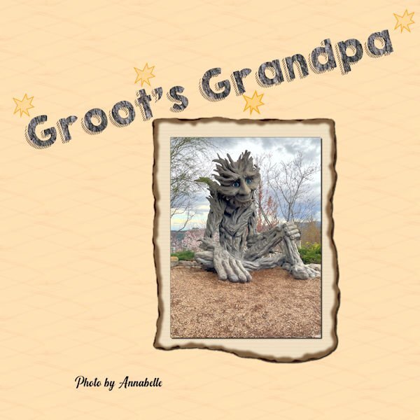
Will attempt. Great granddaughter Annabelle took some pictures earlier this year (she is really a good photographer) and this one really spoke to me. My daughter told me that it looked like the Marvel character Groot - but much older. So - it became Groot's Grandpa! The paper is mine, the bursts are paint brushes, the font is what this challenge is about and I made the solid with an oak bark pattern and colored the shadow brown. The frame paper for the photo is from Cassel.3 points
-
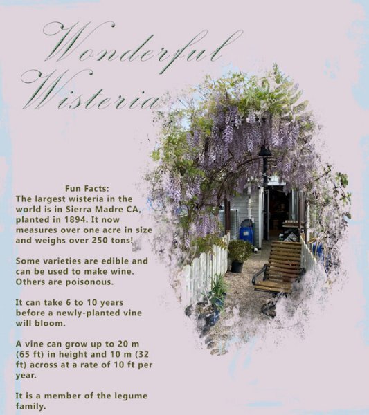
Finally grabbed a quick pic of the wisteria arbour that grows in a fellow's back yard that butts up to the park where I walk the dogs. It's a bit past its best blooms, but still lovely to see. Not many of these vines growing in this area. I don't think many people have the patience to grow it or the time to prune it.3 points
-
X = Xray vision. What mothers sometimes seem to have when they can see the children doing something the should not be doing when Mom has her face covered with a hat while sunning by the pool. (how's that for trying hard to use an X word so we can continue with the next letter LOL)2 points
-
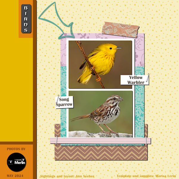
Many of the native sparrow species have already arrived. Much to my delight the White -crowned Sparrows turned up yesterday. I was pleased to welcome them back. A perfect opportunity to create a banner after watching the live masterclass on Sunday. The sparrows of the open field will stay, those like the White crowned will move on further north. I used a gradient which I created for the pennants using colours from the photo, and the light coloured wood frame2 points
-
1 point
-
I get these cute little ones in my yard and at the feeders too. You got a great shot and made the usual lovely layout with a fab banner!1 point
-
1 point
-
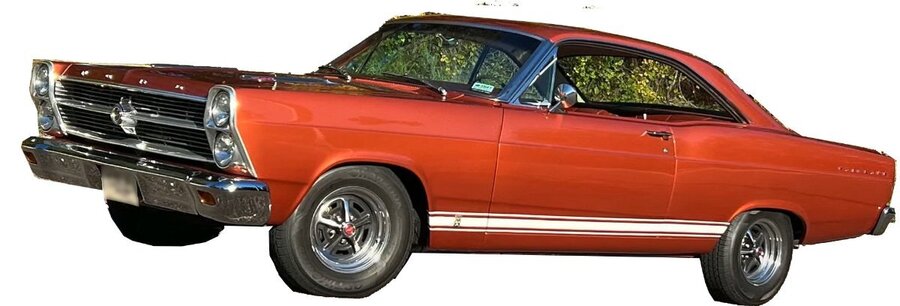
My Dad bought me my 1st car for my senior year in highschool. He bought it new because he didn't want me to have break down troubles, (also I think because I was his one and only little girl) It was a 1966 Ford Fairlane the color was Emberglow. Mom did not drive and part of the deal was that I had to take her and Grandma anywhere they wanted to go. I had that car well into my married life and remember crying my eyes out when I had to drive it to the junk yard because something major finally went wrong that was too expensive to have fixed. My dad had passed away a few years before that and it broke my heart to get rid of that car. For many years my cars were all bought used and kept until they were no longer safe to drive. When I got my first new one, I had it for over 15 years and sold it to someone I knew for there son. I do get really attached to my cars. The pic is not my car but one I pulled up on Google, but that is what it looked like brand new. I did a poor job of extracting that photo--oh well.1 point
-
1 point
-
1 point
-
Looking at what Fiona created, I don't think it would have been a vector. I suspect she used Polar coordinates effects to create the circle. There are other techniques, but I would use the polar coordinates. There is also a circular element script. Rene is right, you don't have to use the selection tool to create a bevel. Make sure you have the right layer selected. You did a great job Fiona!1 point
-
1 point
-
1 point
-
I started playing with this with the font from the font challenge ( kg-happy.font?fpp=100 ) and a freebee from C F that was I think a coloring book page. (https://www.creativefabrica.com/product/funny-bird-chilling-in-the-pool-coloring/) I had fun with it but it did take a while because I was just playing and kept changing things.1 point
-
1 point
-
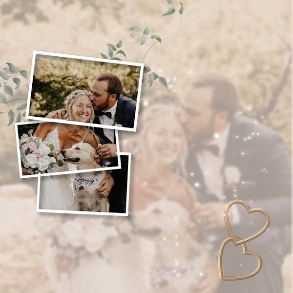
I think you have a done a lovely job. I like the split frame effect. If I may, I'm going to make an alternative suggestion using a frame or the split frame technique and I have also posted an example even though it's not the split frame effect, it is still a frame, and I feel it will work equally as well. Duplicate the photo, hide one. Create the frame/frames. Using the magic wand select outside the frame, contract by a few pixels, then invert. Now you can edit the photo not in the frame or frames, reduce the opacity, blur, add a texture, its up to you. I would then place the hearts up in the left corner, with a few words. I added an out of bounds effect, for that I used the hiden photo. You could have the bouquet just out of the frame.1 point
-
1 point
-
1 point

Resized.thumb.jpg.d25811db03a63358cedab1e79f527635.jpg)


