Leaderboard
Popular Content
Showing content with the highest reputation on 05/04/2024 in all areas
-
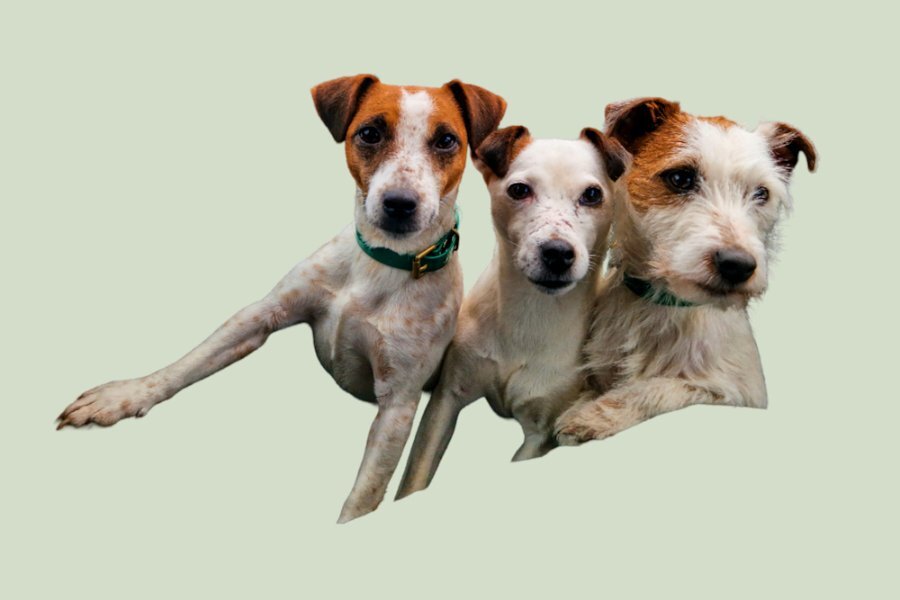
My daughter sent me a photo of her three girls. Tot in the middle is the mother of the other two. Smudge and Bramble is the wire haired one. They are Parsons terriers. I started the extraction last night, after watching the advanced extraction masterclass in the campus. It is an older video, but most helpful. It was a tedious, eye staining task. Yet, althouogh it's not perfect, I'm happy with the end result. I've sent it to my daughter, which she will get tomorrow morning. I given her a choice of background colours. Here is one one them.5 points
-
3 points
-
That's me too. Clothes especially. I cant seem to buy new ones, the prices are insanely high and the job I have wrecks clothes, so I don't want to see money go down the drain. Besides I can buy clothes that I'd never pay new for (jeans that are over $100 CAD! Crazy!) and often hardly even worn. A stop at the book section is a must as well.3 points
-
I'm a thrift store junkie, too, I love buying kitchen items there, My clothes also come from thrift stores and I have a rule, for every item I purchase, I drop one item at the store, so I don't clutter my wardrobe. I'm bad at buying books there also.2 points
-
Yikes, I bet it was tedious and eye straining, especially around Brambles (dog on the right?) face, so many little hairs.2 points
-
2 points
-
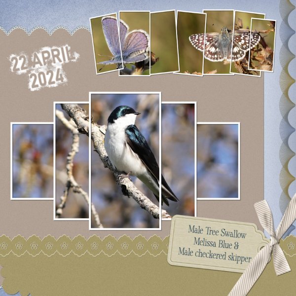
I started out with the best intentions of sticking to the sketch, by creating something using the grid. That soon went out the window, when I decided to use multiple frames instead of the set blocks in the sketch. Some of you will have the frame with the Swallow in as I created a template and made it available to download, back in 2021 I believe. The other frame I created today. The tag is mine, the bow is one of Carole's scripts, along with the decorated bottom paper. The design on the right is created using the brush and brush variance tools, which can be found along with many others in the brush variance masterclass. Birds and creatures of all kinds are now making an appearance, for me this a positive sign that Spring is for me literally around the corner.2 points
-
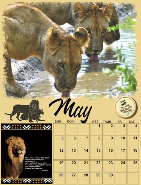
Whenever you create a project, you will likely want to use some text. In this case, you might be looking for some interesting fonts to showcase titles or dates. This month, I am suggesting a font that indicates some thickness. Although it might look like a layered font, it is not, but you can easily "paint" the sides/center in different colors for a special effect. You can get this free font HERE.1 point
-
I started playing with this with the font from the font challenge ( kg-happy.font?fpp=100 ) and a freebee from C F that was I think a coloring book page. (https://www.creativefabrica.com/product/funny-bird-chilling-in-the-pool-coloring/) I had fun with it but it did take a while because I was just playing and kept changing things.1 point
-
Well done, and thanks for including what kind of dogs they are, I was wondering what they were until I read what you wrote.1 point
-
Thrift stores are dangerous for me. So many cool trinkets begging to be photographed. All my t-cups/sugar&cream containers and t-pots have come from them. the flower vessels (for lack of better word) are usually candle holder and ashtrays....for a non smoker I sure have a lot of ashtrays! 🤪1 point
-
I did wonder where you found/got all the lovely vessels for your flowers. Good old thrift stores!1 point
-
I always appreciate your suggestions Sue. Love the idea of putting the bouquet outside the frame. And this frame layout is wonderful!1 point
-
thank you Jeni. I did have fun with them and finding interesting vessels (at thrift stores) to put them in.1 point
-
Here's a Day 8 Extra Extra for you. I did not edit this photo, just stuck it in as it was. It was a failed attempt at floating in a vessel too big for it and it would float to the edges and not stay in the middle. I photographed the vessel/flower on black so i could eventually extract it. but since the rest that I photographed I abandoned the idea of extracting. At least I got to use it here!1 point
-
1 point
-
I don't think any of us ever complete a page as we previously envisage. I whole heartedly agree with you that it is certainly great fun. Also a wonderful surprise to see the end result. There is a tutorial, I had to look it up for you, so you can check it out. Split photo effect. Lab 10-8.1 point
-
Yup, I know that feeling. Starting out with good intentions and a plan, but seeing them go out the window as the layout develops. What I envision is usually not precisely what I get. But it's fun anyway. Love everything about this one. Those frames are wonderful.1 point
-
The background paper and word, Florida, are from Bits Of Scraps and were part of a Digital Scrapbooking blog train, May, 2017. The fern, top left, from Jessica Dunn, May 2017 blog train, Digital Scrapbooking.1 point


Resized.thumb.jpg.d25811db03a63358cedab1e79f527635.jpg)