Leaderboard
Popular Content
Showing content with the highest reputation on 02/23/2024 in all areas
-
4 points
-
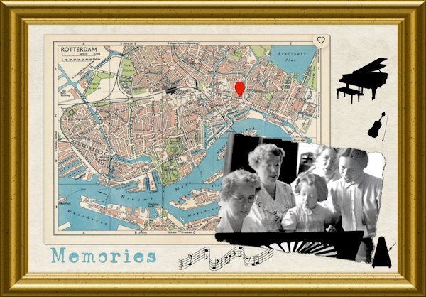
I grew up as an only child, but in fact I wasn't! My parents had a child before me, also a girl which died at childbirth after a normal pregnancy. In those days just after WWII there was no way to interfere as we now are accustomed to. I only found out that I had a sister just by accident because nobody talked about it, although I always had a feeling something out of the ordinary had happened. My mother didn't even got to see her baby, let alone held it! It was thought that it was better this way, how cruel! When I was a bit older I came to realize that my mom was severely traumatized and until her death never coped with it together with the trauma from living through WWII as well. Luckily my dad whom I adored was different, so my childhood was okay. My dad came from a large family and he was the youngest of 12 and I had lots of cousins but they all were considerably older than I was. The difference between me and the cousin above me was 14 years and when we had family gatherings I was the only little one and now all minus one are deceased. I have only a couple of very bad photos and I used one of those for this layout, because it is characteristic of how it was. From the left side there are 3 aunties who were single and lived together in the family apartment and I was there quite often. To the right is my mom and we are practicing a song. My dad's side of the family is very musical; he played the violin, my aunt the grandpiano, another aunt a flute, my grandfather who had already died and an uncle played the organ in church. The rest of them was in a choir. I think I was about 3 or 4 in this photo. I had to fix the very dark and faded photo to get something that I could use. It was ripped at the edges as well, which I kept. The street plan of Rotterdam is from the sixties and that fits in with my story. The instruments are dingbats called 212 Music Dingbats, the music staff is by Janet Scot and the font is Ana's Faded Typewriter which I think is fitting! The picture frame is in PSP.3 points
-
The forum thread will stay open, so don't rush for that. As for the workshop, for now, as a DIAMOND member, the tutorials will stay available to you.3 points
-
3 points
-
3 points
-
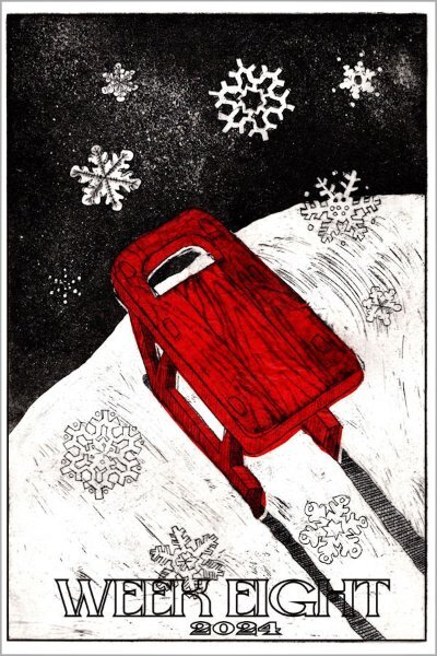
Here's my childhood toy, a wooden red sled built by my grandfather, Emil Hagquist, who emigrated here from Finland in the early 1900s. I was born the year WWII started and there were no commercial children's sleds to be found in the stores as all the manufacturing was devoted to the war effort. This is an etching created by my daughter, Debbie Lennox, who actually played with this sled. Note, there is no steering mechanism; you had to drag your toes to steer. 😉3 points
-
3 points
-
I was very touched by your story and your daughter's drawing. My eyes started to leak a little. ❤️2 points
-
Susan, that's a good question and the answer is I don't know. Possibly one of my daughters has it or it may have been left behind at the house in Sussex County, NJ, where they grew up. Their father passed away in 1992 and their stepmother had a wood stove fire which ended up with the house condemned. Now you have me wondering so I'll make a point of asking. That etching was done just last year so maybe... Thanks for the memory boost!2 points
-
Thank you, Marie-Claire! You're not late, I celebrate all month anyway. 😉😊2 points
-
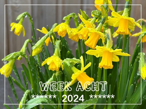
In week 3 I showed a photo from a little container with bulbs partly covered with snow/ice and this is how they look now. They are in full bloom despite all the rain we are getting and today when I took this photo it was dry with better light for a photo. There are still raindrops on them and those haven't had the chance to dry because we have had more rain for the rest of the day.💦☔I don't think I will have a better chance on a good photo because we now (it's evening here) get storm as well with warnings in place.2 points
-
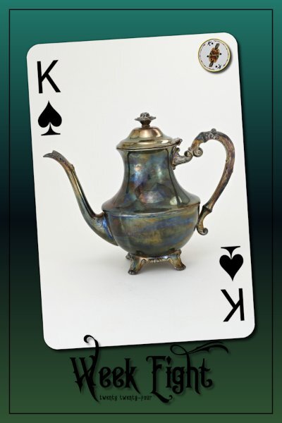
Week 8 I should be doing my Solid papers but for some reason our email program just stopped working so hubby has been trying to get it up and running. So I'm doing a little bit in between his "fixing" time. Good thing for my old laptop with a nice working email. I used King Edward font (from CF). I wanted a shadow so it would show on the card. I sure flip-flopped on what settings to use where it would show up but not look weird because I find shadows can make black text look blurry or like accidental double text. I didn't shadow the 2024 as I knew it would look weird, but I wanted a black text and a darker layout as well. Gradient is from PSP that I've used before, it's a favorite of mine. I'm trying to get rid of most of the t-cups and will be the same for the t-pots and here I was in the thrift store yesterday with yet another t-cup and t-pot in my hands! I just noticed this layout looks better if you click on and see it with the black around it.1 point
-
I hear you. I used to live on the Westcoast (BC) and love the grey rainy days. I've lived in Alberta for 10 yrs now (land of the expansive sunny skies) and if we have 2-3 overcast days in a row I'm pretty whiny about having no sun.1 point
-
It is strange that you could not open it in Chrome. I use Chrome and it plays well for me. Glad you found another way around.1 point
-
Sorry to hear life is difficult for you right now. I hope you find a quick resolution and are able to resume your creative time. take care.1 point
-
Hello, at the moment I'm a bit burdened privately and can hardly concentrate on my exercises. But I'm currently translating the tutorial PDFs so that I can use them when I no longer have access to the mask workshop in the forum. Have a nice Weekend.🌼1 point
-
What a cute photo and I like that you kept the rest of your layout neutral. In this way all the attention is on the cat.1 point
-
thank you ... getting colors to go well together is one thing I really want to understand better. Maybe someday 🙂1 point
-
That gradient background works so well with this teacup! I like the font too.1 point
-
1 point
-
DAY 7 - a bit late but I wanted to finish it For the background, I did the dots at 100%. Then I decided it might be interesting to do another layer, in a different colour, with dots at 50%. I like them both so used them in the background. My image was just something that I liked that I created using the Kaleidoscope tool. Then, I thought it might be interesting to remove the image and have just a paper at 3600 x 3600. I am including the picture of that as well. Thanks everyone for the great work you have done. Thank you, Carole, for hosting this. It has been fun.1 point
-
1 point
-
I went one step farther, I did screenshots of each step and put them in order on a letter size paper and saved it to my desktop and printed it too.1 point
-
Fiona, I fully understand that particular difficulty; I had the same problem but I solved it quite easily. I rewatched the video and halted it at the point where we got to those floating layers step. Used play and stop for the video and simply wrote down on very "old-fashioned paper" the steps and never had this problem again. For a while I needed my cheat sheet but now I now it by heart.1 point
-
Oh, gosh, I didn't see the first one until now - love the out of bounds with both the giraffe AND his leaves out of the frame LOL! I just love the round disks in the middle and the stamped paper - well the giraffe paper underneath, too. An excellent LO all around.1 point
-
That is so nice - the stripe paper and the dots withthe tilt of the backing papers. So happy! And the alpha is fun, too. (Wouldn't you hate to have to reach into that bucket of fish futter? Blick!)1 point


Resized.thumb.jpg.d25811db03a63358cedab1e79f527635.jpg)
