Leaderboard


Popular Content
Showing content with the highest reputation on 02/20/2024 in all areas
-
DAY 7 Font: AR CARTER, Brad : by Magnolia (Digitalscrapbook, blog train Oct.21) Cat on photo is PLUCHE, our friends' cat that I take care of when they are on vacation7 points
-
Day 7 I made it! This too me a long time to futz around with. The keyboard keys was a separate photo that I merged in, the zigzag and lightning bolt are brushes (the zigzag might be from Corel?). And guess what I found out....the diagrams from the pencilsketch2 are also brushes I have. that way I could add them where I wanted. I ran the script several times, changing the edit of the photo each time. that gave me lots of hatch to choose from and I used a mask to get the best of the city buildings (computer circuit boards). The "moon" is the disc from inside a hard drive as are the other elements, except the upper left "cloud". the red flare is a brush too. the font is Avalors (CF) and I duplicated it, turned the bottom version to a raster and blurred it. the font itself had a humongous stroke, by accident of clumsy fingers, and left the tiniest space for fill so I went with it. the keys were taken off the keyboard (that my work was recycling) and lined up as it was, I didnt leave enough space between. I took forever (and the cats got banished because they'd undo my work as fast as I was doing it). tonight I'll get started on the Build a Kit. I see everyone has started off with a creative bang! Thank you for the workshop Carole. I pushed myself more in this one.
 4 points
 -
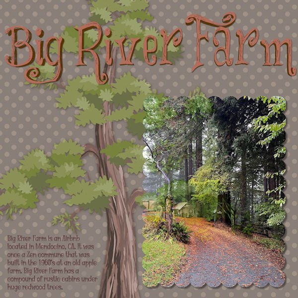
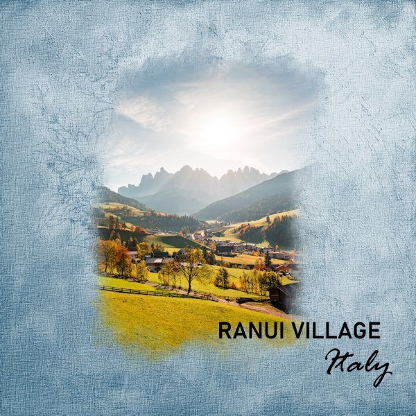
Finally got to finish Lesson 7. Here is daughter, Deb's, Big River Farm that she has turned into an Airbnb. It seems folks want to get away to a rustic environment! Who knew? It does have all the mod cons so there's that. It has about 5 cabins on the property, but the largest one is the rental. The title font is "Things We Said." The text font is "Witch Mystery." (Because the title font is a bit quirky, I tried to follow up with the text font in the same vein.) The redwood tree illustration is from pngtree.
4 points
-
Yeah, me, too. atm I'm feeding 3 feral "community" cats outside on my porch. I have an application in for the local shelter to come for Trap/Neuter/Release [TNR] which means they'll be back for me to feed. I put up a cat cabin on the porch for their shelter. Meanwhile, my indoor brats are jonesing after the ferals food which is different than theirs. I've tried them on the canned pate and all they do is get sick on it. The indoor crew hangs out by the open sliding glass door in good weather; which is their version of a "catio!"2 points
-
Thanks, Gerry. I now have the Powertoys and the highlighted (and animated) cursor!2 points
-
Me too. And I've done the quiz before. I always want to to call the cat Slippers. If I ever get another cat I want to call it Slippers.2 points
-
DAY 6 Bird : free png (pngwing) Nature element : Commons (digitalscrapbook) Elisabeth Minkus Font : Alegra2 points
-
I decided to do the basics and show them here in 1 thread day 11 point
-
On the last Q&A you asked for feedback for highlighting the cursor and I only now had time to have a proper look. It certainly shows where you are clicking on your workspace and that makes it much easier to see where you are and what you are doing. So for me this is great and I would like to have it for masterclasses, Q&A, workshop videos etc.1 point
-
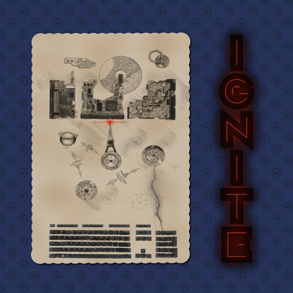
Day 7 here's a diff version I was in the shower, just about to go to work when it hit me to color the blurred raster layer. I used the Ctr A, Ctr F , then flood filled like we learned in the last Q&A. I'm not sure if I did it right as I'm doing it from memory and it merged with the layer below it (the one I selected). I'll have to go re-watch that. I used that because it was blurry so it would use all the pixels. since I wanted a copy of the orig. blurred layer, I undid it, then made a copy and hid it. then did the select all, float, flood fill. then i turned the black layer back on and really cool was the black kinda of stuck out past, and I lowered the reds opacity so more black could come through. Supposed to be like glowing embers about to ignite. What looks better? I did get a color showing through the G but it looks interesting to me so i didnt try to take it out.
1 point
-
Susan, you worked a lot in this workshop to edit all photos with the PencilSketch2 script and then edit further until you achieved the desired result. Very nice !1 point
-
I also chose Slippers 😄1 point
-
Oh Ann, I'm so happy you liked that picture. And my heart sings, knowing it's on your wall. This was a super friendly cat on a walk around the neighborhood. Every time I crouched down to get a picture he/she kept coming toward me. My husband played with it for a bit and it would roll around for tummy scratches of all things....to a complete stranger! Isn't it just a beautiful cat. We have another cat from the 'hood called Snoop (he has a collar) who comes and spends the day lounging in my back yard or going into the garage if my hubby is out there. He very much wants in! I've even phoned the owner to see if it's okay that he is at my house visiting (outside, never inside), and he even came into the part of my gym that is in the little garage and acted as my very judgy trainer. The owner was surprised at how far away he was. I'm hoping to build a catio for my cat girls. I couldn't live with them roaming the 'hood, I'd be a basket case of worry.1 point
-
Me too but I felt good that the PSP ones were right. Must be flook or a good teacher!1 point
-
It's part of a set of tools called Powertoys, a free add-on to Windows. The mouse highlighter is great for finding the cursor, particularly on a busy screen. Just shake the mouse, and a big highlighter shows up, which shrinks down to highlight the cursor.1 point
-
You remind me, #Susan Ewart. During the Vectors class you posted a photo of a cat with a waving tail with the label "I'm too sexy for my tail. I'm too sexy for my tail. Imagine that!" My question, is that your cat? If so, what's it's name? I was so impressed I printed it out and it's on my office wall... 😽1 point
-
I agree with Corrie. The highlighted pointer is a great help. I am using something similar to Windows Powertoys called Powertoys Awake. When I shake my mouse, a highlighter appears so I can find it.1 point
-
I would also be happy with a bruch workshop!1 point
-
Carole - the 2nd image had revised shadows. It seems I made a bad design choice. Below is an image of how I got to that place. The left one is what I started with followed by the routine shadowing. The third is a cutout of the title with the fourth showing the shadowing. This is the one that I used. Had I put that on top of a solid color or a subtle pattern, the eye would have seen it for what it was. However, putting it on top of a bold and colorful pattern confused the eye. Using the original title, the eye would no longer be confused. From a little detail comes an important lesson, which is why I enjoy these workshops.
1 point
-
Lesson 7 Font used Rockwell Condensed Thank you for the workshop. I thoroughly enjoyed it, Carole.
1 point
-
Many thanks for lesson 4. I love the watercolour brushes that you gave us a link to, they are so much fun to use.
1 point
-
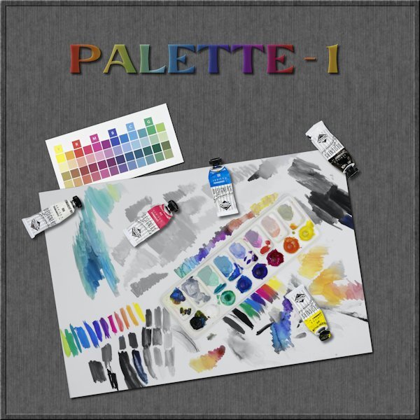
@Bonnie Ballentine The Linoleum pattern is very addictive. It always gives something slightly different so it piques your curiosity! Your style is very simple and always focused on the photo as the star. @sharon thompson If you use a monochrome noise, the effect will be more subtle. If you want something bolder, use a multicolored noise. That is one way to control that. You mentioned that you converted the abr brushes using a freeware. What version of PSP are you using? You can import them directly in PSP starting with version X5. Check this video. The ability to open a font and have it available in PSP is not something that came with PSP, but it was a Windows feature. That was lost with Windows 8 (I think). I used to LOVE that feature. Since then, I have always used TheFontThing, which still works on my Windows 10. @Susan EwartI tend to find the point-to-point selection a bit frustrating as I find that it is hard to stop midway, and if you make a mistake in the selection, I find it harder to fix. Your Palette-1 layout is so colorful! That is a very creative way to use masks. About the Palette-2, isn't that interesting how the shadows will give a completely different effect? @Harmony BirchMaybe your shadow had a horizontal offset but 0 for vertical. At least, that is what it looks like, which is similar to a typical shadow when the element is rotated afterward. That font is nicely used! @Jen Brown Be careful with the kaleidoscope effect: it is addictive! LOL @kasanyThe little caterpillar and butterfly come from where? I have seen those shapes before. @MoniqueN.A simple brush tip can give a great result. You don't need anything fancy. And when you can play with the Brush Variance palette, it opens a whole world of options. @Anja PelzerYour use of the brush blends it so well with the photo. Great result. @Sue ThomasI would not know what a spanner is either! I heard a plumber call it an adjustable just yesterday. That was new to me too. @fiona cook It is great that you chose a font to match the photo. It makes your layout very cohesive. @Gerry LandrethAre you posting a different image? I still see the shadows on the top left of the title. Using snowflakes instead of polkadots is still using the same technique! @Ann SeeberYou used the corner punches in the mask? That is a cool idea. @Marie-ClaireThat last photo of Poncho makes me smile. How can you resist such a face? @Donna SilliaThat is quite a large kaleidoscope pattern! It is fun how to make that title look like a layered font. @Corrie KinkelAdjusting the blur of a mask is one command that you can do and it will suit your photo/project. @Carolyn RyeAs I have mentioned to others, be careful as the kaleidoscope and the linoleum patterns are addictive! I have been getting several requests for a "Brush Workshop". That was not in my to-do list for this year, but I might add it. I had something else in the pipeline, but I guess I can change that.1 point
-
I do love this poem: Trees BY JOYCE KILMER I think that I shall never see A poem lovely as a tree. A tree whose hungry mouth is prest Against the earth’s sweet flowing breast; A tree that looks at God all day, And lifts her leafy arms to pray; A tree that may in Summer wear A nest of robins in her hair; Upon whose bosom snow has lain; Who intimately lives with rain. Poems are made by fools like me, But only God can make a tree.1 point
-
Day 4 I tried the PencilSketch2 script but there was too many hues that are dark so it didn't work well. In fact I had planned on using an image of the paint palette on it's own with the tubes of paint in front of it. It didnt work. so I went on to trying to the use the brush with a "hide all" mask and well, it's looked something you'd throw out with the trash. I had this other image of me playing with 20 yr old gouache WC paint using only CMY K and White for my color group I belong to. I had the idea of having a desaturated image and using the mask to bring back color in the palette and certain areas. I dont know why, but that was a head scratcher using the two layers of the same image (one desaturated and one fully hue-full). I got there in the end and this is just the technique I have been wanting to learn. I need to practice it way more. I extracted the tubes from the other image I was going to use and put them on this image as separate elements. The little square color swatches is from my color group, something we are doing until the real color cards get made and mailed to us. The font is Evidance, by Creative Fabrica I think. With an inner bevel added and a gradient fill and lowered opacity (with the shadow layer below it turned in into a dark tone, as the shadow was not 100% black, otherwise it would have been a dark shade). Tomorrow I will only be 3 days behind. Yippee!
1 point
-
DAY 4 Cluster: Jessica Dunn (digitalscrapbook) Fonts : Forte and Molly Script The birds is a free photoshop bruche that I downloaded once, I think on Deviantart For the paper, I applied 3 large strokes with green, light blue and darker blue on a blue background, using a watercolor brush.1 point
-
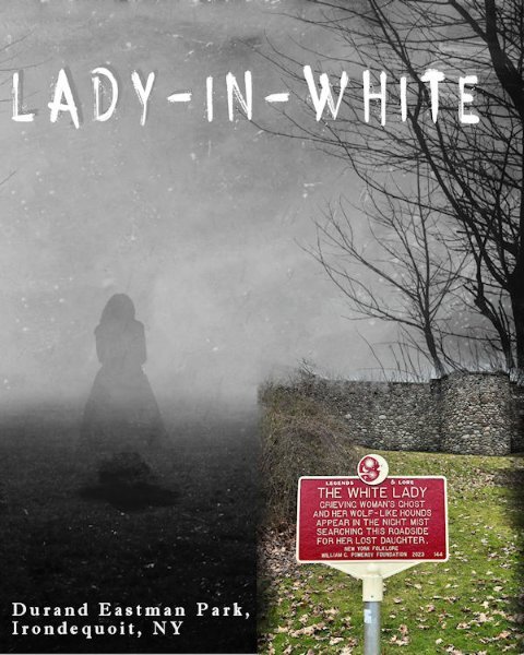
Here is my Lesson Five - Lady in White (A local tall-tale) The title font is Horror Story and the other is Imprint MT Shadow.
1 point
-
Day 3 and 4 🙂 "Zo gaat de molen" is the title of a Dutch song for children, my granddaughter loves to sing it with me, well I sing, she does the movements (she is 2 years now since thursday🥳) The kaleidoscope I totally forgot it was in PSP, was nice to use it again. Sometimes it's nice to have a "calm" pages, with not too much things added. Day 4 is a shipyard form the old days from the Netherlands. It closed in 1947 and rebuilt in the museum in 1948. Font is Bree serif and I used a brush form the link Carole had in her lesson.
1 point
-
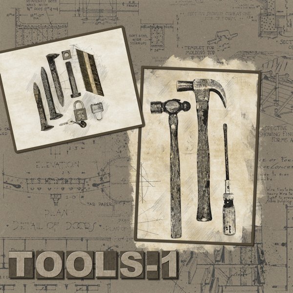
Day 2! I'm just moving right along now. I might even get done by the end of next week! Yeesh, what week to have a heavy workload. Continuing on with playing with the PencilSketch2 Script and some old tools left by the previous homeowner when we bought the house (and he was "kind" enough to leave numerous mystery liquids in unrelated containers that we had to take to the hazardous materials dump since we didn't know what any of it was 😨). But, the tools were cool so I kept them. the railroad spikes I had already. I used the Lady 22 template 158 and changed it to fit my photos. I didn't do the plaid...mostly because I forgot and because it didn't fit with the idea I had, although plaid shirts and tools go together so maybe I should re-think that. For the title I used the Letterpress Script (Creation Cassel) and I used the steel version but added a bit of color. Background paper is from Sheila Reid VPS Set 01 - paper texture - 06 (Digital Scrapbook) - it's originally blue, I did a negative image then changed the color with HSL. I love the PencilSketch2 script, there is a lot you can customize with the layers you get after the script is finished. You might see a little more color in the smaller photo. The photo you use is also in the layers palette (a duplicate as your original is not harmed in any way) so I brought it up above the background layers then lowered the opacity so add a little more color.
1 point
-
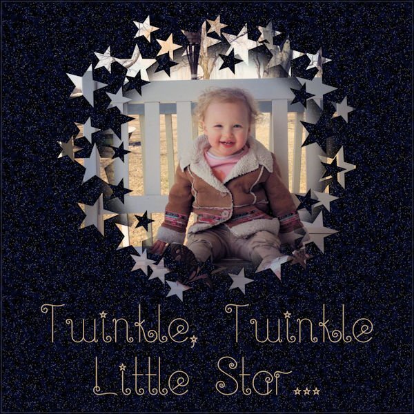
Lesson 5. Font is Twinkle-Fairy.
1 point
-
Day 4 - Am a bit behind but hope to finish 2 assignments today to catch up. I used a watercolor brush from Sweetpoison over at Deviant Art (they have such intriguing names there). It took a couple of tries to get it right and I did cheat by placing the photo to one edge. Then I got the bright idea of using another photo as a background paper. The background that was being masked out was a bit dark so it doesn't really blend that well with the background photo but at least I got the concept right, I think.
1 point
-
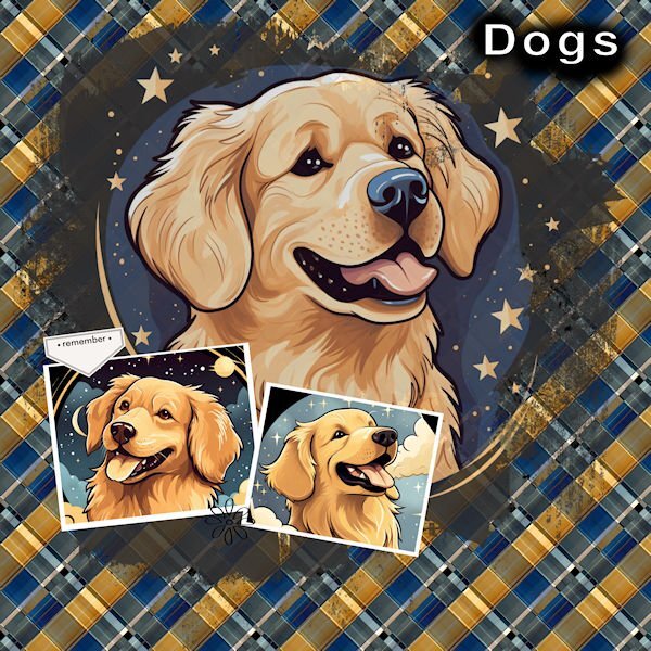
Day 2 I really like what the background has done. It looks really nice. Thank you, Carole, for the turorial.. The Dog images are from Creative Fabrica.
1 point
-
@sharon thompson The difference with the compression is that you are likely using the File > Optimizer > JPG. In older versions of PSP, that was the only place to adjust the compression but since a few versions, it is available (like Julian illustrated) just in the Save as... dialog window when you choose jpg format. @Harmony BirchThat is a fun way to combine different tools to create that background paper. And that font is so fun! @Emerald JayAnother kitty picture. That background is great to showcase him. @fiona cookThat is a very creative way to showcase that tree! It is fun to hear that you had two mask groups. @Rene Marker Yes, when you have a sharp edge on a photo, it can be tricky. Depending on your preferences, you can consider placing an edge on the edge of the page, so that makes one less to worry about. But it won't always work out. Just an option to keep in mind *IF* it can work. @bina greeneIs that "due today" actually written on the wall? @Julian AdamsThanks for your help about the compression. I had forgotten to point that out. @Anne LampThat is a great idea to layer a colored version on a faded copy of the photo. The effect is very interesting. @Gerry LandrethThat is such a cute tradition. I am sorry for your loss, but she surely would love to see you enjoy that dessert (free or not!) @Donna Sillia Before reading your description, I thought you had used a sort of layered font! @Anja PelzerThose colors are so vibrant! It really makes that bird even more colorful! The layered papers really allow you to use a pattern that would otherwise be overpowering. @Corrie KinkelThat extra paint splash is just one element but really suits that layout to emphasize the flowers. @Bonnie BallentineYour adventures never cease to amaze me. There must never be a boring day for you!1 point
-
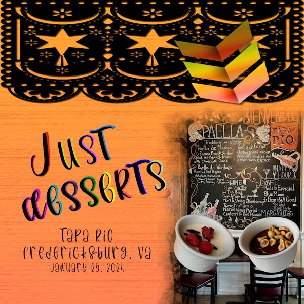
I am continuing with the amazing food the my daughter and I had in Fredericksburg at an Italian-Mexican fusion restaurant. One dessert is a goat cheese panna cotta and the other was a chocolate pot with hazelnuts. The background is actually a wood background that I made, but when I used the textile fill, this is how it came out. The pictures and the arrows are my own. The black border is from Creative Fabrica. The font is called "Los Pinata" from Creative Fabrica. I converted the text to curves as character shapes, duplicated them and now I can't remember the next steps, but I know that I did not use stroke. I guess I will have to keep experimenting and save my steps.
1 point
-
Day 2 again, Thanks Carole for pointing out my mistake with not replacing that placeholder with something else. I used a bird from the Escale Amoureuze kit but recolored it to yellow.
1 point
-
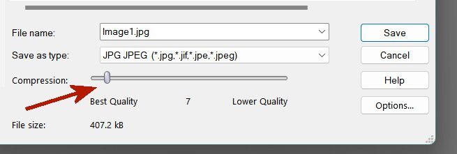
@sharon thompson When you save a jpg there is a slider in the dialog. I pointed it out with a red arrow in my attached screen shot. Higher Quality makes for a bigger file size. The file size is shown too, so when saving to post on the forum, you can adjust the slider to make sure your images are less than 300kb which is the maximum size allowed. If I remember correctly Cassel recommends a quality setting of 12 as a general guideline but a little lower won't matter very much if that's what it takes to get your work at or below 300 kb.
1 point
-
day 2 with my own Kit JustForFun you can find the link in "What are you working on (in January 2024)?" Thread font Underwater for the MainTitle1 point