Leaderboard
Popular Content
Showing content with the highest reputation on 02/08/2024 in all areas
-
I recently participated in a pickleball clinic. One of the instructors was Ron. He is nationally and internationally known referee for pickleball. Just had to have a picture...8 points
-
Template by MsFish and is a part of February's A Love For Layout Templates Blog Train. Blue paper and elements from Digital Scrapbooking, Reniassance Faire bundle.7 points
-
Easter, 2023. My niece and my nephew's soon to be fiancee. We usually have a craft for special occasions. Template 4 by Lady 22.7 points
-
5 points
-
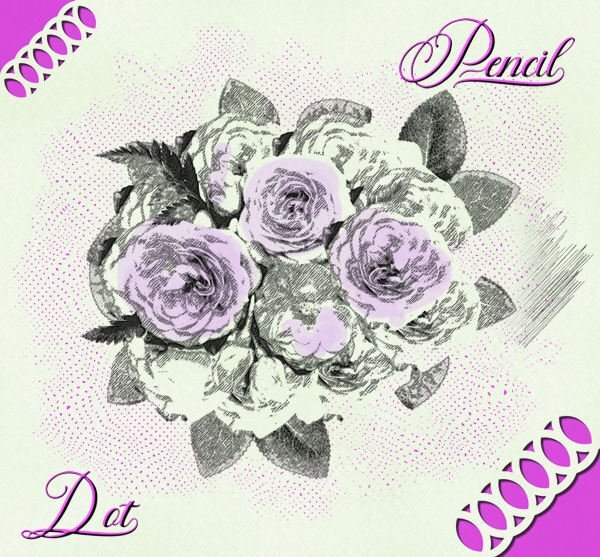
I have been playing with the Pencil Sketch 2 script which I won last Sunday and this is one of the images I created. I used this month's Lab to make the dots and an edge punch just for fun. The font is Fadilla. When using the pencil sketch I find that it gives the best result with images that have very defined edges with colors that are not too light. Here I decided to give some of the flowers a little bit of color.5 points
-
Well, in that case, I'd keep going and create an entire alpha in that style. It is stunning!4 points
-
Wow, Bonnie! This has to be the best D.I.Y. result. I love the dotted background for the title. Very creative! Is that a font or an alpha?4 points
-
4 points
-
3 points
-
Possibly this: but I thought there was a different (more modern) name for it. (the bold part below wasnt me, it was from google, it's like it's yelling at us). What are the characteristics of cloisonnism? (from Fr., cloison: 'partition'). Style of painting associated with some of the painters who worked at Pont-Aven at Brittany in the 1880s and 1890s, characterized by dark outlines enclosing areas of bright, flat colour, in the manner of stained glass or cloisonné enamel. Or possibly this one? Toon style, also known as cartoon style, is one of the oldest and most recognizable comic book art styles. It is characterized by exaggerated, simplified, and often caricatured characters with bold outlines and vibrant colors. Or Pop Art often features hard, defined edges and thick outlines, which can be achieved using stencils or masking techniques. These edges give the paintings a graphic quality, emphasizing the flatness of the image.3 points
-
2 points
-
Cute young ladies and smile... I love the quote, too, Bonnie!2 points
-
2 points
-
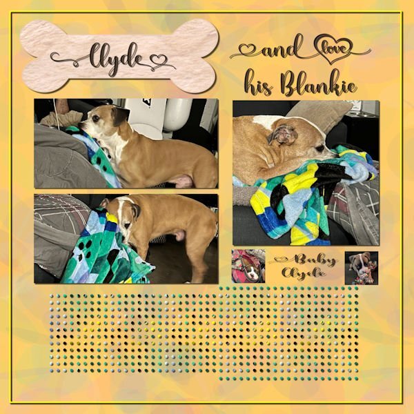
Last week, I was in Fredericksburg, VA visiting my daughter. Her dog, Clyde, is quite a character and a lot of fun. I made a pattern from his blanket and used it to fill the middle dots. I just used a color from the blanket for the other dots. The font is Madelyn Heart from Creative Fabrica. The bone is a preset shape with a texture from Creative Fabrica. The photos are mine and my daughter's. I used the open as a layer and clip to it scripts for the pictures. I loved how he would drag his blanket from the floor to the couch so that he could lay on it.2 points
-
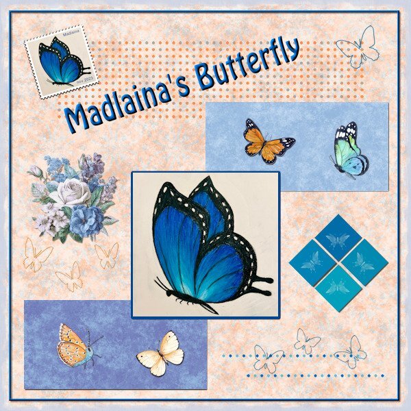
I stayed rather close to the DIY-kit and used all the elements as they were, but reshuffled them. In the big square is a photo of a drawing my eldest granddaughter did. She loves drawing and is taking courses to make a portfolio to get into a highschool that will have extra courses in arts. All the papers are from this month's Blog Train and by Jan Clark and Nellie Bell. I made 2 extra squares and they have brush prints on them; the other butterflies are from my collection and the butterfly outlines are preset shapes. The flowers are by Jessica Dunn, my own postage stamp, recolored dots and the font is Hobo. I think I have it all, nice to be back to scrapping, however I'm not saying goodbye to scripting either.2 points
-
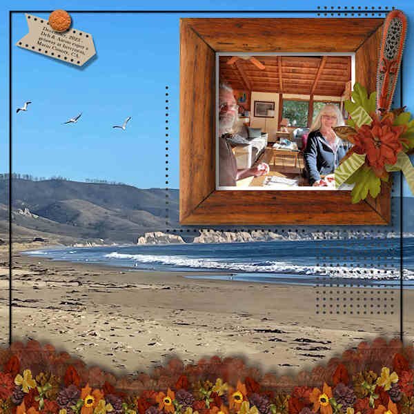
My entry for the DIY Challenge. Using a photo of Deb and Aaron in their Airbnb on vacation in Inverness, Marin County, CA, and her photo of the beach as background. The clusters at the bottom are the same size as the larger rectangles in the template + an addition. The tag top left is a combo of the two small square elements in the template. I added more dotted areas; I like the effect. The frame and all other decor came from the ID-Circle of Life mega kit. The font used on the tag is Baskerville Old Face.2 points
-
Wow, this arrived 3 times via email. I thought you had the hiccups, Bonnie! LOL1 point
-
OOPS. All that work and I forgot one M. Thanks for pointing it out. I am bad as spelling but this one was just a typo.1 point
-
Thank you for the tips. I had planned on playing with the script tomorrow.1 point
-
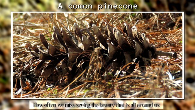
Anne did you make a typo with comon or is this a normal word for a type of pinecone? Sometimes I encounter here words that I have never heard of, so I'm not sure...1 point
-
1 point
-
1 point
-
Doska, your frames are outstanding. I look forward to seeing more of your postings here in the forum. How sad that in your other forums they are so focused on little details and seems they've totally forgotten about the art that is being created.1 point
-
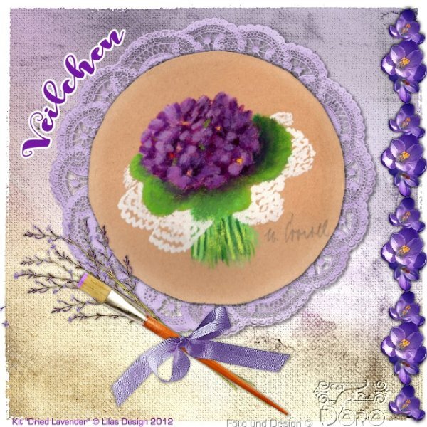
Hi Carole and campus members, I will be taking up more of my PSP training with you again. I'm totally frustrated with the hazing curriculum in two! German forums. I want to learn something AND have fun with it and not have an unpleasant feeling when I log in whether I have misspelled a copyright or placed it on the graphic. It was hardly about graphical errors, only about the legally correct placement of the copyright of the material. Really exaggerated. So I only make individual scraps when I get the chance (i.e. I don't make albums) and I'm only part of the challenges in the digital scrapbook forum and with you. In the last German PSP forum I have left, I only make frames around my own photos (credits!) I actually only want to learn PSP for scraps, frames and image manipulation, I'm no longer interested in animations and sign tags. Here my last frame and a scrap for a color challenge in DS from a small, gifted painting from a regional painter. Next I'll take a look at the button video, I also have photos to go with it. WITH FUN!1 point

Resized.thumb.jpg.d25811db03a63358cedab1e79f527635.jpg)


