Leaderboard
Popular Content
Showing content with the highest reputation on 09/29/2023 in all areas
-
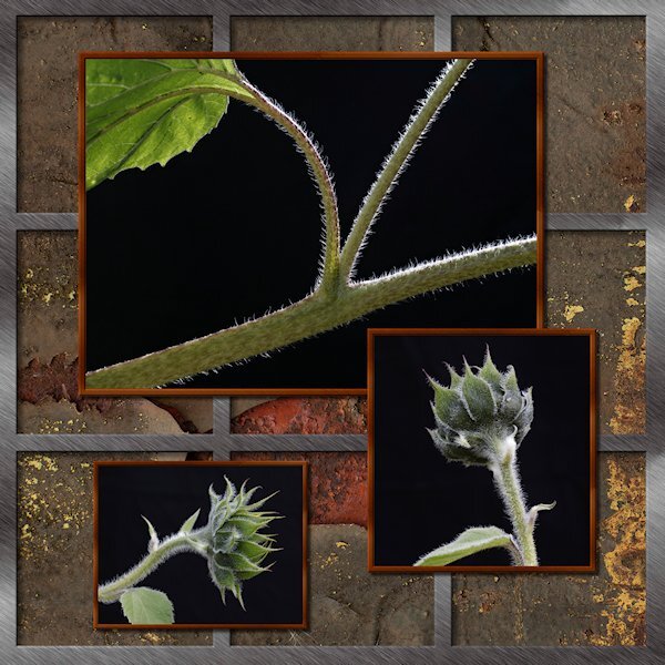
Here's my take on the Sketch Challenge. No words, just pictures. It was fun to do. I did the silver frame with vectors, not sure why, just seemed easier to do it that way. the outer frame is one object and the 2 verticals are one object and the 2 horizontals as one object. It just occured to me to make it a preset shape. Wonder if it would be useful. The background is a patter I got of rusty metal. It only has a number name (02) but I think it came froim of the ...eezy website (Brusheezy, Vecteezy etc). Lighting by mother nature...background by a non-descript black background I dragged outside....and had to weight down because it was like sail on a windy day and kept blowing over onto the poor subjects.10 points
-
7 points
-
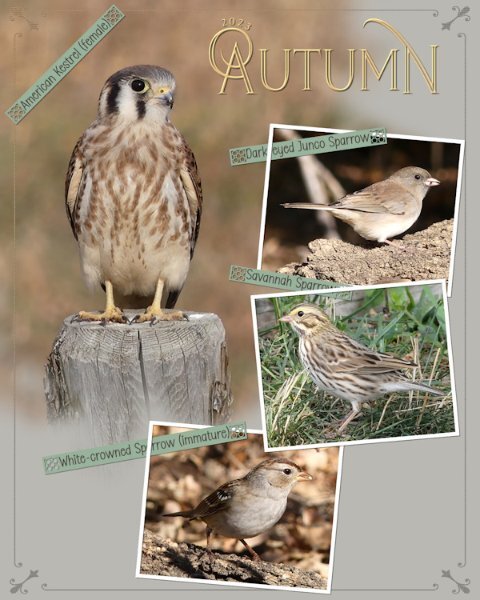
Another Autumn page in a series that I'm doing, on the birds that stop off for a brief visit, before continuing their long migratory journey. The border is a combination of a corner element which I added a thin border all around to, overlay. Phrase strips which I created, adding one of Carole's new punches. I really do love these, they are ever so easy to use. I do recommend using guides or grid when using them. Text on a text path, masks to slot the photos in . Photo frames are done using the vector rectangle tool.6 points
-
5 points
-
5 points
-
Redo of Day 5. I forgot that they were supposed to be two separate pics. I knew it when I started but lost track of what I was supposed to be doing ?. I also reduced the size of some of the stars as per Sue's welcome suggestion.5 points
-
4 points
-
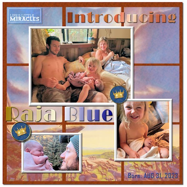
Finally finished my Sketch Challenge. Introducing my new great grandson, Raja Blue Lennox, little brother to Magic. He was born at home on Aug 31, and it took the parents a week to come up with a name. ? I think he weighed in at nearly 9 lbs. Daddy Will introduced him with a musical rendition of the opening to The Lion King, so I went with the theme and used a Lion King poster in the background, mirrored and screened in each of the 9 squares. The mat behind them has a wood grain pattern. The crown brads are from Janet Kemp. The title font is Broadway, treated to a Copper gradient and a Chrome Reflection gradient. The little word art top left is from Marisa Lerin. I tried out PSP's One Step Photo Fix and was impressed with the results. I think it is improved in PSP 2023.3 points
-
Thank you for your words. My heart is singing...and windows are breaking. yes, the behind and a bit to the side. I planted cosmos in pots (as a test to see if I could actually grow anything) and I have been able to move them around according to the sun. the sunflowers were in the garden and the big wind we had made them all lean over at waist height so I was able to photograph them before getting them moved back upright. I will use that idea of a wind break next year. I have been doing the cosmos like that too. I look out the window and see the sun shining through and run for my camera. My backyard has too much dappled light that is distracting since the neighbour cut down two huge trees that gave me beautiful deep dark shade in one corner. So the backgrounds are not great, I had to come up with a plan. Foamcore was first but it blew all over the place, even on lighting stands, so I went to a backdrop I have and put a weight on the stand base. I love translucency in petals and leaves.2 points
-
I'm off out now to shoot the moon. We had a drop of rain last night, which has dampened down the dust. It's a calm clear night.2 points
-
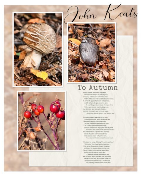
Well! I started out with the intentions of using the sketch. It didn't take long for me to do my own thing, once I added the photos. The background paper is the photo of the Immature White-throated Sparrow, blurred, overlay, and lowered opacity I added the rosehip photo to add a vibrant colour to make the page pop, on an otherwise earth toned page. I screenshot the poem to save me having to type it out. Blend mode multiply.2 points
-
2 points
-
2 points
-
2 points
-
Hello Carol and all members, I'm Doska (nickname from first, last name and city). Jenifer already told me something about you, but because I'm still working with Photo Impact X3, I thought I couldn't take part here. But now I'm considering maybe getting a PSP because I'm afraid that with the next WIN 11 or 12 my beloved PI will no longer work. And I love digital scrapbooking, it's still my only hobby. I'm 72, have already celebrated my golden wedding anniversary (sept22), worked in emergency medicine for decades as an intensive care and... Anesthesia nurse, volunteering with my husband in the emergency services and now volunteer fire brigade (friends of my age) doing digital scrapbooking with PI-X3 since 2005. Before my PC days (since 1996) I drew. I love animals and have had cats and a dog as pets. I also have a personal relationship with Jesus Christ, since HE speak with me 2012.. I would like to ask whether I can still show my PI works until I take a course? I'm also on Merisa Lerin's DigitalScrapbook forum. Thank you for the invitations Carol and Jenifer, I hope we have fun and I learn new things. Kind regards Doska1 point
-
1 point
-
that kestrel is so cute. I love that border and the what you did with the word strips, in and out of the frames and the punches (which I bought but havent loaded - scripting is taking more time these days).1 point
-
I see that I should have put this page in what are you working on in September. I'm going to leave it where it is. There isn't any point in duplicating it anywhere else in the forum.1 point
-
I'll come and welcome you too. I'm a beginner at Photoshopping and not the best in the group. Although I do that at a snail's pace. I've been more creative with PSP for over twelve years. But I'm learning a lot here on this platform. You will experience that yourself here.1 point
-
1 point
-
1 point
-
1 point


