Leaderboard
Popular Content
Showing content with the highest reputation on 08/17/2023 in all areas
-
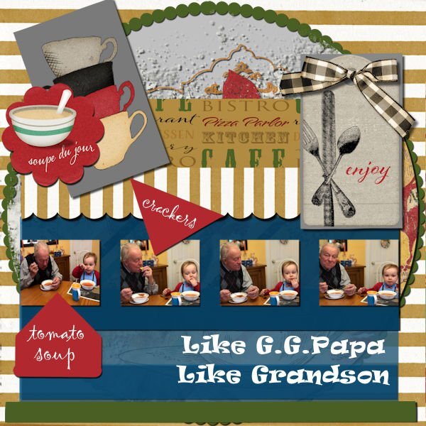
This was a great challenge, and by that I also mean brain smoking! Somehow it came together, I never really feel I'm in control of the out come, I just go with the flow that seems to evolve in the process. There are some fabulous results being posted and tricks / tips shared. Thank you all. This tells the story of my Sister's grandson having lunch with our Dad, his GG Papa. The request was for tomato soup and crackers which is a favourite for both of them! The papers, tags and graphics are from a DS kit of Jessica Dunn's called Bistro. I overlapped a lot of the rectangles at varying opacities. The inner circle was filed with a paint transfer and shadowed which gave it some texture. The large font is Ravi, and the pointers are Gigi, both in my collection, probably from Creative Fabrica, but I'm not sure.6 points
-
4 points
-
These delightful interesting bees have consumed a great deal of my time this summer, observing and macro photographing them. Which is very tricky as they are super fast and really tiny. Every year I create more and more bee log tower hotels for them. Drilling hundred of holes in each one to accommodate the residents. This year I had well over a thousand leafcutter bees to home. For those that are interested :The drill bit size is 5mm, with a depth of 2 1/4 inches. Each bee can lay up to 6 eggs. They collect pollen with the " pollen brush" on the underside of their abdomen. Starting at the back of the nesting chamber, the female bee builds a protective leafy wall, which she will pack with a loaf of pollen and nectar (or paste). She then lays a single egg directly on each loaf and seals the chamber with another protective leaf wall. Typically, the females will lay eggs that will become females towards the back of the nest and males near the front. This behavior provides an extra layer of protection for the female eggs.3 points
-
Lab 11 Mod 4: Rope words; rope wound around a wood frame; horseshoe. All 3. Again I used that upper and lower section - this time for the title words (made with a rope tube) and used the rope tube for the frames. The cowboy boots are from Creative Fabrica; the frame is from Cass. This was good practice with the pen tool and creating vector shapes (the horseshoe) and I also used Cass-CustomDirectional Tube script to create a tube of the horseshoe. I was going to use it on the layout, but decided against it - it just didn't work for this layout.3 points
-
2 points
-
2 points
-
2 points
-
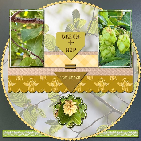
Bonnie you did great! This is my contribution and it is showing a couple of photos I took just the other day. When on a weekly walk with a friend, we came along a street that had a row of small trees that had hanging flowers like hop bells and we joked that the trees must be called something like "beech hop" or "hop beech" as the leaves were like beech leaves. We both didn't know those trees and so I looked in the plants-app on my phone to see what it could be. We had a good laugh when I discovered that those trees were really called Hop-Beech; we will never forget that name! For this layout I used my photos, made a ribbon with lace and colored or filled the other elements. All the colors are taken from the photos and some elements are recolored to match. The background is white with a frosted glass overlay (Inky deals) which I have in my stash. Font is Brellos a freebie by CF.2 points
-
What do you think of the painted gnome house doors? Being August 15, it is also Acadian Day. Do we have any Acadians in the crowd? Let's chat.1 point
-
They are super cute. We need to learn how to make those digitally.....probably with Vectors, our new super tool.1 point
-
•✿• They are SO cute! I can't wait to see what you do with them!1 point
-
1 point
-
1 point
-
Ann - Thanks a whole lot!!! I've been looking for "frosted glass overlay" and can't find one. This is how you do it!!! Thank you! Thank you! Thank you!1 point
-
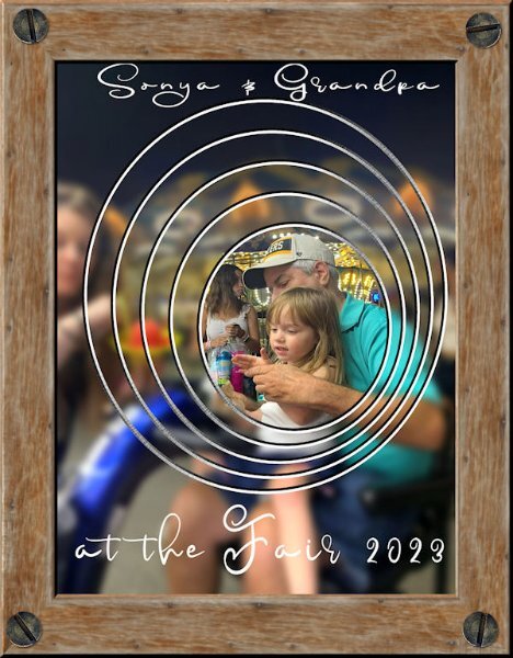
These pieces were definitely a challenge for me. I like my layouts spare and uncluttered usually. I combined some pieces and doubled up on others. The central circle is white reduced to 10% opacity over the background photo. The top border is the scallop clipped to a lace ribbon. The red borders are strips filled with a red pattern called 5Geometry. I filled the beads with a gradient. The top flower is named AHA-hygge, from my stash. This is my grandson Brad and his girl, Livia back in July at an event.1 point
-
1 point
-
1 point
-
1 point
-
1 point
-
Sometimes it's fun just to use picture tubes, clip art, and a gradient. The background sky gradient is mine; the grass, trees, rocks, and cloud are from various picture tubes; the flowers are from GoF Designs; the ladies in white are from CF. Oh, and the blanket is a paper that I changed with the Perspective Mode of the Pick Tool. The font is Amastery Script.1 point
-
1 point
-
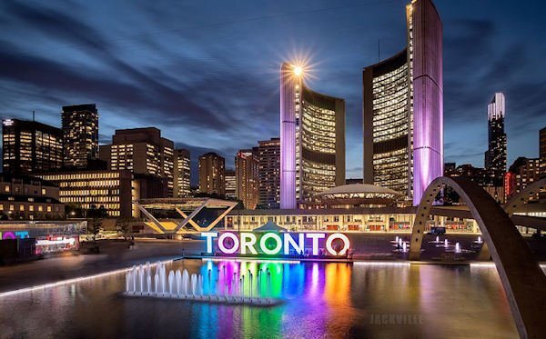
I'm in. I have enjoyed doing a Travel Tale in the past and once I had exhausted my personal travels I decided to make fantasy travel pages. Last time I "went" to Botswana, in Southern Africa, because I'm a fan of the book series The No 1 Ladies Detective Agency by Alexander McCall Smith which is set in that country and I always wanted to experience it IRL. I need to decide where I'm traveling to next but there's still time between now and Aug 21. Here is an example of my work:1 point


Resized.thumb.jpg.d25811db03a63358cedab1e79f527635.jpg)






_600.jpg.2803cbab17e5ead283ca5f02d3dc405c.jpg)
