Leaderboard
Resized.thumb.jpg.d25811db03a63358cedab1e79f527635.jpg)


Popular Content
Showing content with the highest reputation on 08/16/2023 in all areas
-
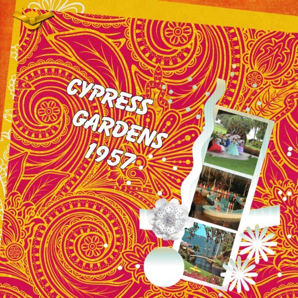
These pieces were definitely a challenge for me. I like my layouts spare and uncluttered usually. I combined some pieces and doubled up on others. The central circle is white reduced to 10% opacity over the background photo. The top border is the scallop clipped to a lace ribbon. The red borders are strips filled with a red pattern called 5Geometry. I filled the beads with a gradient. The top flower is named AHA-hygge, from my stash. This is my grandson Brad and his girl, Livia back in July at an event.
 5 points
 -
Lab 11 Mod 4: Rope words; rope wound around a wood frame; horseshoe. All 3. Again I used that upper and lower section - this time for the title words (made with a rope tube) and used the rope tube for the frames. The cowboy boots are from Creative Fabrica; the frame is from Cass. This was good practice with the pen tool and creating vector shapes (the horseshoe) and I also used Cass-CustomDirectional Tube script to create a tube of the horseshoe. I was going to use it on the layout, but decided against it - it just didn't work for this layout.
4 points
-
•✿• Excellent job indeed! These types of challenges are my favorite. Making us step outside of our comfort zones in trying new things. Seeing how each of us put them together is the absolute best! Great challenge, Carole! ** Will be back shortly with mine too.3 points
-
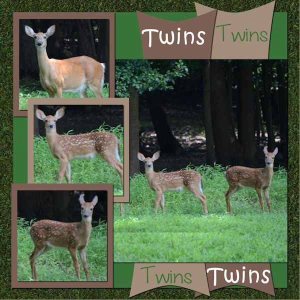
Scrapbookcrazydesigns by Robyn. Also from the ALFLT blog train, 2023 August. We have 3 fawns this year. A single and this set of twins. Again in my backyard.
2 points
-
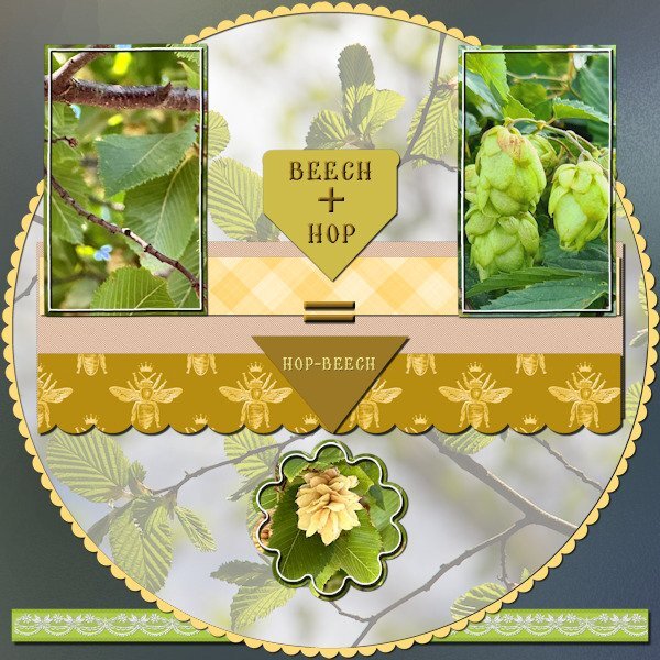
Bonnie you did great! This is my contribution and it is showing a couple of photos I took just the other day. When on a weekly walk with a friend, we came along a street that had a row of small trees that had hanging flowers like hop bells and we joked that the trees must be called something like "beech hop" or "hop beech" as the leaves were like beech leaves. We both didn't know those trees and so I looked in the plants-app on my phone to see what it could be. We had a good laugh when I discovered that those trees were really called Hop-Beech; we will never forget that name! For this layout I used my photos, made a ribbon with lace and colored or filled the other elements. All the colors are taken from the photos and some elements are recolored to match. The background is white with a frosted glass overlay (Inky deals) which I have in my stash. Font is Brellos a freebie by CF.
2 points
-
This was very difficult for me. I don't put a lot of elements on my layouts and getting these to fit in a way I liked was a challenge. Not sure I like it now but it's not too bad. I am looking forward to seeing how others interpret.
2 points
-
What do you think of the painted gnome house doors? Being August 15, it is also Acadian Day. Do we have any Acadians in the crowd? Let's chat.1 point
-
What a cool technique with the white overtop and reduced.1 point
-
Ann - Thanks a whole lot!!! I've been looking for "frosted glass overlay" and can't find one. This is how you do it!!! Thank you! Thank you! Thank you!1 point
-
Cassel, I think you are absolutely AMAZING!! Those are So Cute!1 point
-
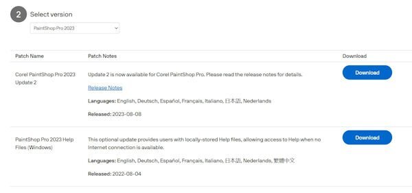
That is an interesting question. I think that until they added Update 2, anyone installing PSP2023 would have automatically had Update1 (the correct one) included. That is my best guess.1 point
-
I have 2023, but I never installed it due to all the bugs people were experiencing. I downloaded the updates, but I'm curious as to why one of them is called Update 2. Where is Update 1?
1 point
-
They are absolutely adorable!1 point
-
For PSP2023 I have a folder called setup with all the files in it. Program Files (X86) >Corel > Corel PaintShop Pro 2023 > Setup I did not have the haze tool either but did get it from customize. I did have to restart my computer to complete the initial install.1 point
-
•✿• These are absolutely wonderful pieces, ladies! It is so sweet to see the excitement you share, when you find yourself achieving your goals. How sweet too, that you share a bit about yourselves in each piece. I am so thrilled to be here .. able to watch you grow!1 point
-
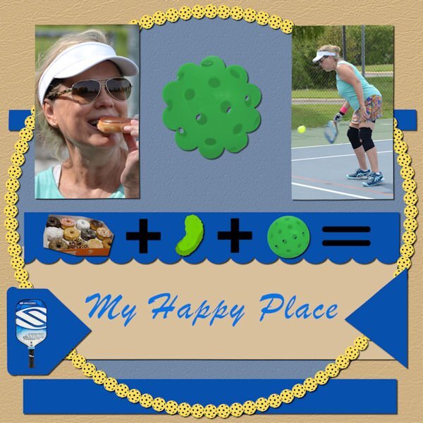
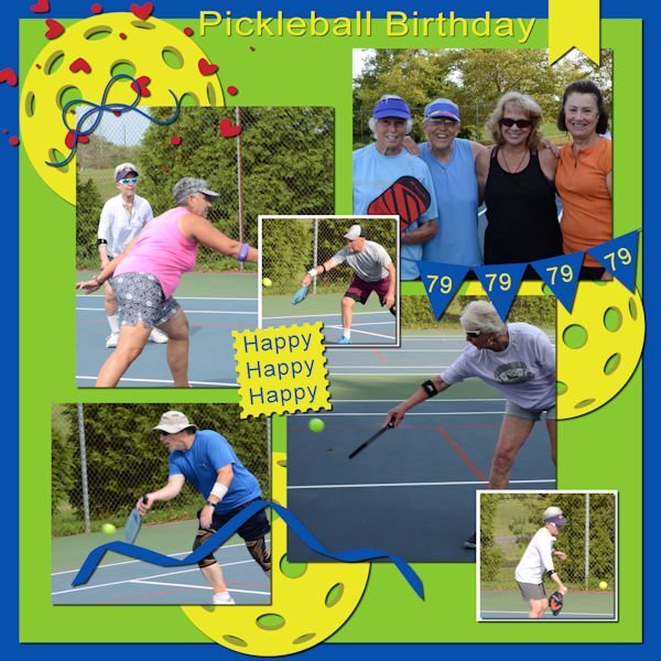
Cindy Ritter designs template from the A Love For Layout Templates Blog Train, August 2023. Celebrating my birthday...pickleball and lunch with friends...the best!
1 point
-
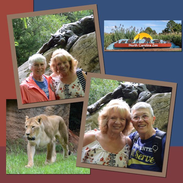
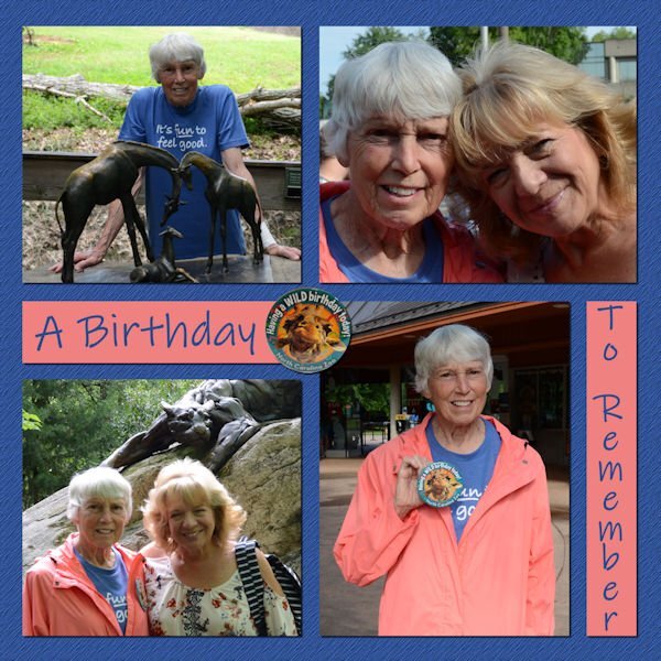
North Carolina Zoo. Judy's 77th celebration. Another Chantahliadesign template...#295.
1 point
-
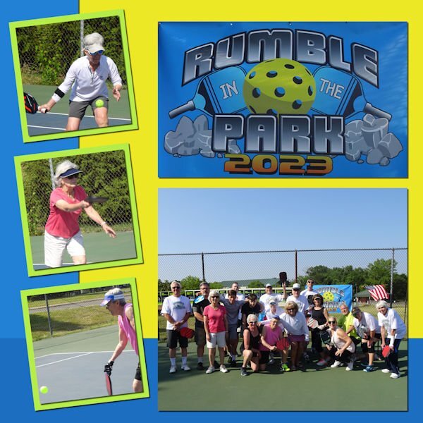
Template 296 by Chantahliadesign. Our annual local club tournament, Rumble In The Park.
1 point
-
Sometimes it's fun just to use picture tubes, clip art, and a gradient. The background sky gradient is mine; the grass, trees, rocks, and cloud are from various picture tubes; the flowers are from GoF Designs; the ladies in white are from CF. Oh, and the blanket is a paper that I changed with the Perspective Mode of the Pick Tool. The font is Amastery Script.1 point
-
Here's Lesson Three from the Vector Workshop - tracing a leaf. I'm doing a bit better with nodes now. Practice helps.
1 point
-
The original illustration is from Freepik by Sketchpedia. For the background I decided to follow a "Swirls and Twirls" tutorial. It was shared by someone in another group and I hadn't used it in a few years. The background is made using the original pic and there are a whole bunch of layers. The tools used were mainly the Radial Blur and the Twirl Effects. If I didn't have my daily deadline, I might still be playing with them. The font is Hesthia Austine from Creative Fabrica.1 point
-
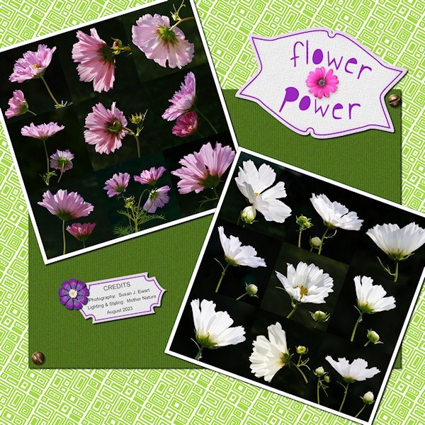
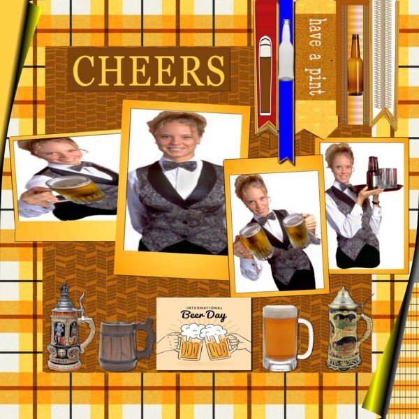
I was talking to Elvis the other (YIKES! Right?) and telling him all about The Scrapbook Campus, PSP and the Forums. And you know what he said to me...."A little less conversation, a little more Action". Kidding aside, here is my latest lab. I dont like the purple color in the tags and might go back and redo it at some point and add some brown or stick with green, in the layout. Lab 7-1 Concentric Rectangles Filled Text Photo Mosaic Even if I'm not happy with my layout design I loved this lab. It's quick and easy to do. I had to use the shift key and make straight(ish) rectangles because drawing with a mouse creates a very achy hand and it's just plain hard. I was a skeptic, but once you use the tile to flood fill your page it looks pretty darned good. Everything is mine except: Fonts: Annie Use your Telescope (google I'm sure), Raftera (Creative Fabrica) Screwheads: Creation Cassel (cass-screwheads freebie) Pink Flower, White Flower: corel picture tube I even made two Vector tags (made previously, but after the workshop) and the Vector flower. Contrary to popular belief, and because I said I did this; no flower heads were cut off in the making of these photos. They are in their natural element (if being in a Pot is "natural"). I hired a lighting designer for this shoot, she came highly recommended by the neighbourhood crows...her name: Mother Nature. The Fine Print: This post has been "Elivs" approved (I think I've had too much sun)
1 point
-
Vector Workshop Redux, Lesson 2 - a bunch of labels. (Yay, I did them! This is where I was stuck in July)
1 point
-
So I had to try out that special border in another way. It seems that you can use anything that will go from border to border and have no gaps. So I tried with a banner that I had created in one of the labs and it works. All of the elements and papers are mine as well as the pictures (which I've used many times). The font is Nandola (probably from CF).
1 point
-
Dorothy Donn's posting of her lab 6 layouts inspired me to try to make that flower (?) element in the middle. I couldn't quite get it to work, but the multicolored element is my attempt at it. I also tried doing another 4-petal flower multiplied and these are my results.
1 point
-
I've started a reprise of the Vectors Workshop and finished Lesson 1 last night. I think I'll post them here as no one else is in the original showroom any more. Here's my heart and arrow.
1 point
-
Such a beautiful layout, Mary! The border makes the page stand out even more... I never tried this technique.1 point
-
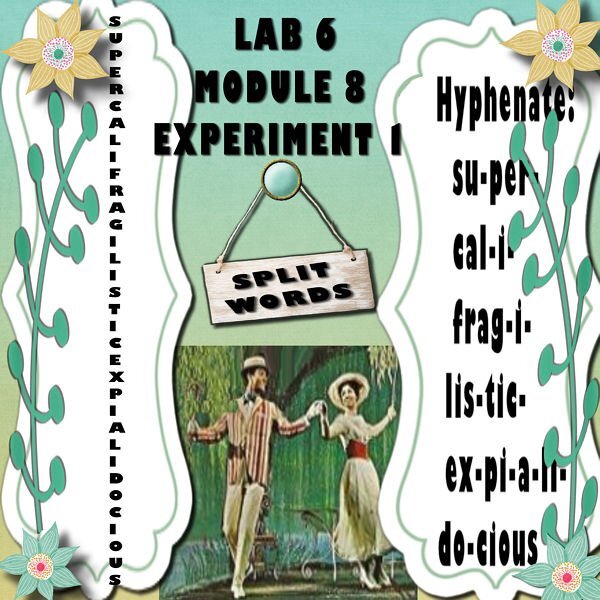
Lab 6 Module8 Experiment 1 1- Title work - Split words. "use a longer word"! At my age this word popped into my mind and I cannot stop singing at the top of my voice while I put this together.
1 point
-
Lab 6 Module 8 Lesson 3 – Cross Stitch Some days are just purple days!
1 point
-
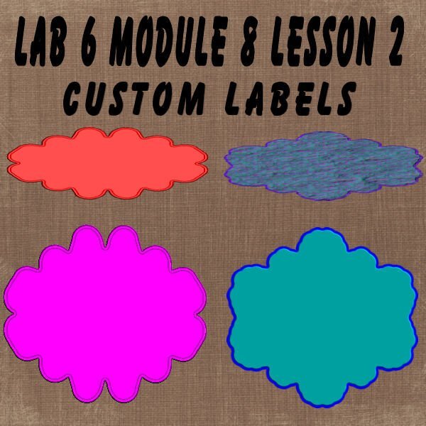
Lab 7 Module 8 Lesson 2 – Custom Labels
1 point
-
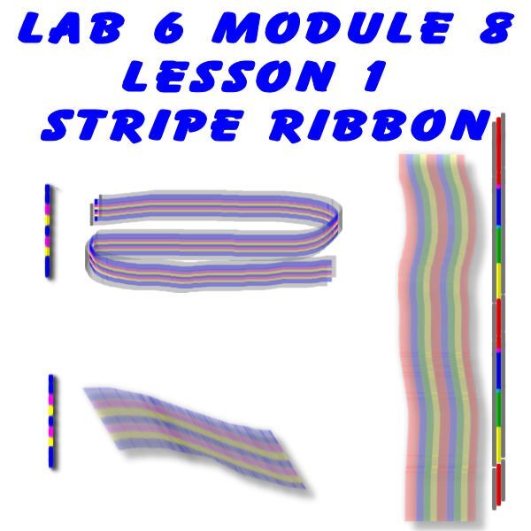
Lab 6 module 8 Lesson 1 – Striped Ribbon
1 point
-
Lab 6 Modulem7 Experiment 5- Fun Font Find -Waterepark Font
1 point
-
Lab 6 Module 7 Experience 4- Sketch idea
1 point
-
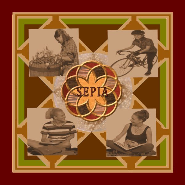
Lab 6 Module 7 Experience 3- Color/Pattern/Texture: Sepia
1 point
-
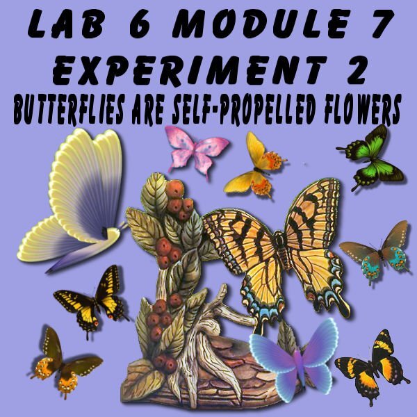
Lab 6 Module 7 Experiment 2 - Element: Butterflies All PSP Butterflies and an image I made years ago.
1 point
-
Lab 6 Module 7 Experience 1 - Title work: Multiple direction A Template I like.
1 point
-
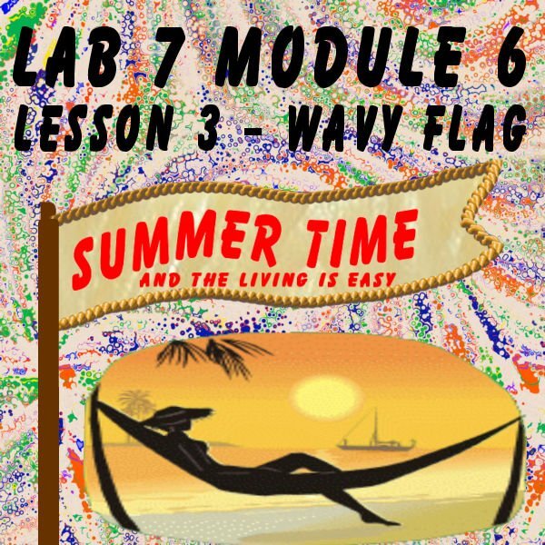
Lab 6 Module 7 Lesson 3 – Wavy Flag One of my favorite things to do but this year is way too hot to do it.
1 point
-
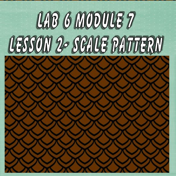
lab 6 module 7 lesson - Lesson 2 – Scale Pattern When I was little, I found a turtle in my sandbox at our beach house. This is how I remember this shell color so well. Sweet Jessica my little friend.
1 point
-
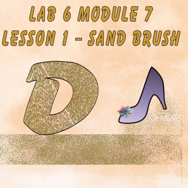
Lab 6 Module 7 Lesson 1 -Sand Brush Please note- Cassell's lovely vector shape slipped it's way into the lesson.
1 point
-
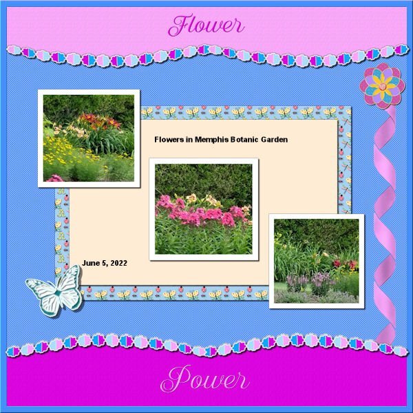
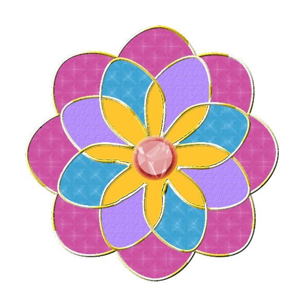
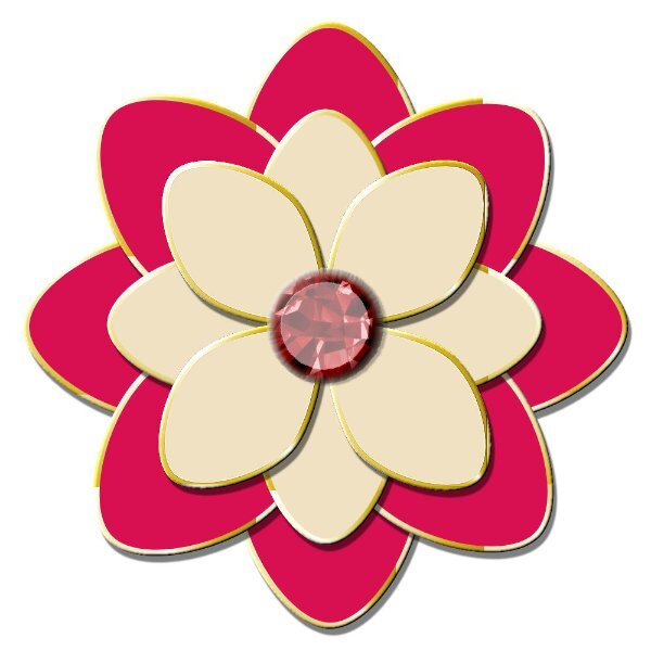
Back to the Labs. Lab 11 Mod 3. Make a banner, 4-petal flower, Sun element. All 3. Doubled up the 4-petal flower to make one with 8 petals. I needed practice to make that delightful border, 2 words, paper above (and below if you want otherwise you can have a different pattern/color below), and middle to display what the layout is about. Although I had written the instructions to make that, I found that I had to add some instructions for how to select with the magic wand. More practice needed, so I may use this again. All elements and papers are mine; the picture is one I took at the Botanic Gardens and the tag is one from the brochure. The font is Better Caramel.
1 point
-
I made a combi from the denim and lab 5 module 11 Cut out words.
1 point
-
Lab 13-07 template again...
1 point
-
Template 184 by Lady 22. Celebrating my friend's 77th at the NC Zoo.
1 point
-
One photo for this page. Font: Choco & Chips.
1 point
-
Ik was op zoek naar deze pagina, maar ik tel hem te vinden. de letter is gemaakt van denim maar is bij een groter formaat onzichtbaar. Ik heb een beetje vals gespeeld. 1items was niet zoals in de film. De selectie voor de kleinere letter is niet gemaakt door te dubbelklikken maar in het lagenpalet 'maak een rasterselectie'. de rest oké. Omdat veel naaimachines tegenwoordig siersteken hebben heb ik bij de tweede een variatiesteek gebruikt. OP de bevel na af. Ik ben al heel blij met dit resultaat.
1 point
-
I used Cassel's WordSlats script for this one. I started with a black background and ran it three different times for each row of text. Copied one on top of the other and moved it to where I wanted the second line of text to be. Using the magic wand selection brush inside the new words, I switched to the original layer and hit delete. Once I hid the second layer, both lines were on one layer. Lather, rinse, repeat for the third row of text. Finally, all three were on one black layer with the words cut out. I used the magic wand again to choose the black and copied/pasted into selection the picture of the woman on the rock. The font is Hobo Std which is what Carole used on her free samples.1 point
-
Thought I would go for an old photo album look for this theme. The photo corners are by Sheila Reid from PixelScrappers. The main font is Tomatoes (free from Fontspace), but I used Lazy Ride (free from FPTFY) for the numbers. I've had the background for so many years that I can't recall where it came from. Given more time, I could have created my own paper with everything I've learned in the Campus. Also don't know where the party pic came from. I've been doing a much better job recording the origin information in the last several years, but the old ones are from who knows where.1 point
-
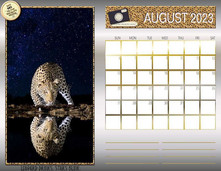
Happy August! Here is my August Wild Cat Calendar for 2023. The layout is from a template shared by Cassel last fall. The photo of the leopard is by a photographer from Sri Lanka named Andreas Hemb. The photo frame and the title strip are enhanced by the Effects/Sculpture with a leopard pattern. The chipboard camera art and label is from a mega kit called Cambodia by Marisa Lerin. The bottom title font is Yellow Fresh and the Say No brad was created from a brad template from Pixelscrappers. The calendar grid and lines for notes were treated to a gold gradient and I filled the background with a silver gradient. I also posted this full size in our Facebook files.
1 point
_600.jpg.2803cbab17e5ead283ca5f02d3dc405c.jpg)