Leaderboard
Popular Content
Showing content with the highest reputation on 07/12/2023 in all areas
-
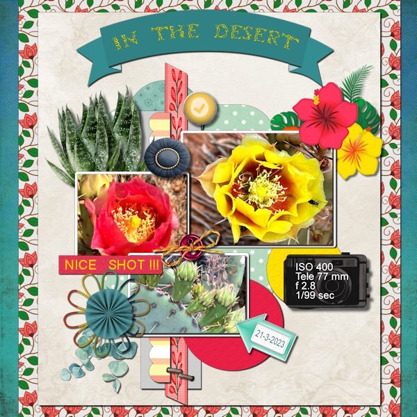
This is the layout I choose for this scraplift and the result. I had a hard time choosing one of the 8 layouts given and in the end I choose for one a bit out of my comfort zone. Mostly my pages are not so busy. To get all the colors working together I used the Hue Map a lot. Thanks to the Q&A of last weekend I finally know how to use that map, it was an eye opener and now it so easy to use!!! I didn't made all the papers and elements myself but used the things I have in my stash or had made on another occasion. The photos are my own and a lot of the papers/elements I used are from Marissa Lerin and from a blogtrain (May 2021). The fonts are Arial and Tribal Case for the title in the banner. Had I realized when I started that it was a lot more work then I anticipated I probably would have gone for one of the less busy layouts.3 points
-
Congratulations, Jannette, plus, you have to get those eyes better before the Vectors class next Monday! Stay well! Thank you Michele. I had no idea they would be that large!, so I’m surely glad you answered. I’m going to make some sort of a birthday quick pages this weekend. I’m goi g to have one ready no matter WHOSE birthday it is! (Maybe I can do some really funny ones for old highschool boyfriends!)3 points
-
This is fabulous. The photo is perfect for your title. I love that green too. Your happy accident is very cool, it a great feeling when you stumble upon something. I wonder if those "accidents" are the universe's way of reminding us to remember to explore and discover.2 points
-
WOW, so many of you are really sooooo busy and creative in different directions, thumbs up for all of you ??!2 points
-
I found a wonderful editorial beauty photo shoot that I felt was perfect for the theme; model Kristy Kaurova and photographer Jamie Nelson. The font is Spac3 tech. I had a happy accident while making this. I originally created a frame with the background paper and added a cutout layer. While playing around with the layers, I hid the frame and ended up with this look. I'm probably not the first to use an effect like this, but I learn a lot from my happy accidents. When I find more time, I'm going to experiment with it more.2 points
-
1 point
-
I like vectors, I am looking forward to this workshop and hopefully learning something new.1 point
-
that is a good idea. then I'd make a duplicate and make the quick page from the duplicate. But I would not put any text on the quick page, that would be added after, according to the occasion. Since I am notorious for forgetting birthdays I don't have to worry about making a quick page for such occasions. ?1 point
-
Congratulations on your milestone anniversary. Sad to hear about your eyes. I hope you have a speedy recovery.1 point
-
Actually, since Facebook will fill in the left and right sides with a complementary color, I find my square layouts don't always look the best. I'm going to transition to Michele's suggestion of 3000 wide x 2000 deep since Facebook doesn't fiddle with them in that format. It seems it insists on landscape format for the ratio. Not sure about iPad or moble because i rarely use them for design. When our company started putting out an emailed newsletter I discovered that over 80% of the subscribers were using their mobile to view our art so the platform we used would design for that format.1 point
-
I always keep a pspimage file with all the layers. That way I can edit the font to reflect the new name.1 point
-
Very nice, Michele and Donna! I want to make some Happy Birthday Cards that fit the facebook posting template size (if that's a thing). In fact, I would rather do that instead of one of the cards in the card workshop if I knew the size (or the ratios?) I have a bunch of friends on facebook, but they come from separate and different compartments of my admittedly long life, and I could get by with one single template for 10-15 different people with no one the wiser, I think. On my desktop computer facebook, the best size is 600 wide x between 420 and 450 high. But I don't know if it's the same on an ipad and phone? Donna, yours looks square, and even a tall square, but Michele, yours is a horiz rectangle, flatter than my 600 x 415. Are yours phone size or maybe iPad (tablet) size, by any chance? Coming up in August is a dear old friend of mine who says "Don't send me belated birthday wishes. If you can't send it on the day, then don't send it at alll!" Yikes! I wouldn't mind knocking it out of the park for her. She loves Chihuahuas - those little dogs that need clothes in Indiana, LOL!1 point
-
1 point
-
1 point
-
Donna, I do the same for birthdays or other occasions b/c it's good practice for me. But I'm not quite as fussy with small details as I might be if I were posting here. No one I know uses any kind of graphic/photo editing software so I assume they won't notice the tiny bits.? Lazy, I know.1 point
-
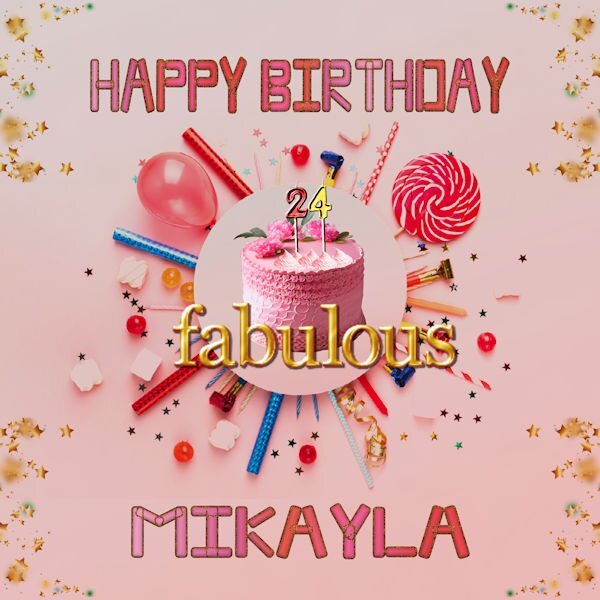
When my FB friends have birthdays, I have been creating files to post on FB. This is the latest one for my niece. All the graphics are downloaded from Adobe Express AI, except for the "fabulous" which is from a Digital Scrapbook kit called "all the princesses" by Melo Vrijlhof. The font is a free font called Moodtype. I am working on a way to convert this file to a quickpage. Any suggestions would be greatly appreciated.1 point
-
D = DIY smoker I read about a technique that can turn a charcoal or gas grill into a smoker.1 point
-
1 point
-
1 point
-
1 point
-
1 point
-
Susan - wonderful idea well played out! This was the module I didn't want to do. The actual game board is the sticker! You are ACE in my book!1 point
-
Z = Zombie, a friend reminded me these days in a conversation about summer drinks of this cocktail based on rum, cointreau and different fruit juices.1 point
-
I offered some to a friend quite a while ago and she was totally happy and satisfied.1 point
-
1 point
-
1 point
-
1 point
-
1 point
-
1 point
-
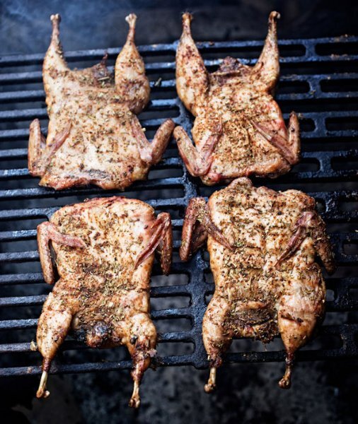
I love to eat quails.In my french country it's not an unusual speciality, but not gtilled, rather cooked in what we call a "sauteuse" or "cocotte", the whole bird sometimes filled with sausage meat, mushrooms, minced meat, foie gras, grapes and so on. Yummy!1 point
-
1 point
-
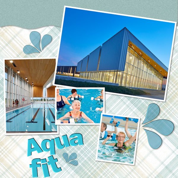
Lately, I have tried (and failed) to work on a layout, any layout. I'd spend time on one, look at it again later, and then move on to another. Just no mojo happening. Then, I was thinking of Bonnie's pickleball projects and got to thinking about my aquafit classes which I began in January. For a small rural area, we have an amazing sports complex cum library that has beautiful pools on offer. I planned to start then the lockdown came along.I've never been a water person, but I am loving the classes. I started with a Cassel template (from Lab 12-11) and tweaked and played with it. All the ingredients come from somewhere online. Two pix are of the aquatic area here, and the two with people in the pool are just grabs from elsewhere. I'm not sure we would be able to take pix while using the pools. Now, about those water droplets (splashes)...I was trying to make my own using Lab Mod 12-8, but they ended up looking like amoebas b/c I had so much trouble with the nodes! So these come from Janet Kemp at DS. Bring on the Vector Workshop so I can beat those nodes into submission! P.S. I don't do Lab Modules in order as others do. I skip around and try what catches my fancy.1 point
-
1 point
-
1 point
-
1 point
-
1 point
-
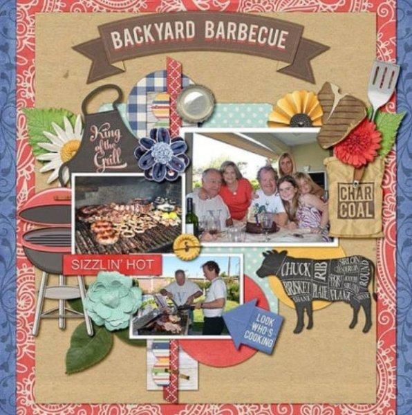
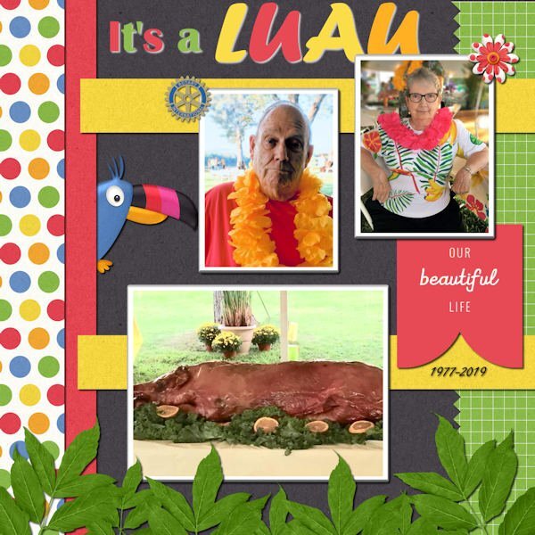
When I was a kid, the local Rotary Club held a huge pit barbecue every year for many years on the farm of a large local cattle rancher. The meat was amazing and people came from miles around to get in line! I enjoyed it then, but don't eat it now.1 point
-
1 point
-
1 point
-
1 point
-
1 point
-
1 point
-
T = Time. The different times for grilling different pieces of meat, fish etc.1 point
-
1 point
-
1 point
-
1 point
-
1 point
-
1 point
-
I- Insert, we often use some sort of tray on the BBQ so the BBQ itself won't get dirty ?1 point
-
Sorry, I can't be behind the pc long as I have a slight inflammation in my eyes. I'm wearing sunglasses all the long, also in the house. So colors al slightly false. So no PSP for this lady. Today is our wedding anniversary. we are 55 years married. I buy a few cakes.0 points





Resized.thumb.jpg.d25811db03a63358cedab1e79f527635.jpg)
