Leaderboard
Popular Content
Showing content with the highest reputation on 06/20/2023 in all areas
-
13 points
-
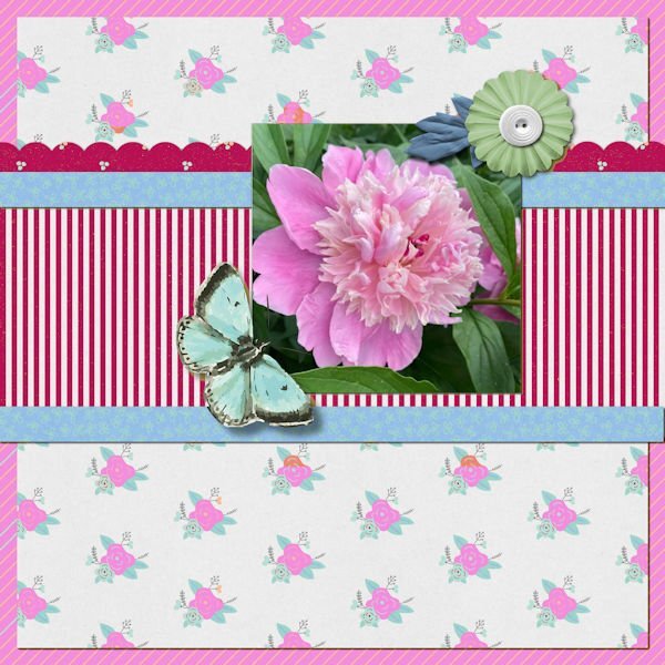
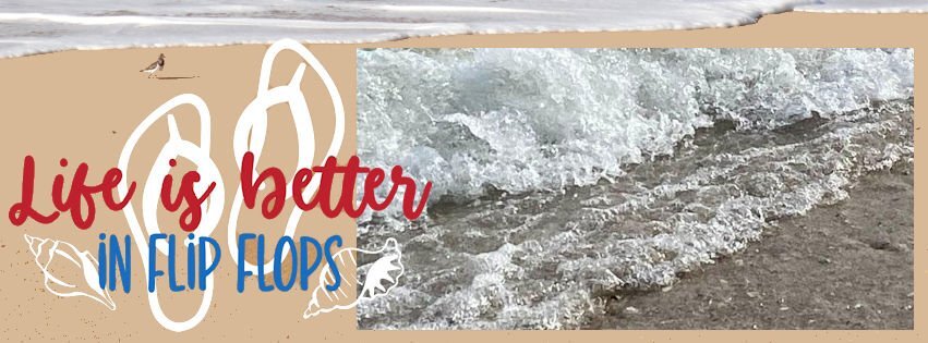
And these are my day 1. The turtles sunning themselves is a pic taken by my son, Chris, when he and his family visited the park in New Orleans. The peony in the extra is from a trip with my eldest son and his wife when we went rv-ing in 2021 in the northwest - this pic was taken at an rv park in Nebraska. The rolling waves on the beach in the FB header is a pic my son, Chris, took when he and his family visited the Gulf.12 points
-
12 points
-
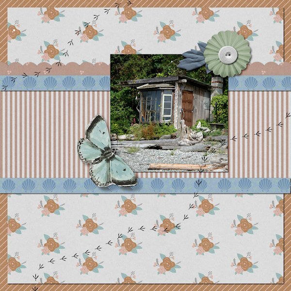
QP Lesson 1 Front used: Brush King Photo: mine from 2007, Visiting at a friends cabin in Gibbsons, BC. Also known as the Sunshine Coast along the Straight of Georgia. It is 31 kms from Vancouver, BC and 40 minute ferry ride...even though it's actually on the mainland BC and not an island. My friends cabin is right on the beach (Pacific Ocean) and this was one of the old cabins we came across while walking on the beach. All you could see was these three windows and bit of the roof, the res was covered in greenery.10 points
-
10 points
-
9 points
-
9 points
-
QP Extra Lesson 1 This was another little odd shack we came across on our walk. I would love to see inside these places. My friends cabin had been in the family 3 generations and they have a sizeable property going up the hill with another cabin and creek beside that they had the water rights to. Because of the close proximity to Vancouver, there is now huge mega houses on this beach. I love the quirky odd shacks, too bad they are all gone now.9 points
-
9 points
-
8 points
-
8 points
-
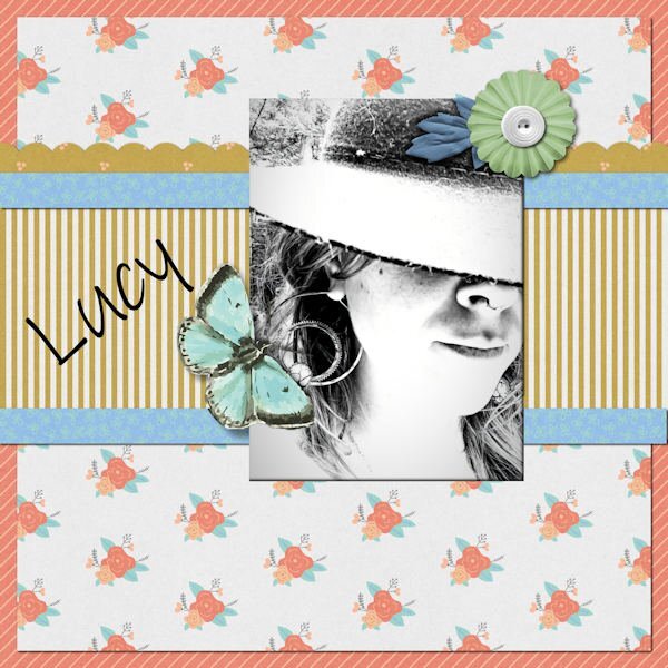
This time I did all 3 layouts for QP-1. First is a new bird at my feeder, well, actually, a regular but in a new color morph. Never saw an orange-headed house finch before but Merlin confirmed my sighting. This is the Merlin photo. The alpha is Fiesta from Annie Tobin-R.I.P. The text font is Ink Free. Second is the flip flop banner, featuring my daughter's flip flop birthday cake from last September when she turned 60. I used a gimp picture tube for the top border. Last is my granddaughter-in-law, Lucy, mother of Magic. I thought the black and white photo went well in the busy layout. I enlarged the photo area with my eraser tool.8 points
-
8 points
-
7 points
-
7 points
-
7 points
-
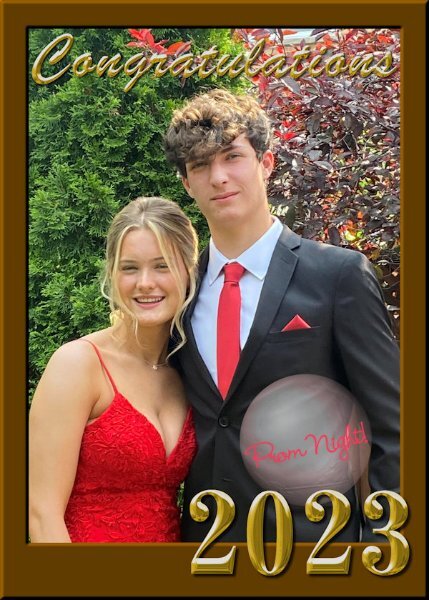
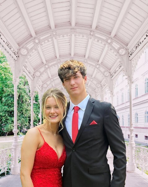
The framed celebration layout for QP-2 worked fine for a pic of my grand-nephew before the prom recently. I added a bubble to put some text in (Prom Night) to distinguish it from another type of celebration. I had tried previously to do something with this photo over and over and was never satisfied with the results. This was quick and easy, for a change.7 points
-
7 points
-
7 points
-
Hi all, I have a little bit free time, so I decide to enjoy the workshop here is my 1st page photo is mine, font is Arnold Story I used a fine brush under the text for better reading7 points
-
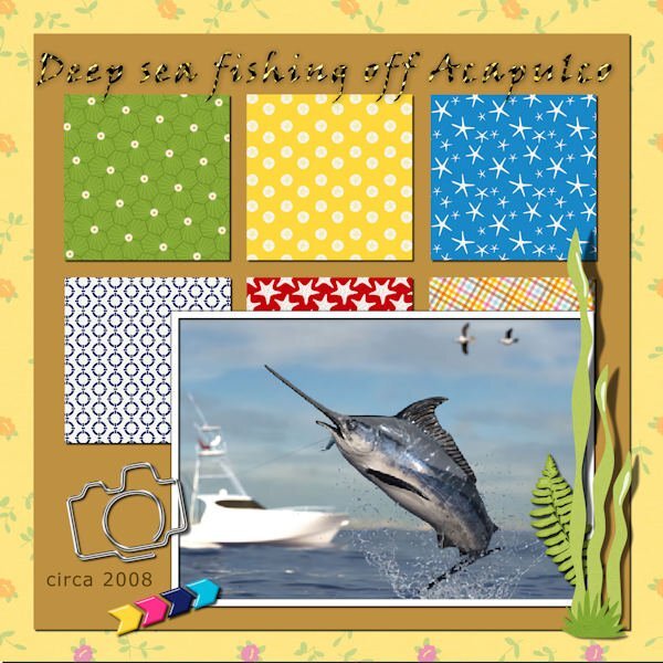
QP-2 - Part 1 - Deep sea fishing off Acapulco. Since that was the only place we went for vacations (we loved being pampered by the "beach boys" ?) we had to try all the activities there. We went deep sea fishing and hubby, Fran, and I, each had a rod and a chair. I reeled in my fish but he had trouble. So I had to reel in his, also! This was sort of ridiculous as I weighed about 110 and he was topping 300. Whew!5 points
-
5 points
-
5 points
-
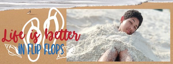
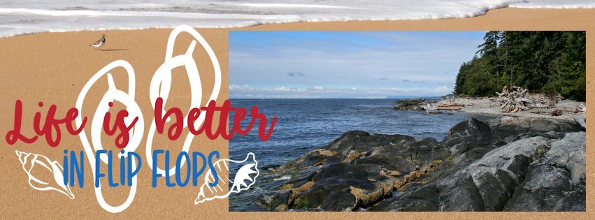
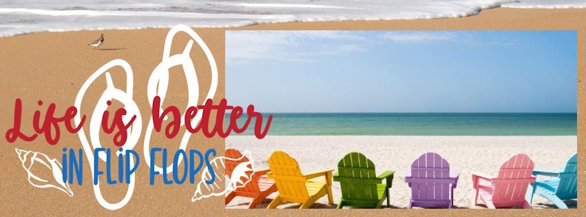
Since I don't scrapbook, I chose the FB cover layout. It takes me SO long to find an image, so what should've been 5 minutes of work turned into something longer. I'm not organized enough, and I don't have a sufficient number of my own pix to choose from. But hey, it's about the fun, right? (BTW, flip-flops not my thing. Too tricky to walk in outside of the house.)5 points
-
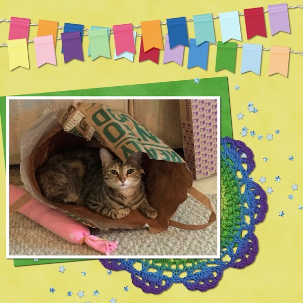
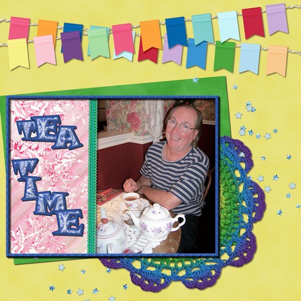
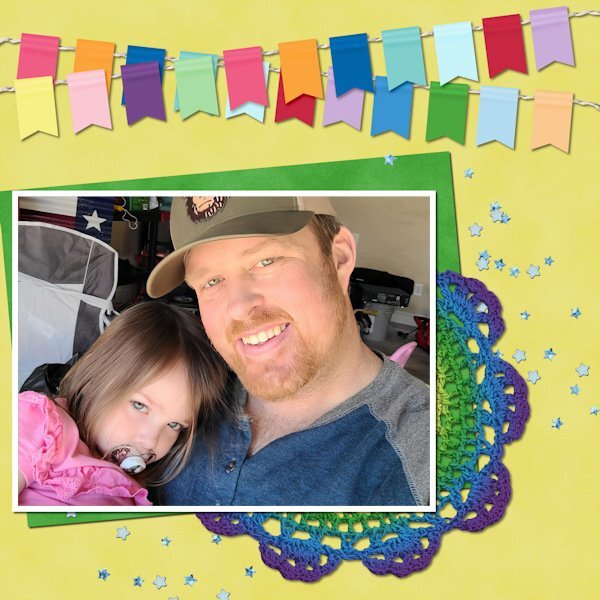
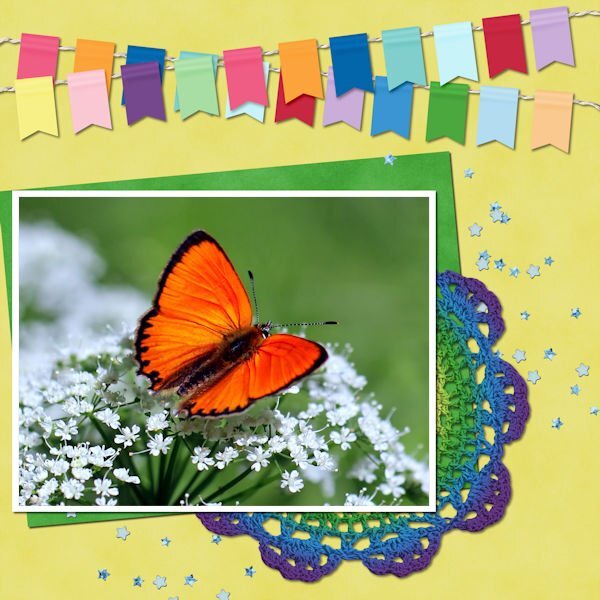
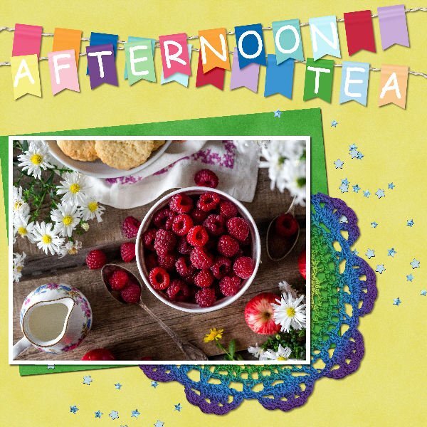
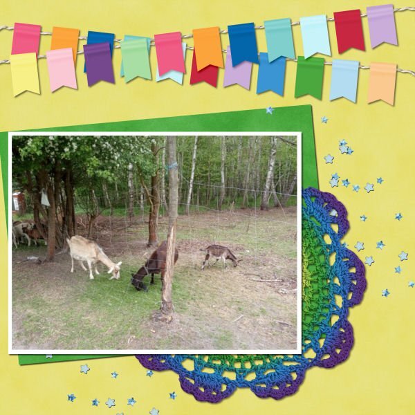
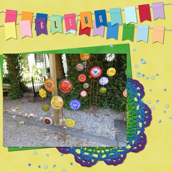
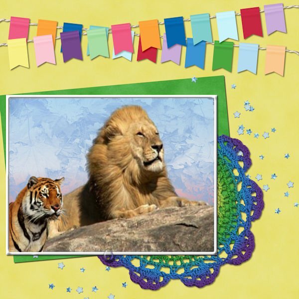
I'm in for some revision because I always take ages doing a page! For this first layout I have taken the decoration literally as the crochet doilie is the same colour as a beanie I made for my cousin, who at the beginning of the year was undergoing chemotherapy. Beanie shown here on the wrapping paper I sent it to her in.5 points
-
4 points
-
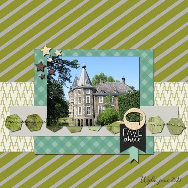
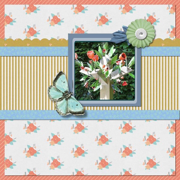
I'm in too. As I do not shoot many horizontal photos I must make a choice from what's in my stock. I only have a cellphone to take photos. But here is my first result. Quickpage 1 is made in the psp2023 I changed the background, the original had a uni color blue as the sky, not so interesting. Quickpage 2 is made in the 2020 edition of PSP. I made an edge with a bevel of 15,8,8. font s name is Butterfly with shadows 1,1,60,1.4 points
-
3 points
-
3 points
-
3 points
-
3 points
-
3 points
-
2 points
-
2 points
-
2 points
-
2 points
-
2 points
-
2 points
-
2 points
-
How neat - filling out the space when you have a vertical picture instead of a horizontal one!2 points
-
I think it was Ann Seeber who used the AI background remover in PSP. I tried it with the same pic I used for QP-2 layout. It wasn't perfect, but it's much BETTER than anything I can do using the Edit Selection which always gives me grief and leaves me frustrated. This time, I can live with the results. Background image of "colonade" from Unsplash.1 point
-
1 point
-
1 point
-
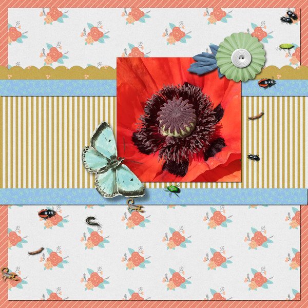
Wow Fiona, stunning photo! And the bugs are a perfect fit, even if I'm a bit squeamish looking at them.1 point
-
That house finch is a "ginger". I love the flip flop cake, that would be perfect for my sister-in-law and niece who live in flip flops (how do they walk in them, I'm always tripping over my feet in them). I never thought to enlarge the photo space, good idea. Love the black and white photo.1 point
-
1 point
-
They are a good challenge and keeps me focused on actually creating something, instead of sitting down and staring at a blank screen and not knowing what to do.1 point
-
Thanks, Cassel. I'm pretty sure I got your 60%off discount in FF10 so the price was under $25. I'll study these two classes and hopefully, in the future, there will be a week-long workshop so I can hone my skills. ?1 point


