Leaderboard
Popular Content
Showing content with the highest reputation on 06/17/2023 in all areas
-
I don't know what it is with me and "cute" pics this week, but that looks like the best ice cream date ever! The frame (it started out as a paper) is from a Scrap Designers Blog Train; the tricky part was changing the dimensions from 3600 x 3600 to 3000 x 2000. Facebook changed how it displays pics a while ago so if you don't change it, FB adds its own borders. I wish I had enough time to create more of my own stuff, but I only have an hour or two every day from inspiration to fruition. Anyway, I thought the frame really complimented the little girl and her puppy. The little waffle cone heart in the top right corner is from CF. I used two fonts, Summer's Ice Cream and Ferrero Rocker; the first one was all cones which I thought was too much.8 points
-
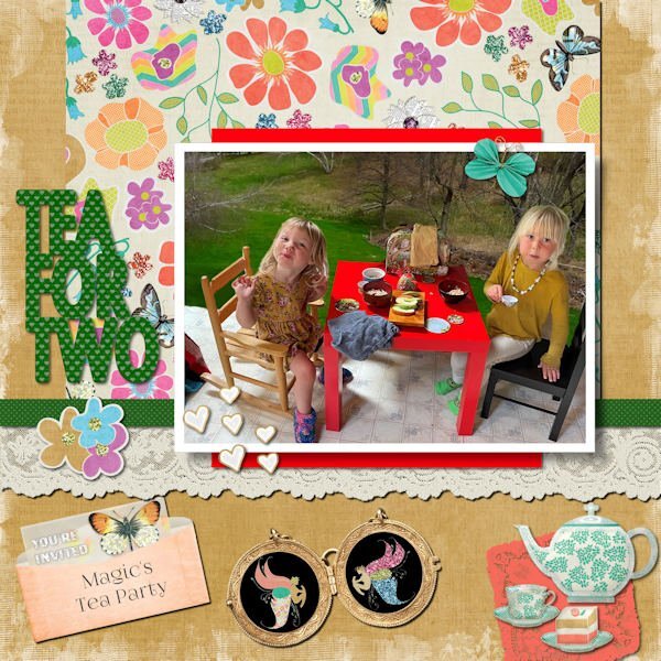
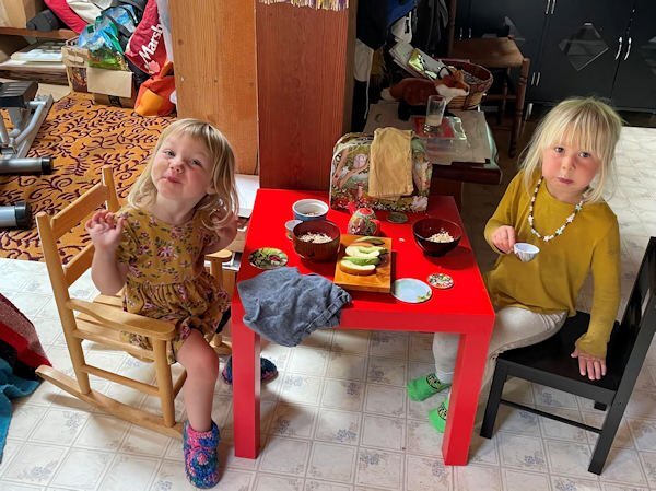
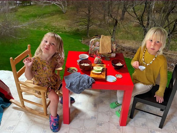
Unlike Michele, this took me two whole days! Deb sent this photo of Magic and her friend having a tea party and I couldn't resist using Janet Kemp's Garden/Tea Party Kit. Even the title is word art from that kit. I spent too much time changing the background on the photo. (Learning as I go here, this subject proved to be too detailed for an easy background change. I used part of a photo from my previous home that had a big lawn for the background.) This is probably more "scrapbooky" than my usual layouts but it seemed to call for flourishes! ?6 points
-
4 points
-
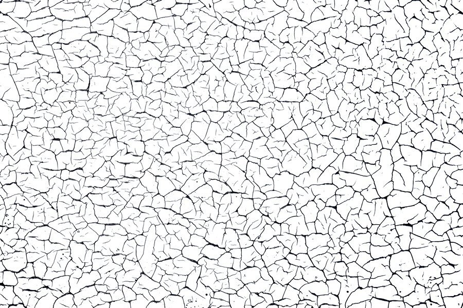
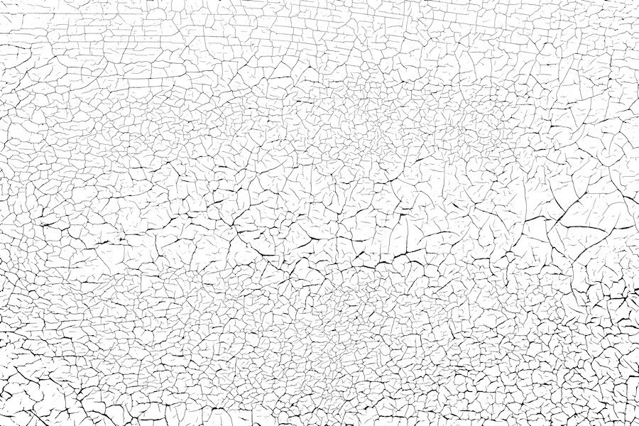
Of course you can. Just home from work (late) and need to hit the bed. I will get to it tomorrow. I think I can put the file on the FB page. Do you want the overlay and also the original photo as well so you can make an overlay. I changed the brightness contrast when I was trying to make an overlay (never done that before) to emphasize the black lines and used different tolerance levels with the magic wand and got different thickness of black crack lines. to me they are a little too thick so next time I would try and contract a pixel or two and see what that does. I also just left the photo and did unspeakable adjustment with the brightness and contrast and came up with a cool paper on it's own. I'm just learning how to make them and guessed my way through it. Here is the one I used, a smaller sample. i will upload the full size file tomorrow. I would love copies of what you made too.4 points
-
And one more for my book. This one is of the village and the surroundings where my daughter lives with the places we visited there like Stanford University! I kept this page in line with the others qua style and font to get a somewhat cohesive look for my book. Mary Solaas, thank you for the shield which I adapted for the road where I was. It made this page come together a bit quicker. I have one more to do and then I can assemble the book with all the individual photos and send it to the printer.4 points
-
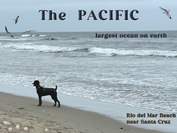
The last of my intro pages for my photobook. We went to the Pacific and it was a very hazy day with almost no one on the beach except some people walking their dogs, as we were. It struck me how empty and endless the ocean was. In The Netherlands we also have nice and sandy beaches bordering the North Sea which is part of the Atlantic, but you are always seeing ships - big and small! Therefore I choose a photo that represented this feeling and left it quite empty. Now I can assemble my book and get it printed.3 points
-
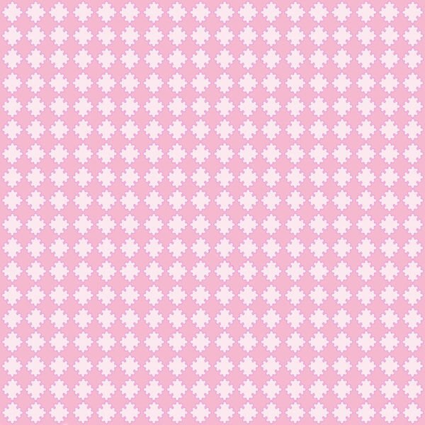
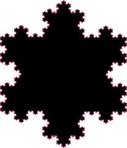
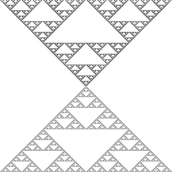
So, I made a layout using one of the fractal triangle papers, and the Koch Star mask. The picture was taken by my daughter-in-law Pam Solaas - she works in this show every year and took me to it too this year. Love it. It is known nationally and has been held for over 70 years in Germantown, TN (just outside Memphis, TN). The horseshoe I got from Creative Fabrica and made it into a paint brush and a picture tube. Also created the wood-burned element from the tutorial by Carole. The font for the title is Ballpark from Creative Fabrica some time ago.3 points
-
Yes this area is silicon valley and my daughter works for Apple and her husband for Amazon. They live, you may have guessed that from my layout, in Los Altos. One should think that the internet and other facilities in such an area are topnotch, but no they are very frequent without power! Very convenient if you work from home.........?3 points
-
Here's another one I can also send. I shot quite a few (it's actually the horizontal slats on my garage door) different areas and will try shooting with my wide angle lens if it ever stops raining. I love shooting this kind of thing. Once I learn how to zip and use something like drop box I can send more and the orignal photos for you to make the overlay in the way you would like. these are reduced size so might not be that great. This overlay was made using a lower tolerance with the magic wand where the one above had a higher tolerance and produced thicker and blacker blacks. that's why you might want the photo as well.3 points
-
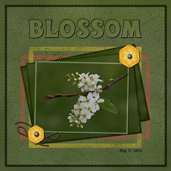
Back in the Lab again! This time Lab 6-9 Wire Clip Flower 2 Overlapped String The wire clip was fun to make, making sure I read the WHOLE instructions on how to use the clip properly in my layout is another story. At first I thought my flower was going to be ho-hum boring but after getting to the end and adding the shadows and the color on the edges it really took shape. They are quite pretty when they are done. The string, well, let's just say I did get two parts overlapped. I wont be known for making fantastic string. I used the see-through technique on the title. And I used the painted frame freebies from the store blog. I put the same asphalt texture (or is it called cement?) on the layer so it looked like it was painted on the asphalt/cement. I also used the eraser tool to make it look scuffed up. The cracks are from my garage door that I photographed and extracted the cracks and made an overlay. Fonts are: Wonderbar 2.0 (title) from Creative Fabrica and Gill Sans MT for the date (windows). Photo is mine. two little brads on the flowers are from Gina Jones Delish Brad 09 (Digital Scrapbook)3 points
-
I sure can. Just running out for an errand and will do it when I get back. Good information about what FB lets you post. This is so cute. You make good use of your hour or two. What you create in that short time would still take several days.2 points
-
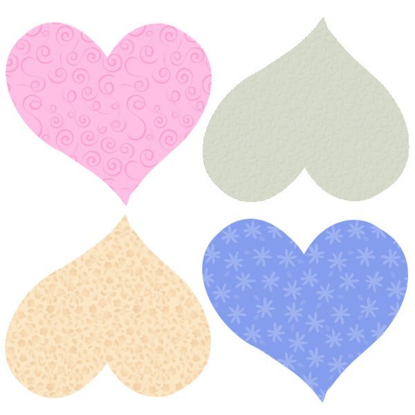
I've posted the patterns (*.png's) on the Facebook page. Seems like that accepts all forms (*.pspimage, *.png, *.jpg - and all sizes). Anyway, someone mentioned the heart paper and triangle paper so I also posted them. All are free to use. Susan - could you post the *.png overlay you made on Facebook? I would like to have it just as you used it since I won't have to extract it, etc. LOL2 points
-
2 points
-
Suzy and Susan. It is not easy to use and since it was free I just messed around with it. PSP is easier and especially since Carole is so good at explaining things and knows so much. You all can have the patterns I managed to make as noted above or I can post them as png's on Facebook (can I?) Only if you want to. I have to quit. I made one more pattern and 1 more paper but it is too time consuming for me to continue with it. It won't do what I would really like it to do. I have a few ideas in mind since fractals are just repetitive patterns in nature. I'll post the new pattern and the new paper here.2 points
-
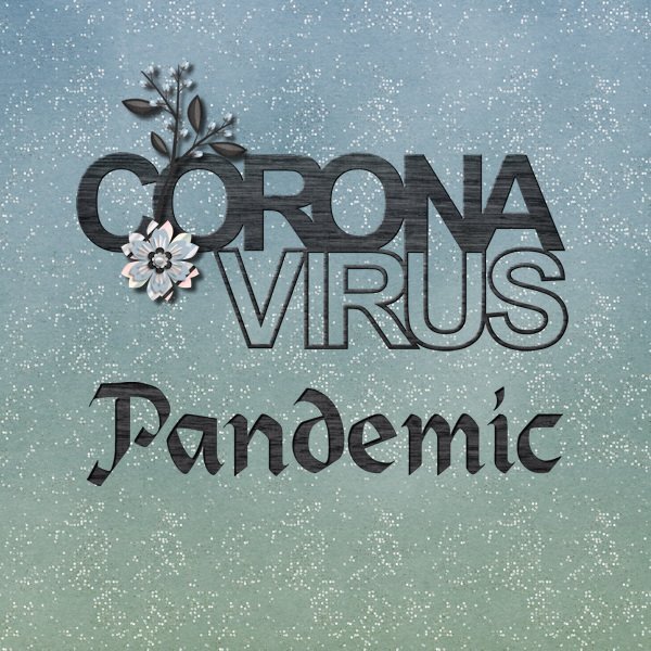
I haven't been scrapping much lately since I've been working on a history project for my church with my cousin. But I did finish an album about the pandemic and had it printed at Shutterfly. It is not especially interesting since it is mostly facts about Ohio, my county and my town. Lots of journaling. I started it with January 2020 and finally stopped with May of 2023 when both the WHO and the CDC declared the emergency of Covid as over. For my front and back covers I used some cut-outs from Scrapping With Liz. For the front cover I used Heidelstein font for the word Pandemic and Cass-punched out script after applying a paper to the raster layer. All papers and elements for both pages (except the cutouts) are from a kit that That Was A Year from Sweet Shoppe Designs. The back cover of all the cutouts was originally saved as 12x12 since I was going to use it as a page. I changed my mind so I had to make some adjustments so things were not cut out on the book cover. I just put every layer into a group and used the pick tool to scale down the size and recenter everything on the page. This is the 12x12 version of it. Worked great!2 points
-
WOW! unreal, the change. You are doing really good works with this tool. I loved your layout, it's well done. And the photo, it's cuteness overload.1 point
-
Amazing what you did - especially that last little area in the child's tan chair! WOW!1 point
-
Love what you do, Ann. Seems like I'm going to have to play with that background replacement tool - My next OCD venture???1 point
-
I love old dilapidated buildings too. Same with old machinery, industrial stuff, etc. Not much around where I live though. I like going to resconstructed ghost town attractions, train museums as well, there is a lot of texture in places like that.1 point
-
I also liked your clever use of a basic texture from your own photo. I take photos like that usually of dilapidated buildings or foliage but have not used them much as you have done here. Inspiration indeed for textures and that Lab tutorial. Thank you.1 point
-
So interesting, Corrie! My granddaughter lives just north of Stanford in Palo Alto. I think this area is termed Silicon Valley? All the big software houses are there. Her husband is a senior software engineer for Meta/Facebook.1 point
-
I'm glad you told me about it. I think I will pass on it. I have to decide where best to spend my time. I think I need to really concentrate on learning PSP before I lose time to learning another complicated program. I really like what you did in a short time using that program, the papers are very nice and I'd love to have them.1 point
-
1 point
-
I find myself looking at textures everywhere now that I know they are good to have for layouts. Finally the old wooden garage door is good for more than just opening and closing. we have a fence that needs replacing that has some promising textures too. Garden fences would be great, especially if they are old and weathered. Thank you for your kind words on my layout.1 point
-
1 point
-
1 point
-
There are so many tools in PSP. But I did download that fractal explorer that Kasany was talking about. Played around with it in my OCD phase about papers and patterns. Well I made 2 patterns out of that and then thought about psp's preset shapes and the heart shape and so I'll show you what I have been doing instead of what I should be doing!!LOL!!!1 point
-
Thank you Michele. The lowered opacity lady is that little extra that elevates the design. it's subtle enough that it's one of those wonderful discoveries you make while looking at the layout.1 point
-
The background paper I used is from CF's Tangerine Dreams set. I found the illustration years ago, probably on a Google search (the game is repeating the daily themes from 2016, but I'm trying to create new pics every day). I clipped the girl and added her on top of the background layer several times at very low opacity; I'm not sure if that made the BG look too busy. Cass's Mitered Corner Frame script is one of my favorites and saved me a lot of time creating this frame. You can't see it at this size, but the ribbon frame has a Multiply blend mode, letting the background show through a bit. The font is Anton.1 point
-
I just ADORE the Hilda pin-ups by Duane Bryers so I thought I would have a little fun with this theme. The font is Morning Sun.1 point
-
I absolutely fell in love with this sweet little face. The fonts are Bubble Bath and Jellyka - Love and Passion. I created the background paper using the Balls and Bubbles effect (Artistic Effects).1 point
-
1 point
-
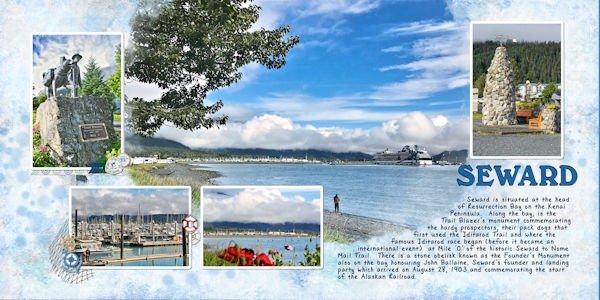
Hi, I thought I would put in what I am working on. I like to make photo books and I am in the process of doing one for our Alaskan cruise from 2018. Yes I am way behind. I usually use Shutterfly to print, so I use there standards sizes. I also do double page layouts. For this one, I started out with a plain blue background, then added some overlays, and blended them, and also added some spots with a brush, then faded them out. I scrap lifted the format from an Indigo template 34, using a mask I purchased from the Indigo template 47. I got most of the elements from Design bundles - Nautical Water colour clipart collection, and Pixel Scrapper Beach elements Blog train from August 2013. My title is the font Calistroke, & the journal is DB Sweet Everyday. I did my frames by doing selection borders, which I learned from a Carole class. (Thank you.) I have learned so much from these classes.1 point
-
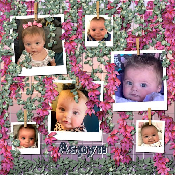
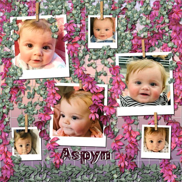
Still playing with Carole's hanging photos, this time with the grid background. I ended up with multiple layers of hanging picture tube vines. This is still Aspyn Dionne, from my last layouts. I finally used all the photos that her mother, Kristan, posted. This turned into a double page, or actually, two coordinated pages. This layout only used 6 photos each and I had 12 photos.1 point
-
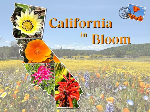
The next one. I was working on another layout but I didn't like what I came up with and made this one instead. I didn't see the full extend of that glorious bloom, only the last of it when I arrived but I have taken so many flower photos that there will be a selection in my book. The background consists of 2 photos taken by my son in law when the family went to admire that bloom. I merged them together with a mask. The template of the State is by Marissa Lerin and I filled it with my own flowers. Carole's stamps template came again to good use as well as datestamp 12 script that I bought in the last birthday sale. Font is Perfectly Vintages that I use throughout this project .1 point
-
1 point
-
1 point
-
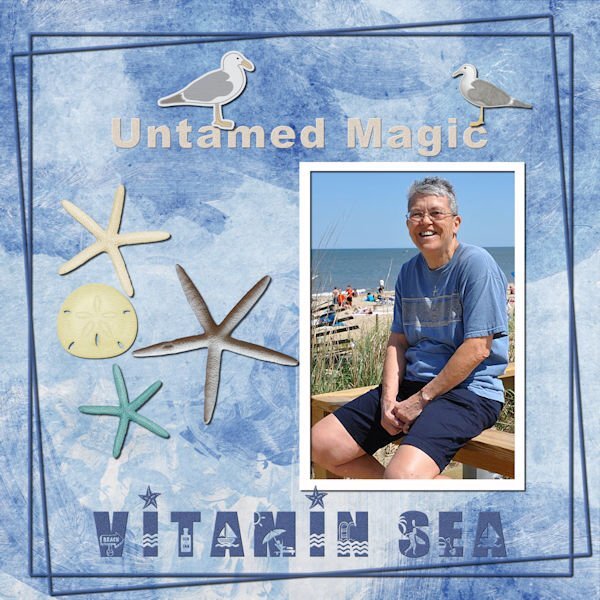
Just playing with this one. This is a favorite photo which I "misplaced". When I found it, I created a layout. Template 167 from Lady 22. Background paper by Marisa Lerin, paper 38, Coastal Papers Painted. Gulls 01 felt by Marisa, Coastal Elements. Teal starfish, White starfish and sanddollar by Sheila Reid, At The Beach Elements. Photo from May, 2010.1 point
-
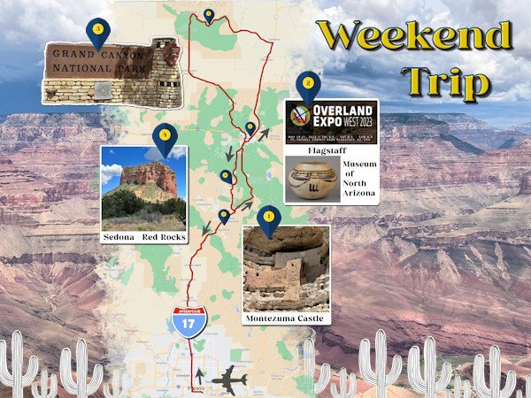
This is my next intro page and it is about the weekend trip we took to Arizona because my son in law wanted to go to the Overland Expo! He went there for one and a half days and had the time of his life. My oldest granddaughter went with her dad for the first 1/2 day while the rest of us (my daughter, youngest granddaughter and I) visited the Museum of North Arizona that has an amazing art collection of the Hopi's, Navaho's, Apaches and other tribes. En route from the airport in Phoenix to Flagstaff we also visited Montezuma Castle, a big pueblo build inside a cave. The second day, son in law again to the Expo and the rest to the Grand Canyon, which is hardly to describe, spectacular!!!! The third day on our way back to Phoenix we visited Sedona and the Red Rocks, which were also very, very beautiful. Near Phoenix the highway is through the desert, another new experience for me. It were 3 days packed with so many new adventures and of course many photos to remember it all. This page took me a lot of time to do with all the tiny details. The font is Perfectly Vintage and photos are mine except the flyer of the Expo which I found on Google.1 point
-
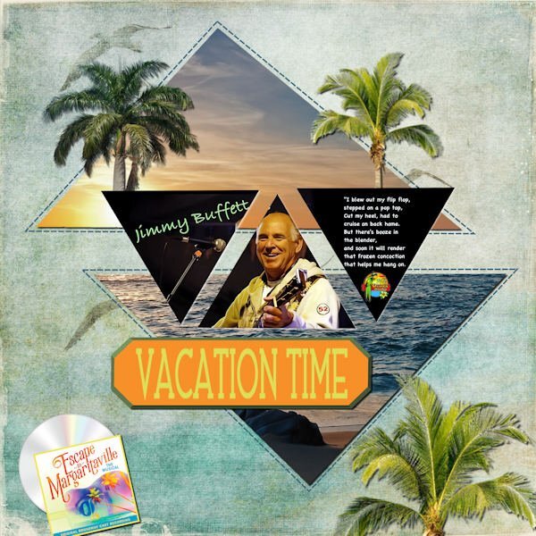
I love song challenges. My fantasy vacation to the Florida Keys to one of Jimmy Buffet's Margaritaville Resorts (he has some all over the world). His iconic "Margaritaville" song always makes me stop and sing along. I got a lot from NicePng, the layout is the template from Lab 13-06. The background is from my stash of beach kits.1 point













Resized.thumb.jpg.d25811db03a63358cedab1e79f527635.jpg)
