Leaderboard
Popular Content
Showing content with the highest reputation on 06/08/2023 in all areas
-
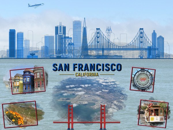
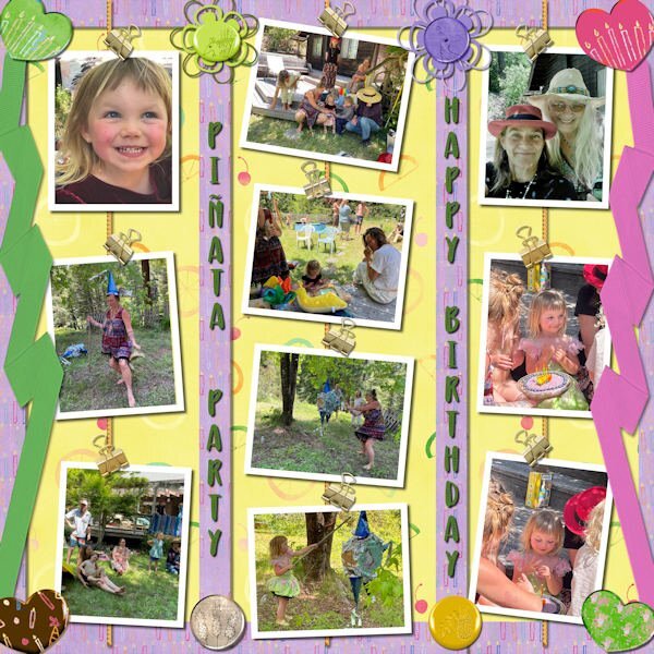
Hi, I'm back from my journey to visit my daughter & co and have been reading all the comments in the different sections of the Campus for over an hour now, you all have been busy! I had a massive jetlag and although I attended the masterclass this Sunday I definitively have to rewatch it, nothing registered with me. I have had a great time and am starting to make a photobook as I did before. I'm going to make a scrapbook page as introduction to the different topics of the book. After each intro page comes the "normal" pages with all my photos and stories. I don't do all the pages as a scrapbook page, that would take me months to do and family and friends over here are waiting to see my book with all the photos! I'll show the different intro pages as I finish them in this section of the Campus; they are still in random order because for some I need to do an internet search. This time they are rectangles because my book will be a rectangle and this way they cover a whole page, which I regret not doing last year.5 points
-
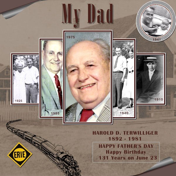
This is my take on remembering my father on Father's Day. I have pictures of Rudy as I knew him (when older), but I have such a soft spot for this photo of him (from his passport) when he looks so young and vulnerable. He was beset with many trials when he was young (in Europe), but he became a gentle and kind man despite the challenges. My dad....? I used several backgrounds of paint splashes and splatters b/c I love using them. The background paper is from Digital Scrapbooking (M. Lerin, yesteryear) and lots of recoloring and blending. None of the materials used are mine, except the bevelled frame. I like ripped and torn pieces and asymmetrical designs.3 points
-
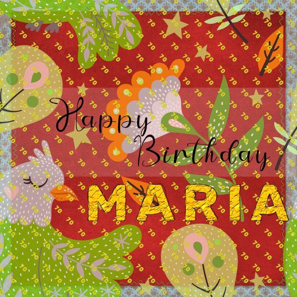
I have a couple of greetings cards to make so for the first I have utilised an effect for text from the recent master class 'Perfectly Imperfect'. For the main fill layer for the 'Maria' text I used Effects/Texture Effects/Texture 'Crumpled'. The Shininess was set to 47% which seemed to create more a gold look. I made 2 outline layers and used the Warp Brush on both. The lady in question is quite dramatic so I hope she will like the bold colours. It's her 70th so I used the pattern palette fill having created a little '70' image and kept it open on my screen in the process.3 points
-
Thank you ladies! Suzy of course there will be a date but not on every layout. I think I'll put the dates of my trip on the cover and/or first of the intro pages. Besides making my photobook I plan to use o lot of my photos in coming projects as well and the nice script of this week with the hanging photos is a candidate for some of my flower photos. But first my book!2 points
-
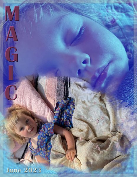
Looking forward to your layouts in the coming months. Good the hear your jet-lagged brain is back to normal. I really like that blue graphic overlayed on the photo.2 points
-
2 points
-
2 points
-
2 points
-
2 points
-
Ah, yes the cover, I thought that was what your Golden Gate bridge was -- I figure you absolutely need a date on the cover because you'll probably go back again in a year or two! :) Did you eat chocolate? Did you ride the cable cars? Walk the steps to Coit Tower? I guess we'll find out soon when your pages start rolling in!1 point
-
Mine text button is also clicked and I love it! I cannot tell you the number of times I have been dissatisfied with a long (or short) string of text, only to click and its all right there, ready for me to add a comma or change it slightly. I have been very happy not to have to remember it, to type it again. It's easy enough to click and hit the delete or other key and change it to the new text.1 point
-
Thanks again, Carole, of course I thought about it and could have made a click unconsciously, but used this part of the textool the first time for months working on your "punched" handout monday, where I had to choose "create as a selection". But the issue persisted more than 3 weeks. I will look at the last scripts I installed. Right now I just remember Vector Tube and Auto Tuber but may be Corel scripts too the last month, otherwise only cass-scripts.1 point
-
Welcome back, Corrie ... I missed you! So looking forward to seeing the results of your vacation. San Francisco is awesome - love that city. I've been there several times enroute upstate to Mendocino to see my daughter, Debbie, and family. Their place is about 3.5 hours north on the Pacific Highway.1 point
-
Kasany this is loverly. Such a pretty place to visit, you did a great job bringing attention to the little parts of it and not just slapping up some big pictures. Does that make sense?1 point
-
Corrie, Welcome back! I can see from the front you hit the high spots and can’t wait to see the rest. Don”t forget the date, at least the year, even super-small.1 point
-
Corrie - this is beautiful. Glad you are back and so glad you had a wonderful time. Looking forward to what you post about your trip. On another note - I never thought about doing a scrapbook photobook as an 8-1/2 X 11 rectangle - great thought.1 point
-
1 point
-
Although I never use that in my scripts, IF you happen to use a script that uses that command, it stays there. That is the way all the tools in PSP are set: they stay as last used. Another thing is that it is easy to accidentally drag the cursor on an icon and toggle it. I have done that if I drop my mouse, or if I have a twitch on my hand/wrist and at the time, I don't notice that it has clicked on something. At least, when you know what is causing a particular effect, you can go back and check that setting.1 point
-
1 point
-
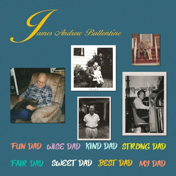
Yes, my Dad drove a City Bus. Dad worked 2-11 and I was in school until 3 or so...we were not home or awake a lot at the same time. I would walk to the bus stop (Dad drove the route through our neighborhood so it was a short walk) and ride a trip with Dad...about an hour's ride. Sometime we had ice cream!1 point
-
1 point
-
I'm adding this layout here because it's June and I'm late for the May Scraplift Challenge. The background paper is made with effects>texture effects>texture>bricks. I scuffed it up with an overlay I made from the image in the middle. The middle dandelion fluff, is one of my photo's, which i did negative image and some other unspeakable things to. Only unspeakable because I cant remember, guessing I desaturated and lowered opacity and other stuff. I used barbed wire instead of stitching, it seemed to fit better. Photo's are mine. I spray water on the seed heads and brought them in the studio to photograph. The concept needs more experimentation (perhaps with gycerine instead). Fonts: Black Range (pluviophile) & Alisabela Brushley (quote) both from Creative Fabrica. I tried putting water spots on the layout but couldnt make it look random enough so just left it off for now. Carole: should this go in the miscellanous area of the gallery or in the Scraplift part, even though I'm late with it.1 point
-
1 point
-
I am the lucky one who won the wool2 tubes from Cassel and I tried something with it. The background paper is by Marisa Lerin Own pictures. Our daughter's dog regularly comes on holiday for a week while she is on the move for work.1 point
-
I love dandelions even though there are none in my grass. My flower bed had some nice big ones that I managed to photograph before the landscaper put weed killer on them. I extracted the fluffy dandelion and added it to my dandelion picture with some extra leaves that were also extracted. The seeds were created using Particle Shop; the sky background is from a desert sky sent by my grandson. The mossy boards are from a photo sent to me by my daughter. Font is Anabel 1 grunge.1 point
-
I made a new post. Is this correct? thanks for reminding me, sometime I forget to look at topic of the original post.1 point
-
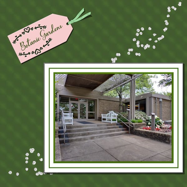
OK, Sue. I added shadows. Since I had merged the papers and frames around the picture, I chiseled the group and then shadowed it. Also decided to do a flip on the ribbon and had separated the shadow for it. Also, decided that it needed something more - just too stark as it was, so I added Cass scattered petals.1 point
-
May I suggest that you would post on a separate thread so that the thread name would direct the viewers? Since this very thread is about the "rules for sharing", it might not be seen by those browsing to find shared items.1 point
-
1 point
-
1 point
-
1 point
-
I will look for The Doctor Blake Mysteries. Thank you. We did watch the season 1 behind the scene and see that season two has one as well. I enjoy behind the scenes shows. She is the woman every woman would like to be for sure. I think I'm more like Dot....but not as smart or capable with a thread and needle. ? Thanks for giving us a new show to look for. Since we gave up Netflix we've been watching a lot of good shows in U-tube.1 point







Resized.thumb.jpg.d25811db03a63358cedab1e79f527635.jpg)








.jpg.c5c7ecaab5bf116de9f63e018dd7905e.jpg)
