Leaderboard
Popular Content
Showing content with the highest reputation on 05/21/2023 in all areas
-
In the April Q&A I had asked Carole how to make a Stencil effect. My idea was to make different papers with it. But at my first try, I wasn't sure for which project I could use such papers. My eternal problem is what shall I make as a project. So I just did something, and tried things out for several days until I finally came to something. I didn't use the stencil technique here to make a paper but saved it as a png. The alphas are a freebie from Carole, as are the screws. Of the photo, of course that is Poncho, I first made a B/W version, duplicated it twice, on the first layer the blend mode: overlay, on the second layer: screen and on the third layer I applied: soft light. Font is from DaFont and is : PaintyPaint 1 and a watercolor bruch for the stripe.3 points
-
@Susan Ewart Dark colors make that photo stand out. And for the next one, it is ok to challenge yourself to not colorize, but follow your feeling when you get to it. @Anne Burgess Great page. Did you make that background paper? @Ann Seeber Good work. Interesting how you angled the custom gradient. @Sharla If you end up making an album about all those books, you might consider either adding some journaling, sharing your thoughts about each book, or even making them into double pages, if you have a lot to say. @Anne Lamp Adding a paper under the text is a great way to customize the layout to make it great. That means you understand the principle instead of "just" following the instructions when the situation requires a tweak. There is still a whole week to work on the projects. Calling the dozens of silent registrants. Come on and show us what you made. If you are having difficulties, let us know. We are here to help you.3 points
-
3 points
-
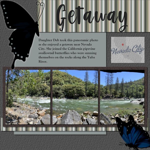
Scrap Bootcamp: Lesson 5 - Yuba River Getaway - Daughter Deb took this panoramic photo as she enjoyed a getaway when she joined the California pipevine swallowtail butterflies who were sunning themselves on the rocks along the Yuba River outside Nevada City. The title font is Berlin Kitchen, the journaling font is Goudy Old Style. Background color fill with asphalt texture, photo mat wood tile01 pattern with hardwood texture. Butterflies are from internet searches for pipevine swallowtails. EDIT: Forgot to mention the stripe pattern; used the directions for making a plaid but stopped before adding a second, rotated layer. The colors are from the portion of the photo that shows on the far left.2 points
-
2 points
-
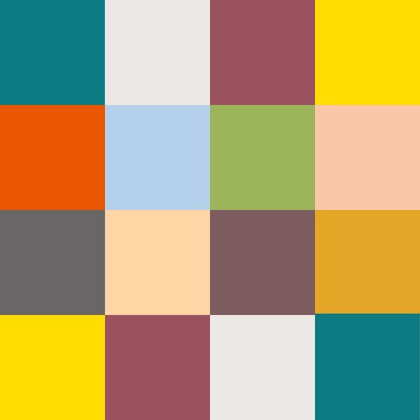
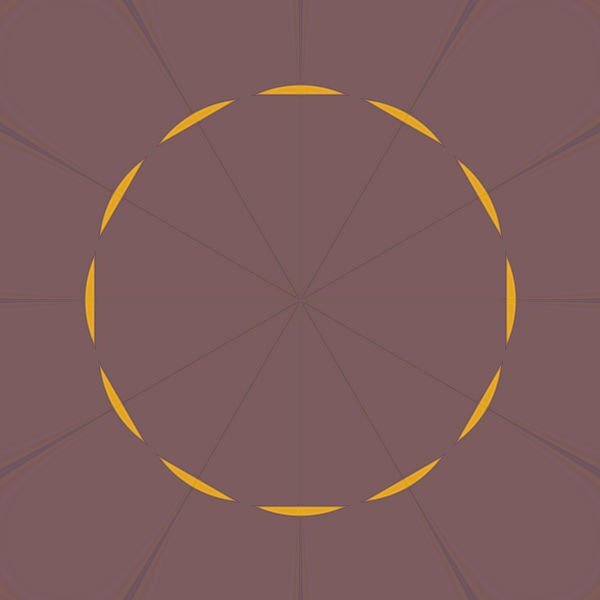
Yes, I always love what you do with the Fabulous Divas, Michele. I'm still playing. Made an image of my Chattanooga Pallet - putting the colors in squares. Then I made a copy of the jpg and played with Kaleidoscope and at the last, played with a copy of it and twirled it, kaleidoscoped it and twirled it again and then kaleidoscoped it again. These are the results. I can't seem to get to making layouts and I need to finish my 2022 Alphabet challenge - S, T, U, V, W, X, Y, Z. Still a lot to do before I can make a photo album of it. And, then, there is the rest of the double page workshop that I didn't finish. My, my - my To-Do List is overflowing! LOL.2 points
-
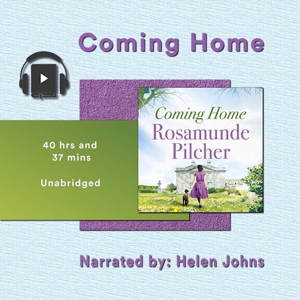
Project 2 - Book number 2. The papers are my creation, the book image from the book cover, headphones a bit of vector art I copied and adjusted. The 'home' in the title is Cornwall for the heroine who is catapulted away during WW2 A very long gentle story. I listened to it whilst doing jigsaws in the winter. It took me weeks to finish it...2 points
-
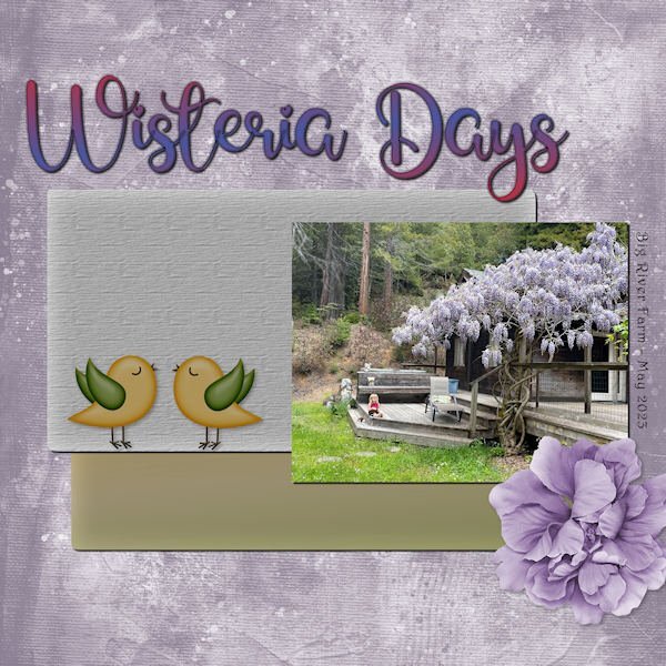
Using the photo I displayed earlier, I toned it up and it's now the star of Wisteria Days. Title Font - Glamlips w/custom gradient, Background paper-Marisa Lerin (colorized), Photo by Debbie Lennox of her granddaughter Magic in Mendocino, CA. Detail font - Harrington, Flower - AFT-Love Life, Bird art - found in my birds folder.2 points
-
Here is yesterday's daily look for my gaming group. The fashion illustration is by Megan Hess, a wonderful artist. I used some elements from AnnieC's contribution to the SYHO (Scrappin' Your ❤️ Out) Lavender Fields Blog Train. One of her flowers worked great as a picture tube ~ created a vector and used the vector tube script to make the frame. The font is Palegina free from Creative Fabrica's 12 Days of Christmas-Beauty-Handwritten-Font-Bundle last year; the bundle is still available as the Beauty Handwritten Font Bundle of 43 fonts for $7. I added a white drop shadow using offsets of -10 and another dark one using offsets of 10.2 points
-
2 points
-
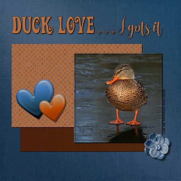
Project 2: Duck Love...I gots it! Another photo from the same photo date and again I used the kits available in the lesson. I'm trying to challenge myself to only use what is in the kit/bundle, but allowing for color changes (absolutely everything was changed). Next bootcamp I will try not do color changes but will get to choose any kit, and only use items from that kit. That's my story, and I can't guarantee I'll stick to it because I probably wont even remember I said this. ?. I used a variety of ways to change the color in the papers/elements to match my vision and often using several on the same paper element. Even making a selection, feathering, and then changing the color of the selection. Good practice for me. Papers and Elements: Rachel Martin Designs; Felicity (Digital Scrapbook) Fonts: Adam Melda, Action Is (Creative Fabrica) and Arial Black (windows). Photo: mine2 points
-
This challenge has had great success in the past so we can continue to have it on a regular basis, don’t you think? Just like those “some assembly required” kits that you can buy for a shelf, a chair, or a picnic table, I am including a 3600×3600 pixels canvas with some shapes. You HAVE to use the shapes in the size and proportions they are. You can move them, rotate them, flip them, and rearrange the layering if you want but you cannot resize them. You need to use ALL the pieces but you can add more if you want. So it is like all the pieces to build a DIY shelf: you cannot change the size of the pieces but you can use them creatively. Obviously, you will want to recolor them or replace them with papers, photos, etc. We just need to be able to recognize the initial shapes. Here is a preview of the shapes involved. Because of the size of the shapes, there will obviously be overlaps. Will it be for papers or photos or both? That is up to you! Click here to download the layered template. Post your projects in the gallery.1 point
-
Stunning! I love everthing about this. It looks like a photo from the 1800's. Really incredible, complex work. Thank you for the instructions. Very interesting to have different blend modes on the different layers.1 point
-
Most if not all of them have a rewind for at least several hours. You can click anyplace on the rewind and it will start the view from there, so you can pick whatever is on the screen at the time for a screenshot. There is no way I could spend enough time on any of them to get a decent live pic. The resolution is fairly good, but I do shop the pics and sometime resize them before using them.1 point
-
Thanks for your comments Carole - all good ideas but I'm just playing at the moment. I already keep an image and summary of books that I've read in A5 folders with plastic inserts - just as an aid to remembering what I've read and listened to. Before ebooks and audio books it was easy - the books were on the shleves to see but these days a lot of mine are no longer visible in that way. What I don't do is record my thoughts and feelings about books - I rely on a feeling (and memory) being generated by the cover. Using books as a theme for this bootcamp is pushing me to learn how to do things differently as, apart from the book images, I'm trying to explore how to create papers etc..1 point
-
Thanks so much, Mary. I've never thought of making a palette of my pic and then playing with the effects to make a paper. What a great idea! Thanks. And I agree with Susan. Just because you're not working on a layout doesn't mean you aren't creating.1 point
-
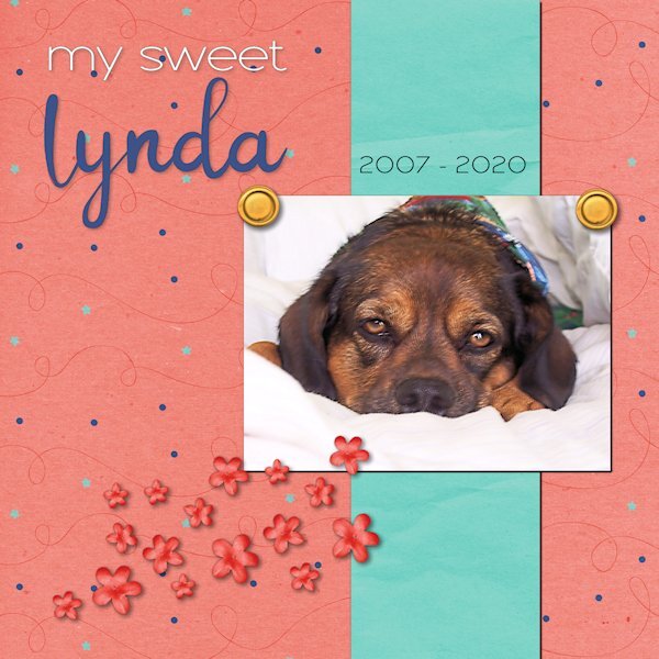
Carole - Lynda slept on a 4" memory foam bed under the window that was large enough to also accommodate Rudy and River. I think Rudy had to crawl over her to get to a spot where he could look out.1 point
-
Love this. Just because you arent into layout making right now doesnt mean your arent doing something meaningful. Play is one of the delights that sparks creativity. Keep on doing what you are doing and the layouts will come when they are ready. I too feel like I'm behind in stuff I'm doing and taking a note from your playbook today I think I will do some photography and see where it takes me.1 point
-
Great idea. what cool shapes you could make into brushes or tubes as well. Or a mask in the middle. So much possibilities.1 point
-
1 point
-
Your papers are beautiful. I particularly like the texture on the background light blue one.1 point
-
This is beautiful and thank you for all your explanations. The white -10 offset on the drop shadow is brilliant. It pops out the title more.1 point
-
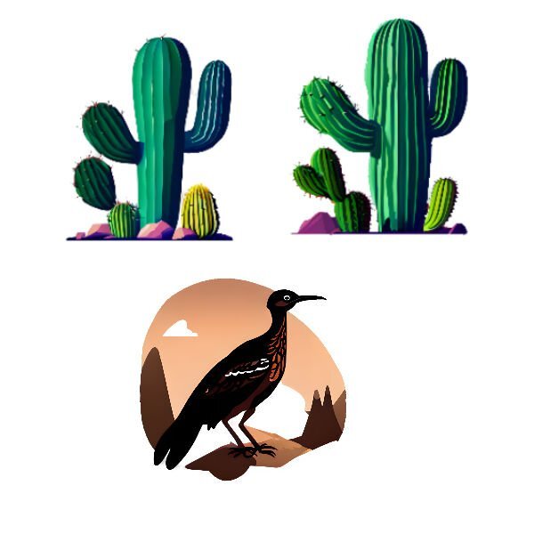
Well, I finished the Chattanooga trip and have ordered it to be printed by Shutterfly. I have enjoyed looking at the neat layouts in the Bootcamp. So I can't seem to get back to created anymore layouts. I played today with Creative Fabrica's CFSpark and with Abstract Curves. Made some patterns in Abstract Curves, and played with AI in CFSpark by asking for the roadrunner and cactus plants. These are my results.1 point
-
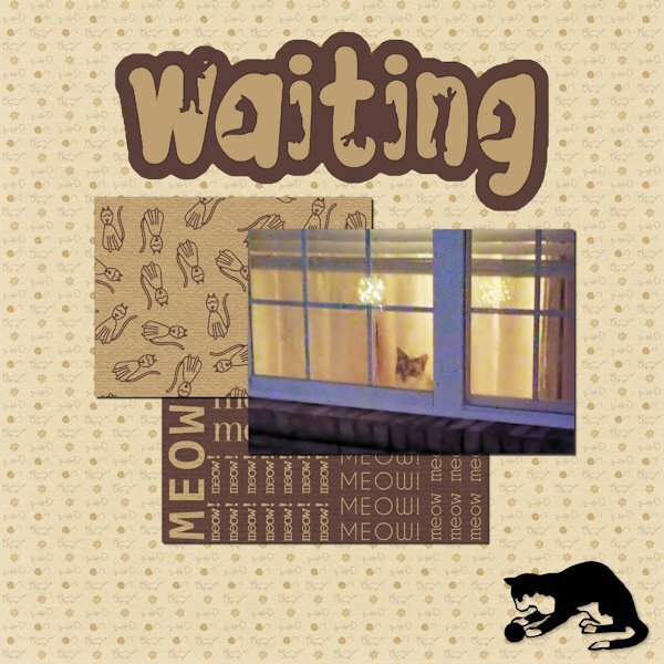
The papers are from Marisa Lerin. The font is The Cat from Creative Fabrica, and the silhouette is from Jessica Dunn at Digital Scrapbook. The little guy in the window is Rudy. He watches when I leave and pops his head up when he hears me pull into the driveway. A side story ... In Lynda's younger days, she would get very excited when I came home. Even though she was deaf in her last few years, she would still poke her head up in the window and meet me at the door. I had no idea how she did it. I finally realized Rudy would wake her to tell her I was home. He was a devoted companion and protector.1 point
-
My new kid on the block or 3 my 3rd entry my new kid is my mom Just Passsed.1 point
-
1 point
-
1 point
-
Project 1 - I tried to add a frame around the flower picture by using shadow on left and right sides. >>> I have found that for me, I am unable to use the frame tool in Paintshop Pro 2022 for large mages like this one (3600x3600) This may have made the drop shadow that I added for the project look bad around this. The picture was taken with my iphone 5S, yes it is old but still works. The papers I used were from the suggested pack from Digital Scrapbook site .. I did change the colour of one of the papers. For the hearts, I just used the Heart from Preset Shape tool and resized using other papers from the same pack. The font used is Varsity Team. I cannot be sure where I got this.1 point
-
There have been unexpected challenges this week, and I haven't had time to make a sandwich - figuratively and literally. I hope to find a few minutes this afternoon to prepare both. "Linda" means beautiful in Spanish. When she was handed to me, I changed the spelling to a non-traditional one because that's how we do things in our house. She had a beautiful spirit that was always calming. The anniversary of her passing is this weekend. The kit used for the layout is called "Celebration" by whispy's D'zines from GoDigitalScrapbooking.com.1 point
-
Day 3 - Project 1 I used various papers and elements from the bundled kits from Jessica Dunn-Frosty Fall (the mini was provided in the bootcamp). I did adjust some of the colors of the papers and elements to fit my idea. The scatter was from one leaf that I made duplicates of and turned them various ways (then grouped them so I could move, resize and duplicate the group as needed). Fonts are: Night Wolf from Creative Fabrica and Arial Rounded MT Bold from Windows Photo is mine. Carole: I posted in the gallery too, but made a boo-boo and didnt put it in project 1, how do I delete it and/or move it to the project 1 folder?1 point
-
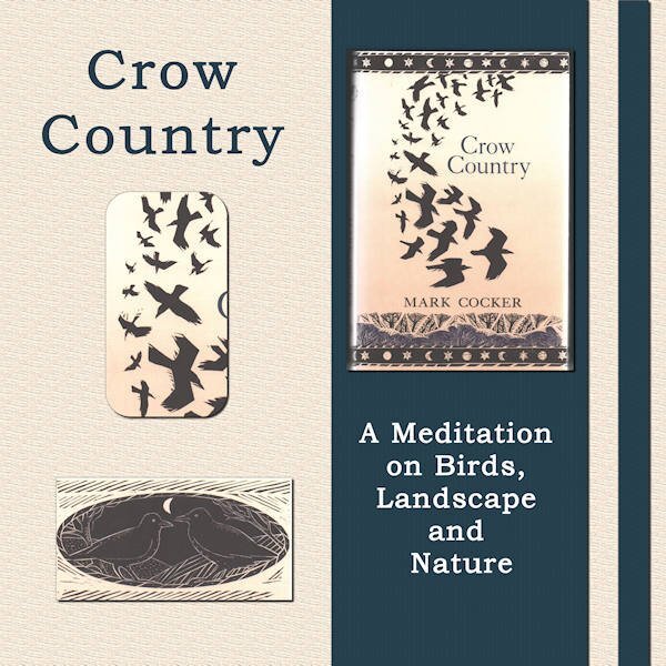
I thought I'd like a change away from my photos of flowers, birds, trees and cathedrals. So, I am going to use books I have loved as my themes for each of the bootcamp projects. Project 1 is Crow Country by Mark Cocker. He writes about his love of birds, in particular the covid family - rooks, crows and jackdaws. It is a lovely piece of nature writing set mainly in Norfolk in the UK and, many years ago, it inspired me to take more interest in birds. The images are all from the book cover. The words are the title and subtitle. The two papers I used were made by me - a simple colour fill with a texture added via EFFECTS then TEXTURE EFFECTS.1 point
-
I realized I forgot to report the details: Title Font = Gil Sans Ultra Bold + Heart Things 2 / ID Font = Freestyle Script / My photo = iPhone XS - 4/2023 Scatters = ps_marisa-lerin_34745_be-mine-squares-scatter / Flowers = SDE_AnAutumnView / Grapes = NicePNG Background plaid = AHA_somewhereintime_papers04 / Vertical strip = AHA_somewhereintime_papers111 point
-
1 point
-
1 point
-
1 point
-
Hello All, All day but I not as embarrassed as my first table, I wished Ann Seeber would give a class on how she did hers I Love it. I got my laptop on the Best Site, lol in the Picture Here. ? This was all day all day every time I got to sit down and Finally got mine to post. I like the dark grey on my psp and the Complete set up, hope I resized it right I made my top bread see thru so you can see the inside. got marshmellows used golf tubes yum.1 point
-
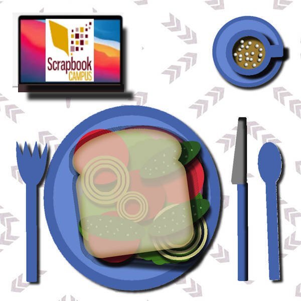
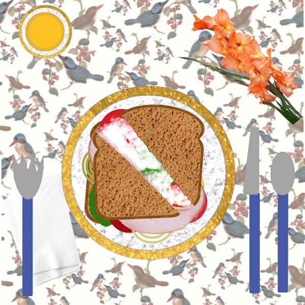
I got a little carried away with this 1st project. The sandwich is ham on rye with vegies and mayo, I didn't want anything hot to drink so I am having orange juice. I get sloppy so I gave myself some paper napkins. . I chose the tablecloth because I think I am going to be doing mostly animals for my projects.1 point
-
Day 2 Exercise Here is my day 2 exercise. Just trying to catch up so nothing fancy today. I did take a shortcut to get my sandwich on the plate. I selected all layers from the sandwich, used Copy/Copy Special/Merged and then just pasted the entire sandwich to the plate. I did make sure that I could drag an individual item to the new image.1 point
-
This looks great Anne. Indeed you are in the right place. If I cant find the forum from the campus I just go back to the lesson and it has the link ("the forum") at the bottom, it says something like this, " Then, go to the forum, and show us... has. Believe me, we have all had to a lot of help from Cassel, when we got started. It was so new to me I didnt know or understand what anything was, keeping going knowing I had Cassel to be there when I got stuck was/is an amazing experience. And it's the first time I didnt get frustrated and quit PSP. I look forward to seeing your layouts.1 point
-
1 point
-
1 point
-
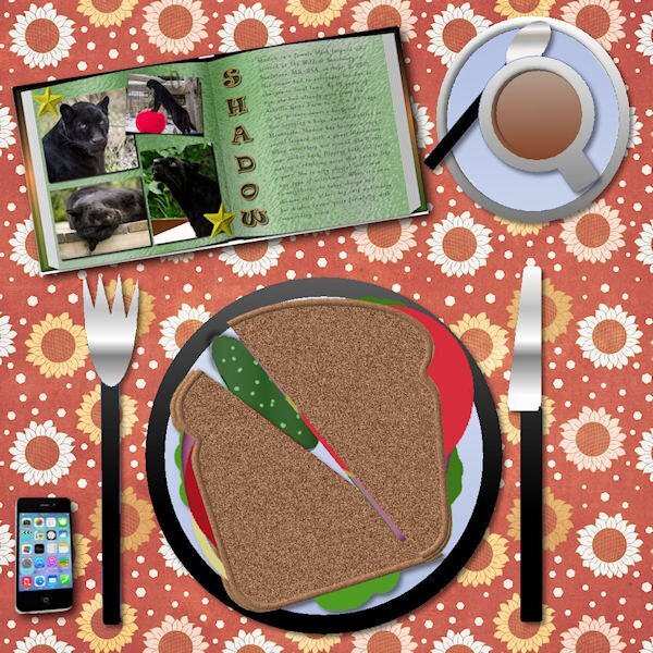
I call this "Dinner and a Movie". I watched a movie (tutorial) and made dinner (or in this case breakfast) at the same time. Yummy! I made duplicates of the onions to help as pep to my oncoming workout and instead of big pickles which I ate the last of last night, I chose those little ones (by resizing smaller). I think they are called gherkins? they are so yummy. I like them on the side. You might see my top slice is smaller. You know how it is when you get the end of the bread and you have a nice full size piece and the only other choices are the end piece or a smaller size one next to the end piece. I wouldnt normally have a knife and fork with my sandwhich, but today I will live on the wild side and try to use them to eat my sandwhich. All kidding aside, this is always a fun exercise. I totally forgot about dragging from the layers pallet one layout to another. it only took me 8 times through the bootcamp to remember, well, er...that is IF i actually remember this time. ?1 point
-
1 point
-
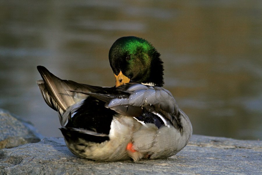
Here is a photo I think I will use. I am going to limit myself to ONE photo date (November 20, 2011) on a visit to the pond at Sardis Park near where I lived in Chilliwack, BC. A very small pond that takes only 10 minutes to walk all the way around. It is on a flight path of waterfowl; mostly Canada Geese. It was only a 10 minute walk from my house and part of my "rehab" after spinal fusion surgery in May of that year. As soon as I could carry my camera and walk for 10 minutes that's where I went. Looking forward to the bootcamp and looking at all the photo's and layouts from all the registrants.1 point


