Leaderboard
Popular Content
Showing content with the highest reputation on 01/06/2023 in all areas
-
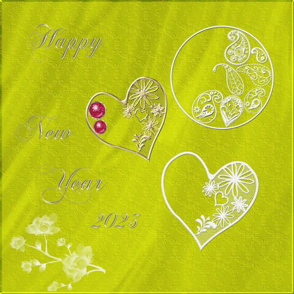
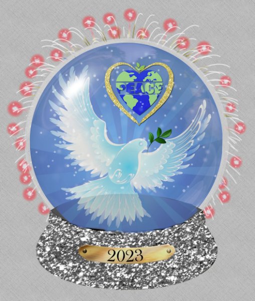
I used one of Cass's Sports Card templates which I edited to fit my theme. That beautiful illustration is by Magali Barbe, inspired by Galliano, I think. I added a little texture to the background just to make it a little more interesting; I learned that from Sue Thomas. The font is, coincidentally, Unique free from 1001Fonts.5 points
-
I love the new forum its Great, I love that I get a email and all them are on it and I love that I can put a heart or thumb up on your messages HI ALL your ALL SO AWESOME I am a diamond but I dont know how to do stuff been reworking on starting over 9 times so far I watch the video then then instructions and over and over but Boot camps I can almost go thru without a glich now Cant wait till the next one, Labs are so hard, if they aren't showing every lil step I lost my place is why I ant do them only did one so far with no problem and dont even remember which its just been not easy but You all are G R E A T and my TEACHER IS GREAT. ITS ME BUT I AM TRYING ?3 points
-
2 points
-
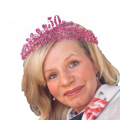
My daughter asked me to make an itinerary for when her best friend visits her in Savannah, GA. I decided to make a card with the itinerary inside. So far, I have made the back and front of the letter size card. It will be printed on card paper. Heidi loves pink and loves glitter. The glitter is from Creative Fabrica, the plane and tag on the luggage are from Digital Scrapbook, the newspaper mockup is from Deal Jumbo, the suitcase is from lsj designs, the tiara a free brush from Brusheezy, the old maps are of old Savannah downloaded from the Library of Congress, and the the airport map is from Google. I plan on using a color version of Heidi for the inside which hasn't been started yet. Beth, fortunately, gave plenty of time. My husband did the proofreading and saved me some embarrassment.2 points
-
2 points
-
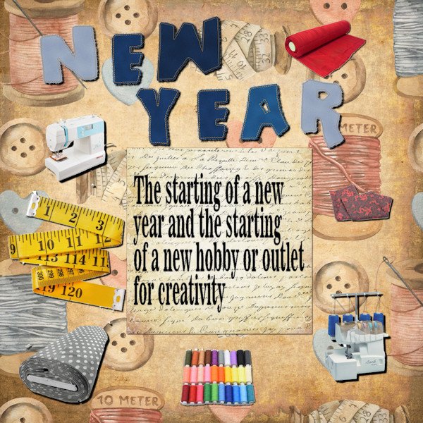
Hi, yes its me again, not able to move around too well so time on my hands. My wife Karen started an interest in sewing around the middle of last year. She has been attending night classes at the local college so half the spare bedroom is given over to her growing amount of materials; I have the remainder as my computer room/office. Karen has made a new years resolution to start to make here own clothes so she'll have some nice new outfits for the spring and summer. The title are Jeans Patch alphers from Cassel, the journaling background and main background is from the The-Ultimate-Vintage-Bundle download called "vintage sewing papers" a free download from Creative Fabrica. The other elements are just images taken from the internet.2 points
-
Hi, Still trying to find my way around this new forum layout. Had some time on my hands so did another lab, 6.04. The layout template I downloaded from 6.04 and its called April 16. The silhouette was created from a photo of myself (It's rare for me to be in a photo because I'm normally behind the lens) and the banner was created form the download and used as the title .2 points
-
Cindy, first, congratulate yourself for getting through the Bootcamps without a glitch. Believe me, I find some (okay, lots!) stuff hard too. Sometimes I need to reset my brain and I walk away for a while and then come back with a fresh mind and fresh eyes. If the labs are too hard right now try some tutorials. Pick the ones that have one button rating to start so you succeed and feel an accomplishment (good for your confidence). Using three tutorials of your choosing you can make your own layout (or your own LAB) until you are ready to jump up to the Notebook Labs. Remember...baby steps, where we all started. It's a different journey for everyone; some of us (like me) crawl longer and some are off to the races immediately. Just keep moving forward, do the the things you can do and add in a little challenge now and then. And another thing I learned from Sue Thomas, if you like a technique, keep doing it until you can do it without reading the instructions. I'm still working on that one.1 point
-
Thanks - forgot about that vector paint script. I really need to sort things out - I've got so much stuff!!!!! LOL1 point
-
Thanks, Susan. WWSTD is a great thing to remember! I didn't realize I actually had a style yet. ?1 point
-
Fabulous Michele! Perfect colors. I like how you tweeked the template. And gorgeous illustration. For a little pizzaz, remember WWSTD (What would Sue Thomas Do), the texture does add that little extra! I love your style.1 point
-
1 point
-
I just knew that that old pen tool was involved. I'm becoming used to using a tablet and pen and the pen tool I'm trying to get used to (the one in PSP).1 point
-
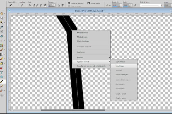
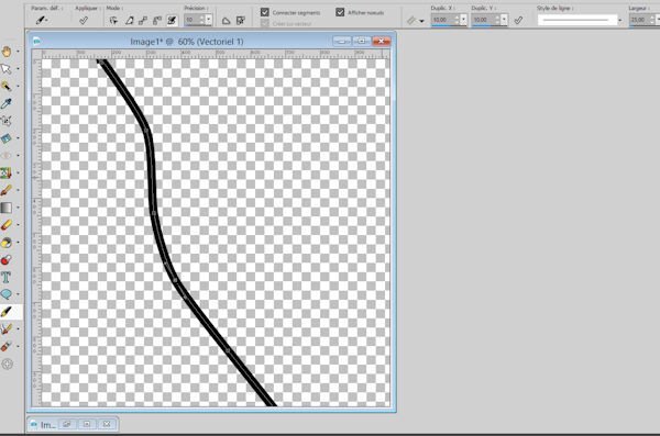
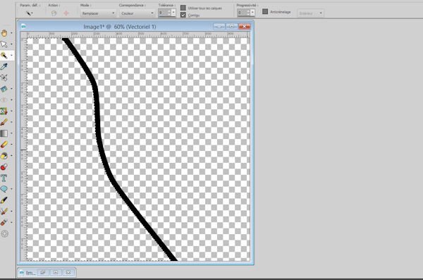
y Mary Actually, it’s very simple. Just use the pen to draw point by point from top to bottom of your image and validate if you are satisfied. Then right click on each node type of symmetric node. Select the part you want to keep, invert the selection and cut your paper with this selection. 6 images for greater clarity in my explanations. Mireille1 point
-
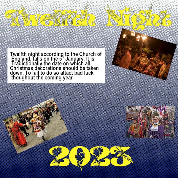
Hi, It's 12th night, the night when all Christmas decoration should be taken down and in victorian times was celebrated by a family meal. Well yes my daughter came over and had a cup of coffee while helping us take down our decorations. Is anyone else who takes down their decorations etc today? It's considered bad luck to leave your Christmas decorations after today. The background to this was a gradient with Effects> Artistic Effects>Halftones with the settings of square 22; Screen Angles 1. = 120; 2. = 103; 3. = 133; with the Use Overlay box ticked and the Blend Mode set to Luminance. the Opacity of 55 and the Colour Scheme at RGB. The photos are taken from the internet; the title text was a font called "NEWYEAR" with the journal text is just ARIAL.1 point
-
Michele, I absolutely love those corner hearts punches, en the background withe the little hearts.1 point
-
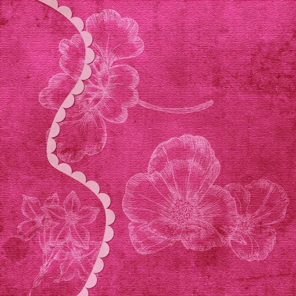
Mary, the scalopped side paper is part of the kit from which I also took the other papers, so I didn't do that myself. But I would also like to know what the best technique is to do this, I like that too.1 point
-
Marie-Claire - I really like this layout. Everything flows together well. I am interested on how you did the edging to the scalloped side paper.1 point
-
1 point
-
1 point
-
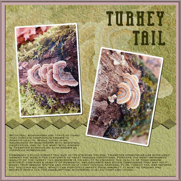
Here's the third in my Mushroom Series. This is the Turkey Tail, and the photos are from Debbie Lennox. I used Inspiration/Template U but made radical changes. I rotated the entire layout and then rotated the photos, also. The title font is Bodybuilder, the journaling is Copperplate Gothic. I used an enlarged part of a photo for the background and applied the Blue Spruce texture. The information is pasted from healthline.com/nutrition.1 point
-
Nice! Poncho is lookin' good -- you much comb him nearly daily because he never has a bad hair day! :)) I finished mine ok, but then I wasn't sure what to do with it, LOL!1 point
-
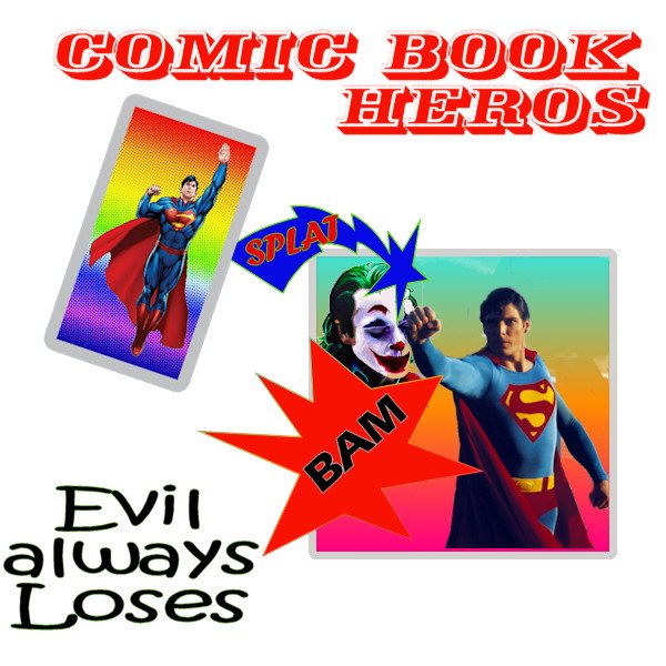
Some more free time on my hands so worked on Lab 6-05. The "Burst" shapes were easy enough to make and I included one that was already in PSP shapes. Making the "Halftone Papers" was fun and I experimented with a few, I also made two new gradients which has added more to my skills with PSP. The Cartoon words were really just duplicating and moving the lower layer a few pixels downward. What is happening as I don't seem to be able to insert the URL from the image in the gallery as I did before and zhave to result to inserting the image direct into the post1 point
-
1 point
-
here are some of my layouts I made during this Weekend für Challenges1 point
-
Template: Lab 12-11 The paper: themagnoliapatch.blogspot.com the clusters: form the.curiopantry.com Own pictures. This is the neighbor's cat and also our friends. When they go on vacation, I take care of the cat.1 point
-
1 point


