

Ann Seeber
-
Posts
3,108 -
Joined
-
Last visited
-
Days Won
69
Content Type
Profiles
Gallery
Forums
Posts posted by Ann Seeber
-
-
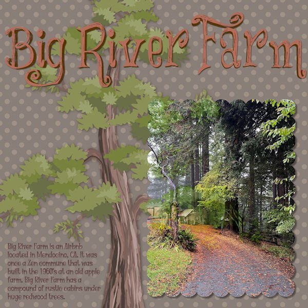
Finally got to finish Lesson 7. Here is daughter, Deb's, Big River Farm that she has turned into an Airbnb. It seems folks want to get away to a rustic environment! Who knew? It does have all the mod cons so there's that. It has about 5 cabins on the property, but the largest one is the rental. The title font is "Things We Said." The text font is "Witch Mystery." (Because the title font is a bit quirky, I tried to follow up with the text font in the same vein.) The redwood tree illustration is from pngtree.

-
 4
4
-
 7
7
-
-
5 hours ago, Carolyn Rye said:
Day 6 with the Mask Workshop. I have be able to learn so much. The new way to doing backgrounds is great and fun to do.

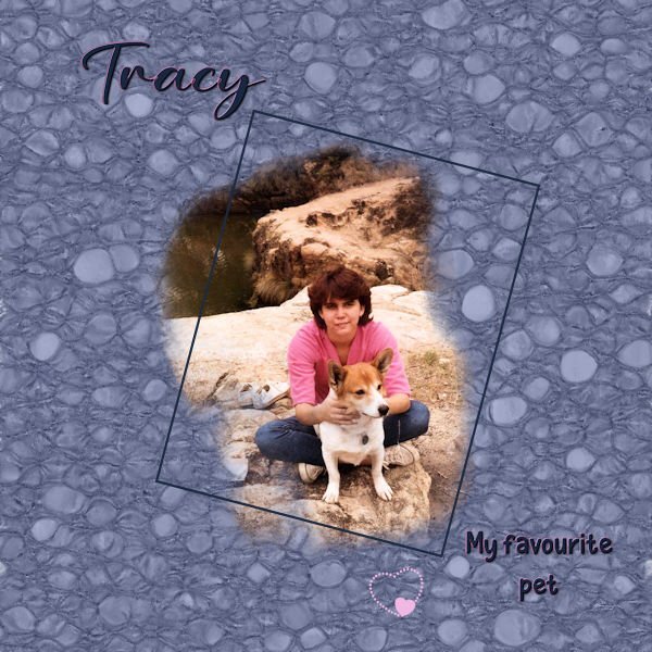
Outstanding linoleum, Carolyn. When I did mine, I liked it so much I started saving just the linos as papers in my stash and went on to create it in various colors. Is Tracy the person or the pup?
-
3
-
-
10 hours ago, Corrie Kinkel said:
Ann happy birthday from me too and as it is on a Sunday maybe some visitors?
Thank you, Corrie! My granddaughter, Jackie, took me out to dinner on Friday evening and daughter, Laurey, took me out for dinner again on Saturday. I'm over-dinner-ed! 😊
-
 3
3
-
-
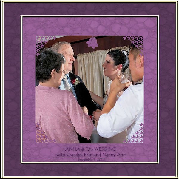
ANNA & TJs wedding reception. (I will also post this in our masks workshop.) Hard to believe it's been almost 12 years! I played with brushes and ended up using corner punches and the wedding bell is also a punch. (in the mask) The text font is Tempus Sans. The frame is called Transparent01 in the PSP frame collection.
-
1
-
-
LESSON 6 - ANNA & TJs wedding reception. (I will also post this in our wedding forum this month.) Hard to believe it's been almost 12 years! I played with brushes and ended up using corner punches and the wedding bell is also a punch. (in the mask) The text font is Tempus Sans. The frame is called Transparent01 in the PSP frame collection.
-
2
-
10
-
-
3 hours ago, Susan Ewart said:
I wonder how it came to be named like that.
according to wikipedia.com "The origin of the name is not entirely clear, but there are reports that it originated in Britain with a fancied resemblance of the wrench's jaws to that of a monkey's face, and that the many convoluted folk etymologies that later developed were baseless."
-
1
-
-
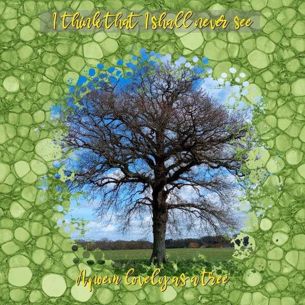
1 hour ago, fiona cook said:
Joyce Kilmer
I do love this poem:
Trees
BY JOYCE KILMERI think that I shall never seeA poem lovely as a tree.A tree whose hungry mouth is prestAgainst the earth’s sweet flowing breast;A tree that looks at God all day,And lifts her leafy arms to pray;A tree that may in Summer wearA nest of robins in her hair;Upon whose bosom snow has lain;Who intimately lives with rain.Poems are made by fools like me,But only God can make a tree.-
1
-
7
-
-
2 hours ago, Susan Ewart said:
Day 4
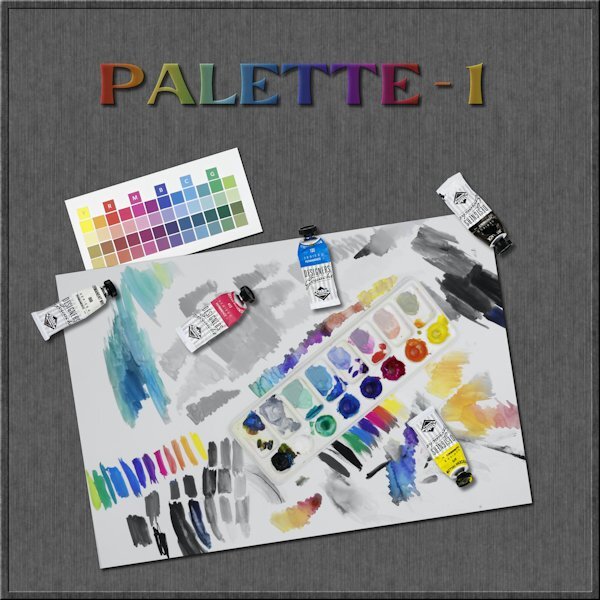
I tried the PencilSketch2 script but there was too many hues that are dark so it didn't work well. In fact I had planned on using an image of the paint palette on it's own with the tubes of paint in front of it. It didnt work. so I went on to trying to the use the brush with a "hide all" mask and well, it's looked something you'd throw out with the trash. I had this other image of me playing with 20 yr old gouache WC paint using only CMY K and White for my color group I belong to. I had the idea of having a desaturated image and using the mask to bring back color in the palette and certain areas. I dont know why, but that was a head scratcher using the two layers of the same image (one desaturated and one fully hue-full). I got there in the end and this is just the technique I have been wanting to learn. I need to practice it way more. I extracted the tubes from the other image I was going to use and put them on this image as separate elements. The little square color swatches is from my color group, something we are doing until the real color cards get made and mailed to us.
The font is Evidance, by Creative Fabrica I think. With an inner bevel added and a gradient fill and lowered opacity (with the shadow layer below it turned in into a dark tone, as the shadow was not 100% black, otherwise it would have been a dark shade). Tomorrow I will only be 3 days behind. Yippee!
Susan, this is really eye-catching! I don't see where you used a mask. Is this posted in the right forum? Is it part of your Build-A-Kit?
-
 1
1
-
-
9 hours ago, fiona cook said:
Lesson 6. My tree photo with Vibrancy adjustment. Mask from DigitalScrapbook.com Yvette;PhotoMask:01 by Rachel Martin. Lino effect repeated 9 times for the Distortion effect. Duplicated the layer and used Overlay Blend Mode.
That poet, Joyce Kilmer, was sort-of local to me when I lived in New Jersey. He became so famous they named a rest-stop off the NJ Turnpike for him. 😉
-
2
-
1
-
-
11 hours ago, Susan Ewart said:
Day 3
Plugging along at a snails pace. Had fun with this one. I wanted one object in color but still with the Pencilsketch2 effects. I believe I used hard light blend mode with an extracted version of the pipe wrench (is that what it is?). The two little box wrenches(?) in the corners were originally photographed (along with a third ugly one that I didnt include in the layout) with the main group of tools. So I extracted them, inner bevel added. I used the Letter press script again with Gill Sans Ultra Bold font (formerly from MSWindows). This time I added the spaces you get when you add a space (I think) when entering the text. And this is a one row box you have the option of making. I did desaturate it to make it look like metal and I had to resize it because it was wooden and the box bottom shows through. The Letterpress script is quite customizable with the each element on a separate layer (when you choose adding the box for it it all goes into layers and I recomend using this because you can choose to use or not use the box and you can also group it all for easy resizing all at once for for copying and pasting into a layout as a group. It's much easier than handling each element separately.
And like everyone else, I went down the rabbit hole for a good hour playing with the kaleidoscope effect. One to Day 4 now.
Wow, this is great! I think we call that big guy a Monkey Wrench?
-
11 hours ago, Donna Sillia said:
Wasn't this a movie or series on PBS, I think?
Not to my knowledge. To me it's just a local roadside historical marker.
-
12 hours ago, Marie-Claire said:
DAY 4
Cluster: Jessica Dunn (digitalscrapbook)
Fonts : Forte and Molly Script
The birds is a free photoshop bruche that I downloaded once, I think on Deviantart
For the paper, I applied 3 large strokes with green, light blue and darker blue on a blue background, using a watercolor brush.
Really nice! Is that some sort of tracker that Poncho is wearing?
-
1
-
-
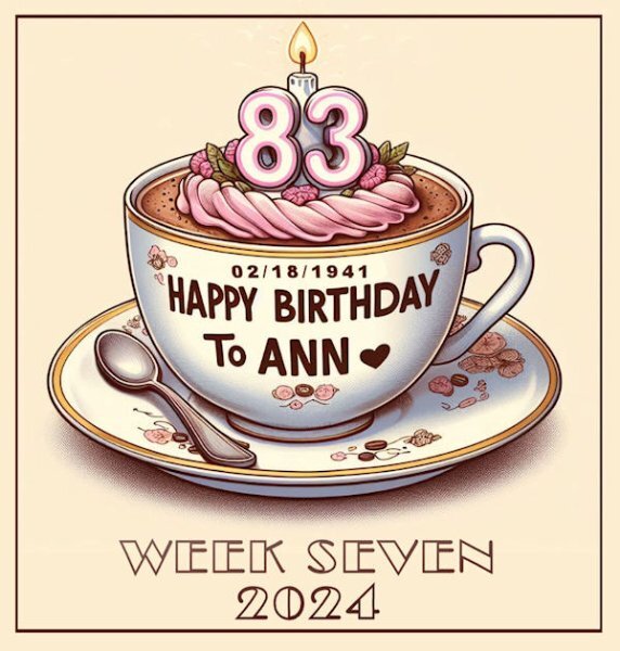
The font for the title at the bottom is Broadway and yes, it is my birthday today.
-
6
-
-
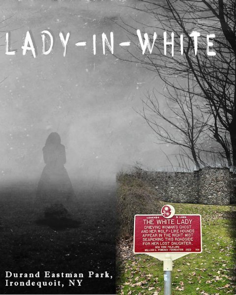
Here is my Lesson Five - Lady in White (A local tall-tale) The title font is Horror Story and the other is Imprint MT Shadow.
-
2
-
9
-
-
14 hours ago, Corrie Kinkel said:
Day 5 and again a photo of a plant that I saw on my trip from last year. I used a hexagon brush to make the mask with some imprints of a leaf brush. A hexagon frame with a bevel and the font is Bahnschrift. The background and the corner punches I have in my stash and I don't know where I got them from.
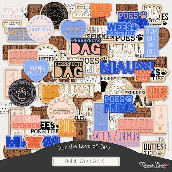
Corrie: Forgive me for changing the subject but I wanted to show you what I found in a Marisa Lerin "For the Love of Cats" bundle that I just purchased. An entire folder of Dutch word art.
-
5
-
 1
1
-
-
I guess I'll post this one here, too, as it fits the theme. I already posted it in the Mask Workshop. Since I'm an only child, I don't have any siblings though I did wish I had some when I was young.
-
5
-
-
8 minutes ago, MoniqueN. said:
Famous actors on both shows! (Don't know these shows)
Yes, Suncoast features Woody Harrelson and Laura Linney. Blue Bloods has Tom Selleck and Donnie Wahlberg.
-
1
-
-
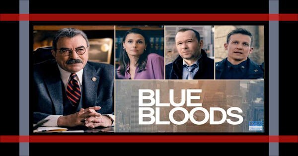
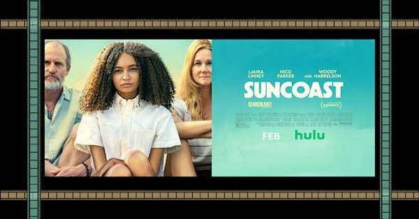
A small project I've been working on to populate my new 32" monitor. I'm using the cass-painted-frames and I've made one for Cable or Streaming TV shows and a separate one for Streaming Movies. For the Movie one I went and found a film strip and duplicated it all over the place on top of the color painted frame strips. Here is one I did for my Friday Blue Bloods TV show and another for the film, Suncoast, which I will watch tonight on Hulu.
-
6
-
-
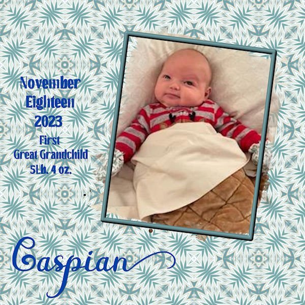
8 minutes ago, Lynda DiGregor said:
Lesson 3
My first Great Grandchild. Unfortunately the only photos I have are sent through messenger. The quality pretty much stinks.
I just copied Carole's setup.
The background was made according to lesson 3.
Wow, Lynda, congrats! I love the name, Caspian. I'm just the opposite that photos I get through Messenger are pretty much all I use, and they look good to me. I do have it on my desktop so I can download straight to my hard drive. And I don't do a Save As, I open each file up and use the download icon top right. Not sure if that would make a difference or not...
-
1
-
-
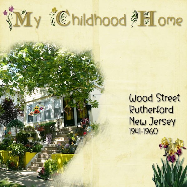
LESSON FOUR - MY CHILDHOOD HOME - I didn't get to do this in January so I used it for this mask lesson. The title fonts are am_intex for the decorated ones and Before the Rainbow for the san-serifs, treated with an inner bevel and shadowing. I found the bearded iris with Google Images and removed the background. The background paper is from Circle of Life mega kit.
-
2
-
10
-
-
1 minute ago, Harmony Birch said:
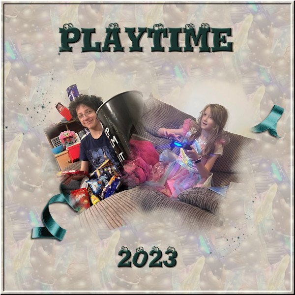
Here's my lesson 4, 2 photos, 2 masks, made the background with a selection from the girls dress, applied balls and bubbles and seamless tile and used as a fill, then put a beige layer on top with an opacity of 50 to tone it down a little. The font is Eyeballs. Then just a couple of scatters and a ribbon to finish it off.
.
That's great, Harmony! The font is outstanding! 👀
-
3
-
-
10 hours ago, Lynda DiGregor said:
Workshop Day 2
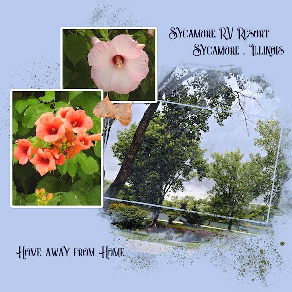
This is the place we stayed at for 7 months while waiting for our home to be built.
Beautiful, Lynda. Did you intend to use the large photo on an angle like that or did it get tilted when you angled the frame? It makes me tilt my head when I'm looking at it. 😉
-
1
-
1
-
-
5 hours ago, Emerald Jay said:
Lesson 3
I added some grunge around the edges. I'm not too crazy about the kaleidoscope method.
Emerald, this would be better, I think, if when you are selecting the pattern in the materials palette for your floodfill, you reduce the size to 50% or even less. See if that improves your opinion of kaleidoscope.
-
2 minutes ago, Susan Ewart said:
We used to paint the farm fences with it so the bird-brained thoroughbreds didn't chew on it.
Around here it was applied to telephone poles to protect them from rot in the ground.


Highlighted cursor for the Masterclass and Q&A
in Let's talk
Posted
Sounds like something I could use in PSP because I use the precise cursor which I find hard to see, sometimes.