Ann Seeber
-
Posts
3,636 -
Joined
-
Last visited
-
Days Won
97
Everything posted by Ann Seeber
-
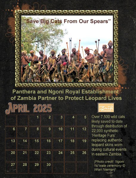
Happy April. Here is my new April Wild Cat Calendar for 2025. All elements are from Panthera.com. The template is from Carole's Calendar Workshop in October 2024. The April 2025 font is Aviation Cocktail with a chisel effect as it is hard to add shadows with such a dark background. I isolated the photo frame using a selection/select borders and promoted it and then filled it with the PSP leopard pattern from my materials palette and treating it to an outer and inner bevel.

-
I asked AI Copilot about the bird and here's its answer: "The pied butcherbird gets its name from both its distinctive appearance and its feeding habits. The term "pied" refers to its striking black-and-white plumage, while "butcherbird" comes from its rather grim hunting behavior. It earns this title because it impales its prey—like insects, small mammals, or other birds—on thorns or sharp branches to store or eat later. This habit is reminiscent of a butcher hanging up meat, hence the name. Interestingly, despite their fierce name, pied butcherbirds are known for their beautiful, flute-like songs, making them one of the most melodious songbirds in the world. Quite the mix of talents, right?"
-
IDK, I kinda like them both... 🤷♂️
-
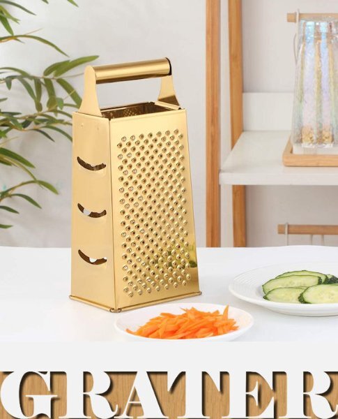
Rene, I tried that script for my G entry. Here's G = Grater. I use it all the time. I prefer it to the fancier rotary versions. I guess it could also qualify as Gold Grater! 😉
-
I'm a little puzzled by what is behind the photo. Is it a frame? It looks like it has another photo... ??
-
I initially duplicated my vector and when I hit the button to rasterize it is when the error occurred. I then went back to the vector and told it to Convert Text to Curves/As a Single Shape. I just checked and I see there's also an option to Create a Raster Selection of the vector. I'll have to try that one next time. But, no, I neglected to keep one as a vector. Next time...
-
Yes, good idea. I didn't think of that. It seems I rarely encounter this problem with my copy of 2023. Just lucky, I guess.
-
Thank you, Corrie. I was working on a new calendar for April today and tried the wrapped text again and it was fine. 🤷♂️ Go figure!
-
A nostalgia moment for me; first with my family, then with school friends and even with my daughters when they were small. It was supremely corny but I did finally venture onto the rollercoaster with my friends! I felt so brave!! The poster is from the Facebook group Peter Gray's Magazine Covers and Posters which I follow. The title font is Century Schoolbook and the papers and accessories are from rae-BT-summer vacation. The information about the park was generated by MS Copilot AI. I probably should report my PSP2023 acted up with the journaling font that I had in a bounding box; as soon as I duplicated and rasterized it, it flew off to the right in a straight horizontal line. 😕 This was just with the raster version! I finally ended up converting the vector text to curves as a single shape to stabilize it.
- 181 replies
-
- 11
-

-
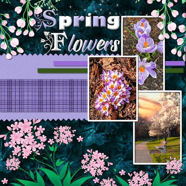
NEXT: Spring Flowers - photos from HV in Pictures gallery - top and bottom decor from DSBT-Magnolia; title fonts: am_intex, Gill Sans Ultra and Babilonia. Papers from my stash.
- 181 replies
-
- 10
-
-
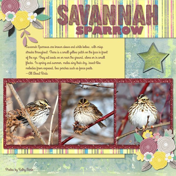
This Savannah Sparrow just flew in with the Spring Migration. The photog is Kathy Marie on The Hudson Valley in Pictures gallery. The background paper is from marisaL-distressed28-vietnam bundle. The title is the new cass-stamped alpha. The subtitle is Gil Sans Bold. The journaling font is Grand Hotel. Flower stamps from my stash.
- 181 replies
-
- 10
-
-
Odd, that title doesn't ring a bell with me. I thought I remembered some clocks?
-
Oh, what a shame about that previous kit, Suz! I'm trying to recall if you sent me a copy... do you remember the naming of it?
-
I have a fear of heights. Only when standing; I can sit in an airplane 30,000 feet up, no problem, but when standing I feel like I'm being pulled to the edge and compelled to jump.😱
-
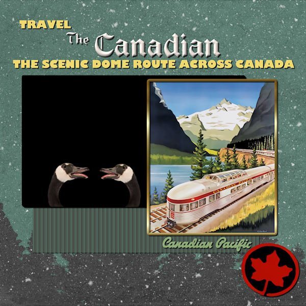
Next: featuring an Adventure! 😉 Background paper from Jessica Dunn; some of the text is from the original poster and some is done in PSP with Gil Sans Bold. The Canada Geese are from National Geographic and the train poster is from Peter Gray's Posters & Magazine Covers page on Facebook. I collect any with trains.
- 181 replies
-
- 11
-
-
No, sorry, that's a typical phrase we always said to our dogs. They would always pick up on the emphasis on the Who's and get excited. 🐶
-
Who's a Good Boy?
-
Sharla, is the "autumn harvests" element from the kit or did you create it? It's really nice!
-
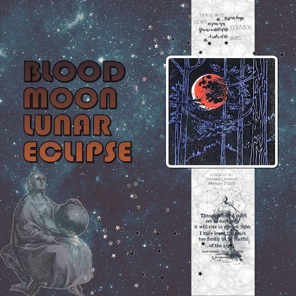
The March blood moon eclipse art is an original linocut created by my artist daughter, Debbie Lennox. The rest of the layout uses pieces from a kit called SI-StarGazer. The title font is Bauhaus 93.
- 181 replies
-
- 11
-
-
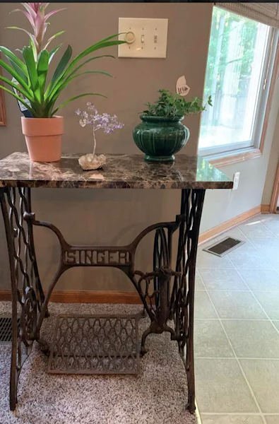
As I have gotten older, I am no longer a big fan of maple syrup -- too sweet! I choose to top my pancakes or waffles with applesauce and even that is the unsweetened variety made with tart Granny Smith apples. My parents often drove from our home in New Jersey to Vermont for vacation, and, of course, brought home lots of syrup and maple sugar candy. They even visited a quarry and acquired a large, flat piece of beautiful marble for me that I installed as a top on an old Singer Sewing Machine base made of black wrought iron, including a large treadle. My Laurey still has it in her entryway.
-
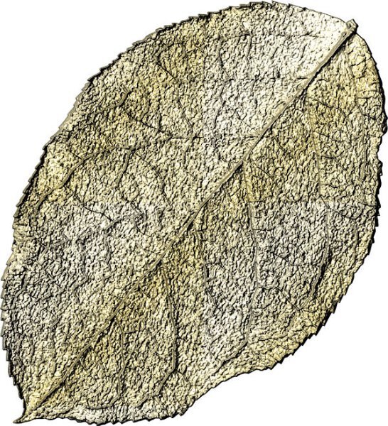
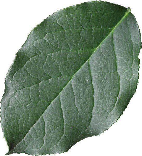
I finally figured out I had to add a gold texture file to the Corel documents folder. Then I called up a leaf from my stash and made it gold. Somehow, it looks more like the underside of the leaf compared to the original. Which setting needs adjustment? I just added the original leaf element so you can see it is smooth and not as veined as the gold variation looks. Don't know how that happened!
-
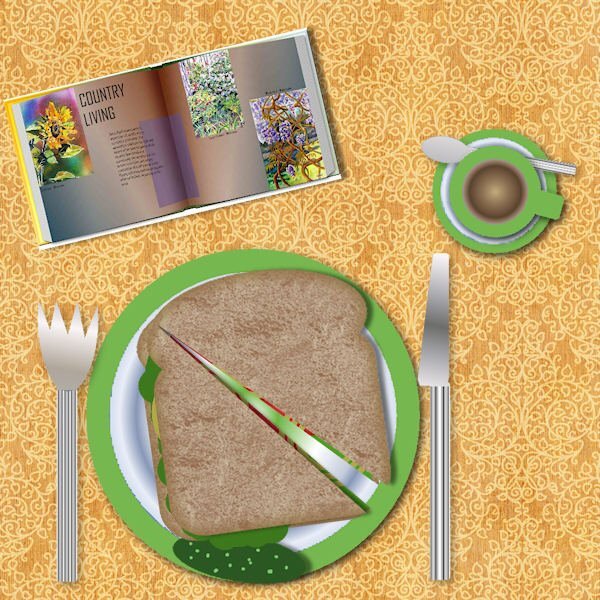
Here's my layers exercise: a table with lunch ready. The book is from a magazine workshop treated to the open book script.
- 181 replies
-
- 12
-
-

-
me, too, except for the Margaret O'Brien maroon velvet that I saw in a movie. I did a layout about that dress...
-
That's just me dithering to encourage the left side of my brain to get creative.
-
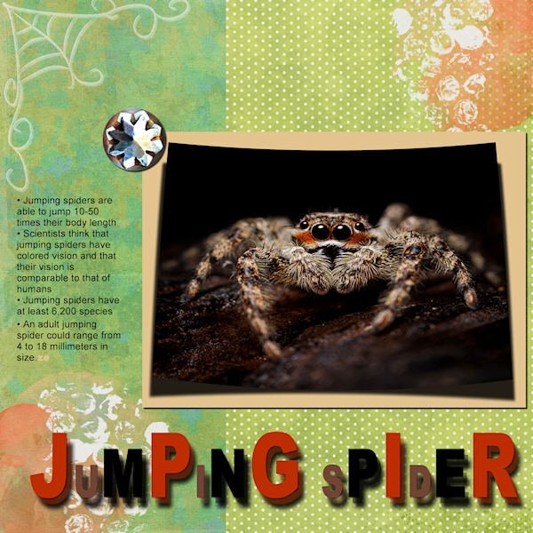
I did a nice layout of a jumping spider when we were studying Text Lessons. Behold: