Donna Sillia
-
Posts
766 -
Joined
-
Last visited
-
Days Won
9
Everything posted by Donna Sillia
-
I will be a charter member!
-
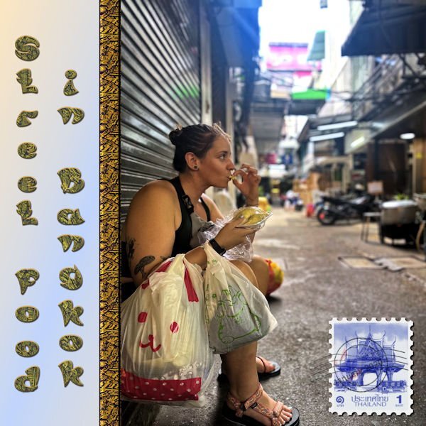
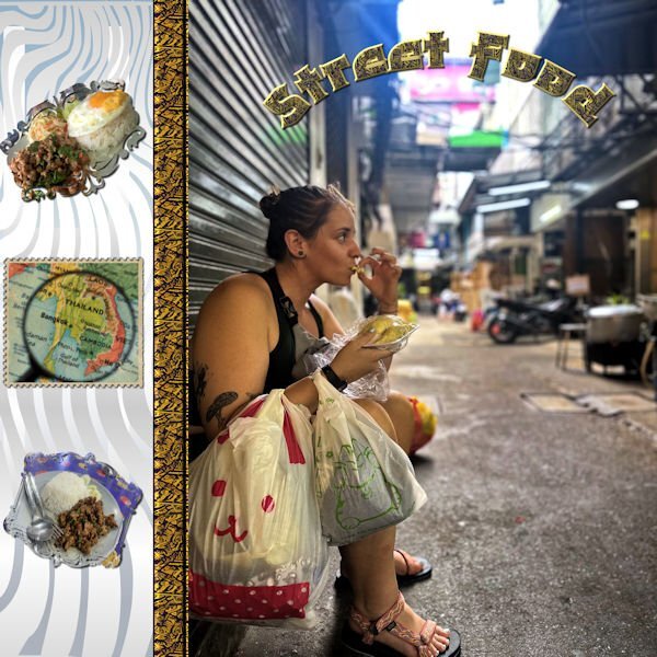
I redid my scrapbook page to make my letters easier to read. I downloaded a font from CF called Shizuko which is thicker. I eliminated the side font and used a map from Canva turned into a stamp from FF to identify the location. I added 2 masks with photos of the food that the kids sent to me. Food is very inexpensive in Thailand, and David informed me that they ate at a Michelin star restaurant and paid $1.50 each for their meals. They were there for 6 weeks playing rugby and working out with the Bangkok rugby club, and, of course, eating.

-
My grandson pointed out the problem with the font. I wanted to use a Asian looking font, but I am going to have to correct it. I also am not crazy about the title going up and down.
-
I made this picture for the Maniacs site. It is a picture that my grandson sent to me from Thailand where he and his girl went to play rugby. The ribbon separating was made from a scrap tutorial using a pattern that I downloaded from CF. The font is Asian Pacific, also from CF. I may change the font because the L and the F look more like a P with the pattern and the stroke.
-
R = River Rafting
-
I realized that when I made the seamless pattern, I had a small rim of white around the pattern. I fixed that and made a new pattern that doesn't show the white lines. I found out about the problem when I used the cass alpha sheet separator script.
-
F = Food
-
My latest: font is apple cider from CF. I am not sure I care for how this font looks.
-
Thank you so much, Mary I love playing with the different fonts. I hope it will save me time on making titles. I have used layer styles so that I have the option of deleting the style, converting to raster and using the raster effects. If anyone wants to use my alphas, let me know.
-
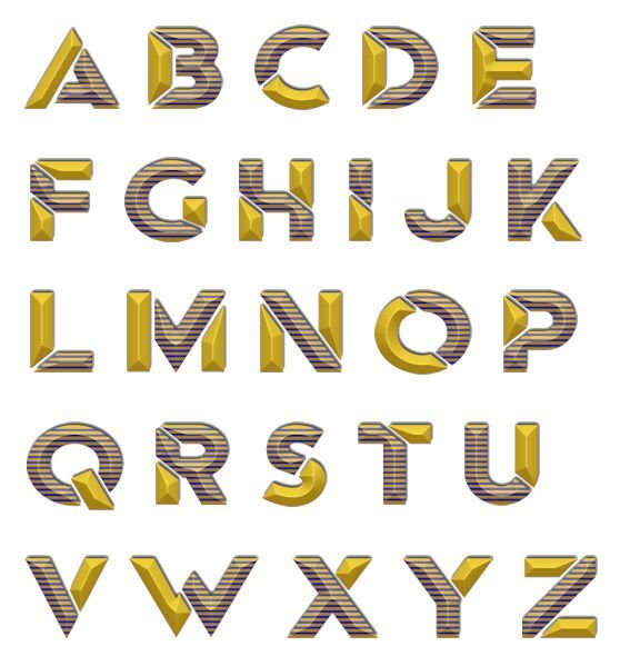
I really think that I need to go to rehab for a font addiction. I can't stop downloading them from CF. I have been working on letter templates using patterns and different fonts. This font is called Mrs. Beasly which is a thick, free font. The pattern is from a dingbat font called Seamless patterns. I made the pattern for the letters using cass seamless pattern script, the cass script element stacker to make the layers and then the cass script text creator for the title. I used layer styles for the bevel and saved as a vector so that I could later change the pattern, colors, etc.
-
I have been experimenting using the elementstacker script. I made my letters on vector and then converted them raster. The letters had a layer style added. When I used the script the layer style was not included, so I merged all to flatten, then copied and pasted them on a new layer with no background. The script then used the layer style. Also since the font had parts of letters that did not touch, I ended up with all the pieces of the letters which I then merged the pieces for each letter. I have saved everything vectors, rasters, etc so that I could use the vectors to change colors. I hope to continue with other fonts in order to be able to use on my projects.
- 151 replies
-
- 12
-

-

-

-
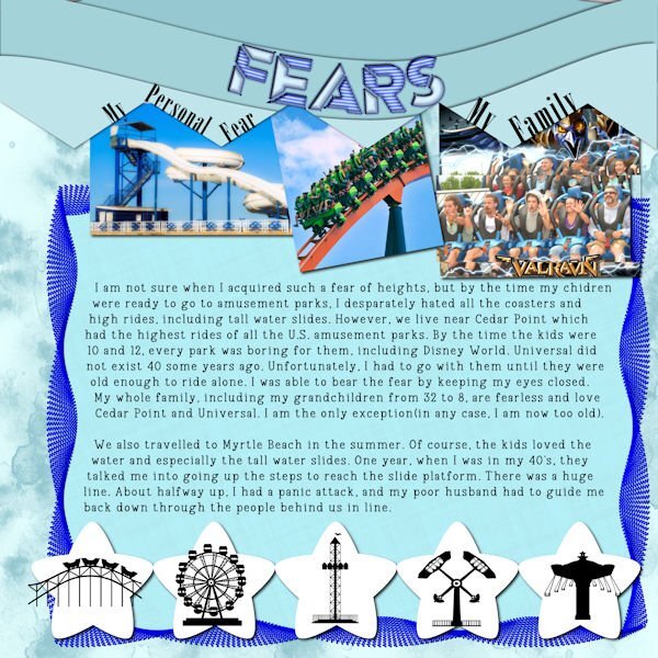
Day 6 - Fear of Heights The picture of the waterslide is from Canva, the coaster from Unsplash and the last one is from my daughter. I made the background and the waves from cass waves script. The border was me fooling around with directional tubes and vector tube. The pattern is from a cass preset. The title font is Ampera, a layered font from CF, and the text is Vintage Remington. The stars are from the template and put in a row using cass repeat script. The little black carnival objects are from a CF dingbat font called DBAmusement Park.
- 229 replies
-
- 12
-
-
-
-
Day 5 was easier for me because I took the photos Friday when we went there. The photos are mine. The title font is Silverblade, a free font, and the type is Vintage Remington. I made a alphabet page and the used cass elementstacked script to put each letter on it's own layer. I love that script; it saves so much time. The background bricks are from Resource Boy and the embellishments are preset shapes. Resource Boy website has many textiles and gradients.
- 229 replies
-
- 12
-
-
-
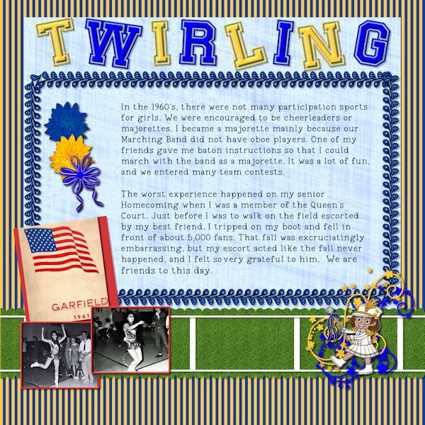
Day 4 - I know I am way behind, but hope to catch up in the next few days. I had difficulty deciding on this topic and ended up dragging out my old yearbook since I didn't have any good pictures from my majorette days. I made the striped paper blue and gold for our school colors and scanned pictures of me from my yearbook. The little majorette is a black and white from Canva, colored by me. The flowers are a my own mum with one changed to blue. We used to wear the corsages on football Fridays. The bow and ribbons are from cass scripts. I tried to make the green paper look like a football field. The embellishment twirls are from a brush. The main title is Preppy Varsity and the typing is Vintage Remington, both from CF. The text border is a cass tube, gimp. I had a typo and could not correct with PSP2023, but I changed the text to character shapes and managed to make it look ok. I also made the title letters character shapes in twist them.
- 229 replies
-
- 11
-
-
-
Carole, I forgot to add the shadows.
-
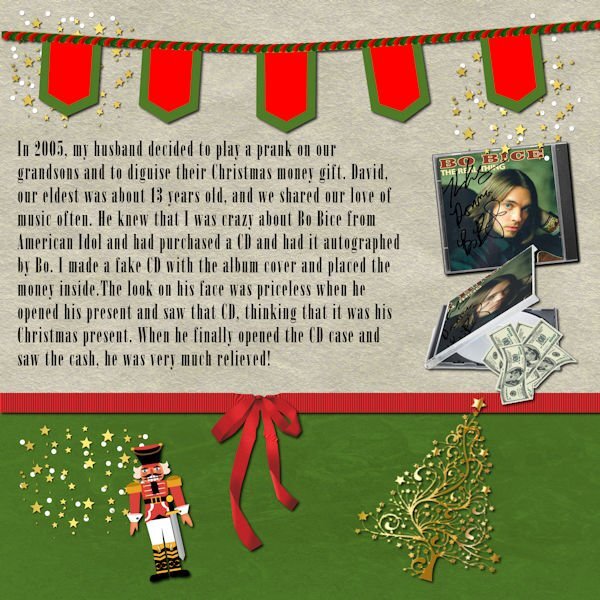
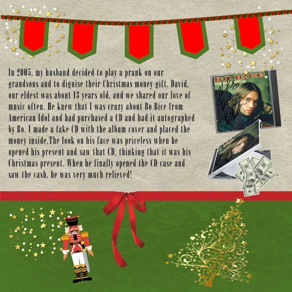
Day 3 Since the prank was at Christmas time, I used some of the graphics from my build a kit. I made the banner using Carole's banner fonts. I copied the front of the CD and downloaded an partially open CD case from Canva. The money is also from Canva. I use raster to mask to place the CD cover into the partially open CD. The font is called onyx which is a windows font. Carole, I wanted to edit my paragraph, but had trouble keeping it in the selection. I didn't want to type the whole thing over, so I just left it the way it was. I duplicated it and made a raster layer. I think that I may have removed the selection and then decided to go back. It didn't work.
- 229 replies
-
- 12
-
-
-
At least you grabbed your bicycle. My son took our car!
-
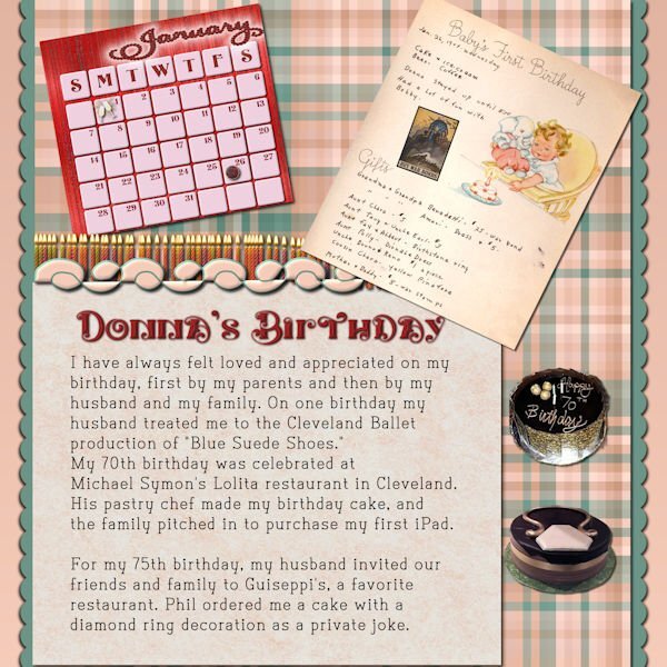
I stayed with my baby book theme for Day 2. The calendar is from the calendar workshop. The cakes were extracted using Cyberlink's My Edit. The war bond was downloaded from the Library of Congress which has free downloads. The candles are tubes, and the decoration is a cass preset shape. I just downloaded the title font, called, Karlburns, from CF and the journal font is also from CF called Type Write. Unfortunately, both the restaurants mentioned hear have closed.
- 229 replies
-
- 12
-
-
-
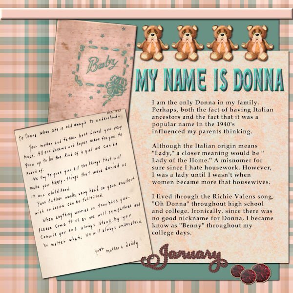
Thank you, Corrie I've had my baby book for a long time, but, yesterday, I just realized that it is 82 years old. It's in pretty good condition, too.
-
I used the Diamond template, but did quite a bit of revising. I still have my original baby book and scanned the cover and the first page that was written by my mother. I made the plaid using cass-stripes 2 script and the colors from the front page. The teddy bears are my own which were lined up using cass-repeat script. The title font is a layered font called Edith from CF. I recolored it and used cass-element stacking script and then the cass textcreator script. My birthday is in January so I used the garnets and garnet January from the Calendar workshop. The text script is called Domitian which is an open source font.
- 229 replies
-
- 10
-
-
-
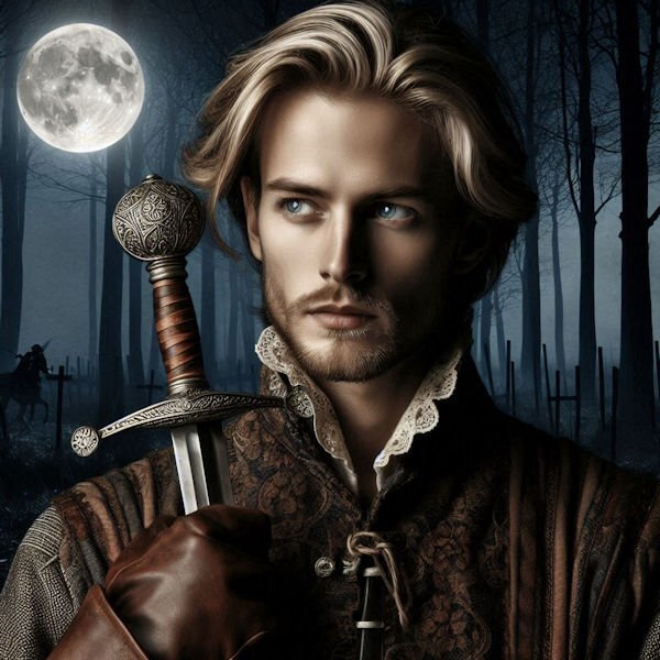
I married a blonde, but Henry Cavill is my ideal man.
-
I sometimes use AI, mostly when I can't make something myself or do not have a adequate picture. However, I had to try Copilot after the discussion here taking my inspiration from Ann. I have a favorite book series by Dorothy Dunnet featuring Francis of Lymond, who is a 16th century courtier, "a musician, a poet, a mathematician and one of the best fighting men of his age. He’s an adventurer, gracious, handsome, very light blonde and lethal." After entering this description, I am posting the picture that was made.😂
-
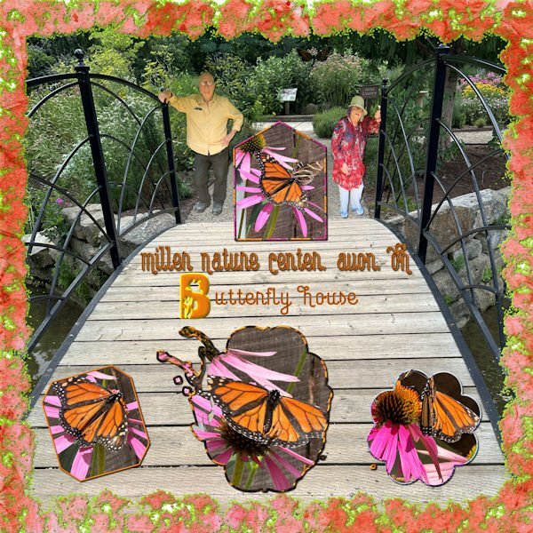
Phil and I visited our local butterfly house which had many beautiful butterflies. However, in this project I just featured, in my opinion, the most beautiful of all--the Monarch. I followed Lab 7, no.2, for the grunge texture. All of the pictures are mine taken at the Butterfly house. The bridge was made into a watercolor using the cass watercolor script. All the masks for the butterflies are mine. The fonts are from CF--Capella for the text and the single letter is Butterfly Logos. I forgot who mentioned Lab 7, but thank you.
-
I watched "Hillbilly Elegy" on Netflix. We are fortunate to have JD as a Senator in Ohio. He is extremely knowledgeable and articulate. His story is inspiring.
-
I love the Libby app. I also read while waiting for appointments. It makes the wait go so much faster.