-
Posts
784 -
Joined
-
Last visited
-
Days Won
9
Content Type
Profiles
Gallery
Forums
Everything posted by Donna Sillia
-
I feel like I am getting a world tour from my computer chair!❤️❤️❤️
- 438 replies
-
- 11
-

-

-
Day 3 - The background is from my papers workshop. I made the mask when I was playing with making masks. I thought that the Hibiscus flower was appropriate for Thailand. The font is atara grunge Regular from CF. I originally applied a style to the font in PSE and opened it in PSP. Then I added vibrancy to make it stand out more. I seem to have this sickness about not putting square or rectangular photos in my templates.
- 438 replies
-
- 14
-

-

-
Day 2 - Rachel and David travelled to Thailand to play in a rugby tournament. The background is from my calendar 2025 workshop, the photo is from David and the mask I used was a grunge mask that I made. The title font is Royal Thailand from CF and the text font is Typefont from CF.
- 438 replies
-
- 14
-

-

-
Thank you, Ann. We went to a Thai restaurant for my birthday, and they were showing many of the same scenes that David sent to me. I'll have to look at that series.
-
Thank you, Susan. I had a lot of fun playing with this script. I did a stupid thing and forgot to save the card as a psp image. Luckily, the original circle was saved, but I have to do the card over.
-
Thank you, Christina. My grandson spent 6 weeks in Thailand this summer, and the photos that he sent are filled with such vibrant colors, especially red and gold.
-
Since you need a lot of pictures, I decided to use my Thailand pictures. Some of them will be repeats of my 2025 calendar.
- 438 replies
-
- 14
-

-

-
I am making a birthday card for my grandson, Matthew, and decided to play with Carole's new script "Radial Script." The photo is Matthew and his fiancee, Lane.
-
Wonderful. I prefer the scripts in PSP, and if you can duplicate some PS scripts that would be wonderful.
-
Carole recently mentioned actions for PSE. I used one yesterday along with styles for the heart. I found it difficult and had to follow a video that was fortunately linked to the instructions. Carole, I downloaded the action from CF; it is called "Digital Art." One thing that I didn't like was that the graphic couldn't be detached from the background. Also, it is not editable in PSE.
-
K - Kleinfeld Bridal (Say Yes to the Dress)
-
I am working on seamless patterns using tips from our last Masterclass. I made the hearts using preset shapes, then manipulated them into various sizes and angles and applied various blend modes with a pink gradient background.
-
S = Special Song
-
I also have CS5 but I used the disk to add it when I upgraded my computer. I used it mostly for styles, text effects and 3D. Now I also have PSE 2025, and I continue to use it for styles that I already had and for styles that I have downloaded from CF. I'll have to look into actions; I have a few but haven't really used them a lot. The cost of PS CC is too expensive for me, too, as I don't use it that much. I found a PSE forum that has actions to download, but haven't had time to try any yet.
-
Susan, I bought PSE 2025 and love styles. I found a ton of them on Creative Fabrica. They also have "text effects," but those can only be used in PS. I've been experimenting with some of the features of PSE. I agree that all the layouts are beautiful, but I wanted to stick with a program that I was already familiar. I've also been busy looking for a new Internet service since Spectrum was once again raising their prices. I've been going crazy setting up my ATT and Directv with my husband's "help." At least some things got dusted!.😄
-
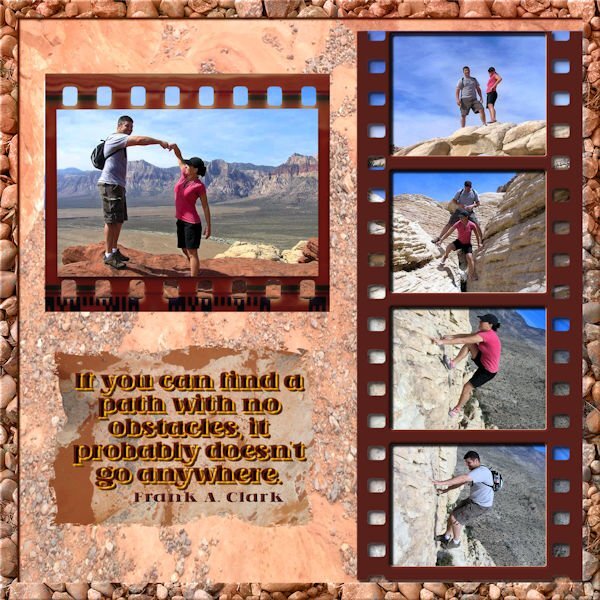
Photos are from my daughter when she and her were husband were hiking in the mountains surrounding Las Vegas. The background is one of my desert photos; the border is a photo of some stones that I took and recolored to match the background. The film strips are from Adobe Express, and the font is Asteru from CF. I used the cass script dimension 2 on the font. The stone in back of the saying is also a photo of a stone when I was walking in the desert.
-
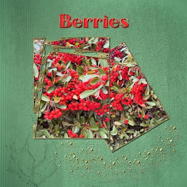
B is for Berries There were some beautiful berry bushes outside our condo in the Outer Banks. I took a few photos to use for decorations. The background is a grunge with some lines and a graphic from Adobe Express. All the background layers are a combination of blends and opacity reductions. One frame is a mask from my PSP masks, the other is just a selection. The scatter is from a brush. The font is Adoleon from CF and edited with the cass dimension script 2.
-
One thing that PSE 2025 has that I like is the access to free Adobe Stock photos, backgrounds and frames. I was able to load a lot of text styles and patterns from my Adobe PS 5. Also, I loaded a lot of my plugins, including Filter Forge. I have been watching and doing some tutorials of which there are a lot on YouTube. I still prefer PSP except for the text styles. The only reason that I invested In PSE 2025 is that I had a $50 coupon on Dell.
-
We spent Christmas with my daughter and son in law in the Outer Banks. Beth and I toured around the lighthouse in Cape Hatteras. The photo is one that Beth took. The lace is from a SS lace brush 003 that I colored, beveled and added drop shadow. The background is one that I love, reminded me of pebbles on a beach and is from Adobe Elements. I have to admit that the lace wasn't very complicated and did not really need mitering. I will be experimenting with mitering later. I've been very lazy lately in working in PSP.
-
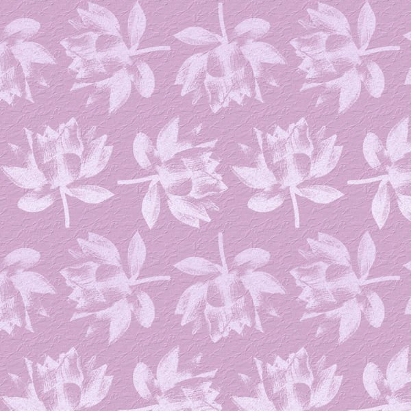
I had to try out my new pattern script from Carole, and I love it. The flower is from Adobe Express and was in black. I locked the layer and painted it lavender. The background is a texture from Carole called cass-crystal.
-
I agree, Cristina. All my other programs complement my PSP. Many of the techniques used in PSP can be used in my other programs.
-
Susan, I finally got it to work after using I0bit uninstaller and the PSP cleanup file. Now, I am in the process of setting up my file locations. Since I had so many 2023 files saved, most were easy to locate. Loading the brushes, however, is a bit tedious, and I can't find where I saved the brushes that I made recently. None of the Corel programs that installed with the bundle that I bought are working either, so I will be uninstalling and reinstalling those programs, too. I had a $50 coupon from Dell, so I invested in Photoshop Elements 2025 with the 3 year subscription. Since I am 82 this month, I am not too worried about the length of the subscription.😄 Since I have the old PS 5 extended, I won't have a large learning curve. I am going to pass on Affinity.
-
Today, I could not open my PSP2023ult. I have uninstalled it and now cannot reinstall. In addition, when I tried to open my 2022ult, I got a message that it was corrupted or illegally downloaded, so I uninstalled that one also. When I run the installation files, all it does is save files. It says it will open the installer after files are saved, but never opens. I have also run the PSP cleanup program. I will try again.
-
Thank you, Christina. The kids were thrilled when they received them yesterday.
-
My grandson and his girlfriend just received my printed Thailand calendars (made from their Thailand photos from last summer) and were just thrilled. Rachel is planning to hand some out to her family for Christmas.


