-
Posts
784 -
Joined
-
Last visited
-
Days Won
9
Content Type
Profiles
Gallery
Forums
Everything posted by Donna Sillia
-
Getting my pictures ready. Can't wait.
-
Maniacs challenge this week was diamonds. How could I resist??? I made an alphabet(caps only for now) using a CF font called "Diamonx." I added my diamond that I had made into a tube by hand since I wanted to able to move them around. I used the vectorpaint script with a brush from my stars stash. I also converted the script to a raster a blurred it a little. I also blurred the stars a little. The background was used so that the letters would be visible and is from a picture that a used a FF filter and then a multiply blend mode. I have been following FF on FB and am finding some really nice filters.
-
Signed in successfully to campus with new email.
-
ok. I'll wait a little while, sign out and then sign back in. Thank you, I think that will solve my problems of not getting your emails.
-
When will it be effective? Sunday, I am signed up for the question and answer.
-
Yes, will that be my new sign in email?
-
att mail through Yahoo mail cannot be recovered. Is it possible to change my email to doonya43@gmail.com. I really am not fond my att mail account, one reason being that I cannot add it my iPhone mail accounts. I find gmail much easier to use.
-
I just joined again, sorry. I never got a confirmation email.
-
I think I joined, but can't find the reply.
-
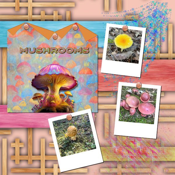
My daughter just sent me photos of some of the mushrooms that see saw on a walk in a Fredericksburg park. The background is called Wood Art from FF. the folded paper is one of mine with a mushroom background created in AI and blended. The big mushroom in the center is from Adobe Express AI. The title was also created in Adobe Express, imported into PSP where I converted it to a vector using the selection to path script so that I could add a glittered stroke with a layer style. I used a star sparkly brush to create the glitters. I used Carole's polaroid lab video to create the polaroid frames. The rusty nails are from Canva. I love glitter, and the stars brushes are great for creating scatters.
- 47 replies
-
- 10
-

-

-
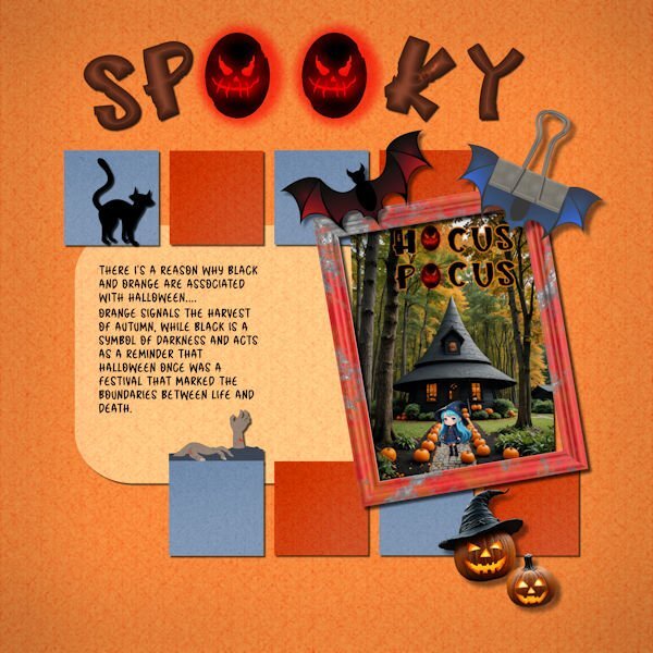
I changed the photo. Except for the "hocus pocus," it was made in My Edit program. It took a while for My Edit to get what I wanted. My Edit is a Cyberlink program which is a yearly subscription. I just downloaded the full program called PhotoDirector 365 to my computer since it was on sale for $39.
-
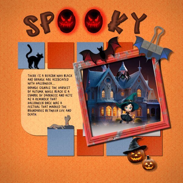
I just couldn't find a photo that I liked for "Concentration," so I decided use some of my Halloween (not my favorite holiday) stuff. I made all the backgrounds using FF and changing them to different colors. The title font is called "Hello Jack" from CF. I experimented with a layer style bevel in orange and was pleasantly surprised that made the letters smokey inside. The journal font is "Halloween" from CF. I used AI quite a bit. I am not sure where I got the house, but it was treated in My Edit, an AI product from Cyberlink. The witch and jack o lanterns are also from AI in My Edit. The bat and frame are from Canva. The clip is my own with bat wings added. The cat and the hands, I think, are from font extras from CF. I have been adding Carole's shadows to my presets after I label them to indicate their use. For example, "cassdropshadow for frame." Since I am shadow deficient, this labeling really helps me when I am making something without having to scroll through a video to help me.
- 197 replies
-
- 10
-

-
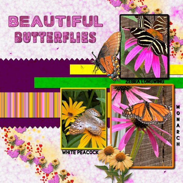
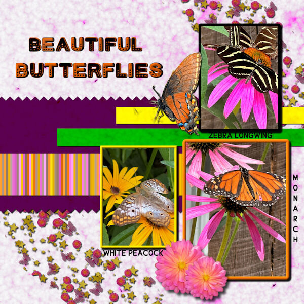
Thank you for your comments, Carole. I was very unhappy with the scatter and font colors on the original. I created a new scatter using VectorPaint and VectorTube. The used shadows on each layer of the scatter before merging since I didn't like how they looked on the merged file. I created a coneflower tube from a coneflower downloaded from Canva. I also tried to fix how the pictures looked. All shadows have been saved on their own layer for future adjustment. The Butterflies font is from CF. The glitter in the scatter is from a brush downloaded from Deviant Art.
- 197 replies
-
- 10
-

-
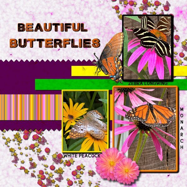
Day 6 I've used bees in the past, so this time I switched to butterflies. All of the butterfly photos were taken by me at a beautiful butterfly house. The single monarch is an extraction from a photo sent to me by my grandson. I made the background papers using FF and changing the colors for the papers. The stripes were made with cass stripe 2. I made the scatters using cass script scattered elements. The stars, flowers and butterflies were from my kits. The font is Cute Dots from CF.
- 197 replies
-
- 12
-

-
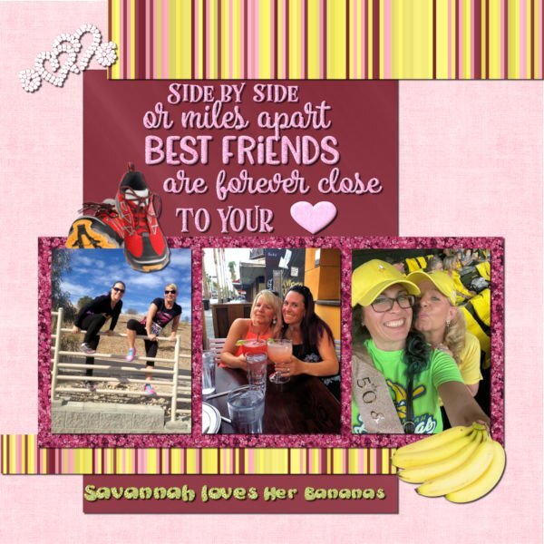
My daughter and Heidi have been BFF for over 30 years. They celebrated their 50th birthdays in Savannah, GA where Beth lived at the time. If you haven't heard of the Savannah Bananas baseball team, you should check out their hilarious videos on YouTube. They are so popular that you have to enter a raffle to get their tickets even if they are playing in Cleveland. I made the background using FF. The glitters are from ones that I made in the past using the cass glitter script. The stripes were made with cass stripes 2 script. The bananas and running shoes are from Canva. The saying is from Creative Fabrica. I converted the hearts to a vector using selection to path script and then my diamond tubes using VectorTube. The saying was selected and filled with my pink glitter pattern. The heart was a vector shape converted to a raster and filled with the pink glitter. I chose the colors based on Heidi's love of pink and of glitter (my kind of girl!). The photos are from Beth (I didn't get a good one of them wearing their banana costumes).
- 197 replies
-
- 11
-

-
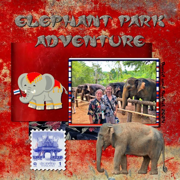
My grandson David sent me this photo of him and his girlfriend while they were in Thailand playing rugby. David educated me on the difference between Asian and African elephants. I had to download a photo of the Asian elephant from Canva. The cartoon elephant is also from Canva. The font is Asian Pacific from CF, and the texture is "elephant skin" from FF. The background and first paper are from CF and called "oriental reds." The second paper I made from a sample of Rachel's shirt. According to David, the elephants in the picture are rescued old elephants who are no longer able to work. The Thailand stamp was a free png downloaded a couple years ago. The picture frame pattern is from stripes created with cass script stripe 2.
- 197 replies
-
- 10
-

-
I don't see any errors.
-
Why do I see all my mistakes after I post my picture?😄
-
I use Canva which is not free. Canva has a free portion, but it is very limited. A friend bought mine for me because I was editing his book. My grandson who is a teacher gets the full version free from his school. Educators and students can get the full version for free.
-
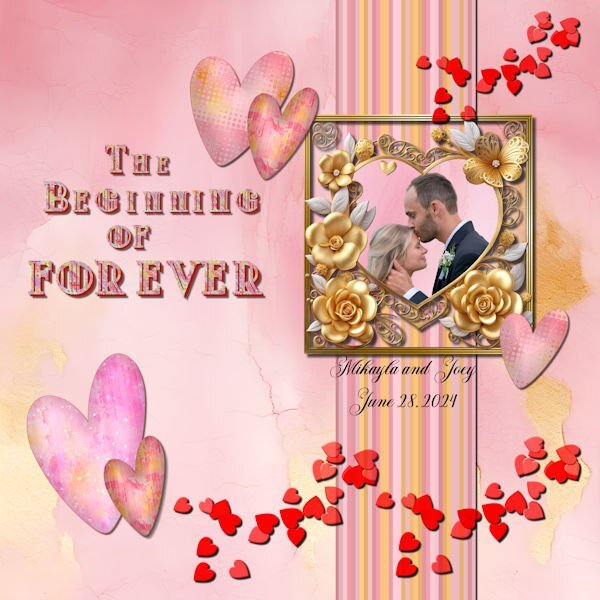
My beautiful niece married the love of her life. The background and the gold heart is from CF. I made the frame and the stripes (cass stripe2 script with colors from the background). the hearts were made with the dingbat font "Heart Valentine" from CF. I filled each heart with a variation of the background using FF to make different patterns. I used layer styles on the hearts to make the darker outline. The scattered hearts are from my build a kit with a blend mode added. The title font is called "Modecque" from CF. I added a pattern and extrusion to the font. The lower case for the font was the same as the upper case but smaller. I made some of the text smaller using the pick tool and snap to guide. I used the following cass scripts for the title: alpha sheet separator; alpha file stacker; and text creator. Carole, the alpha scripts worked perfectly in . The title was done piecemeal in the text creator because I didn't want to have to keep resizing.☺️
-
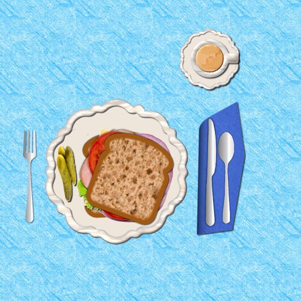
I now only eat whole grain bread, Arnie's" that is made in Michigan. There is only one place near me where you can purchase it. It is the best bread that I have ever eaten and fits right in with my diet. I made the bread with a texture from Canva. The pickles, ham, cheese, onion and lettuce are also from Canva. The silverware is from some that I made with vectors. The plate is from a previous Bootcamp. The coffee texture is from CF.
-
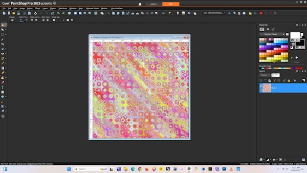
I like to keep my workspace dark. I have a 27 inch screen so I like to have my shortcuts in the middle, along with my scripts palette. Due to my incoordination and eyesight prefer clicking a short cut rather than using keyboard shortcuts except for the "f" to bring up the fill bucket. I learned the hard way to always save my workspace. I have my favorite scripts--directional tubes, open as a layer, clip to it --bound to the task bar. I plan to use the picture sometime during the Bootcamp. It was originally created in kaleidoscope and then treated with a FF effect called "spatter painting."
-
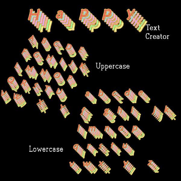
I am still fascinated by various fonts. The font I used is a called maiandra is my computer fonts. The font pages were originally created in Photoshop from an editable text effect called "soft" that I downloaded from deeezy.com. Once I made the letters in Photoshop, I saved them as pngs and opened them in Paintshop. I used the script alphasheetseparator from cass, then the Alpha stacker script and finally the Text creator script. All the scripts worked perfectly in PSP Ultimate 2023.
-
Although I have taken this class several times, it still seems as if I learn something new or am reminded of some clever trick that I had forgotten.❤️


