Donna Sillia
-
Posts
773 -
Joined
-
Last visited
-
Days Won
9
Content Type
Profiles
Gallery
Forums
Everything posted by Donna Sillia
-
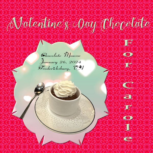
Day 3- More chocolate for Carole. The mask was made from a preset shape converted to a raster with raster to mask script applied. The picture is of a chocolate mousse cup from a French restaurant in Fredericksburg, VA. (and I wonder why my sugar is so high) The font for the title is Chocolateheartfree. The side font is Constancia from Creative Fabrice, and the journal font is Fiolex Girls(not sure where I got that). The background is from the background of the mask, but I changed the color to a more red for Valentines Day. It is actually two layers of the same pattern with different colors and a blend mode of burn for the top layer. BTW, the mousse was outstanding. I think there may be more to see of this restaurant.

- 359 replies
-
- 13
-

-

-
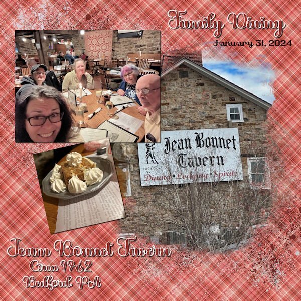
Day 2 - Continuing with my birthday trip theme, my daughter took some selfies at one of our favorites stops on the way home from Virginia. Jean Bonnet Tavern is filled with ambience and a lot of wonderful food. The font is called "Valentine" from Creative Fabrica, and the plaid background is from one of my Build a Kit plaids. I thought it matched the old quilt hanging on the wall. The dessert is Oatmeal Pie. My husband begged our wonderful server for the extra whipped cream.
- 359 replies
-
- 15
-
-
-
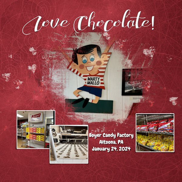
I going to be using the photos that I took in Fredericksburg, VA for this workshop. The photos in the image were taken on route to Fredericksburg, only a little out of the way, because I love Mallo Cups. The graphics are from the kit. Large font is called "ChocolateHeartFree" and the journal font is called "Chewy" which is a free font.
- 359 replies
-
- 16
-
-
-
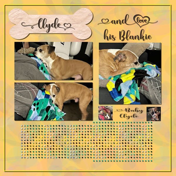
Last week, I was in Fredericksburg, VA visiting my daughter. Her dog, Clyde, is quite a character and a lot of fun. I made a pattern from his blanket and used it to fill the middle dots. I just used a color from the blanket for the other dots. The font is Madelyn Heart from Creative Fabrica. The bone is a preset shape with a texture from Creative Fabrica. The photos are mine and my daughter's. I used the open as a layer and clip to it scripts for the pictures. I loved how he would drag his blanket from the floor to the couch so that he could lay on it.
-
I have had a lot of fun with this Workshop and learned so much. Unfortunately, for the next week, I will be without a Windows computer. I will miss working in PaintShop very much, but my daughter has a full schedule of things to do in Fredericksburg. I am hoping to get some great pictures! I made a quick roadtrip template. Thanks to our vector workshop, I was able to make a little car that sort of looks like our Toyota. The map is from Google. See you in a week.😪
- 426 replies
-
- 12
-
-
-
Thank you, Carole This has been a wonderful workshop, and I was able to use the lessons from Make a Kit as well as some of your fantastic scripts to achieve the effects that I used.
-
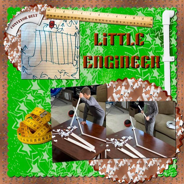
Day 7 Photos of my youngest grandson are from my daughter in law. Thomas loves to build things. The background was created using cass seamless background script with tools from Marisa Lerin. The pvc pipes, ruler and measuring tape were all from in Canva. The pvc patterns were created using cass scatter script and then cass seamless background. The green background paper was actually created by Thomas in Procreate. The font is Super Blash from Creative Fabrica.
- 426 replies
-
- 13
-
-
-
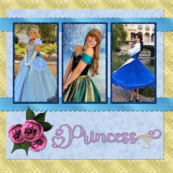
Day 6 - The photos are compliments of my future daughter in law, Lane. She works for a company that does Disney parties for children. The gold dot background is one of my own as is the blue overlay with a lowered opacity. The scalloped ribbons are my own texture, scalloped using cass quick scallop script(what a time saver!). The roses and leaves are from a package that I purchased from deeezy.com. The font is Hilender Rhapsody from Creative Fabrica. I used layer styles for the font, but wanted it to "pop" more and applied Hue and Saturation. The crown is a preset shape that was created from a font. I used VectorTube to apply the diamonds, a directional tube that I made using cassdirectiontube script.
- 426 replies
-
- 15
-
-
-
Carole, thank you so much for the Fade Correction reminder. I remember learning this technique and completely forgot it. I will definitely remember it for future uses. Here is the template with the pictures corrected.
- 426 replies
-
- 10
-
-
-
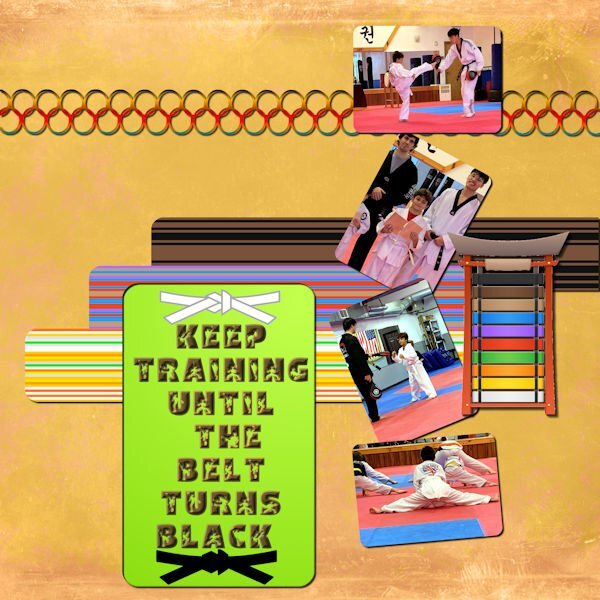
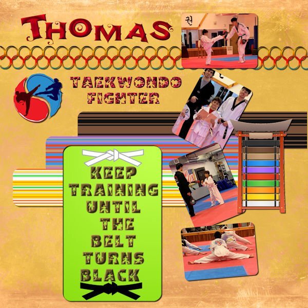
Day 5 - I used the Diamond template but rearranged and resized the photos. Photos are from my daughter in law; the belts, symbol and belt tower is from Canva. The striped papers were made with cass stripe 2 script. The fonts are AgreloycAsparagus, an oft font and Btz Taekwondo from Creative Fabrica. It is a good thing that I have nexusfont since I don't have to install all my downloaded fonts, a folder that is added to everyday from the wonderful fonts that everyone posts here. The background is from Riley B graphics at Creative Fabrica, thanks to Susan's mention.
- 426 replies
-
- 12
-
-
-
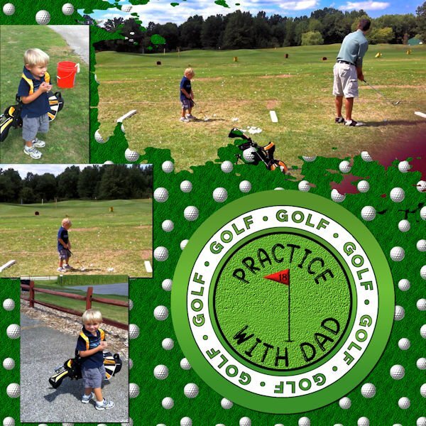
Day 4 - I created the background using balls and bubbles to make the golf ball, then cass seamless pattern script to make the pattern and grass texture from Paintshop. The circle is from a Marisa Lerin sport kit. The flag is from a font called Sports and Hobbies which froze my Paintshop so I had to use Photoshop and save it as a png. The font is Gomuno Bubble which is an oft font. I had to reduce the painted area in order to get the photo of dad and son to fit properly. After I merged the mask, I used the eraser to remove bits of black that remained. The photos are my own and may be a little fuzzy since I captured them from a video.
- 426 replies
-
- 16
-
-
-
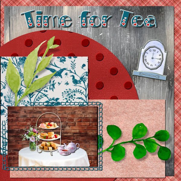
My daughter found an afternoon tea event in Fredericksburg that we will be attending. Since I don't have any good teahouse photos, I created one using Canva for the table, tea tray and tea set. The brick background is from deeezy.com. The bird paper is also from Canva; the polka dot paper is my own, the parchment is from FF, the wood from one of my daughter's photos, the plaid is one of my own and the clock is from my build a kit. The font is Bravo from Creative Fabrica.
- 426 replies
-
- 16
-
-
-
Bonnie, my daughter has quite an itinerary planned including going to see Jersey Boys on my 81st birthday on the 26th. She and her husband are foodies so we will be trying out some of her favorite places to eat--Afgan, Indian, Mexican and French to name a few.
-
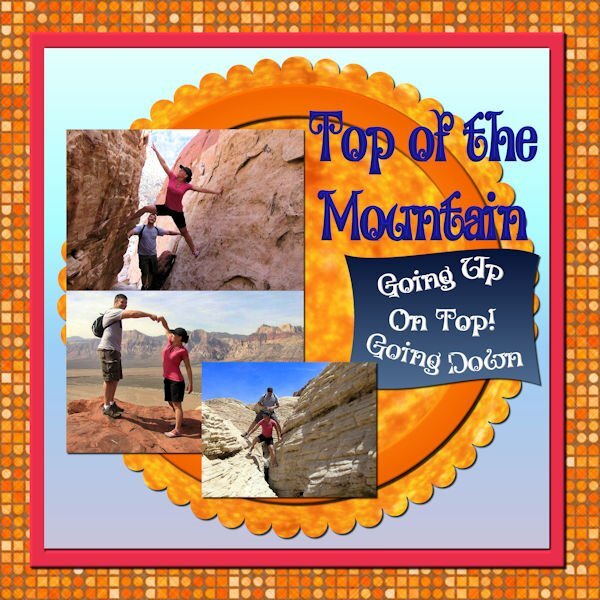
My daughter and son in law loved to hike in the desert around Las Vegas when they lived there. The background is from FF as is the pattern in the scalloped layer. Pictures are from my daughter. The font is Alister Oblique, but I don't know where I got it. The pink square is the color of my daughter's shirt. The other backgrounds are gradients. Beth now is in Fredericksburg, VA, although the Las Vegas house is going to be their retirement home. I will be computerless from Jan 24th to Jan 31st as I will be visiting her in Fredericksburg. Old Town is charming and there is lots to see surrounding Fredericksburg. Needless to say, I will be taking lots of pictures.
- 426 replies
-
- 15
-
-
-
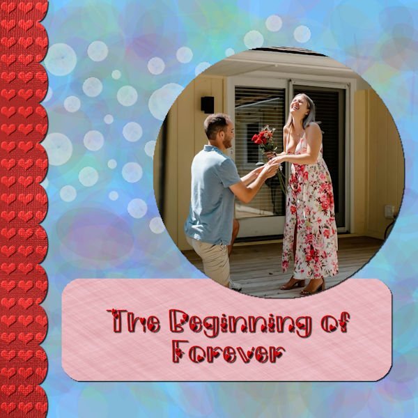
One of my favorite topics is my beautiful niece, Mikayla, and her finance, Joey. She has graciously shared her photos, including her wedding dress which I will not use. I made the heart background using one of my shimmer papers, the ellipse background was made with gmic filter and the rectangle from a FF linen seamless pattern. I lowered the opacity on the dots. The font is Morning Love from Creative Fabrica.
- 426 replies
-
- 19
-
-
-
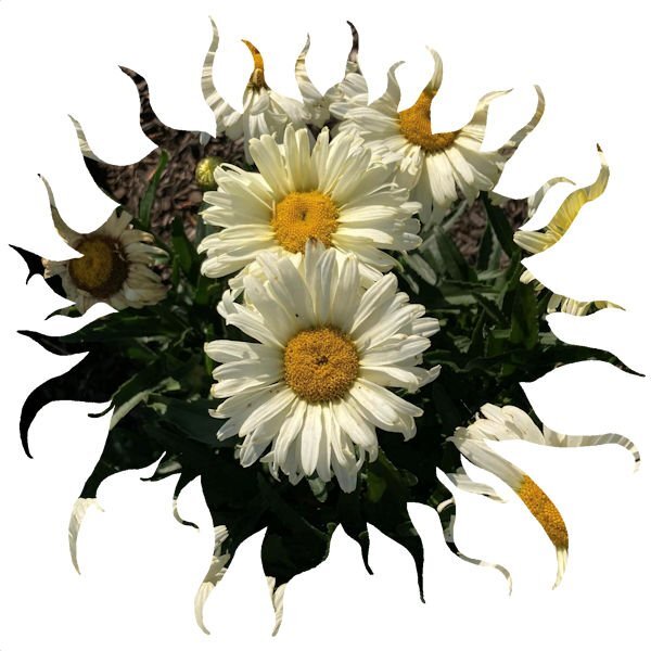
It's still raining here, no snow yet. I am still addicted to making masks. I downloaded a picture from Creative Fabrica, removed the background, and used brightness and contrast to make it black. I applied cass script raster to mask and added one of my daisy pictures.
-
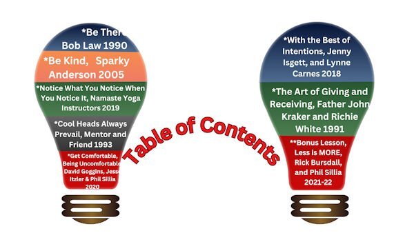
I am working on a friend's Canva project and made this table of contents. The light bulb is a black preset shape which was altered with vectors. For some reason the Canva clipboard misaligns the one top text, but it looks good in the presentation. Canva is a whole other learning curve, and I'm not ready to indulge. I am only using it because of my friend's presentation. Thanks Carole for the great vector lessons!
-
Yes, the script makes preset shapes from font dingbats.
-
I made sure that when I bought my new computer last year that it had a lot of ram, but I guess I'm still remembering the cautions about too many fonts installed slow your computer. What font viewer are you using? I have AMP font viewer also, but don't use it much even though it installs fonts temporarily.
-
I like NexusFont because as long as the fonts are in the uninstalled folder, I don't have to install them in the Windows font folder. I try to keep my installed fonts at a minimum. Creative Fabrica is not helping my font addiction.😄
-
Organizing fonts is very tedious work. Installed fonts are no problem, but finding where I saved the uninstalled fonts was difficult since I have them in so many files. Then I put them into 2 programs. NexusFont and Character Map UWP. I like UWP since it shows all the additonal characters and is large enough for my poor eyes to see without strain. I have several programs to wash my windows, including a Dell program that came with the computer and Norton Utilities Ultimate.
-
I've started organizing my fonts into categories using NexusFont and Character Map UWP. In preparation for the Template Workshop, I have also been making masks using cass raster to mask. Most of the shapes are from preset shapes and preset shapes that I created using the ss Making preset shapes scrip.
- 145 replies
-
- 11
-
-

-
-

What are some of your go-to scripts from the CreationCassel store?
Donna Sillia replied to Suzy's topic in Chit Chat
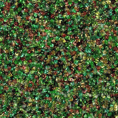
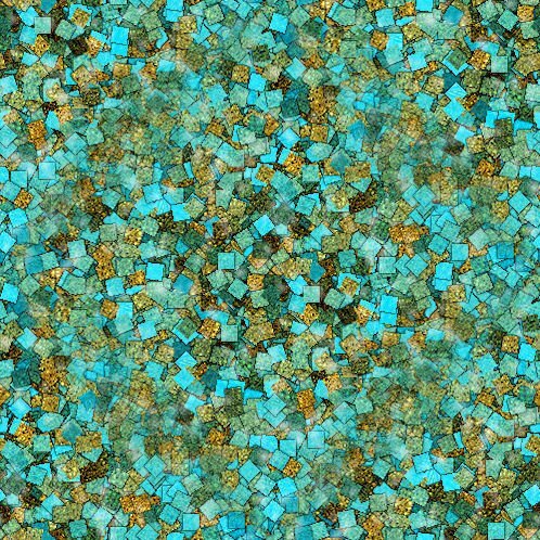
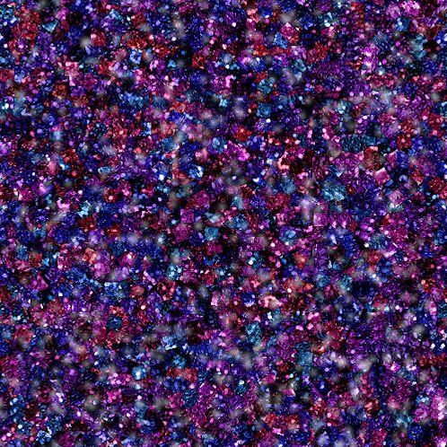
My favorites: custom directional tube; raster to mask; scatter brush; scattered elements; seamless tiling; all the bow scripts; curling ribbon; custom calendar; glitter B; guiding lines. Just to name a few. I have some new ones that I haven't tried yet. I especially love creating glitters.
-
I'm in! Looking forward to this workshop.
-
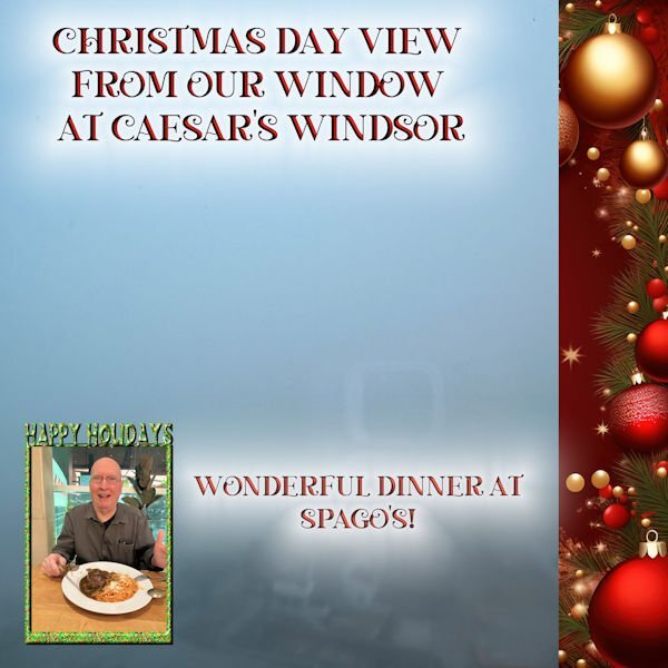
We spent Christmas at Caesar's Windsor in Windsor, Canada. The weather was a little foggy😄. We had a wonderful time and didn't lose a whole lot. The background is my photo and the small picture is mine with Carole's Frame filled with a glitter that I made using one of cass glitter scripts. The red background is from Creative Fabrica. The font is Christmas Crafter and can be found on Creative Fabrica.