

Susan Ewart
-
Posts
3,882 -
Joined
-
Last visited
-
Days Won
119
Content Type
Profiles
Gallery
Forums
Posts posted by Susan Ewart
-
-
On 4/20/2024 at 7:44 PM, Bonnie Ballentine said:
Before:

After:
Done very quickly. I'm sure I could do better with a little more effort. I also removed an age spot from my forehead. 🙂
Wow, that is awesome.
-
 1
1
-
-
1 hour ago, Michele said:
I'm having a problem with PSP so I can't make anything. 😢 I'm waiting to hear from support.
Oh no Michele. I hope you get a fast resolution.
-
2
-
 1
1
-
-
Day 6,
More of the mundane things I found around the house to put on the little baby plinths. Maybe I'll dig out some beads to show what they were really for.
Fonts are Sea Gardens and Shintaku from CF.

-
 7
7
-
-
1 hour ago, Sue Thomas said:
All haylage and silage bales have to be wrapped, due to the higher moisture content to keep the air out otherwise the feed can be contaminated with botulism, which is a bacteria that likes the higher moisture, which can kill live stock and horses. Haylage is dryer than silage, ideal for horses. We did both, round and square bales and silage pits, which would be compressed down with heavy equipment, and covered. Unwrapped bales would be straight forward hay. Just thought I'd tell you.
Interesting stuff, I didn't know. I just dealt with baled hay and straw for stalls (for the momma's and babies not for the racehorses...they'd eat the straw, they had to be on shavings).
-
2
-
-
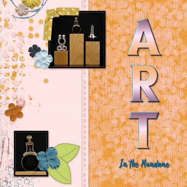
here's a close up of the screws (on plexy) just to show you that I really do have a "few screws loose". I call it 'Art in the Everyday' or "Art in the Mundane'.
-
 1
1
-
5
-
-
Day 5, plugging along slowly.
These photos arent really meant to be shown small, detail is lost in the lack of size. And why on earth am I photographing screws. Hubby torn apart all the hard drives I brought home from work (they have holes screwed into them so they cant be used again) so I could use the insides for photo projects. I walked into the room and saw the screws had attached the very strong magnets inside hard drives and thought, that looks like industrial art. The wood plinths (two are laying on their side) are reject left overs from wood stands I used to make for glass bead makers (lampwork) (some with knots, some without). They remind me of the big plinths you'd have in an art gallery show, but in miniature.
Font is Nathalia (title) and Neuton (Extra Bold) both from CF I think.
I changed the color of part of the QP using a layer mask (actually two masks; one for the band, one for the above and below part). I need to learn how to duplicate and invert a mask, I tried but it didn't work.
-
 1
1
-
5
-
-
7 hours ago, Cassel said:
For Filter Forge, have you tried simply adding the path to the standalone version, inside the File Location for plugins? I am not 100% sure if it will or if it is, somewhat, a different "version" between the plugin and the standalone.
I will give it a try. I'm thinking it might be way more convenient to have it there.
-
8 hours ago, Mary Solaas said:
@Susan Ewart Wow, Susan. You sure are on a roll. Your creating the text and then using Objects>Convert text to curves>as character shapes - really got me going. I believe Carole taught us that in one of the workshops we've been attending - maybe the Text workshop??? Anyway, so I got to playing with it and this is what I came up with. Because using layer styles means you don't have to change the text to rasters in order to bevel, etc. them. Carole also introduced us to layer styles in one of the workshops. We have to remind each other of the different things Carole is teaching us - so much to learn (and maybe forget until one of us reminds us of them)!
Mary, THANK YOU! this is brilliant. And it looks fabulous.
-
1
-
1
-
-
4 hours ago, Michele said:
I love everything about this, Susan. Thanks for sharing what you did.
Thank you so much Michele! My heart is singing right now.
-
1
-
-
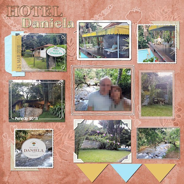
3 hours ago, Cristina said:
After many moons, I have something to post here... It's one layout from the folder I called Unfinished Layouts... There are still many in it!
I finished it a few weeks ago, but I only remember to post it today.
Credits:
- Template from Scrapping with Liz (SwL_LotsofBlocksTemplate3)
- Background paper: DiHiller_PSJul2021_Paper5 plus Greenery and berries stickers from mommyish_AAM. I played with the blend mode.
- Alpha (Hotel): APennington_TLP Treasured
- Font: Astorica Display Black
- Cassel: I followed different Frame Tutorials from the Creative Scrap tutorials.
I agree with Mary, this background is fabulous. I thought the paper came like that. The first thing i noticed was the different frames on each photo. What a great idea.
-
3 hours ago, Mary Solaas said:
Extra for lesson 4. Font is Arial.
Mary, that sign fits perfectly in this QP. Nice and colorful too.
-
1
-
-
32 minutes ago, Cassel said:
@Susan Ewart For Filter Forge, it is a plugin that you can access from PSP directly. Under Effects > Plugins > Filter Forge. Do that while your image is active in PSP and it will automatically "open in FF". Those irregular letters on the Flower Power makes the layout so much fun!
@Jeni Simpson Great choice of photos for those pages!
@Michele That photo really made me smile. Isn't that a great attitude we should all have?
@Ann Seeber Isn't that great to see those cute creatures so close to home!? It is great that you find space to add a lot of information about your photos on the page.
@Anne Lamp Is that you, dancing, in the photo?
@Mary Solaas On your Museum photo, did you place the photo on top of a shadow? It looks like part of the shadow on the plant is missing. Moving the arrow is definitely a chore; it is not really meant to be moved as it is a flattened png format! You are making things hard on yourself 🙂 Interesting to see that a bride was not wearing white at her wedding. You are also adding fun information to your pages.
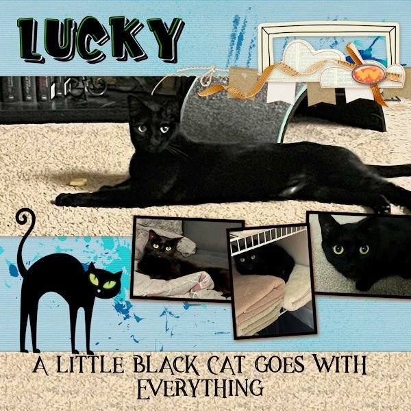
@Donna Sillia Beautiful cat! Black cats can look mysterious!
@Bonnie Ballentine Are the deer photos from the cam?
Keep them coming, and if anyone has not started yet, you can still do so. Those pages are quick to make so you should easily catch up.
I remembered from Build A Kit - Alphas about making the text into characters. I felt pretty happy that I remembered it. About Filter Forge, currently it's a stand alone product for me. I didnt want it in PSP because it used to really bog down my system when it was rendering the effects on it's own, I thought it would make PSP crash. But now my system barely has to lift a finger to use FF. Here's my problem. I don't know how to make it a plug-in in PSP. Does the masterclasses show how to do that?
-
1
-
-
1 hour ago, Mary Solaas said:
On to Lesson 4. Font AR ESSENCE.
That top photo is stunning Mary!
-
1
-
-
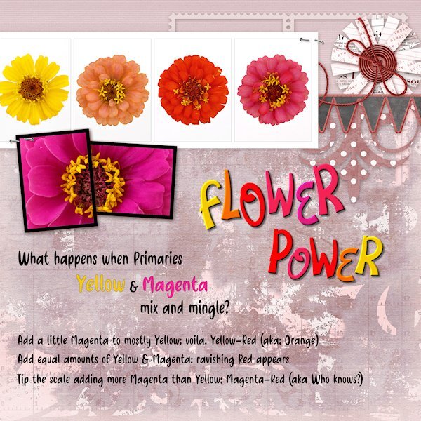
Day 4 Diamond QP
Here is a color flow from the subtractive color (absorbs light as apposed to RGB which is additive and reflects light) color system CMY commonly used for printing (inks, paint etc). Starting with Yellow (very low on the value scale) and strong willed Magenta (fairly high on the value scale). Note the colors of the flowers are not PURE colors, in fact if all all three primaries are present and not any one of them at full strength, it's a tone (Hue+grey). Just keeping up with my color practice along with my PSP practice.
I changed the color of the back ground with either Hue Map or HSL or likely both. the Fonts are Flower Love and Friendly Cactus. I used Objects>Convert Text to Curves>As Character Shapes for separate the letters so I could move them separately. Then rasterized and inner beveled.
-
1
-
6
-
-
8 hours ago, Sue Thomas said:
Check out the image in my response. It's the original post.
I see now, thank you.
-
5 hours ago, Donna Sillia said:
I had this quickpage saved from last year. The photos are of my daughter's cat who was a feral kitten when Beth rescued her. Baby Lucky terrified Beth's two pit bulls. She would boldly lie on one of the dog's beds, and they would not come near her. Now, of course, they are friends. The fonts are a layered font, Kid Zone, from CF. The black cat is from Scary Halloween Ornaments also from CF. The quote font is Magestic Inline Grunge from Deeezy.com.
As a Black cat owner I love everything about this layout Donna. The quote is so perfect.
-
1
-
1
-
-
1 hour ago, Jeni Simpson said:
Thank you, Susan.
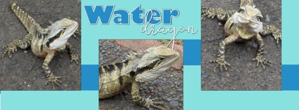
Because I am in the Southern Hemisphere, so far away from most others, I enjoy showcasing our beautiful region, both Australia where I lived for a while, and still enjoy travelling to, and New Zealand where I live. The water dragon in those photos is about the size of a small cat. My housemates and I used to take a salad and a loaf of bread across to the Manly Dam in Sydney, Australia for our breakfast on weekends, and I remember seeing a small iguana sitting on a log close by.
JeniOh Jeni, you are so lucky to live where you do. I have loved Australia since I first saw "The Man from Snowy River" and "Pharlap" many many years ago. And New Zealand, so rich and green and so many interesting animals and birds, that I've only seen on nature shows. I'm looking forward to more of your showcasing.
-
3
-
1
-
-
8 hours ago, Julie Magerka said:
Love the layout, and the background really makes it! Great colours.
Thank you Julie!
-
28 minutes ago, Michele said:
I'm late, but here's my Day 1. Since many of us are seniors, I used this funny photo from Freepik. The font is Rosthila Sans. QP's are just that...quick, but it took me some time lining up all the letters. OCD is a battle sometimes. LOL
What a wonderful layout, love the photo. It sure puts a smile on my face. I hope I have as much energy as this lady seems to have when I get to where she is (in age; 29 yrs with 50 years of experience, right?)
-
1
-
1
-
1
-
-
17 hours ago, Julie Magerka said:
Darn! Thanks for your good eyes, Sue. I missed that!
I would have loved to see the hard edges so I can see the difference. Julie, I love your layout style. It's a hard one for me to emulate (don't we tend to love what is out of artistic reach). I really love AMarie's work too.
-
1
-
-
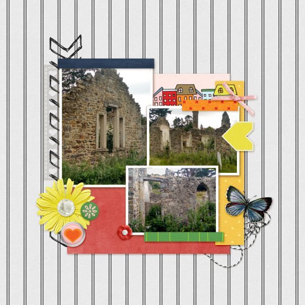
2 hours ago, Jeni Simpson said:
An old run-down building in St Bathans, Central Otago, New Zealand.
The owner of Ohinetahi, an historic homestead on Lyttelton Harbour at Governors Bay, Christchurch, New Zealand hosted a garden party yearly on behalf of Save the Children.
I loved to attend partly because of the scenery, and partly because of the gardens.
An Australian Water Dragon, posing while enjoying the sun at Lone Pine Koala Sanctuary in Brisbane, Australia
Jeni
Jeni, I am really enjoying your pages. The scenery and critters are so wildly different than in Western Canada where I am. That water dragon is so cute, are they as big as iguanas.
-
1
-
-
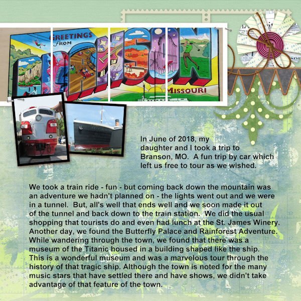
Day 3 Diamond Extra QP
You know you need more practice with Filter forge (13) when you cant figure out how to get a photo into it. It was different than version 12 and I haven't used it in a long time. They have great filters so I don't know why I haven't. The Fonts are Break Love and Breath from CF. Bottom photo is my original. upper right is PSP effects>photo effects> infrared. the left photo is the one I used filer forge on, I forget the name now.
-
10
-
-
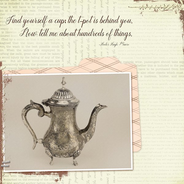
Day 2 Diamond Extra QP
I used the PencilSketch2 script on this little t-pot I have. After the script, I chose to add the max gaussian blur(the the background layer) and then repeated over and over until it was basically a solid color yet still textured. I chose to not use the diagrams or the hatch as I wanted a clean, yet old-world look. Then I used the the original photo as a layer above the sketch layer and reduced the opacity(of the photo layer) to bring the sketch layer through even to look like a sketch, but with help from the photo layer to make it more solid.
Font is Humilde Regular from CF (probably). side note on this font. If I chose to use Bold on the top tool bar I would lose the descenders, instead I added a stroke in black and then, rasterize so I could use Paint Behind (blend mode) with the color of the QP background to make it more readable. The quote is by Hector Hugh Munro and I have used this quote in my "rubber stamp" days.
-
9
-
-
Day 1, using the Diamond Extra template.
I used a photo from the distant past, a Carousel from Burnaby Village Museum (in British Columbia). I even gave a donation to save/restore it many years ago and they have a book with the names of everyone who donated and my name is in it. This carousel was also featured in a stamp set of Canadian carousels and the photo they used is the horse that I have showcased in the past. This is my busy (several extra jobs) week at work so I might be sporadic with my postings. I'll try and keep up though.
The font is Cowboy Kids, either Creative Fabrica or Google fonts, all is mixed up together now in my font viewer.
-
8
-


Quick-Page Workshop - April 2024
in Showroom
Posted
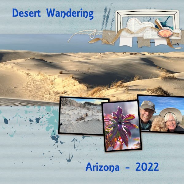
Day 7 Diamond Extra
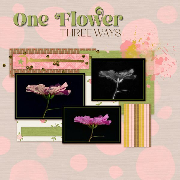
Photos from 2022 when the world was being contained (or were we coming out of containment by then?) I started doing flower flat-lays and well, I contained them too. I had to buy the flowers as I have never grown them before. 2023 was my breakout year for learning to grow flowers.
Font is Gill Sans Ultra bold (formerly from Microsoft) that I had to scoop off my laptop since Windows 10 didn't have it anymore. I used the technique we learned in the Text Workshop (and there is a blog post on it too) where the outline can be used separately, which I added a bevel too.
Side note: I think my brain has turned to mush. My shadows, even at 80% have been looking soft and lighter and I thought, oh oh, something is wrong with my eyes. Today I just noticed the shadow color wasn't black but a dark grey. Geez, when did I change that and why?