

Susan Ewart
-
Posts
3,882 -
Joined
-
Last visited
-
Days Won
119
Content Type
Profiles
Gallery
Forums
Posts posted by Susan Ewart
-
-
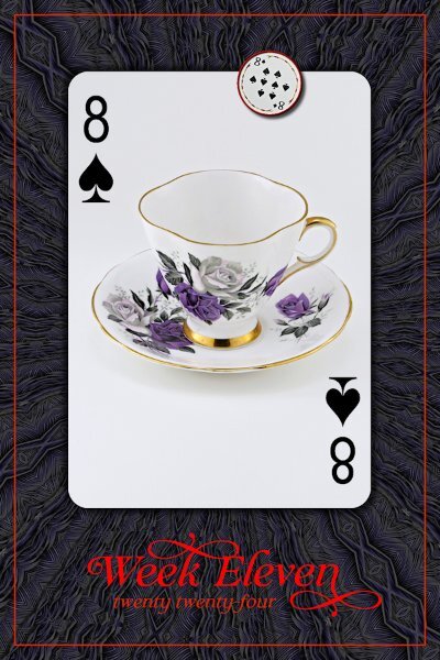
P52 Week 11
The font is Claire Murphy (Creative Fabrica). the background is a PSP pattern (feathers) at I think size 200, 120 deg. angle then I used the kaleidoscope effect. Not shown in this lower resolution; the color in the pattern has purple in it like in the T-cup.

-
 5
5
-
-
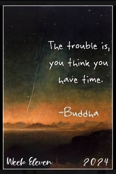
1 hour ago, Sue Thomas said:
The font is Troemys. I had a little play with the script, it certainly does have potential, along with several options to choose from.
Thank you for the name of the font and the info about the new script. I wonder how font designers come up with font names, some are rather odd.
-
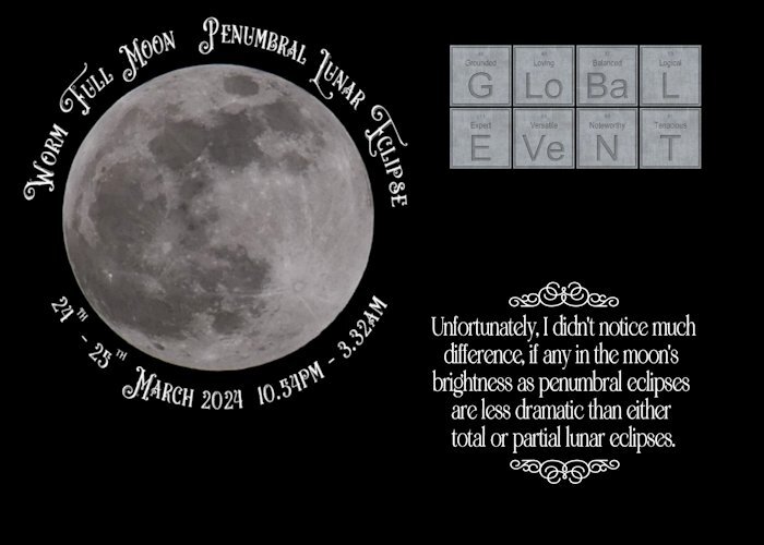
44 minutes ago, Sue Thomas said:
I must admit I was disappointed, as I was hoping for a more defined eclipse. I stayed up until 1.15am As the eclipse started at 10.53pm, maximum was 1.12am, ending at 3.32am this morning. The duration of the eclipse was 4hrs 39 mins. It was an ideal opportuntiy to use the Periodical script which I won.
The next ecplise will be a total eclipse on the 8th April, beginning at 11.53am.
Great shot and I like the choice of font around the moon. I think I might need to get that periodic script. I looks really cool.
-
 2
2
-
 1
1
-
-
14 minutes ago, bina greene said:
Here is my week 12, fonts Bell on my poem, Swissn on date @Susan Ewart @Cassel: PSP's vector support is what got me into checking it out a bit closer. I understand 💕the real fun starts with the scripts. I need to get into them.
I love that poem, it's beautiful. As is the layout.
-
1
-
1
-
-
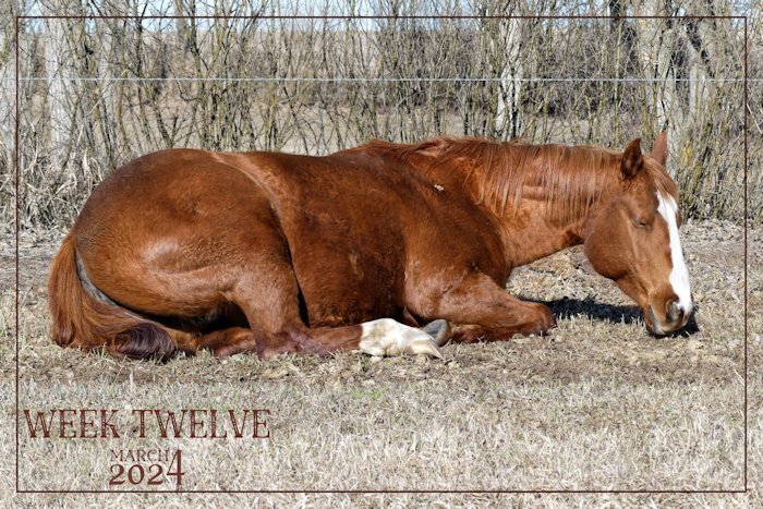
1 hour ago, Sue Thomas said:
Nell is enjoying the heat of the morning sun. She is the younger of my 2 girls.
She's BEAUTIFUL! And thank you. I can never get tired of seeing horses.
-
1
-
-
10 minutes ago, bina greene said:
Many thanks @Susan Ewart!!! 💕 This is it. I really love it. Such a smart script. Since I failed to see this before I made a bit of a basic template for that purpose, only in 3x4" tho so far.
I love it too. Especially since it's all in layers and vectors so we can make changes as we need. It's a great and very useful script.
-
1
-
1
-
-
9 hours ago, Ann Seeber said:
Here is my Week Eleven - I count Sundays so I'm a little behind here. The font is Cardigan Script. This is just a quote about Time. Sue Ewart is the expert on that topic; she will have a Mega Kit for it by the end! 😁
hahaha...the "MEGA" - mini kit. A mini kit with about 40 add-ons. This is so pretty Ann, you have the nicest background for this. I think I might be so behind (in P52 and Build A Kit) that I've caught up to myself. This would have been the perfect journal card for my kit wouldn't it?
-
2
-
-
22 minutes ago, bina greene said:
@Susan Ewart: Many thanks! 💕 xx Just curious, is that the same script y'all are using on the photos? The frame and date set? I can never dl the blog freebies, I must be doing something wrong. I think I recall a similar frame date set script being advertised by Carole @Cassel at one not so distant point in the past....
Oh, thank Carole, I forgot there is a freebie in the store (creationcassel) that you can use. I had bought the script right away so totally forgot about the freebie.
-
5 minutes ago, bina greene said:
@Susan Ewart: Many thanks! 💕 xx Just curious, is that the same script y'all are using on the photos? The frame and date set? I can never dl the blog freebies, I must be doing something wrong. I think I recall a similar frame date set script being advertised by Carole @Cassel at one not so distant point in the past....
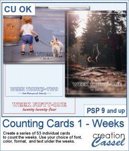
Yes, the outer frame, along with the year and the week #'s are a script in Carole's store (creationcassel.com) called Counting Cards 1 - Weeks
Not sure everyone is using it, some might be making it from scratch...there is a tutorial in the campus for doing a frame with words in the frame line itself that would also be cool. But please do what you want as the rules are loose. You gotta be you!
-
1
-
1
-
-
24 minutes ago, Sue Thomas said:
Beautiful image! Spring is still a long way off here. I'm in a bit of a quandary, unless something else comes along for me to photograph. Ground squirrel or Redpoll photo?
You got horses! They make good photo subjects. any cows close to home right now...cows are awesome!
-
3
-
-
3 hours ago, Corrie Kinkel said:
at the same time you instinctively know what to do
most likely a confidence or lack of experience issue for sure. it's right on the money though.
-
1
-
-
3 hours ago, Corrie Kinkel said:
Susan, that you overthink was an issue with the scripting course as well and at the same time you instinctively know what to do. So try to find your own "style" and I know that such a thing is easier said then done, I struggle with it myself. But in the end we will get there with all the positive comments and help we are getting here in this lovely community.
2 hours ago, Rene Marker said:Styles also evolve.
My beginning layouts were a lot like what is being done in the Boot Camp course. Over the years I have changed but yet still mainly do what I call a "clean style". But the embellishments I add have changed over the years. Even now my style is evolving as I'm learning to put together clusters of flowers/greenery/ribbons/other elements on my own that are pleasing to my eye. They are usually small clusters and/or minimal embellishments. They don't overwhelm the photos and the story behind the photos. Once in awhile I will do a layout that has more clusters that are larger than normal when I feel the photo will work well with that kind of layout.
It took me years to get to where I am today! My first layout was done on December 30, 2007 and has 3 photos (with rounded corners!) and a title. That's it. Nothing else.
Thank you Sue, Corrie and Rene. I am finding my tastes/styles in photography is changing too. What most has changed is my passion. Often now, putting creativity first and the fact that I did find a passion in the digital world which lead me back to the my first passion (photography). Now I understand my "real" artist friends (one's that are making their living from it) when they'd pull an all-nighter because they were in the zone. I get that now...although I'm too old to pull all-nighters...but I've been doing some late-late-lighters, especially when I have an idea and I have to get it out of my head (so that I can go to sleep).
-
1
-
2
-
-
1 hour ago, Sue Thomas said:
Adding elements can be tricky, as I feel they have to be in keeping with the page, at the same time complimenting the page. As you say some elements are non descript. I totally agree the page has to be balanced. The photos direct me, helping me to create an even flow to the page. The photo will envoke the memory of taking the shot, such as what the weather was like at the time. I get the impression that you tend to overthink, I wonder if it's because you are still evolving your own unique style.
yes, that is it. I think I am still experimenting with styles. I definitely dont have a style as yet. I often sit back in my chair so I'm farther away from the screen and just look at it and see where my eye goes or if I feel it's not quite right. I think I probably overthink. I never thought it could be because I don't have a style; which if I did (have a style) it would be more instinctive to know where something needs to go. Soon as Build A Kit workshop is over I am looking forward to getting back to the Notebook Labs again which means more layouts!
-
4
-
-
1 hour ago, Sue Thomas said:
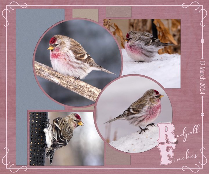
Today a flock of around 30 Redpolls stopped off en route north for a feed. The snow is slowly going. It would appear I sparked some interest in the technique I used the other day and again in this layout. I've given some tips, but should anyone need more instruction, let me know.
I created a word frame with a twist, outlined text on the letters R and F, lifted the one comrer.
I forgot to mention that I created the letterboard, in the previous layout, matching the colour of the wood frame with the ground squirrels.
This one is really pretty as are those Redpolls, mother nature really knows what she's doing when she creates. I love that background too; do I see a background photo through the pink textured paper as well?
-
1
-
1
-
1
-
-
1 hour ago, Sue Thomas said:
Yesterday was a beautiful day, sun shining as it almost always does. Generating more and more heat every day, brought out the first of the ground squirrels. Temperature raised to +13c.
Of course I had to take photos of them, also fed them with carrots and nuts. Which they filled their cheeks with to take back to their burrows. The three that emerged were half grown, undoubtedly born later in the season last year. There was a bitter cold wind today, which meant they weren't going to venture out. At least yesterday they had a chance to replenish their larders.
Continuing with the topic of photography, when I take photos there are several thoughts on my mind, such as visualizing how the shot will look. Lighting, distracting objects, angle and so on. Hoping to take a shot that will appeal to a wide audience, evoke emotion and compel myself and any viewer to keeping looking. In my opinion, that is the essence of a good photo. The same applies to my layouts. When you create layouts, what thoughts run through your mind?
Beautiful and oh so sweet. What runs through my mind when creating layouts? Usually if I'm adding elements I think, "does this/these element(s) make sense with what I'm trying to say with this layout". Sometimes, I will add a surprise element in a corner or on a frame, somewhere in the layout. For example I've put a very owl small on top of a frame, or a cat in the corner of a layout that isn't about cats...sort of like "Easter eggs" in films (definition below). I try to make it look balanced and with fonts I try not to over "glyph" them. It's still a struggle at times and a learning process for me. Some I like and some I just don't like. Of course there are elements that are non-descript and fit any layout, like flowers and buttons and fasteners etc. Usually I have a photo(s) and the layout evolves from me thinking about it when I'm not where near the computer. If I sit down and say I'm going to make a layout, I come down with "blank page" syndrome and other times I already have a theme or concept in mind. Like the layout I did recently called IGNITE, it was in my head for some time, and that time (when I had to do photography for it and go to work and do regular life things) is where it really evolved when I'm doing non computer mundane things, more ideas pop into my head.
Why are Easter eggs in films called Easter eggs?It is believed the name derives from the idea of going on a traditional Easter egg hunt - the task of finding an object that has been concealed with the intention of it being found.-
4
-
-
4 hours ago, bina greene said:
Hello everyone! Stunning images here, such a treat. I'm not sure if I'm playing this challenge correctly. Or should I rather just post a photo instead of a layout? Supplies myself (love the plaid trick @Cassel), font is Times New Roman.
After seeing this beautiful layout I'm BEGGING you to please continue as you are doing. I think this challenge is pretty relaxed on rules and that makes it why I wanted to do it.
-
3
-
1
-
-
7 hours ago, Sue Thomas said:
As I commented to Cristina's words, I deeply appreciate your, and many others within the campus family for their exceedingly inspiring, complimentary comments. It’s an absolute pleasure for me to share my photography, through showcasing them with you all.
As I have said many times before I am very much an amateur photographer, learning and improving as I go along. I have learnt to think more about the elements of an image which will make them more appealing to myself and the viewer. Showcasing them isn’t any different, in my layouts, first and foremost the layout must not take presidence over the image, whilst still making it appealing to myself and the viewer.
How great that we can spend a lifetime continually learning something we love.
-
5
-
-
1 hour ago, Sue Thomas said:
Did you create all 12 from scratch? For many elements, you can create a template, save, and then create others to your liking, colour, size, orientation etc. Remembering to save each one first, to enable you to keep the template in tact. It can be very frustrating when you have put a lot of time into doing something only to find something wrong, and unable to work out what you did wrong.
Not quite from scratch. thankfully, Carole shows how to use the first one to make the other three, saving some steps. It's to get the 4 directions of the prong with the highlight in the right spot for each direction. I am thinking I need to "think" in template terms too, going forward. It would be so much faster. On the bright side, I did a lot of cutout effect today so I'm hoping that got stuck in my brain. And it helped to understand using the cutout for highlights is different than using the effect to indent (such as for the wax seal). Imagine how much more I could have done today if I'd just followed the directions. 😪
-
1
-
 1
1
-
-
12 hours ago, Sue Thomas said:
Again, I appreciate your words. In fact this time you mamaged to curb the length of your comment, by quoting more of my words than your own. 😉 ❤️ Gone are the days when words used to flow freely for me. Though, these days I do have my moments. A tip, when using the technique, make sure you delete EVERY layer which is bleow the photo. In order to get the right effect.
I totally hear you. I have learned in the past few years to back away and not engage in conflict that just isn't that important (As a child I was the temper-tantrum Queen!). I'm trying to save my words ("those" kind of words - we all have them) for really important situations. Thank you about the tip. I was making Photo Prongs today (12 of them) when around prong number 6 to 12 I saw a little something weird on the prong (of course AFTER I was done). Ugh, I had switched one the steps with another one which cause the issue, took me some time to figure it out. Yup, any and all tips are important...so is following the steps in the correct order!
-
3
-
-
2 hours ago, Sue Thomas said:
I decided to do a follow up page to the one I did for the mating hares. Once again I have used Carole's punches, simillar colours too. Now that the snow, and snow banks are slowly disappearing as the sun warms up, it's lovely to see one of my resident hares out feeding during daylight hours. Rather than use borders I used the selection tool, select selection borders, delete Instead of round I went with oval for thw photos. Although I use square layouts, I much prefer to use rectangles.
We now live in a digital world, a far cry from when I was a child, when we didn't even have calculators. It doesn't matter whether you area a pro, amateur, use a pro camera or a phone. For me photography is far more than pressing a button, but in the ability to weave a narrative through pixels. Immortalizing the fleeting beauty of a moment no matter what it may be. Using the powerful impact of PSP to tell the photos story, by showcaseing them.
What a cool and clever technique. Love it. Beautiful words Sue. "Immortalizing the fleeting beauty of a moment no matter what it may be.", really resonated with me.
-
1
-
1
-
-
2 hours ago, Cassel said:
Can you try again. I had to disable one plugin to test for something and had not re-enabled it. I did now. Can you retry?
Thank you it's all good now. I did the wax seal tutorial, it's a good one.
-
1
-
-
I have tried to watch some tutorials tonight but there is no video. In the spot is a URL address, but I tried using that and couldn't make it work. I did a re-boot on my computer, cleared the browser history etc but not working for me. The masterclasses play okay.
-
29 minutes ago, Julie Magerka said:
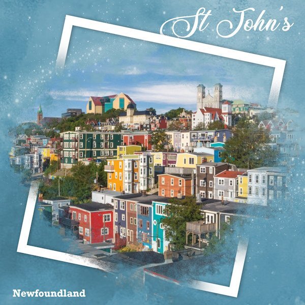
I'm in need of real colours around me these days. Saw this image online and it touched me b/c I love those primary, primitive colours in art or photos. Not much of that around here for a while. I used the spill (or split) frame technique (again). Background paper with sparkles added, and simple text. Glad to get a layout done!
I have been to Newfoundland and it is absolutely breathtaking to see. We did the trip on motorcycles many years ago.
That's beautifully done Julie and the background color works so well with the color in the photos.
-
2
-
1
-
1
-
-
1 hour ago, Anne Lamp said:
On the PSP maniacs there was a some talk about using the Layer Styles and I started playing with this. First I duplicated the flowers only made a couple more layers of that and added some of the the layer styles on the a couple of them. I thought it turned out pretty so here it is.
the flowers just pop right out of the photo. Beautiful.
-
4
-
1
-

.jpg.94ee827e12448708b74a4c6a855bb238.jpg)


March 2024 - P52 challenge
in Challenges
Posted
P52 Week 12
I used a gradient background, meant to texture it but forgot. Cass-lifted photo script used as well. Font is DaisyRegular. My font viewer's little circuitry imploded on this font. I have another one called Daisy, but my font viewer calls "it" Daisy Regular (with a space between the words - but the font is actually only called Daisy) and no amount of manipulation or pleading to the font Gods would allow the viewer to see both of them. So weird. so I had to install this one in Windows. Programs are great....when they do what you "think" they are going to do. 😁