

Susan Ewart
-
Posts
3,882 -
Joined
-
Last visited
-
Days Won
119
Content Type
Profiles
Gallery
Forums
Posts posted by Susan Ewart
-
-
8 hours ago, Cristina said:
Wow, what a beautiful layout, Susan!
Thank you Cristina. It was fun to make, relaxing I'd say. just having fun after a busy week.
-
 2
2
-
-
4 hours ago, Ann Seeber said:
Oh, I had to look that one up, and found this (sorry it's quite small)

hahaha, that's him/her (I feel that it's a him). There is a statue of it in City Park in Kelowna. My bestie and I used to ride our bikes all over Kelowna and we always had a stop at City Park to practice gymnastics - we were 12.
-
2
-
-
53 minutes ago, Julie Magerka said:
I think I'd love to move to Scotland too.
Me too, my dad's side of the family is Scottish. I'm looking forward to hearing about their adventures there. They bought a house in Nairn, close to Inverness (they will be having tea with Nessie). The funny thing is my friend was born and grew up in the Okanagan (where I lived for a short time and we became best friends at 12 yrs old) where there is the Ogopogo, which is similar...or.....are they one in the same (insert eery music here)? 😨
-
1
-
-
52 minutes ago, Julie Magerka said:
Love the quote! and the colours.
Thank you Julie. I actually tried A LOT of combinations before lucking out with this one.
-
1
-
-
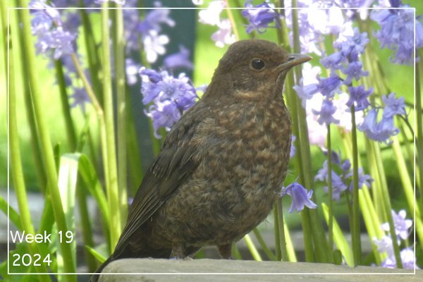
9 hours ago, Sharla said:
Week 19 A quiet moment on a sunny May day.
Oh, that's so sweet. Is this bird getting ready for bath time?
-
1
-
-
On 5/11/2024 at 2:44 AM, Ann Seeber said:
I'll be here with bells on! 😉
Whoaaaa Ann, it's gonna be "that" kind of party is it? Well then, let me get my bells shined up!
-
1
-
 1
1
-
-
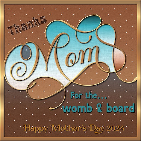
I finally got some PSP time in. Busy week and finally some down time. And just in time for the Q&A. I was driving home from grocery shopping this morning and a local Lube shop always has a funny quote on their sign and this was the one I saw today. I had to keep repeating it over and over because I couldn't pull over on that road to write it down... and my pen was in my shopping bags way in the back.
4 fonts used:
Mandala Vintage (for the womb and board)
Mansdefia (Mom)
Magestica (Thanks)
Marcgravia (Happy Mother's Day 2024)
Papers are by Gina Jones (Digital Scrapbook) Kumbaya papers
See you at the Q&A! All the cool kids go there....I hear.

-
1
-
7
-
-
4 hours ago, Julie Magerka said:
Rhymes with cereal...almost.
I love cereal!
-
 2
2
-
-
6 hours ago, Sue Thomas said:
I have to agree with you. Julie's work is quintessence of her style. I have described her work as ethereal on more than one occasion. Now then do you know how to correctly pronounce ethereal? I ask, as when I was a child in school, the english teacher asked who can pronounce it correctly. I stuck up my hand, of course I was completely wrong. How some things stick your head for ever. This is the correct pronounciation, e th ee r ee ul.
That's me....I have been corrected more than once on this one, so now (jokingly) I will say it as 'Either-rea'l or I could start saying it as 'Ether - reel'. hahahaha, the English language is silly isnt it? I hosted a garage sale for my friends (who live in a condo) who are moving to Scotland and my dear friend has an English degree and had to put all the books oriented in a way that was easier for the buyers to read the titles. I totally supported it and get that. When you know about something, you want it to be right...right?
-
2
-
1
-
-
8 hours ago, Rene Marker said:
Several of my neighbors got photos last night in west central Ohio of them. All I saw with the naked eye was a slight pink glow. They were saying that we could see them again tonight and I've been out every 30 to 40 minutes taking photos but no luck. Even a friend in Dayton, Ohio (an hour south of me) got photos last night.
Smoke from northern Alberta and BC rolled in yesterday morning so nothing for us to see. I missed the friday night show, bummer. I remember watching them when I lived in Alberta when i was a teenager. Now the city lights are too bright to see them regularly.
-
 1
1
-
-
12 hours ago, Sue Thomas said:
Mother nature provides me with everything I need to showcase my photos.
Well said, that's an incredible quote.
-
1
-
-
22 hours ago, Julie Magerka said:
When I first started to learn PSP a few years ago it was to improve old photos for my history articles. Then, with Carole and this group, I got hooked on learning more and just playing as a different kind of creative outlet, something removed from words which I deal with all the time in research.
This type of layout takes minutes to create and serves a purpose when I just want a more personal kind of message to send to someone. This time it was made for a friend whose husband of 54 years died. I sent a "proper" card (in the mail), but followed up with this. I just like that I can do that.
This is incredibly beautiful Julie. It's is papers/elements blended. It's so ethereal. I looked up "ethereal" to make sure I'd used the word right. And meaning of the word is perfect for this layout.
e·the·re·al/iˈTHirēəl/adjective-
1.extremely delicate and light in a way that seems too perfect for this world.
-
2
-
 1
1
-
-
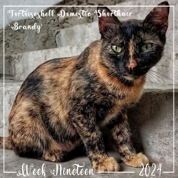
3 hours ago, Ann Seeber said:
Almost all Torties are female - it's a genetic thing. "Brandy" is my newest visitor and is now showing up twice a day for meals. When I go out to feed her, I say "hello" and she answers "meiow!" ☺️ Torties are known for being a bit feisty. They even have a special term for it - "Tortitude." The font is Valentina.
I love this Ann. I didn't know that about Torties (being mostly females). I had a cat for a short time (Emi) and the vet said she was a Torbie...A tabby tortie. And she had such a zest for life and was the biggest cat I've ever had. Sadly, she past suddenly due to a failing heart valve(we found that out later). I didn't get enough time with her.
-
1
-
1
-
-
Wouldn't miss it for the world!
-
1
-
-
10 hours ago, Corrie Kinkel said:
Oops Michele I hope there will be a solution to your problem. Because I am away and don’t have my laptop with me I hope it will restart when I got home in a couple of days. I like this new font and although I probably don’t will participate in this challenge I shall certainly use later on. When coming home I have so much to do, after sleeping off the jetlag I have to install all the goodies of the birthday sale. I have downloaded the zip files on my iPad and have to transfer them to my pc where I can open them finally! The next step will be making the missing layouts for the P52 project, watch the last masterclass, go through all my photos and select which of them I want to use for making a photo album! When all that is done I will resume making layouts for all the different challenges. I admit I am starting to miss you all. Hopefully I see you at the Q&A coming Sunday if I can stay awake that is.
Welcome back Corrie, I missed you in the Campus. I'm looking forward to seeing your coming layouts.
-
1
-
-
10 hours ago, Rene Marker said:
Don't mind me but I have to brag on myself... The designer of the kit I used (Forever Joy at The LilyPad), has added this layout to her Pinterest board where she highlights layouts done with her products! This is a first for me with her products!
That's awesome Rene. And so she should, your layouts are always superbly executed.
-
1
-
1
-
-
On 5/6/2024 at 4:54 AM, fiona cook said:
Now got rid of the corner of the image sticking out of the frame. Didn't notice at first because of the excitement of the technique working!
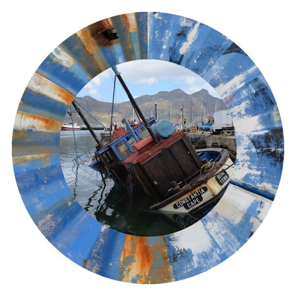
Fiona, this is fabulous. that corrugated wall photo is STUNNING!
-
1
-
-
On 5/5/2024 at 8:58 AM, Ann Seeber said:
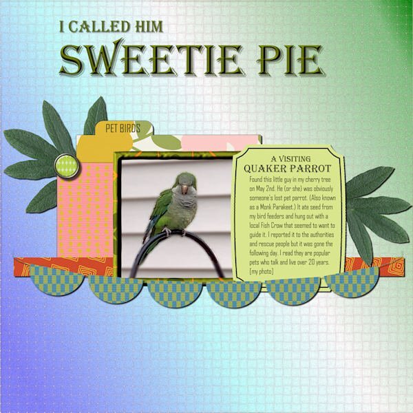
Here's what I've been distracted by recently. I was a bit astounded to find a parrot at my bird feeders! All the supplies came from Marisa Lerin, mostly from her Template 530 and Bolivia Mini-Kit. The title font is Algerian, and the text font is Agency. I'd like to introduce you to the Quaker Parrot "Sweetie Pie".
What a surprise this must have been. Ann you are a good steward of all things "critter". I hope this little guy can survive or be reunited with his human family.
-
1
-
1
-
1
-
-
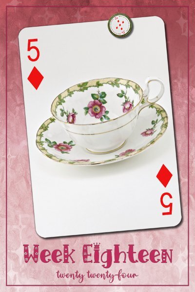
1 hour ago, Ann Seeber said:
I know it doesn't address your problem, but I posted Week Eighteen in the May thread for P52. Your issue must be very annoying as I know you are meticulous with your presentations. Looking forward to seeing what might be causing this. Good luck! ❤️
Oh thank you, I reposted in May and deleted from April. I even wrote that down that 14-17 was in April and 18 was in May because I thought I'd forget. The weird issue distracted me I think.
-
1
-
-
Week 18...caught up enough to get behind again. 😁
Background paper by RachelLm-seth paper15 (Digitalscrapbook.com). Fonts Emil Love (Wk18) and Emely Love (creative fabrica)
and reposted here after posting in April by mistake (even after making a note that it should be in May).
-
7
-
-
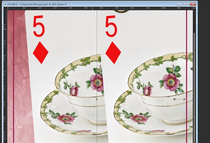
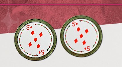
Can you help me. I must be doing something wrong. I noticed this in 3 of my layouts as I was about to save it that the card and magnet seemed blurry/out of focus. I had to actually copy/paste them in again. Here is a couple comparisons. when I make my layouts. I have the blank template with the frame and text. from there the order is:
- add card to layout
- add magnet to layout
- work on background layer (lots of adding and delete, trying out gradients/textures/blend modes etc - not touching the above two elements at all
- then work on the text layers
- save
am I doing something in the wrong order for this to be happening. My elements are whatever the card size is, I dont up or down size except a small amount and usually smaller and not larger. the magnet is HUGE so is downsized with the pick tool and therefore should retain it's sharpness. And they are sharp when I first add the elements in. It's after when I'm done the rest that I notice they seem blurry.
Playing card original (blurry) on left
Magnet original (blurry) on right
-
1
-
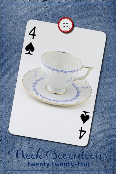
Week 17
I used a background from Janet Scott (digitalscrabook.com); Christmas Memories-blue wood. then added an effect: Effects>distortion>Spiky Halo.
Fonts are Daughter (Week 17) and Dangrek from CF or Google
-
5
-
-
Week 16
All my ducks line up in a row (centered actually). Except the T-cup which I tipped over a bit.
Papers from Creative Fabrica: the Dutch Lady -Daphne Populiers - Watercolor Inc Splash Backgrounds, Sandy Shores. Two papers with a blend mode surprise for me that it matched the magnet and the t-cup.
Fonts Country Wedding (Week 16) and Couple Heart from either CF or Google.
-
5
-
-
Week 15
White, Gold, Black is the theme. The fonts are Compress (Week 15) and Cormorant Unicase, I think these are google fonts (my font viewer came with 5K of fonts (some families have 3-7+ fonts in them). Gradient background with a texture added (Texture>texture effects).
-
6
-


What are you working on (in May 2024)?
in Showroom
Posted
That is really cool Anne.