Julie Magerka
-
Posts
1,243 -
Joined
-
Last visited
-
Days Won
31
Content Type
Profiles
Gallery
Forums
Everything posted by Julie Magerka
-

Wonderful designer and mega-sized downloads for FREE
Julie Magerka replied to Julie Magerka's topic in Chit Chat
No VIP should clean a bathroom! That's what men are for, right? -
October ALL ABOUT ME Challenge (2024) - Clothing
Julie Magerka replied to Cassel's topic in Challenges
Oh Ann, that brings back such memories for me. I too was usually seen wearing cowboy gear and rarely dresses. And my mother was an extraordinary seamstress who kitted out my dolls instead of me. I don't have any of those things anymore, but I sure remember them. Thanks for the memory! And I do recall Margaret O'Brien. Perfect layout for the theme. -
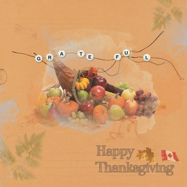
Just playing around with pieces from the Anna Aspnes freebies. And wishing my fellow PSPers a Happy Thanksgiving (well, the Canadian ones anyway). The only bit I "created" was the beaded string effect. It's an idea taken right from AA. I used her strings and the alpha beads come from Marisa Lerin (I started making my own and then gave up!). Oh, and the text is something I made some time ago, just added the Canadian flag to it.

-
You might have been reluctant to do it, but the layout works so well! Love the colours.
-
Wonderful designer and mega-sized downloads for FREE
Julie Magerka replied to Julie Magerka's topic in Chit Chat
And it seems to be the gift that keeps on giving. You'll get emails about more freebies to come! Gotta love that. I'm still watching her videos and trying to use the techniques that she has developed for such unique layouts. -
Wish I could take credit for it! That photographer does some great nature pix!
-
I'm there already! And lovin' it!
-
From National Geographic magazine. Our shared hobby is good for us. (And pickleballers? You're in there too!) https://www.nationalgeographic.com/science/article/hobby-health-benefits-exercise-art-outdoors?rid=F706D92997827DA4EC860DF81A10247E&cmpid=org=ngp::mc=crm-email::src=ngp::cmp=editorial::add=Daily_NL_Tuesday_Health_20241008
-
R = Reykjavik
-
I often take screenshots of layouts I like so that I can try to replicate them using my stash. It's a great way to learn and have fun. But sometimes, it doesn't work out so well, but that's valuable too.
-
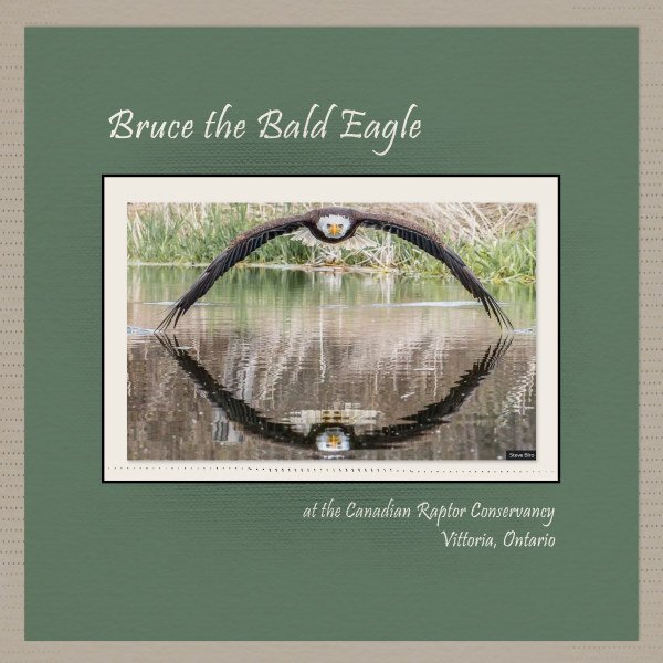
Another Steve Biro photograph, which puts me in mind of Sue T. He got this shot in 2019 after many attempts over the course of some time. This image went viral and he became quite well-known across the world. You can google Bruce. I kept it really simple since the photo is so stunning.
- 88 replies
-
- 10
-

-

-

-
Gorgeous layout!
-
P = Papua (New Guinea)
-
It might be the word "should". Brits use it differently than North Americans. For us, it has the connotation of something that OUGHT to be done. Just my tuppence.
-
L = Languedoc (France)
-
I am so happy that it's October! I love this month and the colours it brings, and I could make layouts all day long. Trouble is, I don't take many pix so I have to rely on finding them somewhere. In this case, the photographer's name (at bottom of layout) is a local guy (Windsor, Ontario) who travels around and creates some great images. I lifted this one from his recent FB post. I've started delving into the Anna Aspnes goodies that I downloaded and most of the background is from her designs. There's some Katie Pertiet elements in there too. The camera brad was in my Autumn stash, and the transparent label is from dhariana and I forget what site that was from. So basically, I did nothing more than make frames for the image, then just shuffled a bunch of stuff around! But I enjoyed doing it! Blending and adjusting, and tweaking and moving, and more blending....
-
I have joined the ranks of the calendar people. Not because I plan to actually make/print a calendar, but to be involved and learn some new tips and tricks. Now I have to think of a theme?
-
This is fun and has so many elements to admire. Love the kitty too.
-
So you're first out of the gate with Anna Aspnes's creations. And you've done a lovely job of it. I really enjoy seeing old photos displayed this way. You've made it delicate and reminiscent of the past, like a fond memory. Great stuff.
-
You're right Sue. I might have felt the layout was forced and unnatural, but it is good to step outside our usual zones and try something different. It's a good reminder for other aspects of our lives too. Not just layout styles!
-
F = Faroe Islands
-
I am posting this layout (without my own approval) to get it over with! I have started and stopped so many times with different attempts at using the 1-2-3 elements required and I just couldn't get it to work. So I figured - glitter? must be for a celebration, right? So I made a kid's birthday (photo from online) layout using some stuff from my stash. Bits and pieces from Billie Irene (the folded edges on the corally-coloured background paper); Rachel Jefferies for much of the birthday things (e.g. balloon sketches and striped paper at the far right); also some glitter bits from Marisa Lerin. The only piece I was involved with was the striped folded-corner paper in the background. The whole effort felt forced and unnatural to me, but I really wanted to produce something I could post and live with. If anything is missing or not according to instructions, please don't judge me too harshly. I have to let it go!
-
Z = Zulu Kingdom (or Zululand)
-
Well, you did a fine job of this challenge and kept true to your style. I am struggling with the whole thing. Glitter is not in my repertoire either. I have started and discarded a few layouts already. (Love the pix and the paperclip.)
-
That folded paper looks real enough to touch!