-
Posts
1,639 -
Joined
-
Last visited
-
Days Won
70
Everything posted by Mary Solaas
-
@Bonnie Ballentine I, too, want to wish you a wonderful birthday year. The 80's are good - welcome to the club. You still keep fit with the Pickleballl group so it should be smooth sailing.❤️
-
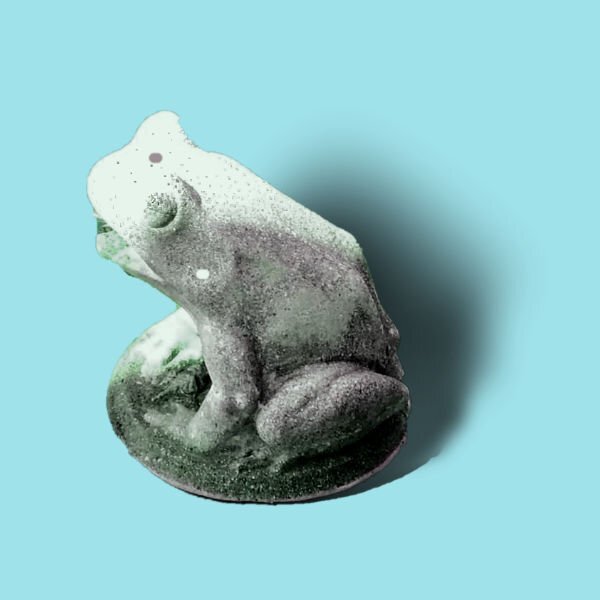
OK. I needed to see how to make shadows for something that stands out and up. I extracted a frog statue during my work on the Chattanooga trip. This is my take now on the shadow for that element. And now I'm finished with the Shadow Workshop and am ready to go on to other projects.
-
Back to finishing up the Shadow Workshop. This is Lesson 6 Tutorial. I wasn't going to do this one as it seemed to be so tedious. However, I plowed through. This is the result.
-
Tre one on the left looks right
-
@Daniel Hess I am interested in your nautical picture tube. Thanks - the link did work. t
-
@Daniel Hess I love the picture of "The Old Salt". Can't wait to see how you will use it. Love what you have been doing on the Campus.
-
-
-
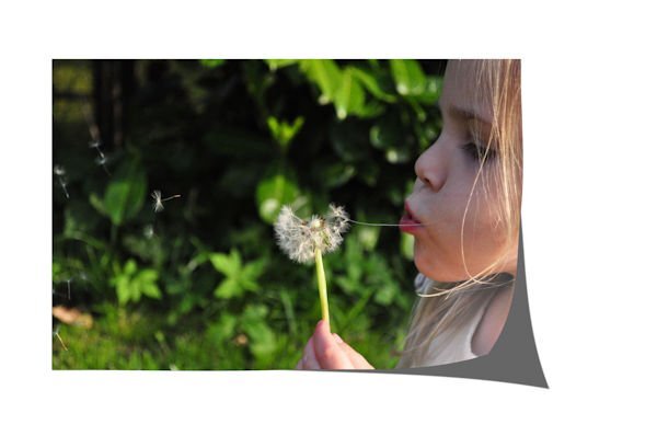
Well, I'm home. Trying to get back in the groove. Not easy. Back on the shadows. I'm not good at this. Still a lot to learn. Redid the Tutorial 3. Maybe I get a "C" on this. Definitely not more than that. I'll post the 1st take and the 2nd one I just finished. I really don't get the lifted corner thing. I did try the script, but I'm not happy with that either. The white background is done with the script. The top one is the one I did first.
-
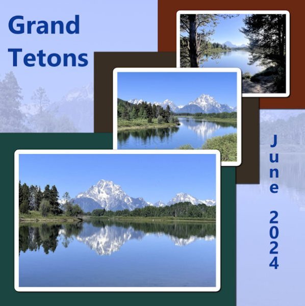
My last Hurrah before the trip! I liked the April 2024 sketch challenge and used it for this layout. The background is a duplicate of the largest picture. I liked the progression from the largest to the smallest and thought of these pictures that Joe and Laurie took on their trip to the Grand Tetons and Yellowstone this summer.
-
I've been behind in this workshop - WAY BEHIND! I've been getting myself, the car, etc. ready for the trip I will be taking with my daughter next week. I've kept all the stuff for this workshop in a folder that I'll be taking on the trip, but probably won't post anything until I get back in September. This workshop will take going over many times, I think. I've even thought of using a lamp to check out how the real shadows show on a flat surface. Well, might post results in September. Thank you, Carole. Really have enjoyed looking at the videos and everyone's take on the projects. All of you have given each of us much to think about. Love you all!
-
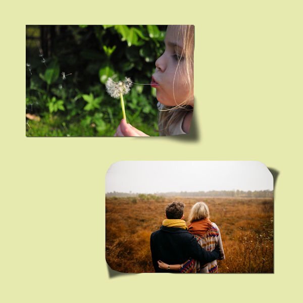
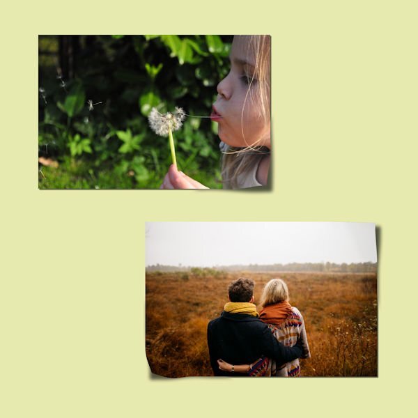
Day 3. I, too, need practice. I did as instructed for the 2 photos, but added on the top photo an adjustment of brightness because as the corner is lifted, the light is shining and brightening that corner - just a little bit. On the bottom photo, I adjusted the brightness downward as the only corner that will reflect some of the light as it is lifted is the bottom right.
- 262 replies
-
- 11
-

-

-
@Cassel-- Mary SolaasHow do you feel about all those shadow settings? It was very interesting how you demonstrated it on the blue circles. Most of these settings I have put as presets in the shadow tool.
-
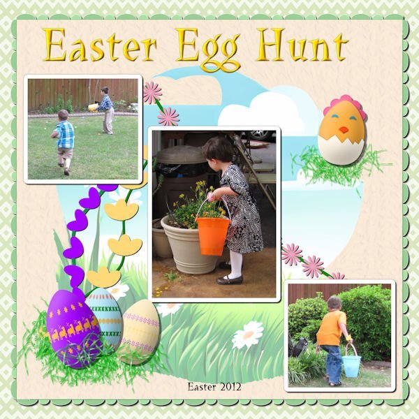
Lab 13 Mod 4: flower vines (pink one behind the 3 photos, purple one and yellow one behind the Easter eggs); Easter eggs (3 in the picture of the 6 I made); Easter chick. The font is LaBambaLET; the background picture behind the 3 photos is an AI I created with CF's Spark some time ago. The 2 background papers are mine created from labs. The title is inner beveled and shadowed. Shadows are the ones I have been using which I put in presets - learned mostly from Cassel.
-
Lesson 2 I used the same setting for the papers (10-10-90-10) and the reverse (0-0-90-10). I placed a white paper behind the picture in order for it to stand out.
- 262 replies
-
- 11
-

-

-
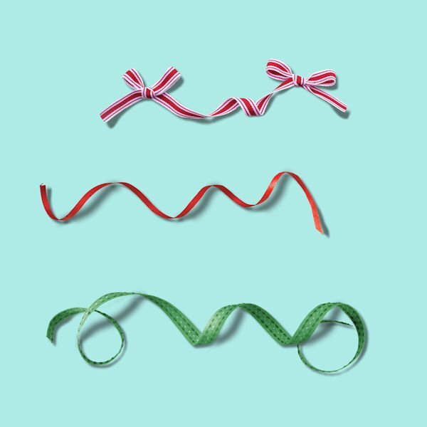
My 1st lesson: On the practice: Paper: 10-10-90-10, Ribbon: 12-12-75-12, Button: 15-15-70-15, Scatter: 5-5-80-5, String: 15-15-65-15 The different items on the tutorial: Frame: 20-20-80-20, Button: 30-30-70-30, Brad: 20-20-80-20, Ribbon: 12-12-75-12 (kept the same setting as on the practice)
- 262 replies
-
- 10
-

-

-
@Ann Seeber One of my favorites. I was a teenager (late teens) and had a part time job. So I manager to see so many musicals. All the Rogers and Hammerstein musicals from that time frame - 50-52 - Carousel, Oklahoma, Show Boat, and I loved Gene Kelley - so An American in Paris was one of my favorites. I loved Mario Lanza and so the first 2 or 3 at that time, and Howard Keel was another of my favorite male singers. Also loved Julie Andrews - her voice was absolutely the best - but I love Shirley Jones voice also.
-
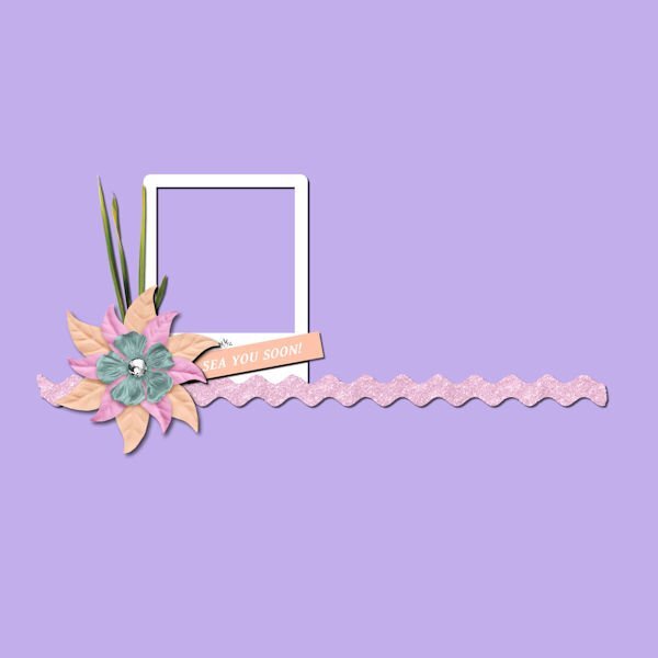
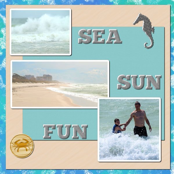
Oh, you Fontaholics. I am a PSPaholic. Can't quit can't quit can't quit can't quit.......... Lab 13 Mod 3. Papers from my beach kit. I didn't like the distressed look, so I didn't do that part of the decorated metal charm. At first I didn't want to do any alphas in it, but I finally relented and did a few letters - enough to do SEA, SUN, FUN -- and I made a heart charm as well as the seahorse. The background paper doesn't show up so well in this size, so (as I took an existing paper and made it black and white) I will show the paper here and the heart charm.
-
This is beautiful. Yes, it takes some time to do the project well. It actually took me 2 years to finish my Alphabet Soup album. So just stick with it. You have lovely ideas that come through in your layouts.
-
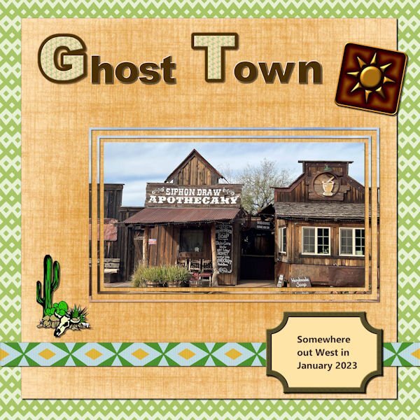
Lab 13 Mod 2. Double arrow - I made papers and ribbons; Cutout shape - I made several but did not save them as "shapes" or "brushes", just png's (several of them all with different corners cut out) - used a copy to make the label. The rest of the papers and elements are from my desert kit including the title. The picture was taken by Joe and Laurie on that western trip they took in 2023. I used that mask I made some time ago playing with several frames in different opacities.
-
I, too, have all 4 of Carole's books. The 1st 2 on Kindle. and the next 2 in paperbook. The previous 1 is marked with numerous paper clips as that is how I marked it for places to study as needed. I just got my copy of the new one and am looking forward to reading and marking it!
-
I agree. In my planning of an album, I usually plan the pages as facing each other and so the look is cohesive. Worked with my Chattanooga album which I had printed for my daughter who shared the trip with me. The trip that my son and daughter-in-law and I took in the RV out west, I did that in double pages and it was a chore in getting it printed and not losing anything in the center.
-
Since I am a Diamond member, I downloaded both the pdf and the mpr of Playing With Vectors Master Class. The very end of the mp4 mentions the upping of the Tracking # in the pen tool. This is not mentioned however in the pdf version. Anyway. Thanks for the update for me. I love what you do, Carole. I guess I'm going to also go to the Master Classes as well as the Labs. Will I ever catch up??????????
-
@Cassel I never thought to look at the tracking! Wow! What a difference. Could we have a workshop or something to give us practice on just using the pen tool??????


