Mary Solaas
-
Posts
1,609 -
Joined
-
Last visited
-
Days Won
68
Content Type
Profiles
Gallery
Forums
Everything posted by Mary Solaas
-
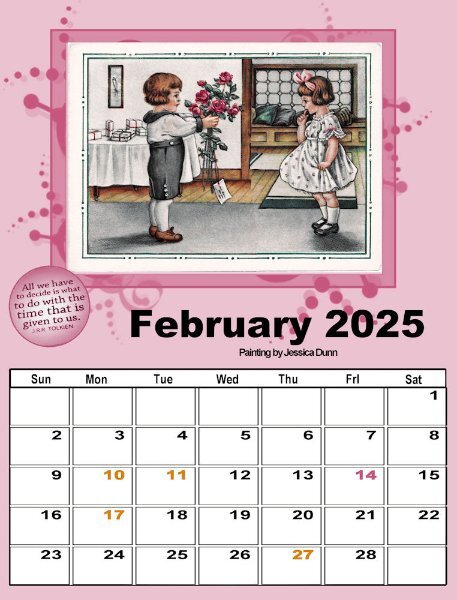
In the 4th lesson we learned to colorize dates that are important on the calendar. Since I was putting a white background on my dates so that I could still keep it white to write on while I had a different background paper, I had to use a different technique for colorizing the dates. In February, we have Valentine's day (pink) and I have 3 birthday dates (gold); I had to use a different technique. I isolated the 14 date with the magic wand (set to RGB) and flood filled the selection with pink; then I isolated the 4 birthday dates with the magic wand and flood filled them with the gold. I'm not sure if I will use this February page or use the original with no dates highlighted, but it was fun.

-
I'm keeping with the white background for the dates since they may be used for writing in after it's printed. Also keeping with the Arial Black for the font. But love what everyone is doing with their calendars as far as font, background, etc. which are in the tutorials. So, I decided to play around with background, fonts and whatever else the tutorials tell us to do. This is one of the background papers I made (looking forward to the upcoming workshop). This is some of the fonts I played with (but not the glyphs since I seem to have chosen ones without extra glyphs. On the paper, I played with blend modes on both papers and on the smaller one I used the layer style of outer glow.
-
Whoops! I noticed that I haven't put my Tolkein button on the last couple of pages. So I went back and added one to each that had been skipped. But I'll only post the last March one I did.
- 430 replies
-
- 12
-

-

-
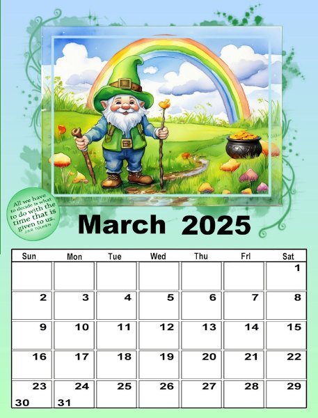
I finally finished March 1st calendar. The picture I developed from 2 AI pictures from CF Spark. The background paper is a gradient. I guess I'm playing with gradients because I need to practice making them.
-
Well, I changed all the January :& February layouts (& the pspimages) so that the days of the week are abbreviated and centered. Works out well. The Arial Bold font that I am using doesn't show the small i very well. This is the March 2nd set page. I'm having trouble with the March 1st set since I am using St. Patrick's Day for the theme.
- 430 replies
-
- 11
-
-
-
@Cassel I think you are right (as usual). Thank you. I've seen how various members have handled the days of the week and have decided to handle it by using the abbreviations since they are just 3 letters and will be easier to center over the blocks. Will take me a while to go back and redo the January's and February's and I have done one March so that one too. ONWARD!
-
I didn't like the background for February 2, so I created a gradient with pale yellow and pale purple and used it for the background.
- 430 replies
-
- 10
-
-
-
My February in the 2nd set - Mardi Gras time!
- 430 replies
-
- 10
-
-
-
This is my February (1st set) offering.
- 430 replies
-
- 13
-
-
-
This is the January of my 2nd set of calendars.
- 430 replies
-
- 10
-
-
-
@Cassel yes, I did resize the dates - was looking for more space to write on the date.
-
I think I may end up making 2 calendars. This is the January for the 1st set. I've added the year and made a separate image so that I can use it throughout. I also added the days of the week and saved it as a separate image. The Tolkein button I will use on each page changing the color to coordinate with the picture as I love this quote from Lord of the Rings.
- 430 replies
-
- 11
-
-
-
@Susan Ewart what is the font used. Itr looks like it is filled with playing cards.
-
My last playing until the workshop beginning on Monday.
-
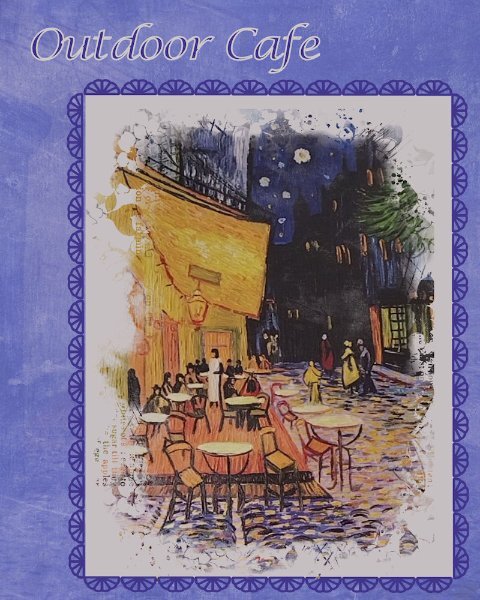
Thanks, @Corrie Kinkel for the info on the Outdoor Cafe artist. I redid my layout to acknowledge that the painting was Vincent Van Gogh's. And then I realize that I hadn't been acknowledging the photographers when I use family's pics. So I went back to the recent layouts and did so. Won't post them here, but I will be more mindful of that in the future. On all the ideas on logos - I haven't begun to think of what I want to do along with the initials (I won't use my name - just initials). I have seen Susan Ewert's, @Lynda DiGregor and I remember Annie Tobin's.
-
I'm in, too. this is my first calendar workshop.
-
Thank you for the info. I love this picture.
-
@kasany really love that layout.
-
This picture is on the wall of one of our favorite restaurants. It is unsigned - a print of a painting. I just started playing around with it and how to display it. Decided on doing a vertical format this time. the picture is in a mask from Jessica Dunn - April 2024 challenge mask. I put a cream color mat behind it and a frame around that of Cass stitching. The background is made up of 4 layers - white, bluish purple, picture, overlay of RileyBgraphicsLondonFog7 from CF and colored a bluish purple using HSL and blend mode of multiply. the other layers have different blend modes as well. Several of you use your "logo" on your layouts. My daughter was telling me that my graphics designer daughter-in-law had said that everyone needs to put their initials or logo on all their work. Maybe it's time for me to develop one.
- 88 replies
-
- 10
-
-
-
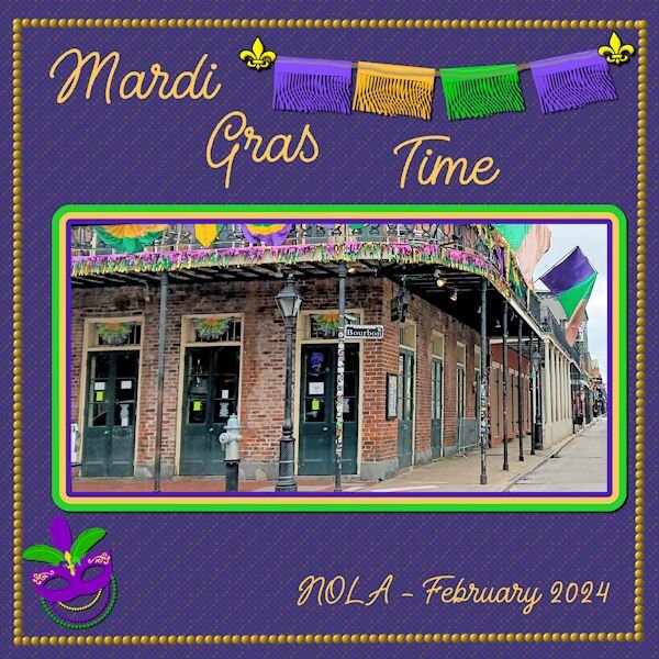
Lab 13 Mod 5. did'nt really want to do this, but finally tried out the fringe paper. Made several of them - three in Mardi Gras colors (which I used for this layout), two in Halloween colors and two in Valentine colors? The picture was taken by my daughter and is actually after Mardi Gras but in February. The font is from Creative Fabrica (where all my specialty fonts are from) and is called Adventure Island ScriptRough. The mask I got sometime back and might have been from CF or NicePng.
-
My Swan Sony for September. Just playing around with Olaf.
-
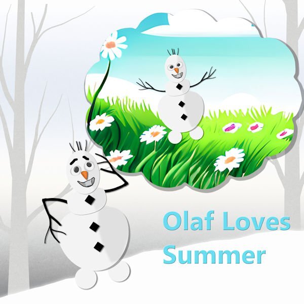
the next lab 13 module calls for learning to do fringe papers. Not sure what I will do with it, but I thought that Olaf (from Frozen) wanted to experience summer. My daughter got me a little stuffed Olaf with a hula skirt (since he wanted to experience summer). I thought that maybe I could use the tut for fringe to make a hula skirt for him. So I made an Olaf. This is my Olaf waiting for his hula skirt. I made the eyes in a previous lab. the toothy grin is mine as are the square buttons. the arms and carrot nose are from Pixel Scrapper - Jessica Dunn.
-
@Bonnie Ballentine I, too, want to wish you a wonderful birthday year. The 80's are good - welcome to the club. You still keep fit with the Pickleballl group so it should be smooth sailing.❤️
-
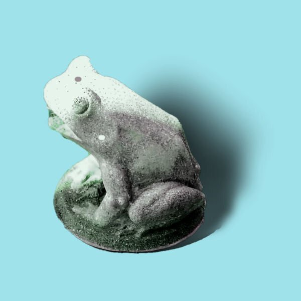
OK. I needed to see how to make shadows for something that stands out and up. I extracted a frog statue during my work on the Chattanooga trip. This is my take now on the shadow for that element. And now I'm finished with the Shadow Workshop and am ready to go on to other projects.
-
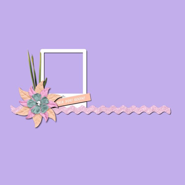
Back to finishing up the Shadow Workshop. This is Lesson 6 Tutorial. I wasn't going to do this one as it seemed to be so tedious. However, I plowed through. This is the result.